


barbieq25
-
Posts
6,393 -
Joined
-
Last visited
-
Days Won
86
Posts posted by barbieq25
-
-
-
I like your sigs! Well done.
-
Hi Bbq
 . It`s just struck me how little I`ve posted in your thread. Sorry. Of course you know how I admire your work but I really should try posting here more as well. :wink:
That's because we mostly comment on each other's work on fans & yes I know.
Maybe there's a lesson for us all in that. Guess I should do the same with the comments as I do with the updates & just C/P that way I don't have to struggle so much with my dyslexic keyboard.
You're a sweetie!
@Bjarni, yes, I'd love to see it. I challenge you to create a Mondrian style piece
@Sokagirl, with your work it would be very easy to create something like it.
Take one of your fabulous pieces & cut a circle or oval, on a new layer make some golden yellow lines diagonal from the bottom. Select only the yellow lines (set selection mode to global but remember to change it back when you're done), Gaussian Blur at about 3, Bevel using a light tanish yellow for the highlight & a darker tarnished golden yellow for the shadow, amount depends on the size of the lines. Since I always use an image 3200 x 2400 (read David Atwell's DPI & you post) & then scale it back to 800 as a png when its done, its hard for me to say exactly. Then use curves (there's a gold text tute that gives you the settings but only do the first one). Then run Polar Transformation (not sure which setting I used but play with it). Duplicate the layer, maybe run some more PT, stretch/play. You may need to move layers down etc or even cut bits. When you're happy with the gold run a Gaussian Blur @ 1 or 2 to clean the image up or use feather (I prefer GB rather than feather - works better for me).
Take a look at Helen's Galaxy Ball tute for ideas on how to do the highlight. If you don't like the colours or think that they dont go well together, use Colour Flip/Rotate. Just make sure that the gold stays on its own layer or the colour flip will be yucky.
I did a Drop Shadow on the gold. The background is Bolt Bait's Fire render. Run a b/w clouds first at max scale, then max scale the fire, then Splinter Blur at max.
Sorry that it isn't in more tute form but I really don't recall exactly what I did.
I hope you'll give it a go & post the results. With one of your pieces it will look awesome!
-
Thank you for looking at my gallery. All visits are appreciated.
Yes, Piet Mondrian is my hero. I have quite a few works styled after him. My sig is called "Sig After Mondrian". The MB Series are Mondrian Blue & all of the works in the two series are based on the one work that I did. I have done windows & boxes in his style. All done in high performance vinyl. I did a few works & my husband commented how very similar our works were, even before I knew about him. His works are very cool. Even his earlier works.
Very pleased you have made his acquaintance too!
-
Of course, thanks for sharing. Barrel looks good & can be used for other images too.
-
Or maybe a little bit of polaroid style. Which is better?
Oh, photo: http://blog.yanidel.com/2009/05/03/focals/
Very nice & great imagination.
@Burning Rock - nice one! Nice to see you having a go & good luck!
-
Ooooh! Stacks of possibilities there! Nice job so far. The fire stuff I love...care to share how you did it. At least you remember how you did stuff - I don't. I should write it down as I do it but it just gets in the way of the flow.
Very nice so far!
-
The first two I like a lot. Showing a lot of promise here.
Please don't limit yourself to just doing sigs...I think you have much more potential. Well done!
-
Oh Chad! It is lovely! Love the glow of the jewel, very magical & thank you so much. First time ever an artwork was dedicated to me.
Thank you for the beautiful jewel.
-
(I'll lend you a submarine to put at the bottom :wink: )
Good idea...at least it can't be sunk...um can it?
Great job in the fish tank.
-
The winter "Aislin" one is my favourite & I love your avvie too! Well done!
The before & after gives us an idea of what you are trying to achieve. You did very well with this one.
P.S. Personally I didn't mind any of those ones you removed but there are rules. Do you have a Deviant Art gallery? They should be on display & DA is really good for that.
-
Very nice & soothing. Great choice of colour!
-
Nice colours & I love the soft bits in the middle. Kinda reminds me of a lovely silk scarf. Well done!
-
Some nice work here!
-
And thank you :wink: I think it's just a basic sig, made with a tut

I'm kinda new, so I'm trying to learn as much as possible on the forum

Very nice indeed! Tutes are a very good place to start. Well done!
-
Think you're right on the lighting. It shouldn't go right around the planet. Otherwise well done!
-
Good sig...did you mean for some of the buttons to be overlapping & others standing in front?
Look like smarties...yum. Well done!
-
Nice one! Good onya!
-
Looks like an ogre's face with the big ears. I love the top bit!
-
Nothing is ever impossbile
Unlikely & improbable maybe. I sense your frustration but I was always more frustrated with Paint Shop Pro 
Have your tried:
1. Hold down the shift key as you make the selection? That makes a perfect circle or square for that matter.
2. The starting point is probably not that relevant as you can move the selection. I don't have a little icon to show you but if you look on your toolbar it is a white arrow with a + just below it. It should be right below the one that moves the selected pixels.
3. You can use the magic wand to select the moon or any shape. You may have to play with the tolerance & it does take some practice. I would not recommend moving the shapes on that layer as it leaves the tiniest outline which can be problematic to fix.
So hold down the shift key (sometimes the selection lags, at least my pc does, its slow). Then once you get it to a reasonable size, use the move selection to position the selection exactly where you want it.
I hope this has helped. Maybe someone else has another method?
-
Hey, well done & congratulations!
-
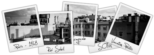
Here's my entry:

No stocks, no renders, no nothin'...just pure PDN...enjoy!
-
Very cute little fishies...good coral & the bubbles & background are great. Just where it meets the sand looks like there is overlap?
Great work, Chad!
Had to edit coz I forgot to comment on the new avvie & sig. Cool! You really have some great ideas!
-
Lens flare is/was in the older version...not sure what version you are using?
Check your PMs!

What is Paint.NET's most powerful feature?
in Paint.NET Discussion and Questions
Posted
EER, agreed. 2nd most powerful capability is between the chair & the keyboard. (ties the first one in too)