


Possum Roadkill
-
Posts
2,045 -
Joined
-
Last visited
-
Days Won
1
Posts posted by Possum Roadkill
-
-
@ EscapistAngel Wicked ! I like the way you did the blood and the blade. I saw this the day you posted it and thought that it needed to be lightened. It's much better now, you can see the detail and the work you put into it. Very nice. It would make a good album cover.
This is something I've been working on for a while. It has things from other pieces that I did in the past with the thought in mind to put them in a much larger piece. This is 100% PdN with no stock images used (* See Edit comments) . Everything was "painted" (* See Edit comments) and built into the overall image. The final image (pdn) is twice the size of this flattened version so I'm hoping that some of the detail isn't lost in the reduction.
* EDIT: I changed the stuff on the wall and used a stock image to get the Indiana Torch and Stars.
-
Great tut ! Great ideas that can be used on other things.

-
Great tut ! Great ideas that can be used on other things.
-
Great tut ! Great ideas that can be used on other things.
-
Great tut ! Great ideas that can be used on other things.
-
@ jerkfight I like the look of the stars. There is a nice variety of sizes and brightness to them. Good job. I also like the red planet the best. It has a nice rough texture that adds to it's realism. One thing though, and I could be wrong, but I think a more orangeish red would look better than the bluish/purpleish red. What I like best the the nebulous gaseous clouds. I would add a little more of that to the image.
@ Goonfella AWESOME ! Great image. I think the music sheets look fine. I wouldn't expect them to be as sharp in focus as the guitars. First of all they are not the subject of the image and they are also farther back in the image to have the same sharpness. I really like how you picked up the music and used it as the background, but to do it in a reverse blueprint effect is brilliant. The only critique would be that the wood grain of the guitars is identical. There should be some variation to the woodgrain pattern. Other than that, this is one of the best images I've seen on here.
@ Welshblue you must have the patience of a Saint. The detail in your image is astounding. The rock wall just blows me away. The moon, clouds, and stars are, again, so detailed it amazes me. The crates also, so detailed. Wonderful image ! And I'm glad that the dolphin was able to escape any injury in the process.
-
@Possum & LJXD - Thank you both for the useful feedback. I messed up slightly in not being able to "undo" the bevel, but I think if I crop the canvas enough I can kill it. I conceived the grey lines as being part of an overall design on a ship, but I think it isn't working for me. I'll see if I can add some access panels and maybe try some tubing (tourist's rope tutorial maybe?) and see if I can get this design a little more balanced. Oh, I did intend for the lettering to look painted on. I tried a color burn tut I found but it just turned my lettering orange. I think the background isnt' busy enough to support that idea. I'll take a look at the grunge tut's to see if I can find a good painted-on suggestion there. Incidentally, the bolts were a happy accident. I used the polygons plugin and accidentally doubled it but with the star option the second time, so I shrank it and found these great little bolts.
Thanks again for the suggestions, guys. I love this community. I can always look forward to detailed, constructive responses from y'all.
For the painted on look try this viewtopic.php?f=16&t=29353 I have been making my own textures for some pieces and others I use stock images
either as grayscale or embossed depending on the texture I am trying to get.
I wouldn't worry about the bevel, it looks pretty good.
-
Wow ! The ribbons on Gift are amazing. I have no idea.....
On the candles, I was thinking they were done with ripples to get the ribbed effect but now I see how you did it. Very clever ! It gives you a much smoother more realistic effect.
-
Wow ! The ribbons on Gift are amazing. I have no idea.....
On the candles, I was thinking they were done with ripples to get the ribbed effect but now I see how you did it. Very clever ! It gives you a much smoother more realistic effect.
-
New.

I like the size, so I'm going to make a lot more planet 300x500s.

I like the presentation. The black background does not distract from the subject and the band of lines across the image is really nice. I can see the point of making the planets more detailed, but it's really about what you want to convey. It might be that the detail of the planet is not that important, just the fact that people have the impression that it's a planet is sometimes enough. With that said, your second planet it really good.
-
New.
I like the size, so I'm going to make a lot more planet 300x500s.
I like the presentation. The black background does not distract from the subject and the band of lines across the image is really nice. I can see the point of making the planets more detailed, but it's really about what you want to convey. It might be that the detail of the planet is not that important, just the fact that people have the impression that it's a planet is sometimes enough. With that said, your second planet it really good.
-
Without a doubt ! I'd love to see you do another gem tut. I learned so much from the first two and have used the gems in several pieces. I can't wait !
-
Without a doubt ! I'd love to see you do another gem tut. I learned so much from the first two and have used the gems in several pieces. I can't wait !
-
I really like your abstract style, you certainly get a lot out of 'nothing'
 I think this is my favorite.
-
I really like your abstract style, you certainly get a lot out of 'nothing'
I think this is my favorite. -
This is a website header I'm working on to help dress up my club's site a bit:
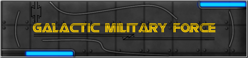
I just recently put a bevelled outline around it, which doesn't quite match the other random grey lines. When I tried bevelling those originally it didn't look quite right, so I'm not sure what I'll do with them.
Some suggestions, I wouldn't put a bevel around it, I would leave it like it is. I would also replace the gray lines with something to go with the background. I really like it, like the hull of a ship or the inside of a troop transport. Maybe put some cables or metal brackets just to stay with the background theme. You could make them look like they are bolted onto the background, that would pick up the theme of the bolts on the background. Also the text could use a little grunge to it like it's painted on and is worn and dirty like it's been through a battle. Hey how about some flash burns like laser fire has hit it? One more thing, I would put more glow on the blue lights too.
 I think this is my favorite.
Image Umbrella: Realistic Images
in The Pictorium
Posted
@ EscapistAngel Wicked ! I like the way you did the blood and the blade. I saw this the day you posted it and thought that it needed to be lightened. It's much better now, you can see the detail and the work you put into it. Very nice. It would make a good album cover.
This is something I've been working on for a while. It has things from other pieces that I did in the past with the thought in mind to put them in a much larger piece. This is 100% PdN with no stock images used (* See Edit comments) . Everything was "painted" (* See Edit comments) and built into the overall image. The final image (pdn) is twice the size of this flattened version so I'm hoping that some of the detail isn't lost in the reduction.
* EDIT: I changed the stuff on the wall and used a stock image to get the Indiana Torch and Stars.