
csm725
-
Posts
2,130 -
Joined
-
Last visited
-
Days Won
1
Posts posted by csm725
-
-
Thanks BarbieQ, you too.
-
Yeah, you know what else would be cool?
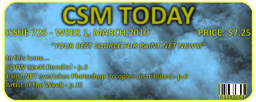
Paint.NET actually overtaking Photoshop in copies distributed...
-
Thanks, you too.
-
Text is aliased, tombstone is a little off on the compostion, and the grass is not natural. Sorry for the harshness, but as the great Welshblue said, nobody learns from just saying, "Awesome work!"
...just trying to help.
-
@Everyone - Thanks!
NEW PIECE:
SOTW 34 ENTRY:
-
-
Thanks, but would that mean that the number of votes on the leopard-skin BG got reset, or does it stay?
-
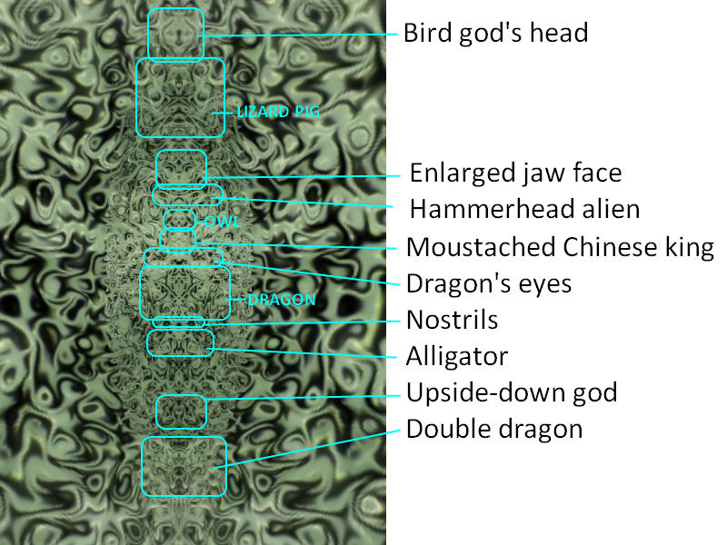
Here's what I see:
And nice job on Ghostly.
-
-
Yummy! Sorry...
Nice theme. I shall enter ASAP.
-
@McSteeze - I think I'd like to see you leave the world of glowy swirl sigs, they get boring real fast - just sayin'.
Also, use a different font. Lucinda is a bad choice (that is Lucinda, isn't it?)
The upper one is better because on the lower one, the comet's color is a little more subtle and the glow seems a little purple because of that. 7.5 and 7 respectively.
What of my current? (Yes, it's old...)
-
-
Can I resize it to whatever aspect ratio your screen is? If so, what is your screen res?
-
You incorrectly resized my leopard-skin image...
-
@McSteeze - Yes. Much better. Background is still not top-notch but the swirl effect is amazing. Good improvement. 7.5/10
@ChrisCo - Nice, but the BG is sharp on the right and blurred on the left. I don't mind it much but I'm just saying. Cool text + render. 8.2/10
-
@Freedo - Your sig is, to say the least, newbish. Aliased text. Work at 4x the final size then resize. i.e. for sigs 2000x600 or 2000x480. Glowy lines are cool. The gloss effect is out of place and too blurred. It's in the top 5 newb sigs I've ever seen. 8.5/10
@McSteeze - I know you didn't ask, but I will critique your sig as well. Text is nice, colors aren't. Red+green+blue+creamy yellow = not the best color scheme. I don't like the use of Twist. For a newb, nice. 6.5/10
-
@BarbieQ - Thanks. I think I see what you're saying. It's kinda like my Table Series Piece 1 - Breakfast. Took me 3 weeks to do it, each individual aspect could stand as a piece on it's own. I will definitely continue working on this piece, thanks for you support!
@Helen - Thanks so much! This support is what keeps me going and constructive critisism and compliments are what help shape up my work.
-
He said he couldn't use S3D.
-
LOL, yeah, I see what you're saying. I was thinking putting like an army jeep on the terrain or something, what do you think? And then maybe like an alien's head peeking from above a wooden crate or something. Again, I'm not Welshy, so we'll see what I can do.
-
-
-
An option is to adapt this tut:
http://paintdotnet.forumer.com/viewtopic.php?f=31&t=31472
You can also download this GIMP tut but it's hard and long, so I would try the above option before this one:
-
This one:

Is awesome, although I think the light coming from the bulb is a bit too strong.
This one:

Is not bad, although I have three major criticisms.
1. The sky. Skies are never one color, even at night or when they're clear. Maybe a lighter purple to darker purple gradient (lighter on the bottom) or something?
2. The water. It appears as though there is none. It looks like there is a floating pathway. Lake water is never perfectly clear, maybe a tint of low-opacity teal. The only reason I knew there was water is because of the reflection, which is nice.
3. The moon. In a realistic or landscape piece, the more work you put into something, the better it is. There are many planet/moon tuts out there, maybe follow one of them to achieve a more realistic look. Now, I wouldn't mind the moon if the pathway wasn't so realistic. You can go either with a fun cartoony look or a serious realistic look. The pathway you made is brilliant, so I think you should make a new moon (Get it? New Moon...
 ) with a realistic texture. Otherwise, nice job.
 -
Nice, water is a little too blue and cloud is too dense + in the wrong place. For the birds, maybe a little too blurred? Maybe use CustomBrushesMini and the bird brush package on DeviantArt and the ABR Viewer mentioned in a bloody tentacles tut (Was it Crimson's?). Sun reflection is perfect. Overall, a cool piece.

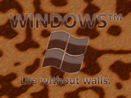
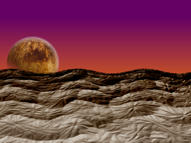
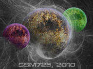
Image Umbrella: Image Modification/Manipulation
in The Pictorium
Posted
Wow Frontcannon. That's amazing. Top notch manipulation. Good job.