


himself22
-
Posts
628 -
Joined
-
Last visited
Posts posted by himself22
-
-
Does this explain?
-
I like the light coming from the background but some parts aren't smooth (In my opinion.) , like here:
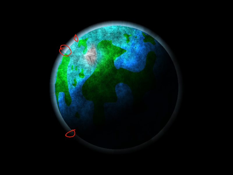
Was the black clouds/noise on purpose? Last thing, the texture is a little cartoony.
I'd like to see the finishing picture though. Good luck!
By the way, are you making all the planets individually then copy and pasteing them on to the bigger one? Just a suggestion, if you do that, watch out about the lighting. For example, in this one, the light is coming from behind and is coming up through the top left, if you have another planet to the left of this one, make sure it comes from the right and above (unless there's another star).
Example #2: http://i283.photobucket.com/albums/kk293/himself22/yhsjjie-35.png Click!
-
Go to effects-photo-sharpen. When I tried it on my computer, the lines usually didn't show up until I set it to 20 then repeated it a few times.
Good luck with your cartoons!
-
Trine0: I like it! The colors all match, but the angle on the moon is a bit off, and in my opinion (as usual), there's too many nebulae. One thing I really love about the planets are that they have realistic textures, which is very hard to make. The light is perfect, especially the reflection (which again, is always hard to grasp). 9.999 (repeating)/10
...wait, is that possible? 9.999 (repeating), or is it 10?
 hmmmmmmm...
EDIT: There's a wikipedia article on it right here. So far there's no real answer (A.K.A. still debated)
-
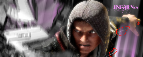
Possum Roadkill: I like the creativity (personification)! The light outside though looks a little weird though because it's a different style than the faces and the planet textures, almost realistic, but a bit cartoony for the face, and totally realistic for the planet texture. The light is blurred. I would recommend making it less blurred.
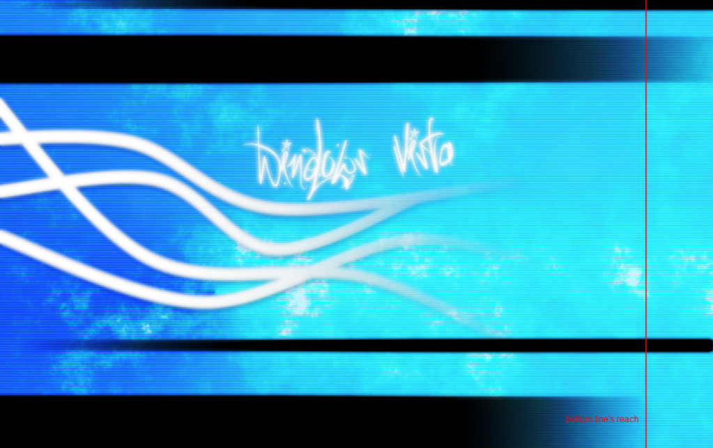
Spm3: I don't think the waving lines match the form of the "grungy" font and the same type of background. And the top line reaches farther than the bottom (link) doesn't look right. Other than that, I like it.
-
Here's mine. Not too good, but I want to see how far it gets.
http://i283.photobucket.com/albums/kk293/himself22/yhsjjie-27.png
http://i283.photobucket.com/albums/kk293/himself22/yhsjjie-27.png
-
Wala! Your new men's trousers, large, too!
O.K, whatever, thanks anyway.
-
Recently after I've started watching specific topics, I've been getting spam emails in a Paint.Net forum format. For example, I got one like this "[men's trousers] New Reply Notification" (
) and when I click to the link that leads to this forum there is no topic.Any explanations?
Just tell me if you want me to post the email (as soon as I get another one, i deleted the other ones already, sorry).
-
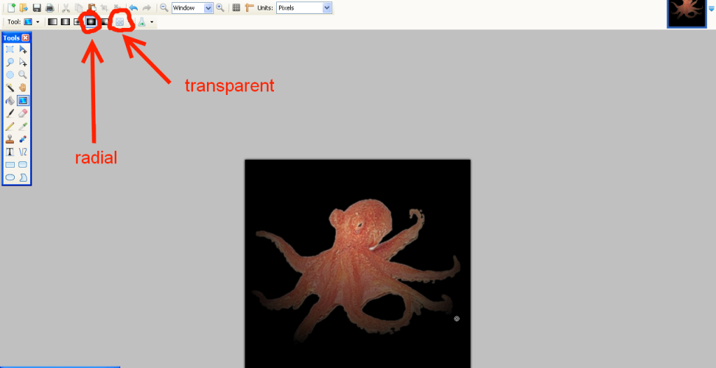
I don't make and haven't made any plugins but without a plugin, isn't it just black dots with a fancy colored background?
I did the same here:
I would suggest start with the big and medium,
make a new layer and add your background color(and put it to the back),
then select all of the larger dots,
make a new layer in between the two you already have layer,
select a color with a darker hue than your background color and fill it in,
and gaussian blur, duplicate and merge, and edit transparency on that layer until you have what you want.
Here's what I did (the background blur stinks)

-
This should explain.
Edit:
Oh, sorry Frontcannon I think we were both posting at about the same time so I never realized you posted till I was done.

-
-
How about 2 images? Both on different layers, the one on the top layer, just leave it, and the on the bottom, stretch, so that only the bottom one moves.
-
You could also use sin waves
or you could curve each individual letter like this:
...or you could use distort->bulge
...or you could use power stretch
...or you could use Tube oblique
I'll post more later.
-
PM him and ask for a few suggestions?
-
yeah I know, but you could start with that, then edit it A LOT so that it looks like it, right?
-
#2: viewtopic.php?f=31&t=26973
#3:I don't know, though I'm sure people have plenty of ideas....
-
Who requested it?
btw it looks pretty cool
-
ahhhhhhhhhhhhh, i guess your right, I just wasn't thinking......
BTW I like that bunny idea
-
true, I guess its not really a bug, but it gets annoying when your drawing small gradients
-
I noticed when you have a gradient, and you put one of the dots on the same spot as the other dot, than the whole gradient disappears.
I just tried putting the first dot on top of the second and it all disappeared.
Edit it also works with transparentsy
-
instead of just this:
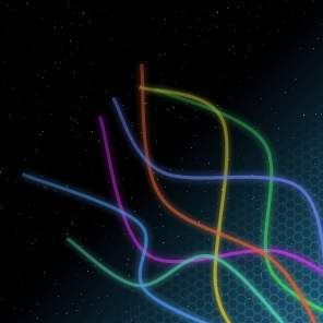
Ok, first, your going to want to make a bunch of random lines like so .....
Use a size 2 line tool. Just be yourself with it. Go crazy. Feel free to add some pencil and change the line size/color is you want to experiment.
I would use the random lines plugin
here:
-
thanks for the quick reply and suggestions, i'll get working on that, maybe, but you should tell which one your talking about first.
-
thanks for the quick reply and suggestions, i'll get working on that, maybe, but you should tell which one your talking about first.
-
new thing:


(WSC) | Discussion Thread
in The Archives
Posted
Doesn't it say...
Two...