


himself22
-
Posts
628 -
Joined
-
Last visited
Posts posted by himself22
-
-
21) Don't create useless polls. Also, don't create polls in any forum except the Overflow forum--and even then we may delete them if they are useless.
I believe that applies here.
And as for the actual question, I think your looking for effects-photo-fade edge.
-
I could see that working out...
-
ptuz 3
siddek 0
Sorry Siddek, but I don't really like the planet textures in yours, but as said before, I like the text you always put in!
I really like the colors in Ptuz's
BTW, last competition, nobody said:
#winner himself22
Hehehe...
And than also:
#winner ptuz
-
I'll PM him.
-
-
Challenge:

Edit: Isn't that 500x160? that's a little too big. I'll resize and post.

Couldn't get the flashing url at the right speed. Sorry.
-
It works well, and I can see the difference in speed, but don't you need permission of some sort?
-
Challenge with this:

-
Nice tutorial! I would say the best of the planet tutorials!
hexratt: I really like it except for the reflection of the clouds in the water.
-
I second that (if it was made in PDN).
-
I really like the outcome, but some new people might not want to use the same font as you and that font might not have the space in it like yours does, so I recommend adding a little part on that.
Very simple (which is good because its meant for newbies), and its very realistic..

-
In picture manager, does it copy how it looks, or the real size?
I don't know much about this so please excuse if it's a stupid question (But if its good it could answer your problem!)
-
Yep. You can find smudge here:
-
I really like the texture of the road. The grass is great, too, because the ground turns green when there's grass there.
Nothing bad about it except I don't like how you can still see the grass in the end of the mist, but this is all opinion. The planets are awesome, they're very realistic.
Good job!
-
Lol the two people that started it get the top two prizes (That's not suspicious.)
No just kidding. Good job!
-
You can always download the Google toolbar, which will automatically translate each page into Italian if you want to.
http://translate.google.com/translate_tools
I don't believe there's a forum in Italian, but once you have the translator you could read some of these:
http://forums.getpaint.net/index.php?/forum/18-tutorials-publishing-only/
Edit:
There's also a manual that is translatable:
-
All the ones pinned here, especially the packs:
http://forums.getpaint.net/index.php?/forum/7-plugins-publishing-only/
And next time to avoid topics like this I would use this:
http://www.getpaint.net/search.html
Because I remember someone just asked that question:
-
And me with my current:

-
The the History of Time (: (that's also a book by Stephen Hawking, but it's really called "A Brief History of Time")
-
Yeah I know what you mean. I just made a signature for terminator, and I did all the text and did Swatgafgjio, gaaaa how do you spell it, how about Arnold? Whatever. But I did one of those half robot half Arnold people, and it turned out looking really plain. I suggest The Image Hospital
-
You're really getting good.
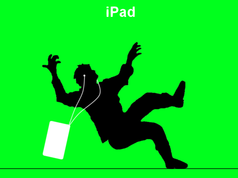
I really like it, but the reflection of the grass in the iPad is kind of weird. I don't know what though, maybe turn down the opacity?
I really like the background (the circles, not the black).
Edit:
Hehehe, I made a response ad... here:
http://i283.photobucket.com/albums/kk293/himself22/yhsjjie-54.png
Lol.
-
Really nice tutorial.
-
Looks like nobodies posted here in a while, could someone critique my current signature?
Here's a link to it:
http://i283.photobucket.com/albums/kk293/himself22/yhsjjie-53.png
-
Well for your current one I would have to see what are stocks and what isn't, because of what I can see so far, it's a background that isn't made in Paint.Net, and three different birds that are made in Paint.Net, and your name.
I like the mixture of colors, but its too plain.
Also, if you look very closely, you can see the beveled parallelogram that it's made up of. I like it overall, but from the looks of it, most of it could be done in a few minutes.
However... if that background were in Paint.Net, things would all be different.
.Gif decompiler?
in Paint.NET Discussion and Questions
Posted
Instead of using .gif, I recommend using .png for a higher quality. It should be included somewhere in the page linked.