


himself22
-
Posts
628 -
Joined
-
Last visited
Posts posted by himself22
-
-
Could you possibly make something for the bevel plugin that would let us choose how solid the colors are, like an alpha slider or something like that?
(you can tell I don't program)
Thanks.
-
#3, no shouting
And your welcome, but make sure next time to read this:
http://www.getpaint.net/doc/latest/en/L ... Modes.html
Layers and Opacity

-
paste 2 pictures on different layers, the one you want translucent on top.
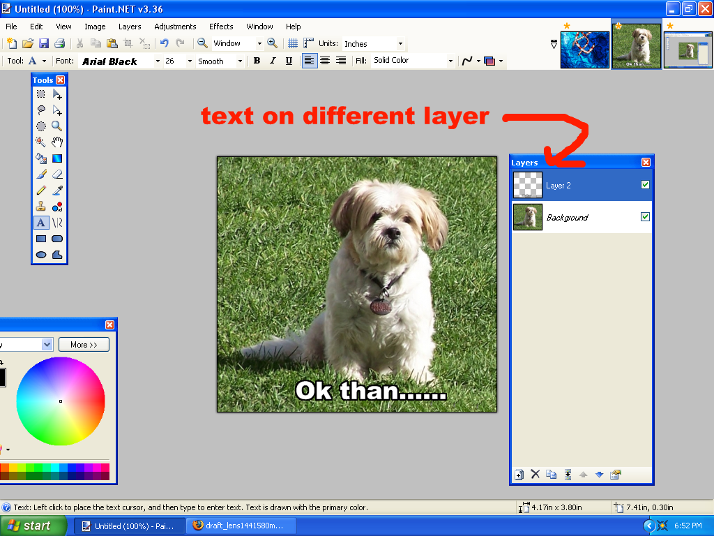
Than go to properties on that layer :Properties: , and set the opacity a little lower, 200 maybe?
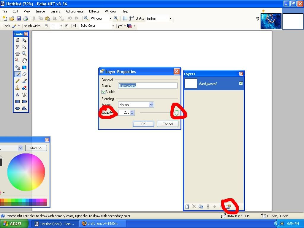
Done.
-
This should help, just set it to rectangle and it'll make a border(make it on a separate layer though. (please search next time)
search: http://www.getpaint.net/search.html
Just use a gaussian blur( :GaussianBlur: ) if you want it like, I guess, blurred. Don't worry, I used to ask very stupid questions when I was new to PDN.
edit:or you could do fade edge and make another layer on the back and fill it with whatever color you want
-
Is lens and sphere different?
-
Ok,thank you Boltbait.
edit: isn't easier to just delete the reply than to lock the topic though?
-
You may wish to read rule #6.
Ok now that I have changed that I still want to know what bump means please.
-
Like this?
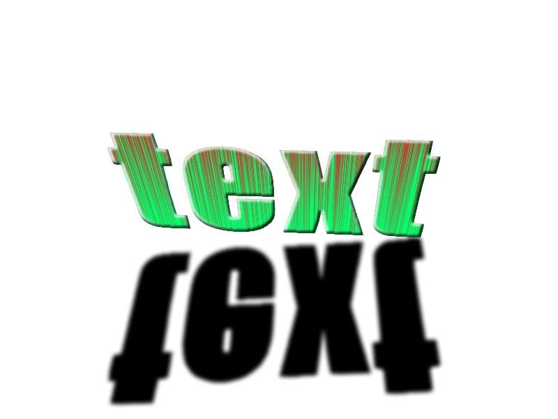
Steps:
1.Make some text, try to use something bulky
2.delete the text and make a new layer
3.on the new layer create what you want your text to look like(you might want to bevel it)
4.merge layers
5.use roll/rotate to move it where you want
6.duplicate the layer,and select the text on the back layer, fill it with black
7.use the move tool (
 ) to create the shadow
8.make a background on a new layer
Done!
I hope this is what you want though.
Other 3d text tuts:
-
This may sound like a stupid question but what does the term "bump" mean?
-
UGAdawg591:It really sticks out! Especially the text and I like how it's 3-D! The background needs something though, like a picture of the band maybe?
Kemaru:I think like I said too dawg, the background needs something, I like the 2nd one better. Nice though! (just change the gradient to something with color)
c&c on my knew avatar?

-
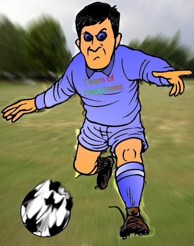
This is my first try at manipulating a photo.
Hope it's not that bad.(crosses fingers)
I started out with a black and white picture of a man with a soccer ball and a soccer field.
-
Really nice! My favorite was the Grevius one, the background is really nice on that one.
Some of them might need some anti-aliasing and feathering though. (anti-aliasing: viewtopic.php?t=6567)
(feathering: viewtopic.php?t=2498)
And I see you like those animated gif.s.
-
Joker is like Poker with a J. :shock: :shock: Coincidence?
I like yours soul41 but the texture makes it a look a bit low in quality.

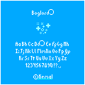
I'm falling in love with pixelart. I made a minifont:
Coincidence that we find Coincidence's at almost the same time? I think not, Time to investigate. 8)
Wow! That looks really nice! I never really liked pixelart. I always thought it would take too long. But I might start getting into it now.
-
You kinda skipped soul41.
soul41:Really nice! the background looks like it's splattered with dirt. Could you show us the original picture though so we know where you started from?
Render: http://planetrenders.net/renders/displa ... pos=-32860
A lot of the textures in this pack: http://resurgere.deviantart.com/art/Pac ... 4-67297559
edit: has anybody noticed its Soul41 and forty-two?
Cool coincidence, or maybe not.......
What? :?:
Soul41:wow, that's a long way from where you started!
The coincidence goes soul41 and 42
-
You kinda skipped soul41.
soul41:Really nice! the background looks like it's splattered with dirt. Could you show us the original picture though so we know where you started from?
forty-two:I like it, the background kinda looks watery which is cool but the background is kinda bland, gradient with some gradient bars? I think if you add some color....
edit: has anybody noticed its Soul41 and forty-two?
Cool coincidence, or maybe not.......
-
What font did you use?
To make the matrix picture more visible you might want to put the opacity to full then put it above the other layers and set it to multiply (or any other mode).
Other than I think you should make the background come out, if you know what I mean? Like more colors. But that's just my opinion.
I think it's better than the last signature.
-
This is awesome!
The lighting is awesome, and I love how you can rotate the object!
This took like 10 minutes:
-
Really nice!
Its very easy to follow.
It doesn't take too many plugins.
And it looks awesome!
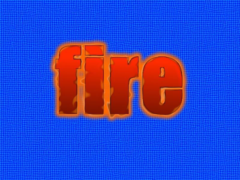
Here's what I made:
edit:
It also kinda looks like fire if you make it orange:
-
-
oh sorry, ill remove it, i was just showing how his 1st image is kinda superior to mine. (lol)
-
-
soul41:It's very nice, there's only thing I can think of that you can improve on, the back round to me kinda looks like water, and to me that doesn't look right in the picture.
I don't know about anybody else. :?:
tmds3: How long did this take you?
To me it looks maybe......simple?
Add some layers, effects, and change the back round, the back round is somewhat bland. I suggest a gradient of some sort.
Though I like the glow on the top edge of the water.
You did good for your first image though.(nice creativity)
-
I wrote a tutorial on how to make something like that.
Is this what you mean?
-
Good work!
I changed it a little but it still has the same effect. I actually used it twice and it looks different because the shine effect is like all around, that's because I used zoom blur deluxe
This is what I made:
 ) to create the shadow
Image Umbrella: Signatures, Avatars, Logos & Text
in The Pictorium
Posted
Wow that's cool, it's short and to the point.
IDK about mine though, or, my new one.
I'll resize it later.
C&C?