


himself22
-
Posts
628 -
Joined
-
Last visited
Posts posted by himself22
-
-
I like it but there's only one gallery allowed for each person.
-
Instead, could I just make a random account, post the username and password for everyone to use, so everyone doesn't have to make one?
OR...
Make an account, than post the image in full size?
-
It brings you to stock exchange when you click on it, than it says the real image is 4272 x 2848 pixels, but when I click for the larger image, it asks me to sign up.
Then, if you go back, there's a download, and the same thing happens when you click on that.
?
-
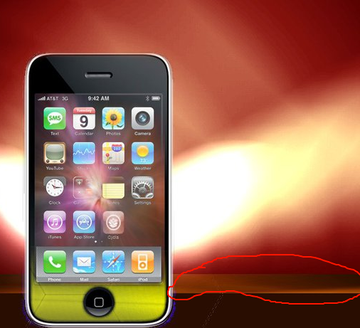
Just a minor suggestion, it would be awesome if you took the same background for the background and the iPhone.
Like this (but better):
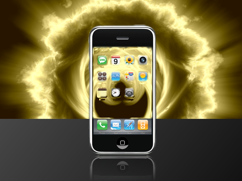
And also, what's that thing on the very edge of the table?
-
Well okay than...
-
The most recent one, I don't know about that hair, if I were you, I wouldn't do just some of it.
Did you use this tutorial?
And also, It's kind of hard to see the text. The way you cut him out is very smooth though.
-
This might help.
By the way, ever since we moved the forums there's been no orange box. I miss it.

-
That rule doesn't exist.
I know, I was kidding.

-
Doesn't rule number 30 apply to that post?
Same as post above, family-unfriendly.
Hidden Content:30) Never post after drinking any sort of alcohol-containing liquids, those who do will be banned, as well their email and IP address. -
I see...
I believe I misinterpreted the last line there...
-
There's a lot of file type plugins. I don't know which one that is. What type of file did you want to be able to save as?
-
You could always just go to effects-photo-sharpen.
And by the way, if you ever need to go into another program to edit your image, than just use That Other App
-
I like them overall, they're really good for someone who has been using Paint.Net for under a month. But here's some suggestions:
The first one I like overall, but the colors don't really match (the soldier is too bright, and the background is too dark), and I can't really tell what the background is, and in my opinion (as always), I the white outline on him looks kind of weird
For the second one I like all the blurs, but the colors, It think it should be the other way around, the background black and white, and the person and your name colored.
I like the third one, no criticism there.
The fourth one, I don't really think the font of the text matches the picture, and it's hard to read. The guy (I don't know who that is), looks angry and almost sinister, when the font is very fancy. I like the color though. And one more comment on the last one, I would use some anti-aliasing. (example)
Here's some links to anti-aliasing plugins:
There might be more...
-
Great! I use it all the time! (It's really amazing how fast you updated it!)
By the way, the anti-alias 1.5 leads to another plugin of jsonchiu's (bevel plugin).
-
 Mine are next week.
-
Stocks used?
Mine is here.
-
I would like to see the original picture just to see where you've started from. I agree with everyone else who commented, lens flare overdone. Also, the transition (I don't know what else to call it.) between the guy with the sword and the background isn't smooth. One more thing, the yellow gradient on the swordsman's left are and ends at about his hand doesn't look very realistic. The light(according to where the lens flare is.) is coming from the top left. Where it then hits the front part of his armor and continues from there, so then the sun must be in front of him and to his left, but then why does his face have shadows and why does the lens flare not matching?
-
CSM: 1
CT: 3
(That's end)
I think CSM's is creative but not much color to it or anything.
May thee enter with sword in hand?
Challenge me, I demand.
(Sorry I'm in a mood for poetry. My current signature enters please.)
Link to my blade:
Edit: This is the stock I used:
-
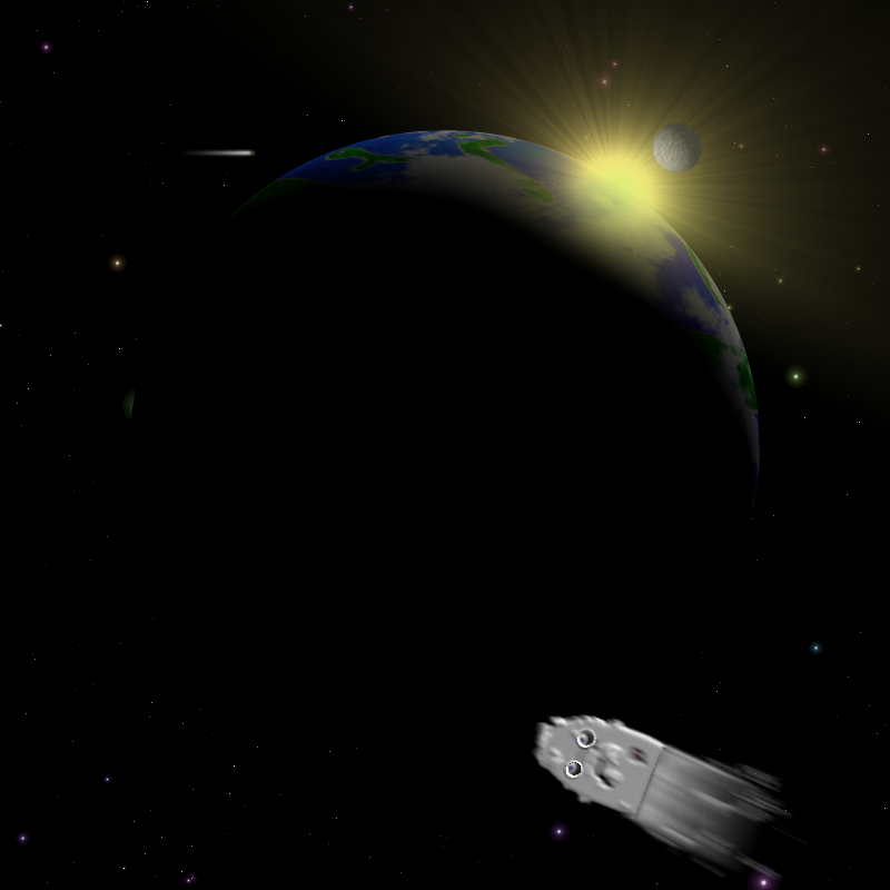
Whoah, Oma, you standards must be really high! You say space isn't your strong point when I don't doubt that'll be the best picture in the competition (no offense to other competitors)! You use all of the blurs perfectly, the detail is amazing, and the meteors are amazing (especially the tails hue).
-
Maybe a meteor, a black hole (that would be interesting), and the spaceship from 2001: A Space Odyssey (that would seriously be cool), a man with a cup of tea (don't ya love that one?), a floating astronaut, a space shuttle, an aurora occurring in the atmosphere of the planet, there's millions of ideas!
-
http://i283.photobucket.com/albums/kk293/himself22/yhsjjie-36.png
100% PDN
 The asteroid has eyes...
And yes I know it's kind of...blank.
-
Does anyone have any tips/ideas on how to make an aurora (example )?
I have an idea, but it needs to be polished. You make a nebula (like one in here), except in the last step, you duplicate the layer, and run zoom blur one way on the bottom layer, and on the top the opposite way (the way heading towards the Earth needs to have less transparentsy and less of a zoom blur though, look at the example above and you'll see).
Tips and/or ideas?
-
Yes you can.
Make any random selection using the
 than click the white little hand (the move selection tool or
  ). Move it around so it's the rectangle you want it to crop it to. Then once you're done with that just go to
image- crop to selection.
Is that what you mean?
-
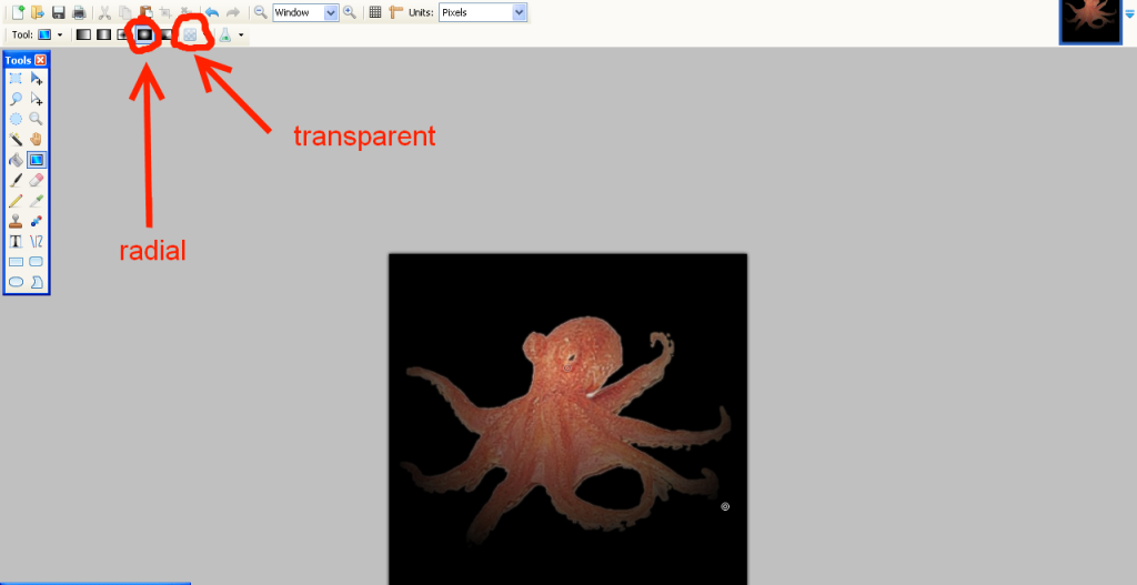
You could just use
 on transparent.
Click!
http://i283.photobucket.com/albums/kk293/himself22/yhsjjie-38.png

 than click the white little hand (the move selection tool or
  ). Move it around so it's the rectangle you want it to crop it to. Then once you're done with that just go to
 on transparent.
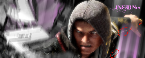
![[picture of shining sword]](http://i283.photobucket.com/albums/kk293/himself22/yhsjjie-28.png)
Sig Battles (ENTRIES/VOTING ONLY)
in The Archives
Posted
Pipp92: 2
Weylin: 0
Weylin's is too pixelated...