


himself22
-
Posts
628 -
Joined
-
Last visited
Posts posted by himself22
-
-
A lot of the sentences on there I can't read. And it's kind of plain (no offence). I would have to say though, the look of him is pretty cool.
-
I mean what are the images you found? I know one is Homer.
Stocks are images taken from the internet that aren't made by you.
-
Well first of all, what was made in PDN, what was used as stocks etc.
-
By the way, I would change the title to something more specific (It's a rule.).

-
Edit:
Oops!
(This isn't a WIP.)
-
More screen shots (with arrows)?
Do you mean the end of the canvas, other than that I don't see it...
-
You mean the gradient? That's what a gradient is, a fade between two things.
If your not looking for this, I would use the selection tool:


And than invert the selection, than delete it and possibly ant-alias it.
Or am I missing something?
-
Some screen shots would help (they always help in my opinion)...
But anyway, are your primary and secondary colors set to black and white?
do you have any other layers with images?
-
Boltbait: It's not a big deal, just a simple control-z would replace it if you do make that mistake. But it would be useful (Rick's already done a lot already, and optional things wouldn't be a priority (ignoring the fact that Paint.Net is totally optional for him)).
-
I downloaded a trial of Photoshop and noticed that if I drag part of the picture off canvas then deselect, I can reselect the picture and it'll still be there where in Paint.Net it cuts off the off-canvas parts.
Will this eventually be implemented into Paint.Net?
-
Yeah, I wouldn't put it in the realistic section, I think it belongs in the abstract section right here:
P.S. I know tinyurl wasn't necessary there, but I want to get into the habit of using it.
-
Never argue or say anything mean to a moderator, but never ever argue or say anything mean to an administrator, even if you're kidding.
He's an admin.
-
I like your first signature, the colors match and everything can be clearly seen except for the text at the bottom.
I prefer your first one to your second one because the picture looks a little squished. Other than that, fine.
Third one is the same as the first, text fades in and out so fast its hard to read, plus its almost as light as the background.
Fourth one I would have to see the stock, but other than that its kind of hard to see what's going on in the signature for two reasons:
1. Everything is some sort of orange or red.
2. It's kind of small.
Number five is very nice, but I don't really like the outside part where the diagonal lines serve as a border.
I know I'm repeating myself a lot but anyway, in the sixth sig, the text is hard to read... but its very good, you can clearly see the focal point of it etc.
Seven: Nice! Nothing really to suggest for it.
Eight: I can really see you getting better over time. This one is very good, all the colors match, the "style" is the same etc.
Nine: Very nice... I would have to see the original though.
Ten: This one "flows" very well. Some of the lines are a bit aliased, though.
Eleven (wow this is a long post) and twelve: I like the match of colors, the black white, and very dark red, I'd prefer the second one.
Thirteen: Very nice! You can easily see everything even the name even though its small. And I like the chrome-like style to the map (?).
Fourteen: Once again, I would have to see the stock used.
Fifteen: I don't like the way the rainbow continues into the blue-purple in the name, I would put it on a separate layer that start the rainbow over from red (since you won't be able to see it if it was as dark as blue or purple)
I'm stopping here because I don't want to bore you with my repetative comments, but I'll make sure to come back soon and comment on the other ones in a less boring fashion later! (
 :devlish: )
I just saw one last thing to comment on (
:devlish: ), I wouldn't use polar inversion in your abstracts too much. -
Okay.
chrisco97:1 (or 2 depending on if ptuZ changes his post)
csm725: 0
I think csm's is too simple, and the colors are messed up. But I don't really like the fact that Chrisco's doesn't have colors either.
Scoring could be wrong, next person who votes please check and if he changes it make the score 2 to 0 plus your vote.
-
That's really good...
-
MMS 1
GC 0

-
ptuZ: I really like it, did you make the graffiti 100% Paint.Net?
BadCompany: That's good for your first post (mine was certainly worse, it was like a rock texture with two steps needed)! I don't really like the faded outline, though. Other than that, great!
-
CSM - 2
Chris - 0
More than enough said.
-
I don't think it has been implemented yet.
-
I like both, and the way that the colors match, but I have a few comments:
I like the nebula in the second one more than the first, and I recommend to use this tutorial's way to make them (just a suggestion).
For the background of the first one, I think for the noise you should turn up the intensity and turn down the coverage, it looks more like outer space that way.
I really like the texture for the planet in the first one, too, very creative.
The second one in my opinion is better and worse at different things. I like the main galaxy, but I don't like the clouds. I recommend changing the colors by selecting each big chunk at a time, and changing the hue just a little bit (using hue/saturation), like this. (I only did a few.)
Good work!
But by the way, only one gallery is allowed...according to your created topics you have 4 others (I always check to see whenever posting in a gallery.)...
-
-
Thank you (can't believe I didn't see that)
-
Where should I download it?
The link leads to the old forum (which is obviously gone), and I tried google cache, but that doesn't work either.
-
Challenge with this:


 :devlish:
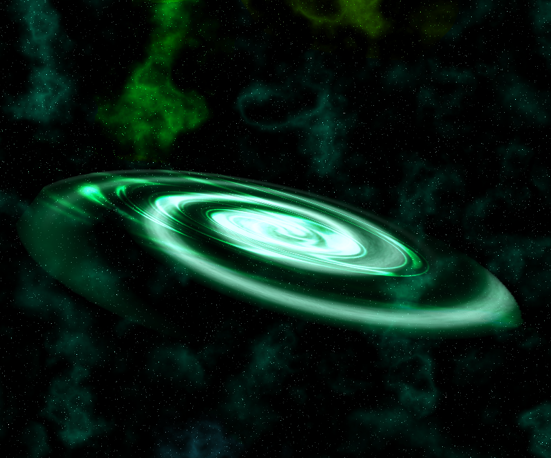
Image Umbrella: Realistic Images
in The Pictorium
Posted
Some of the black lines are pretty aliased. I like how all of the lighting matches up (Which is hard to do.).