


-Expiration-
-
Posts
1,076 -
Joined
-
Last visited
Posts posted by -Expiration-
-
-
Well, I know that.
I was addressing the issue of having to resize, making the words illegible.
Also, un-anti-aliased is kind of a double negative.

Anti-aliased is :AntiAliasingOn:
Aliased is :AntiAliasingOff:
-
If you're using size 10 font on Word, what makes you think size 10 font on PDN would be any different? If it won't fit into the provided area, using size 10 font on Word, it won't fit into the provided area with size 10 font on PDN.
-
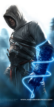
I actually like your new sig Myrddin, 'cuz I like the dark

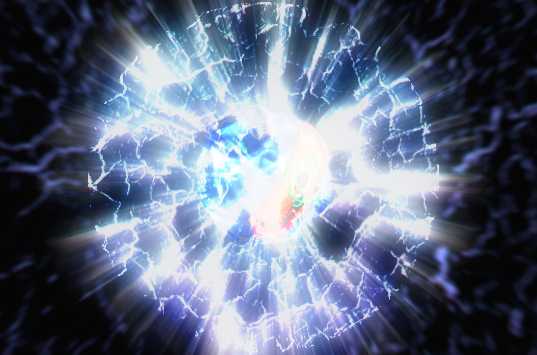
The thing that bugged me at first was the red curves (which I'm assuming to be like the spinning of the propellers).
Oh, so that's what they were ...
I thought they were little blinking lights on the plane.
-
And, for the record, I tried the screenshot method. Once the screenshot of the text is in PdN, I have to re-size it to make it fit the space it has to go in. Resizing it distorts the text and makes it unreadable, defeating the whole purpose of putting the text in there in the first place.
Um, use a smaller font size?
-
I can't say I like the solid color outlines around everything, but other than that, it's really good. The shading and everything is spot on. I (impatiently) await your new signature.
-
What would you suggest? Shifting the lampstand closer to centre, mayhap?
I think this would be a good idea. I would shift it over to the left about an inch or so, so that it resides near the 2/3 margin of the signature.
Or even more 'stuff', like a return of the lightrays? Hmm, I will have to play with this emptiness.I don't think light rays would be appropriate for a nighttime scene. However, I'm sure there are other effects that could be well suited towards improving your sig, although I cannot think of any at the moment.
Maybe adding a little depth of field would improve it, but once again, I'm not sure.
By the way, congratulations on your
3000th post!
-
Well, I think one of the main problems is that in your previous signature, the person is a large part of it, and dominates the view.
However, in your latest sig, the lamp post is only a small part of it ... It feels emptier. :o
-
This is also very useful for Basic Antialias (my antialiasing effect of choice, no offense BoltBait), because it doesn't work with any transparent pixels at the edges. Thanks Mike.
-
Even nab who writes in third person is confused


Nab supports Jake's idea - and him aslo hosting the new contest for this theme.
-
Well, I guess with school out and everything, I've gotten more time to think about what I'm going to do. :wink:
Also, .PDNs uploaded! Check out the first post. The layers might be a little confusing though.
-
You could try this tutorial. It's stickied in the tutorials section.
Next time, try to use search before you make a post.
Hope this helps!
-
Okay, I'll upload them in a sec. Just for you guys.
also:this thread now has 200 posts in it.
As well as 4k views.

Thank you everyone!
-
As did I, after Nab expressed his frustration:
Just do as Yata said. :wink:
-
Thanks all!
Yes Nab, I finally managed to create something original. If any of you would like the wallpapers without the Audio Jungle Logo, just ask.
I also added the third wallpaper to my gallery. Enjoy!
-
Yeah, it kind of looked like that, but it also looks like there's some sort of electric 'force field' or something around it.
-
Ah, okay. I'll post all my Audio Jungle wallpapers here.
-
Erm, sorry to double post (again), but I took everyone's advice and tried to improve. Only 11 days left to enter.
So, I made the Audio Jungle logo bigger.
I tried to make music notes, but I couldn't make any good ones, and I couldn't find any quality stocks.
I added some grass on the bottom, to make it look like it's on the ground.
Yuppers. Check it out.
Grass stock is here. Special thanks to Wither and his Faking Soft Brushes tutorial. :wink:
Constructive criticism please.
-
I'll be definitely participating in this one.
Bring it on, Crimson. :twisted:
-
Love your sig Max. Hehe ...
-
Nice stuff here, I really like
and

Keep up the good work!
-
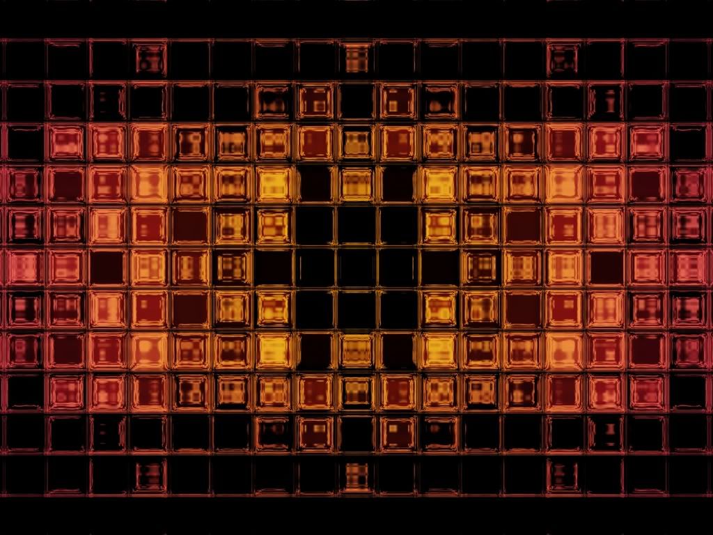
i agree there is something missing. Could you make the logo larger??
Yup. I managed to acquire a larger version.
make some music notes coming from the gramaphoneInteresting idea, I'll see how it goes. :wink:
Excellent Expiration! Nicely executed, but the gramaphone seems as if its floating in air, so you could maybe add some jungle flooring? just an ideaI was thinking about adding some grass or something along the bottom edge.
I know, I was trying to fix that too...Since i used overlay - the light is on the left side, so that's where it shows up.
I tried fiddling with Curves, but even there it was only showing up on the left hand side.
Let me see what I can do very quick...
EDIT: All right, better?
EDIT 2: With some advice from Ash, I resized my bigger version, so that it could still have the special and black borders.
Love it Nab. Nicely executed, very pleasing to look at. Keep up the good work!
-
Grats Crimson!
And I used to think I had a low post count. 8)
You may want to update your thread title too. :wink:
EDIT: I see you did that right as I posted. :shock:
-
You should post images that are larger than 800 px on its largest dimension as a clickable thumbnail, that way you won't stretch the screen for other, small screened users.
Other than that, great job on the tut!
-
Thanks Salu!
I have two others in the Image Hospital, you may want to check them out. :wink:
I also like yours a lot. You're getting better at these types of things (I don't know what to call it), almost as good as Jake2k.


Designs/Graphics Gallery Help
in Paint.NET Discussion and Questions
Posted
You could try SimpleViewer from Airtight Interactive (Google it). That's what I'm using (temporarily).