


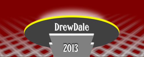
DrewDale
-
Posts
1,579 -
Joined
-
Last visited
-
Days Won
48
Posts posted by DrewDale
-
-
Font - UkNumberPlate from dafont.com. European Union logo adapted from This the rest was PDN.

Not my personal number, but it should be
 Any resemblance to anyone's plate is by pure accident or telepathy.
-
 1
1
-
-
@ Daniels - We have some really splendid & spiffing words here that sadly hardly ever get used
 (its all street slang now unfortunately) Although Cockney rhyming slang is pretty neat
@ Helen - After our long and drawn out winter I for one am looking forward to a paddle in the sea and a beach bbq this summer

@ Daniels, Helen and Barbieq25 - Thanks for your feedback as always it is most welcome.

-
Can someone please help me out with what the Bevel Selection settings should be? I get a 404 on the image.
Thanks!
Here you go

-
1
-
-
Great depth to the Chinese new year image, cool reflection.
-
Thanks Sasha. I'm chuffed at how that turned out, the sig is also based on a heavily zoom/blur variation of the beach image.
I can see some more addiction with a combination of clipwarp and bevel object now
-
The entry deadline is here and it is now time to cast your votes. The poll will close on Sunday April 21 at 9PM (UK Time)
To see how that equates to other countries, here is a link to the World Time
You may again vote for 5 this week. Good luck one and all, thanks again for entering.
-
Thanks Sasha and Daniels, glad you like the end product, just been playing around with Red ochre's new bevel object plugin too, an example is on page 1
-
Nice one Red Ochre, it gives some more powers to clipwarped text for sure
I can see many uses. 
Reason for edit - Changed image for a less rushed version.
-
There are many ways to do what you wish to achieve Here is a few pointers:
1- Use Hue / Saturation. Or
2- Use Colour balance, Or
3- Duplicate the image layer and play around with the blend modes of the upper layer (F4 on the keyboard) Or4- Use curves to change / enhance the colour. (found in adjustments menu)
I guess there are many more ways too.
-
100% PDN
-
Nicely written, but all I ended up with was a black circle with a red (ish) coloured ellipse on the top of it
 will try again.
 -
:MoveLayerUp: Looks like we may have next weeks winner already
-
This Weeks Theme is – Art Deco
And was chosen by – Dug.
This weeks theme invites you to create a sig full of shapes and bold colour.Inspiration can be taken From here
The deadline for entries is 9:00pm (UK Time) on Sunday 14 April.
To see how that equates to other countries, here is a link to the World Time
Please take a moment to read the rules below. (If your entry breaks any of them, it will be disqualified and not included in the poll)
The Rules:
1. Max sig dimensions 500x200. Please NOTE: The forum limits signatures to 500x150, if it is too large do not try to use it as your sig.
2. No crude or offensive language, pics, etcetera. This is a family friendly forum!
3. Your entry must follow the set theme.
4. Only one entry per person, modifications to your image is NOT permitted after submitting your entry!
5. Your post should include your sig and links to your source images.
6. Use new, fresh sigs. The idea is to get you to create new things, and if you are just pulling out an old one, you are not doing that.
7. No uploading a place holding sig, and then adding a new one later in the week.
8. Very Important - Your creation must be made using paint.net, please don't use an outside image editor / renderer and try passing it off as PDN work. Or it will be disqualified!
The winner of the current SOTW gets to choose the subject for the next competition.
Good luck to all and thanks in advance for entering.
Special thanks to: Sozo (since I’m using a remix of his template) chrisco97, Sozo TheHowler and Nitenurse79 for keeping this comp going in the past.
This thread is for posting your entries only.
If you want to talk about one of the entries, you can do so in the discussion thread located here..-
1
-
-
Nice job pdnnoob, would like a tute on how you did it in pdn, love the effect.
-
Thanks Barbieq25 and Helen. It was just a play around kind of creation really, I tried different backgrounds and the S3D was a last minute addition, appreciate the comments
-
The voting deadline is here... And it is now time to announce the winners. Again another close vote.In first place with 9 votes is dugTaking joint second place is Myself (DrewDale) and Daniels with 8 votes each.Joint third place goes to doughty and Minners71 with 7 votes each.Great entries from all involved, well done to the winner and runner's up. Thanks also go to the voters and supporters.I will send a PM to dug and will launch the next comp once we have the topic for sotw#79
-
New creation on pg1
-
Why do the Sig Battles just up and die off suddenly? Should there be a competition length after whih the current one expires, cuz things alway seem to get slow and require a start over.
The reason this time round (I think) is the fact that two people jumped in while a battle was still underway, then one dropped out and others joined in too, making it difficult for people to vote on.
Anyway - While I'm here I will vote.
Chimay's sig is well put together, great details and depth, but it's just a little too much in a small area, would look awesome in a larger format.
Xzerizon - Love the frozen / broken glass effect on your name, nice and simple, minimal colours too, top work. And gets my vote.
So the final score for that everlasting round is:
Chimay - 2
Xzerizon - 3
Meaning of course that Xzerizon is the winner. Let's see the next entrants and hope for more normal order here
-
A very nice alien, great details and good use of light & shade. Welcome indeed, i look forward to more from you
-
Top work on the zen stones barbieq25, nice use of colours and a really eye catching background too, a job well done
-
1
-
-
Hi and welcome.
What you need to do first is create a new layer - :AddNewLayer:
Type on it your text -

Use the magic wand -
 (While holding down the Shift key) and click on one of your text letters to select them all.
Then run your chosen effects then click on deselect - :Deselect: (it may be wise to use the feather plug in or AA's Assistant plug in afterwards)
Next you need to go to the background layer (The white one) and delete it - :EraseSelection:
Then save as your chosen format (gif / png / pdn)
Hope this helps you.
-
Cheers dug. I do enjoy seeing the out come of blending modes, always amazed at what can be done with it.
-
Top quality new works again Red, Just amazed at the realism of the metalics, I love the little tribal style one too, great depth.
-
The deadline for entries is here and its now the time to cast your votes.
The poll will close at 9:00pm UK Time on Sunday April 7th To see how that equates to other countries, here is a link to the WorldTime
There are Ten entries, you may vote for Five that catch your eye.
Good luck to one and all, thanks again for entering
 Any resemblance to anyone's plate is by pure accident or telepathy.
 (its all street slang now unfortunately) Although Cockney rhyming slang is pretty neat

 (While holding down the Shift key) and click on one of your text letters to select them all.
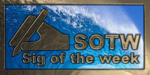
Barbieq25 Gallery - Gallery update 2 new p. 1
in The Pictorium
Posted
Top detail on my paris hat Barbieq25, love the depth and detail in the face / mask and the texture and light on the background too. Top job