

Red ochre
-
Posts
3,019 -
Joined
-
Last visited
-
Days Won
125
Posts posted by Red ochre
-
-
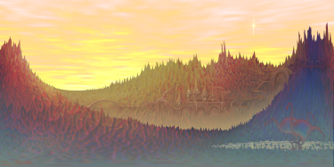
I can't update my gallery for some unknown reason. If I add this one to the first page it loses all the links to previous ones? - oh well!This one is all Pdn and since it is nearly a spacescape I'd like to dedicate it to Sir Patrick Moore - a great man who died today.
@ Many thanks Dug & Helen

-
Hello Lobo 1943, welcome to the forum.
Are you using the gridline plugin ? http://forums.getpaint.net/index.php?showtopic=4175
- if so, run it own its own layer above the photo and tick the 'foreground only' box to make the white transparent.
The little grid icon :Grid: is for the pixel grid, which is mainly used for tiny pixel art and probably not what you are looking for.
Hope that helps.
-
Hello Painterman,
Check that the selection mode is not set to subtract.
That produces the behaviour described (something I'm always forgetting!).
Hope that helps.
-
I'm confused - same as DrewDale. (Powerpoint also part of office 2007).
Are the U.S and U.K versions of Powerpoint different? - or am I overlooking the obvious?
I can see plenty of text effects, but no layers.
-
I agree with Helen!
Would love to see more of your work!
-
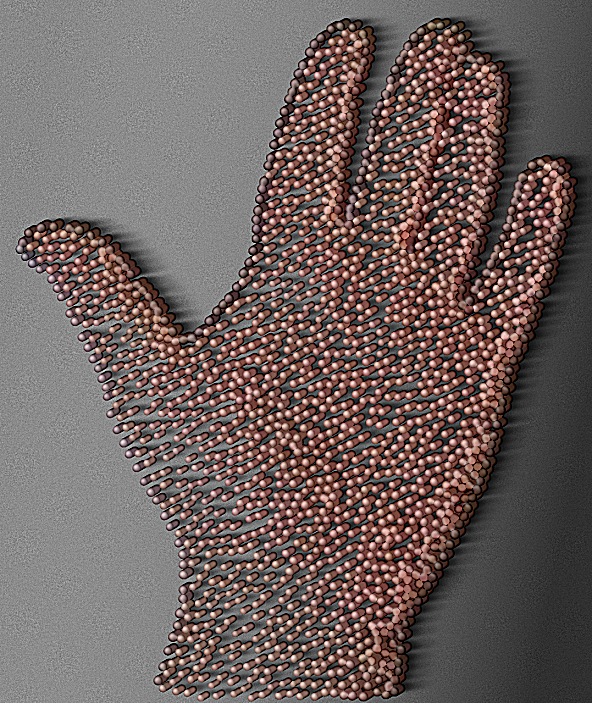
This is roughly what I did:
Hidden Content:I'm afraid I use a lot of my own (codelab-written) plugins. Link in sig.
Additionally plugins used :
Stipple!
Trail
motion blur (hardware accelerated version with 'centre' unchecked)
standard Gaussian blur (not a plugin)
Bevel selection
AA assistant
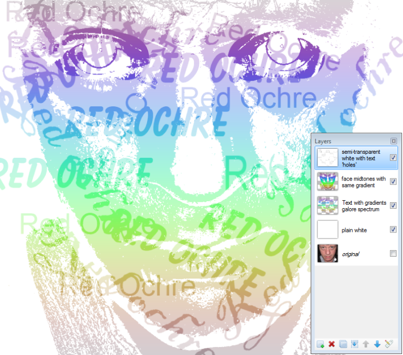
Here is an explanation of the image (as I can remember):
1.Photograph left hand (this is the hardest bit!).
1a. Remove background to leave hand as an object on a transparent layer.
1b. Use AA assistant to smooth edges
1c. Use Object2colour on 'cleanclear' preset - to ensure transparent areas are white.
1d. Save as a .png . Always useful to have a folder of 'objects' for use in other projects.
2. Run Stipple with 'color' & 'transparent background' checked. Reduce the 'threshold' slider slightly so the dots ignore the transparent white background.
2a. Duplicate this layer.
3. Top layer. Use Objectedge with a small radius, to give the dots a round appearance.
4. Next down - on another copy of the stippled layer.
Selected background, inverted selection, used Bevel selection on small radius.
(careful, I nearly crashed pdn on such a complex selection - give it time to render)
A similar effect (in this case) can be achieved by duplicating the top layer, 'eroding' it with AA assistant and moving the layer a few pixels diagonally.
5.Next down - 'Extruded' layer.
I think this was a duplicate of the top layer, with the darkened edges. 'Extruded' using Trail (fade out unchecked).
darken this layer a bit with Brightness/contrast.
6.Next down - shadow layer.
Use a duplicate of the stippled layer. Turn it black using Object2colour. Move it to line up with the ends of the extruded layer. Motion blur it off at an angle consistent with the overall lighting. Add a slight Gaussian blur to soften.
7.Next down. - general shadow layer.
Used Gradients galore to produce a transparent to black gradient to emphasise light direction.
8. Lowest layer.
'Grey' noise (Noise choice) over grey background.
9. Adjust transparency of layers, Flatten image and slightly sharpened the image with Overblur.
Well, you did ask!

I'm sure there are different methods/effects that could achieve a similar result using Stipple as a starting point.
-
Great work - love the metal bars in the 3rd sig!
-
Really enjoying the new options - all very useful!
These are great new plugins you're coming up with.
Well worth a big hand
-
 1
1
-
-
Hello kamariden, welcome!
Is the resoloution the same for both pictures?
go to Image/resize and look at the D.P.I. box.
If the image is for the screen you should make sure this is 96 dots per inch for both images.
The size at that resoloution will then be shown in the boxes 'Print size'.
Are they of a compatible size now? - if not then resize using the 'maintain aspect ratio' box and 'Best Quality' and 'By percentage'. You should see the new size dispalayed at the bottom as 'print size'.
If you need this image to be printed then 300 dots per inch is recommended.
If it is only for the screen and you set it larger than 96, the image will probably be larger than your screen.
I recommend reading this - http://forums.getpaint.net/index.php?/topic/17049-dpi-and-you-understanding-resolution-for-print-and-web/
I hope that helps. Good luck!
-
Hello David,
Ed Harvey's 'Halftone' is excellent, but it imitates printing halftone (as you would expect) and appears to erode a preset pattern (or choice of patterns).
Your 'stippling' appears to randomly scatter the dots to achieve tone by the density of the spacing, which gives an interesting, more human feel. Stippling also has the advantage of using the source colours (yes, Halftone could be used as a mask to similar effect).
In terms of shapes I really like the 'Yak/butterfly' example you posted. When you stipple with a (real) brush or felt-tip pen the marks produced will vary in a slightly randomized way (both shape and position). Now whether it is possible or practical to incorporate varying shape is different matter. Generally I think adjustable random is more pleasing than strictly geometrical.
I doubt if a user defined shape would be worth the extra complication.
I would like to see an option for 'transparent' for the background color, as this would save time converting the image into an 'object' layer, where further manipulation is easier.
The stipple shapes can be varied to a degree by running 'splinter blur' on the stipples (when they are objects on a transparent layer), then messing with the transparency.
Thanks again for an excellent plugin!
-
Another top notch effect David, thanks!

I'm always in favour of many options, so if the variable size/shape choices are still practical I can see no harm in adding them. (only if this does not involve too much extra work though!).
@Boltbait, - you are getting younger!
@Nitenurse, - great image (your pdn skills have really improved btw! - some great sigs recently)
Re: plug-in pack - definitely - I've found it best to leave new plug-ins published for a few weeks before adding them to a pack, just incase there are any minor changes required. Saves people re-downloading the whole pack each time.
Here's my offering
(I used splinter blur, dents and a few other things too).
-
1
-
-
I used white as both primary and secondary color.
White cat in a snow storm effect?
Hello Badpenny,
try double-checking that the primary color is not the same as secondary color.
-
I only call them bugs if they crash Pdn!
I spent many years making 'nice' images (to get paid) - so exploring darker images is fun for me

-
Hello David,
Congratulations on the 'sticky' (sounds uncomfortable but I believe it is a great compliment!).
Very much deserved though, great plugin.
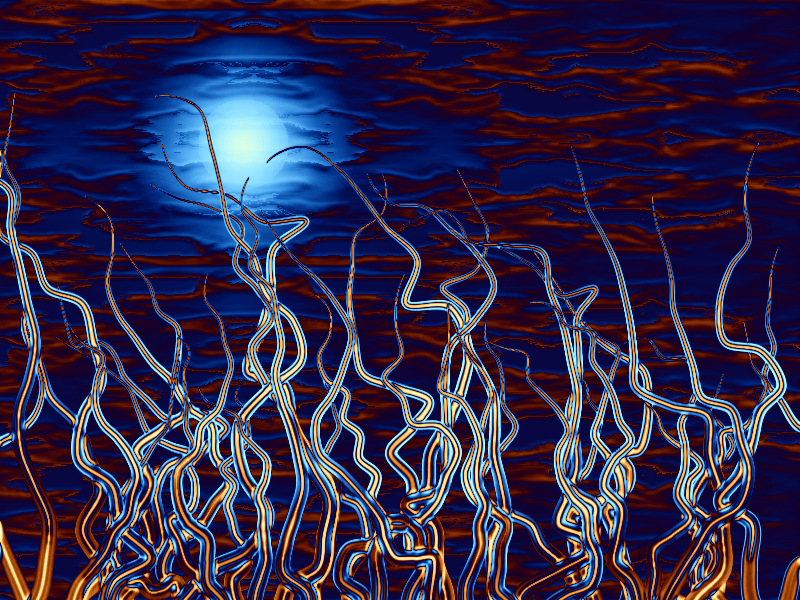
Been playing with the new version 1.1a - love the width-wise shading options - running it on different layers is no problem. The randomization code feature is really useful for that.
I have noticed a slightly unexpected behaviour. Not a bug!
The 'identical lines' checkbox can be selected in radial or parallel mode. It then remains selected but greyed out when returning to point to point mode, (producing many lines on top of each other appearing as one line). This is logical and I don't know if any other behaviour would be better. It just puzzled me for while that I had selected a number of lines but could only see one. Perhaps it shouldn't be greyed out if it is active? - anyway not a problem.
Amazed at how many useful things can be produced with this, many thanks!
(re. EEr's comment - I assumed it had to be written in Visual studio ?)

I've merged and altered the original shading layers quite a bit on this one.
-
Hello David,
Those are impressive initial results for the shading across the line width!

Particularly the first example, which hopefully indicates that when lines cross over each other, the lines should appear to be one on top the other - (something which is currently difficult to do if shading the 'object' created by the effect).
It would be ideal if you can keep the existing length-wise shading and have a slider to blend these colors with the new cross-wise shading.
So, 'start' and 'end' colors from the UI colorwheels and 'edge' and 'middle' colors from the Primary and Secondary colors - with a slider to blend the two different patterns. The advantage of the Primary & Secondary colors is that the transparency can be selected before running the plug-in. This (hopefully), would allow blending of edge color or middle color or both edge & middle colors with the existing length-wise color shading. I hope that made sense.
Absolutely no time pressure! - I think we're all very grateful for this excellent plug-in as is.
I know there can be a lot of work and headaches involved in a supposedly 'simple' change!
Thank you for the time and expertise you have put into this.

-
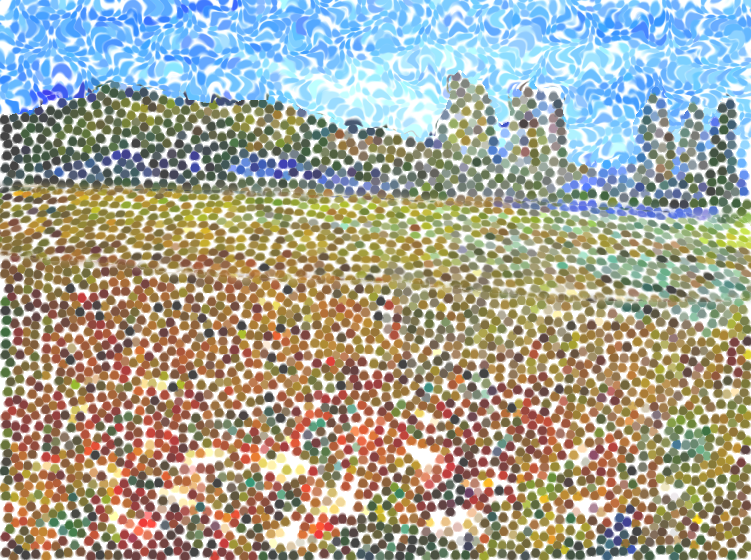
Hello David,
I'm really enjoying this plugin - just had fun making a meadow!
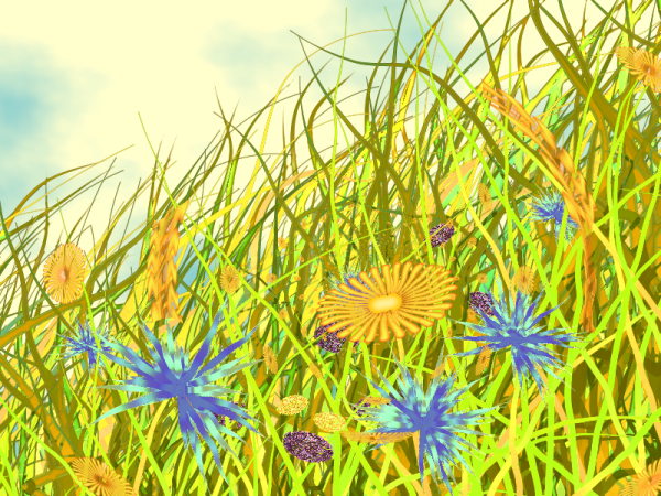
It could be useful to have shading across the width of the line too? (if not too cumbersome to add).
This could be from the primary color, as adding another color wheel would make UI even bigger.
Just think it might add more 'depth' when using it for grass/flowers.
The branching idea sound good too!
Thanks again
-
WoW, - looks brilliant, thank you and thanks for taking the time to write instructions.
:star: :star: Some plugins suit simple interfaces but its good to have ones with plenty of parameters to 'tinker' with too!
-
Hi Dug, (sorry for slow response),
Flaming lips - (Good band - "Yes I realise!")
Fascinating - I enjoy looking at your creations - what more can I say ...
a few questions.
Texture in the girl's sillouhette? - photo? - of something copper that's fallen off a car onto hot road tar. It's really bugging me what it is - in a good way!
LHS 'foam' texture around the eye - how? - I understand the emboss/relief bit, I don't understand how the different size circles are not overlapping - I don't know of plugin that does that? (I tried writing one and failed dismally).
RHS texture around eye - also great - reminds me of 'pickled' paint, after paint stripper has been applied, or possibly river systems on a distant planet. Again, how?
Ballrace and Moonflowers are fantastic too. Keep 'em coming!
-
Hell vvn!, welcome.
I had a quick go at this - results below.
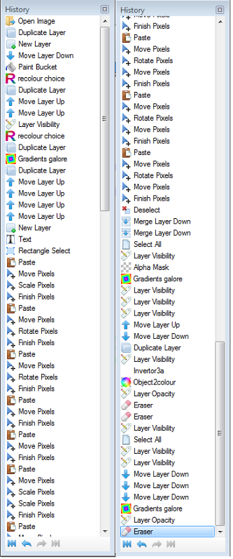
I would advise using the aplha mask plugin rather than the magic wand as it produces better edges.
The other plugins used are shown in the history - I'm sure there are many more efficient ways of doing this and various plugins could be used to the same effect. Best to experiment - good luck
-
Hi Helen,
Autumn leaves - or is it 'fall'
,Great colour choices, strong image!
-
Hello Texman, welcome!
I think this may be useful (Yellowman's contribution)
http://forums.getpaint.net/index.php?/topic/24857-making-stretched-arch-shaped-text-over-oval-image/
Hope that helps
-
Thank you Helen, Welshy, Barbie25, Yellowman, Dug and Nanette, for the kind comments.
I've uploaded some more at the top.
I've recently treated myself to a decent camera - but I don't understand it yet!
'Moonshot' was a very lucky 'snap', on full zoom, with suprisingly little hand shake (no tripod) and in between swathes of cloud.
Cropped and tidied up a bit in Pdn - a very lucky snap!
The 'geometry' ones are actually based on a pentangle,then rotated which brings out the cross shaped symmetry.
The other 2 are just playing around again
-
1
-
-
I've just tried lowering the opacity of the layer to be warped (using BB's transparency adjustment).
Then you can see the background better whilst warping.
When finished use the 'transparency' adjustment (plug-in), to reset to opaque.
And thank you Pyro for the brilliant plugins!
(would it be within the plugin rules to access the layer transparency setting or make it adjustable within the plugin?)
-
I'm sure you can do this!
1. Experiment with the texture layer having a transparent border and using the method I described above to show the background.
Then when you warp the texture it will reveal the background outline at least.
2. make a 'grid' with a transparent background. Warp this to fit the face image (again copied to clipboard and set as background).
This should make it possible to see most of the underlying image.
Save the 'Mesh'.
Run it again with the desired texture and use the previously created & saved Mesh.
In both cases you also want to use the tone from the object to shade the warped texture layer to give an impression of depth.


Barbieq25 Gallery - Gallery update 2 new p. 1
in The Pictorium
Posted
Looks like we're all having gallery problems at the moment!
The new one looks good small - looking forward to the big version.
(I'm not touching my gallery code till everything settles down again).
The new avatar/ sig combo looks good too - nice metallic colours!
Good to see you creating again!