


oma
-
Posts
4,331 -
Joined
-
Last visited
-
Days Won
3
Posts posted by oma
-
-
beautiiiiiiiiiful!!!!!!!!!!!!!!!!!!!!!!!!!!!!!!!!!!!!!!!
great job. I'm trying out your method in next person I do. I love the color pallet did you keep track of the colors you used?
ciao OMA
-
I'm thinking you want to know how to apply that lens effect to get a real mock fish eye distort.
there is this method from back in Dec 21 2008 by Zizoiz viewtopic.php?p=235951#p235951
about the 3rd post down.
You will want the lens plugin. Search for it under plugins, if you don't have it.Open your picture, and select the line tool. with the line tool, draw from the top left corner to the bottom right corner on you image. While you are doing this, keep an eye on the left side of the status bar on the bottom of your window. This will tell you how ong your line is. Memorize or write this length down.
Press control-Z, to undo the line you just made. You don't want it in the middle of your picture.
go to Image>canvas size, or press control-shift-R. Set the image dimensions to the value you wrote down, for both height and width. Set the little image icon to the center of its grid.
Use the lens effect to get the amount of fisheye you want.
go back to Image>canvas size, and reset to your image's original dimensions.
Hope this helps.
ciao OMA
-
add a layer bucket fill with white and move down under your image.
I suggest this way as it sounds like you only want to toggle the layer off and on to view.
ciao OMA
PS if you are not sure how to add layer and how to move a layer...... check the very first part of my snowman tut there is a little review there on where to find the cliky buttons
-
I've a few more tuts out there. all teach different little tricks I use in my work.
there's the pear tut for shading that you might enjoy. I did a snowman tut, and a soundwave tut. I'm not sure if my basics of how I do faces is still active or not. but if it isn't I've still the pictures and might just revive that one.
also in my gallery here on paint.net I do many walk thru work in progress shots so you can see little tidbits of ideas that might help you .
the hardest part most times doing a tut is condensing things down to a managable level for beginners to follow.
ciao OMA
-

@alex979 that is super. I really like the green it makes this so celtic looking. great job.
@Stiefel theres not too much wrong with that sword. you say you don't like your handle. It's not bad I think its more of a perspective problem there. The blue stone on the top is maybe too large and it overpowers the work you did on that wrapped handle. but over all it looks good.
@madpenguin I do like your versions very much! you've done a fine job as well.
@neomorfo thanks.... but would it surprise you to know I'm a female... and actually I'm an old grandmother.
 I like what you've done with the basic tut to make it your own creation. very smart looking.
 ciao OMA
-
couple of things could make it all disappear when you hit delete.
#1 you have colored area selected instead of the area you want to be transparent.
#2 you haven't set the tolerance to 0
also I note on that tut the person wants you to do each of those transparent areas selections. if you change the tolerance to 0 and the next tab to that from flood to global you will get all the transparent areas in one go.
screen shot image of what you are starting with would help.
pinpoint where you are going wrong.
ciao OMA
-
what exactly does this do? I've tried it out but see no difference in my image, perhaps I'm not applying it correctly?
cioa
OMA
-

I remember all these pieces. Glad you are back and working away again. This one always was one of my favs along with the little wooden man.
ciao OMA
-
well yes the tut was just for the simple heart. the items I make are way more involved but they always start with the basic shape as in the tut. The more complex the background the more fiddling with settings, and those come by instinct not by a set formula.
but this tut should get the newbies started.
remember tomorrow is the 14th so its valentines day!
:wink:
ciao OMA
-
This tutorial is available as a PDF. Click here to view or download it
QuoteIt is valentines day coming up and I've seen a few requests for some simple 3dshape tuts.well this one is very easy BUT! you must already have the plugins installed as I will not be telling you how to do that.
This topic in the forum will advise you how to go about installing a plug in: Installing Plugins
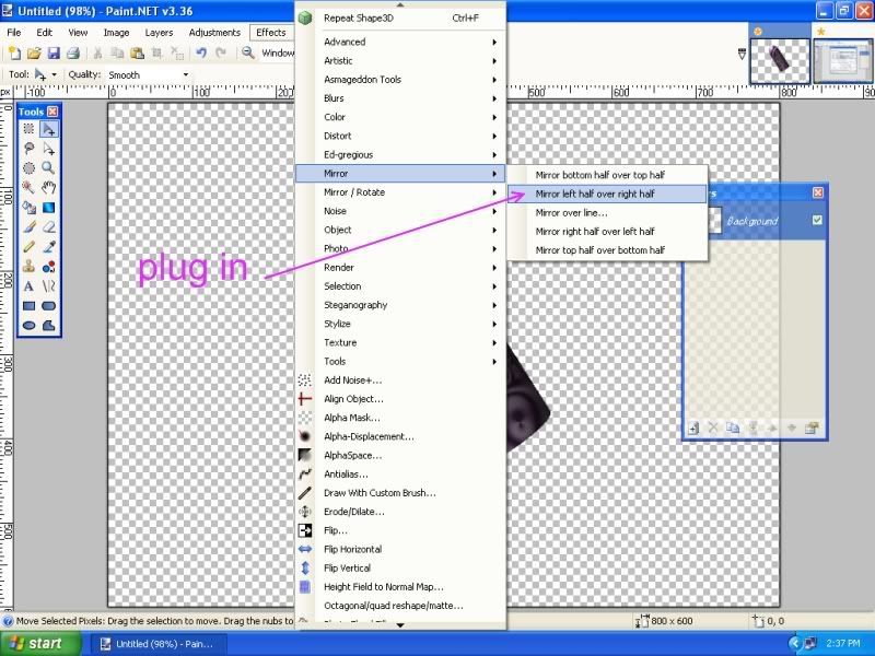
You will need these two plugins: Shape3D and Mirror
The standard forum proceedure is if you have a problem getting a particular plugin to work, you post a message in the plugin thread. That way the author of the plugin has a chance to see your message and address any problems or fixes required to his plugin.
so
here I'll give you a quick little heart.
super simple heart shape.
start with any design of your own artwork on a 800 x 600 canvas. Fill the whole canvas not empty portions 😉 see that little thumb up the top right of the next picture that is what my canvas looked like when I started.
so from that I did
step 1
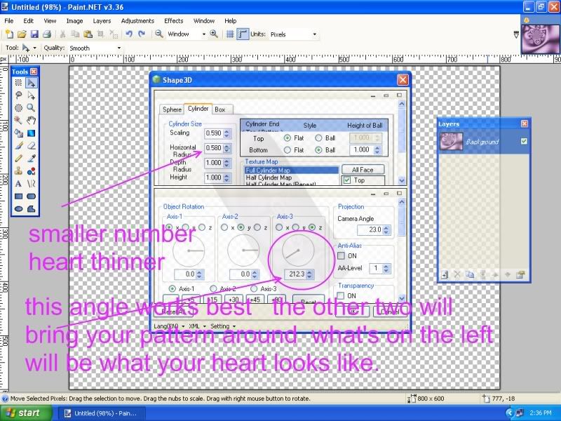
the first number at the top should be scaling around 59 so it all fits on the page.
do your first heart at these settings until you get the idea of it. the second number adjusts the width of the heart. etc.
the x,y,z dials the first two rotate your picture around to a pleasing spot. the third one is the angle you need to get a good heart shape.
use the mirror plugin next.
step 2
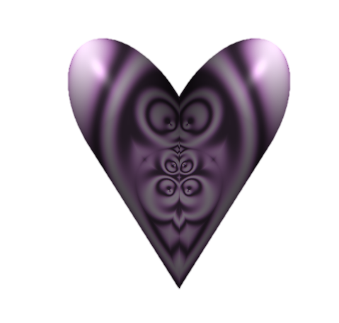
step 3 feather at default
step 4 and finished project.
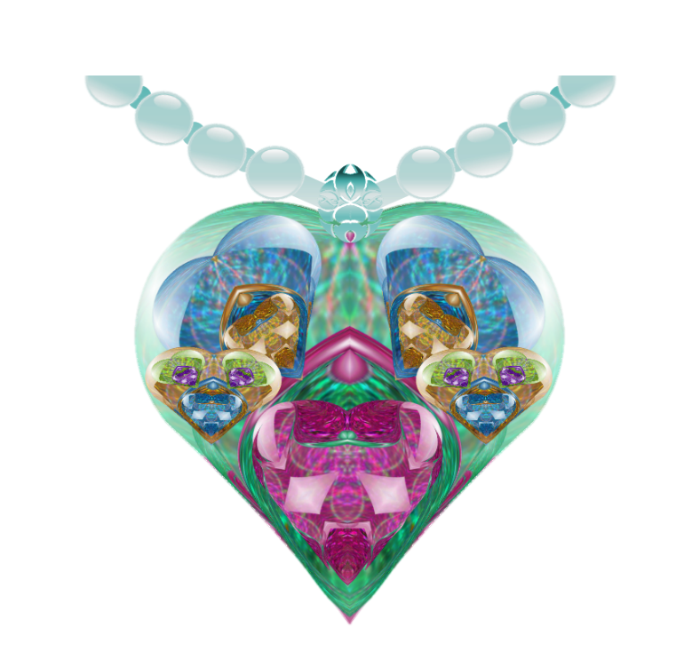
this is the same way I did some of these hearts from the image in the galleria called she makes my heart sing.
and this one Miss va va la voom the fallen fairy is wearing it.
-
exactly as soaka girl says its the quick little tut I did up I'll re add in the newbies section
ciao OMA
-
thanks you for the nice welcome back. It feels good to be up and out of bed, although I still get very tired and sleepy from the meds. I'm finally back in remission right now so hopefully I'll get a bit of art time in.
I missed my computor and playing with the colors on the screen. So many things to try yet I don't know where to begin.
ciao OMA
-
Hi welcome to the forum. Nicely done so far and I look forward to viewing more here soon. I will be watching for some larger items.
ciao OMA
-
-
actually pyrochild is correct
the shortcuts really help
if you are unsure where to find a list of them here is the link.
http://www.getpaint.net/doc/latest/en/K ... mands.html
these are the ones he meant would help in this situation
Toolbar
Decrease brush width by 1 [
Decrease brush width by 5 Ctrl + [
Increase brush width by 1 ]
Increase brush width by 5 Ctrl + ]
ciao OMA
PS just for the record I'd have answered "nope" as well.
-
second version is nicer by far to use.
one thing you might want to keep in mind for any further updates to this plugin. The original should automatically be purged from the effects dll or at least mention the person will need to go in and remove old version. On this one I had to manually remove first version from my effects. (when you are a plugin junky it quickly adds a long list under effects if the older versions don't get swapped out)
ciao OMA
-
also make sure the new layer is not under another layer that is fully opacity.
that sometimes happens.
ciao OMA
-
you will often hear them called blend modes. take care when using that form of making some items semi transparent. with merging down layers sometimes makes thm opacity 100% again. under image>flatten image is what you should use in this case.
The best method is actually to use the transparency plugin in BoltBaits pkg. I suggest if you haven't downloaded his pkg it should be one of the first plugin pkgs. you get. As you are only working with two layers flattening in this case is quickest and easiest to explain.
Have fun with using Paint.net.
and welcome to the forum.
ciao OMA
-
so when you made that rainbow did you make it as a .png image. in other words just the rainbow with a transparent background?
if so
load your landscape
add the rainbow .png layer > import from file.
double clik in the layers window and change the opacity.
if that's not what you mean let us know.
ciao OMA
-
as CommanderSozo pointed out to you the rules very clearly state that asking others to do you work is not allowed. I often when I'm stuck how to get started with drawing something use this site. they just happen to have a kangaroo!
http://home.howstuffworks.com/how-to-dr ... garoo1.htm
draw each of the steps 1 to 4 on separate layers.
use the line tool and then erase out the lines not required, where they cross over one another.
use gradiants for your coloring and it should look not to bad, for a begginers image. Once you are more familiar with using paint.net you can always go back in and add some textures.
ciao OMA
-
thanks you Chad , Helen, Sokagirl, Csm725, AFG, Yellowman, and Welsh for nice comments on Crossing over. "Life is such a journey"
Bryan1998 sorry if I gave you bad dreams with that scary dragon.
Welshy black and red? no I think more in the terms of this
"Welsh Warrior"
with your own little portal to the stairway up. not down.
ciao OMA
-
***************
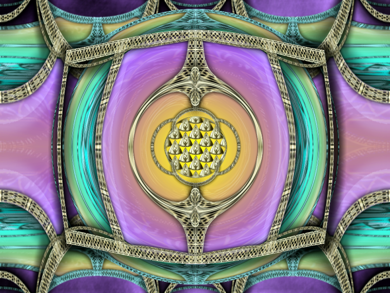
I don't often show you all my abstracts but here is one I've been working on.
One of my daughters and I sometimes get into real deep conversations, about how life is such a journey, and what would be at the end of life. Would there be a crossing over to the other side? She often thinks in terms of light rays, and me I imagine beauty and sparkles, an explosion of colors, and peaceful joy.
"Crossing to the other side"

ciao OMA
-
@Soka girl Lingo Ding is a very fun looking piece of art. Made me think of blackberries, so I had to go to the kitchen and have some berries and yogurt. You are killing my diet.
@Ryberg360 as i told you on the other forum I love this style and can see you doing so many side track images from it.
@Olav that's not too shabby for an abstract. The colors are nice together, very uplifiting. I'd say its a good base to build more into I'd definietly like to see some other elements added so you can get some shadows for more depth.
***************
I don't often show you all my abstracts but here is one I've been working on.
One of my daughters and I sometimes get into real deep conversations, about how life is such a journey, and what would be at the end of life. Would there be a crossing over to the other side? She often thinks in terms of light rays, and me I imagine beauty and sparkles, an explosion of colors, and peaceful joy.
thumb full size can be viewed in my gallery pg 82
"Crossing to the other side"
ciao OMA
-
Ideally it would be a nice feature if you could somehow have an option of off the canvas endpoints of perspective. For now I imagine using a larger than the picture cavas size could cover that. It would just be a matter of figuring out how much larger to make the canvas drawing area outside your intended image.
There is a problem with this feature IMO. Let's say I will have this option, it means that the vanishing point will not be seen, since AFAIK there is no way to tell Paint .Net to show stuff outside of the Canvas. That means that the user won't be able to accurately draw more lines to the vanishing point...
didn't think this was possible that's mainly the reason I make larger canvas and draw my perspective that needs to be outside intended picture area. then I just crop back to the size I require. For now its a simple work around. I wouldn't get hung up on the color wheel thing. just do the two in primary and secondary. perspective lines shouldn't show in the finished image and they will be done on a separate layer to be deleted. If someone positively needs different colors they can always just use Ed Harvey color change and two other colors.
ciao OMA
 I like what you've done with the basic tut to make it your own creation. very smart looking.
Oma's gallery
in The Pictorium
Posted
well I finally felt up to finishing this one.
thanks to Welsh you clarified how I needed to do the rocks for the cave floor.
I enjoyed doing this image but find I'm still not too fond of dark and brooding. :wink:
well I'd already flattened that portion of the tree back around mid/ end of Jan so hopefully this works out. So I did a backwards variation of what Helen suggested. drew some new leaves and lightened them and added in over top and added some very faint shadows. had to wand in and feathers some areas of the sky so the tree didn't loose the sparse ness in the left side.
and some releif just because those leaves still looked too flat.