


oma
-
Posts
4,331 -
Joined
-
Last visited
-
Days Won
3
Posts posted by oma
-
-
sigh, sometimes I'm just way too nice person.

LOL! and that's why I'm loving ya! thanks so very much you're a real sweety.
ciao OMA
-
RAR is evil.
exactly! I agree with pyrochild, just zip the thing "pretty please", as all the other plugin writers do.
I'll retry to use the source file provided above if you refuse to use zip, but may need some assistance to build the dll. Last attempt I still received error messages.
ciao OMA
-
 sorry this might be a dumb dumb question but I've not been around for awhile. rar files? how do I extract the .dll to put into my effects file?
 I tried using the source to build a dll but received an error message (sorry didn't write it down) but it was basically telling me there was an error on a certain line.
ciao OMA
-
use a radial gradiant on a new transparent layer. in two shades of the color you want your mat to be. I generally find that lighter shade primary and darker shade secondary works best. you may have to try different values of the colors until you get the correct variance for the next step.
cut out the section in the middle in your oval or square shape where you want the picture to show thru completly.
then use crystilize try different settings most times I use default.
then just gaussian blur. set this at fairly low setting maybe less than 10 for sure.
change the transparency as desired on the crystalized and blurred layer so some of the image shows thru the vignette if required.
ciao
OMA
-
I've not changed to 3.5.5 version yet. still using the 3.5.4 which permits 1 pixel brush width all around. so its a problem only in latest version.
what happens if you draw a filled shape no outline and then use the outline plugin at 1 pixel? would you be able to continue with this as a work around in your image until there was a code fix?
ciao OMA
PS try aa enabled you may get different outcome.
-
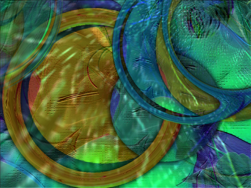
thanks everyone. Possum you hit the song I was listening to right on the button. I don't think I captured the mood totally on it but I was just doodling and humming and this is where the tune took me. Mainly this was inspired by the organ solo portion of that song.
ciao OMA
Artist: The Eric Burdon Band
Album: Power Company
Title: The House of the Rising Sun
There is a house in New Orleans
They call the Rising Sun
And it's been the ruin of many a poor boy
And God I know I'm one
My mother was a tailor
She sewed my new bluejeans
My father was a gamblin' man
Down in New Orleans
Now the only thing a gambler needs
Is a suitcase and trunk
And the only time he's satisfied
Is when he's on a drunk
[Organ Solo] this is the section that was my inspiration for this art piece
Oh mother tell your children
Not to do what I have done
Spend your lives in sin and misery
In the House of the Rising Sun
Well, I got one foot on the platform
The other foot on the train
I'm goin' back to New Orleans
To wear that ball and chain
Well, there is a house in New Orleans
They call the Rising Sun
And it's been the ruin of many a poor boy
And God I know I'm one
PS its "Burdon" He is one fascinating fellow. " Don't let me be misunderstood is the current song I'm working into an abstract." http://www.youtube.com/watch?v=d2FT4FprxDg&feature=related I've been on a real retro art feeling lately.
-
In the house of the rising sun
-
I absolutley agree nicely done. I truly love it when someone takes the basics of the tut and adds some extras adapting the tut to their own style.
once again bravo on that juicy pear. looks good enough to eat.
yum yum
ciao OMA
-
thanks pyrochild. now I just wonder how on earth did I manage to switch that off? I never adjust those settings ever ever ever!
ciao OMA
-
sorry for title not sure what to describe this as.
attached is what I get when I try to look at the pictorium. even my own gallery.

-
are you by chance using dual screen?
-
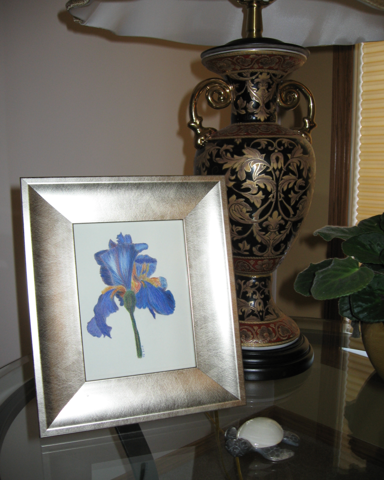
well its not really paint.net but it is a colored pencil drawing. I have taken the things I've learned about drawing and coloring and shading in paint.net and tried for a more traditional art form. ( made a drawing of an blue iris for daughters birthday present)
ciao OMA
http://fc04.deviantart.net/fs70/f/2010/135/e/a/iris_by_omagrandmother.png
-
Leonte congrats! I know you didn't beleive me when I pm'd you on how excellent that flower was but see
 I wasn't the only one that thought so. congrats on fine fine fine work! your flower made me smile
  with happiness

ciao OMA
-
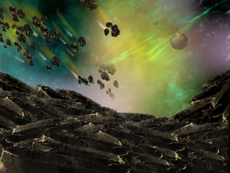
nice asteroid texture yellowman!
going to pick your brains on that one on pdnfanatics. great to see you are back, missed you.
ciao OMA
PS sozo crack them books I want to hear you bragging this time next week how you
Aced those finals.
-
Just a piece of advice, I'm going to be utilizing the 1600x1200 workspace (for high detail), & I've found that add noise doesn't have such a good outcome for stars (when using a large resolution). they all look distorted & like they have tails (
 ) & stuff. Yikes. But anyway, if you're using a large workspace (e.g. larger than 1024x768), don't go with traditional add noise. either manually draw in the stars (this isn't as difficult as it sounds, just draw a couple of white dots in with the pencil against a black background, duplicate with blending set to additive, move the stars, merge layers, & repeat), experiment with an add noise render with high coverage combined with brightness/contrast adjustments, or use mcamp14's starry sky plugin (it can be found here). It's remarkably simple, but it works for large canvases. Not that I wouldn't recommend adding some customizations once you use it, though.
try using random shapes set on white / white colors use circles set on low size max and min. gives some nice random stars especially on large large canvas size.
re the blurs I use every plugin out there. those blurs took a total of about 5 layers.
used trail by pyrochild used gradiant blur and then some individual transparent gradiants. over lapped some of different colors and gradiant blur by boltbait. also motion blur works well ...think that one was by madjik.
back lite the asteroids on a layer below with fire plugin. and gassiaun blurrrrrrrrrrrr.
just a lot of plugin mashing until I got a look I liked.
the shooting rocks. well they are just little bits of the asteroid texture lasso'd and then shrunk down real small, use trail plugin and layer tilt tiny tiny increments (2 or 3size on trail) about 10 or 15 times each rock going different directions each time
ciao
OMA
-
well I've tried this competition. Space isn't my strong suit but I think I've done fairly well all things considering.
bit dark for my personal taste in art but I think it suits the subject.
http://fc00.deviantart.net/fs71/f/2010/118/c/b/asteroid_by_omagrandmother.png
-
not my strong point not even sure what I'm going to try for this comp. but please how do I get a decent starfield, I do know I'll be needing one of those in this image.
tips tips tips gladly accepted from all you space buffs.
ciao OMA
-
thanks this was a given for me to enter
abstracts + flowers = my two favourite things to draw in paint.net great choice for theme. everyone has submitted great images. good luck to all!
ciao OMA
just had to try the new smilies love the pizza one. 
-
http://fc07.deviantart.net/fs70/f/2010/112/2/d/Under_the_moon_floral_abstract_by_omagrandmother.png
I sure hope that I added the thumb correctly ....
Under the moon abstract floral "She loves me not"
ciao
OMA
-
so I did a picture but don't know how to add the thumby thing to it. I'll be uploading it to my da account. will need some help to get the thumb put up in the contest.
ciao OMA
-
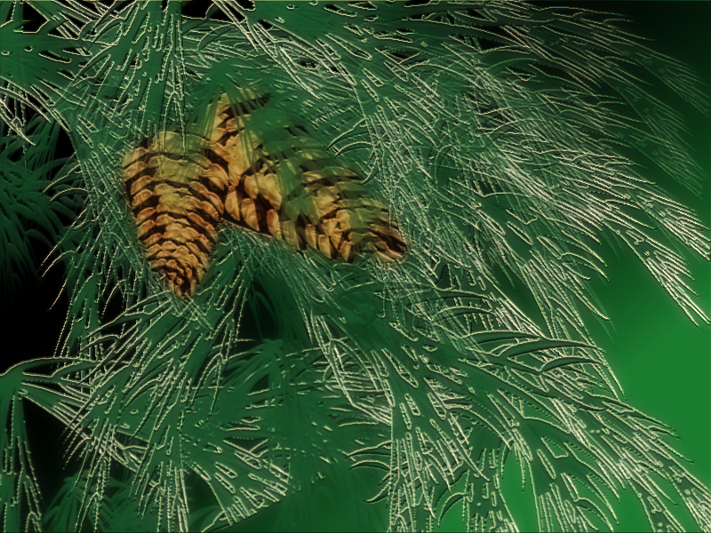
thanks everyone. I've not been ignoring you all just so many pressing things going on at home. My PDN Fanatics friends will know what I'm talking about.
needed some relaxation this morning so attempted another of the ten items on my 2010 list. Its not the best but it was something I wanted to work on.
Pinecones in the needles
-
Advanced Tools - LFC4EVER
The most awesome collection of tools ever produced for PDN. No, not really. Actually - an Aprils Fools joke
-
actually RB Whitakers wiki page has a ray tracer. I'm not sure he ever completed that one.
edit wrong set of notes
ciao OMA
-
In Paint.net there are so many ways to do things. all depends on the image you are working on. here is another method that I sometimes use. (most times I use Welsh's method as I like gradiant colors in letters)
this method gives solid color letters and maintains your spacing.
type your word in the color you want first letter/s to be. (do on a transparent layer)
dup layer of your word
use Ed Harvey color flip for second color required. and then adjust the hue.
go back and erase out the first leter on this second layer
repeat across if you want more colors.
 sorry this might be a dumb dumb question but I've not been around for awhile. rar files? how do I extract the .dll to put into my effects file?
 I wasn't the only one that thought so. congrats on fine fine fine work! your flower made me smile

 ) & stuff. Yikes. But anyway, if you're using a large workspace (e.g. larger than 1024x768), don't go with traditional add noise. either manually draw in the stars (this isn't as difficult as it sounds, just draw a couple of white dots in with the pencil against a black background, duplicate with blending set to additive, move the stars, merge layers, & repeat), experiment with an add noise render with high coverage combined with brightness/contrast adjustments, or use mcamp14's starry sky plugin (it can be found
AOTW # 10 Discussion Thread Winners are !
in The Archives
Posted · Edited by oma
good luck to you all.
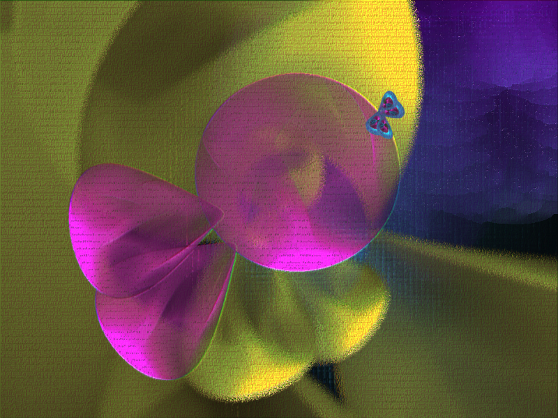
I've often been asked what inspires my abstracts.
almost anything can be a trigger but often its
1) a play on words, or the lyrics of a song...Sometimes English phrases are really funny. Like a "Solid splash" Thats almost impossible to imagine but I used paint.net for my interpetation. http://omagrandmother.deviantart.com/gallery/#/d1atocr
"Living in a prism" http://omagrandmother.deviantart.com/gallery/#/d1nq1rf
2) I love the rich and soft colors alike. The colors determine the mood, or can invoke an image. "When light has a voice" http://omagrandmother.deviantart.com/gallery/#/d1c185t
or "Inner Peace" http://omagrandmother.deviantart.com/gallery/#/d1gvfb5
3) strong emotions or very personal private thoughts are many times the starting point. Here are a few of my favs, Each image brings to life exactly what I was feeling at the moment.
"A single moment in time" http://omagrandmother.deviantart.com/gallery/#/d1nr755
" Unleashed" http://omagrandmother.deviantart.com/gallery/#/d1uiosi
"Fragil soul " http://omagrandmother.deviantart.com/gallery/#_featured--2
"Whispers" http://omagrandmother.deviantart.com/gallery/#/d2apcn1
so there are a few things that inspire me. There are many more triggers but these are common ones for me. Please do take time to go thru my gallery at DA for other examples of my abstracts along with my gallery here at Paint.net. I often have little tips and extra comments on the meanings behind the picture in my gallery here.
Thanks for the compliment in your intro Possum, and I wish each and every one of you good luck in this comp. Let me feel your inner thoughts and let me learn something about you thru your art.
ciao
OMA