


oma
-
Posts
4,331 -
Joined
-
Last visited
-
Days Won
3
Posts posted by oma
-
-
@Lance those were minor changes so I went ahead and updated above post
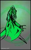
hope that's what you meant by your critques . the racks still have the velvet in the picture I've worked from. must be early in the season for this buck.
thanks for the valuable critique if that's not what you meant by darkening let me know. I still think perhaps a bit more dark brown yet need on left?
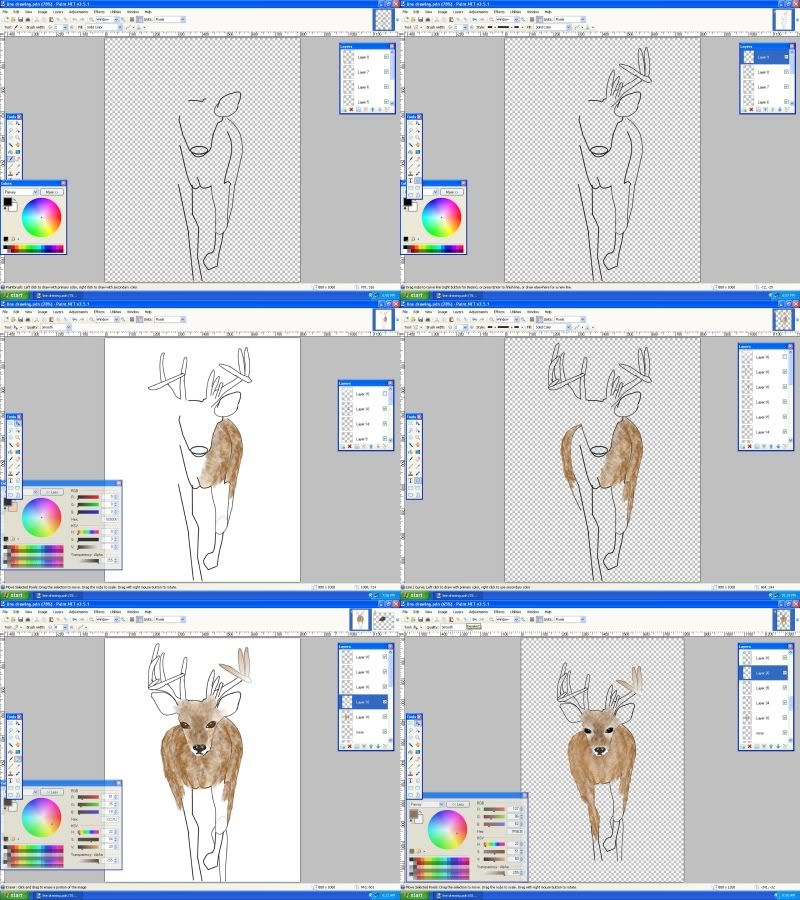
didn't use any smudge so not sure where I went off on those ears. might have been part of the fracture I used for smoother fur texture, not sure. but I took the eraser and mag up to 800% to pixel by pixel to get those out of there. Hope I've not missed any . I actually didn't even see them until you mentioned them to me. What can I say but bad eyes acting up most likely.
I guess I may as well continue with a background of thick brush/thicket trees since I've still the PDN open.
ciao OMA
-
thanks LibbyH that's nice of you to say that.
On this one I won't be doing any "MAJOR" changes ""For sure""
it was just a challenge to myself to do a better deer than last time. I made such a colossal mess of that one previously, I slated it in for an early retry of doing a proper deer. As Lance so diplomatically put it in post below,
.I remember seeing your previous version and thinking it closely resembled a dog more than a deer. This time around, however, I do see a definite white-tailed deer that's so common in rural Virginia.
Lance was too nice to say it as it should have been.
I would more correctly put it ""My last attempt at drawing a deer well
 It looked like an extremely bad science experiment involving a deer and a wild rabid dog. ""
 I do not have a tablet so everything is done just mouse. no shape 3d very min of plugins. fracture, frosted glass, jitter, I recall using. also gradiant bars, true blur and transparency. if I think of any others I'll edit this and add but I don't seem to recall using any other plugins. most of this is just straight gradiants and brush work. ( pm answer not downloaded brushes! it is paintbrush built in the little
 with blurs check my pear tut for a very brief run down of method.... this used at least 1000 or more blurs or so it seemed. )
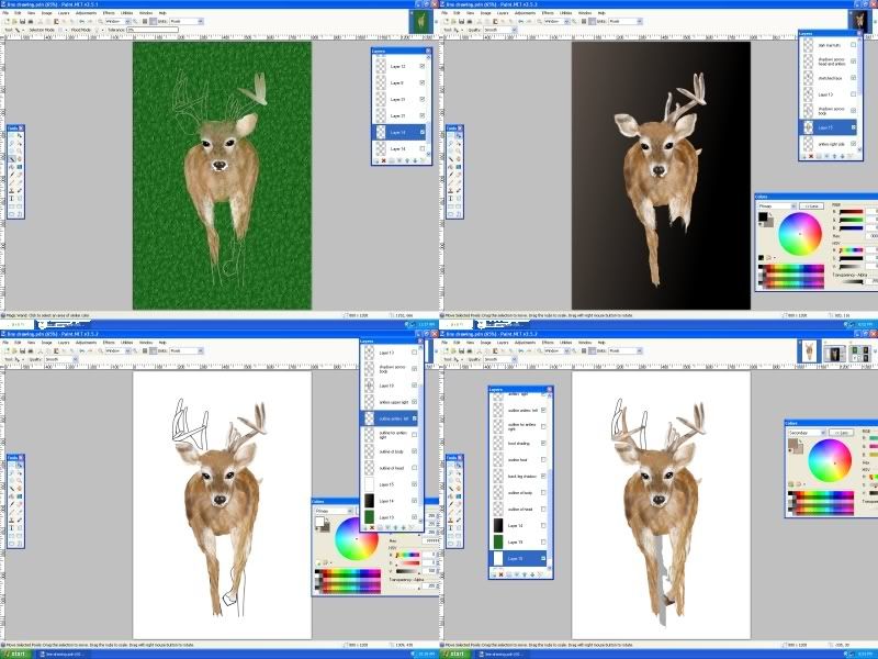
 I've still the pdn open so I may try a bit more brush/underbrush and wooded area in background. but as you can see from the inspiration piece its fairly blurry background. now completed
I just noticed still the rack on left requires more dark shading (its frosted glass and true blur over gradiants for the person that just pm'd me ) now completed
hope you enjoy this one.
ciao OMA
PS I put the comparison between my inspiration piece and my drawing at end. I'm not 100% accurate but it was just a personal test piece and the photo was just for inspiration and some guidance for color and shading areas. .
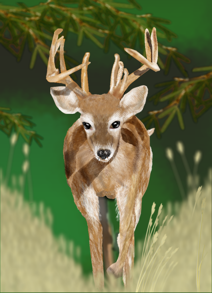
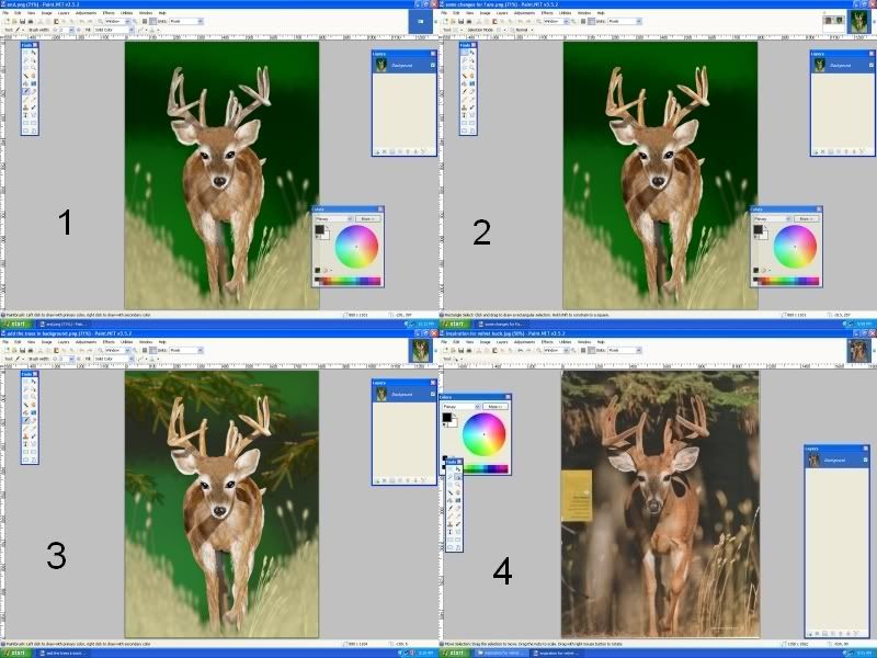
#1 before the final fixes
#2 with some changes as noted by Lance below re darker shadows and ears and darker antlers
#3 final clean up of leg area pixels and added background foilage trees. (early season buck coming onto trail from deep bed bush)
#4 inspiration photo I used for color and shading ref. and to try and improve my hand at drawing.
conclusion I did manage to do a better deer
big test to my skills this one. I think its my best. wow! ciao OMA
-
great looking new image Chad, its nice to see you don't crack under pressure ! but please could you turn down the volumn on that Crank Up the Volume, I've a splitting headache already. :wink:
ciao OMA
-
I like the sword very much. You have some nice drawing skills and it will be a pleasure to watch how you progress with using Paint.net. welcome to the forum and I'll be by from time to time to view your gallery. I won't always leave a message but I will be looking for sure.
ciao OMA
-
Hi Gigabyte, I love the snowman
bet you knew I was going to say that. Really you have a nice start to your gallery, The image of those little fish is so cute. Welcome to our gallery and I hope you enjoy your time with us. I look forward to watching your progress. ciao OMA
-
what a nice gallery you've started. I like the one with the lines and the silver tree. don't know if you named it but it so beautiful it needs a name!
I'll be watching your progress and I'm sure I'll be seeing some magnificent paint.net pictures here in your gallery very very soon. You have some nice artistic talent.
ciao OMA
-
Sokagirl Glassy stones is lovely. It reminds me of that beach glass that gets made when lightning strikes the sand on a beach. it turns the silica to glass.
ciao OMA
-
Oh that looks delicious. welcome to the forum. I look forward to viewing your progress with this great program.
ciao OMA
-
sorry about that.... grandkids been on my computor again. leaving their logins active. uuuuuuuuuuuuuuuurrrrrrrrrrrrrrrrrrr.
anyways Sarkut thanks I had hard time finding that pdnrepair. It looks like that cleared up the problem. well at least it seems to. wonder what glitch was.
anyways thanks
ciao OMA
-
Flip that albumn cover is very effective. In this case a stock texture is not a problem, and is a rendered piece used appropriately. It would be nice if you linked to the stock though when you post the image. That way the person taking the original stock photo is acknowledged for their work, and we can all see just how creative you've been in adjusting to suit your application.
I must say there is some really lovely work lately in your gallery. I've really been impressed with the newer images you have been doing.
ciao OMA
-
"BOOM" you've been exploding with imaginative pieces lately. The latest are exceptional. Perfect for a logo! I really like the use of the subtle gradiant in the font.
ciao OMA
-
That latest piece is absolutley wonderful. Like nature in a glass tray. wonderfully crisp and shiny.
ciao OMA
-
When I do a transparent gradiant on one layer
then switch to another layer and select and area and copy
move to another layer and paste it does not paste any image.
this happens because I have not switched back to the non transparent gradiant.
Is this the way its been programed? It tends to slow down work flow if it is intentional. Just a clarification please if this is how its supposed to work or if its a wee bug that needs to be addressed further down the road sometime.
ciao OMA
-
Chad congrats on the rookie of the year award. You've worked really hard this past year and the past few months images have been incredible. great work my young friend and I will certainly be watching this gallery for some real inspired pieces in 2010.
pressure is on now. ciao OMA
-
How's this image for a beautiful color gradient Oma? This is one of many good examples of lots of good space art out there, and one of the pieces that inspires me. Work like this is always a learning process, and next time I'll use a blue are greenish color. Blue and green are my preference anyway.

yes my preference as well for space scenes is the blue and green, sometimes light inky purple. I often think space is cold and blue green just makes me feel the immensity and awe inspiring vastness. Orange red is so in your face.
up close and scorching instead of distant and mysterious as cool colors would be. ciao OMA
-
even if there is lines (I don't personally see them) I think you've done a fine job on the texture of this planet. As I said on DA the only thing I can think that could possibly make this space scene any better would be to off centre that planet from smack dab in the middle. other than that even if it uses my least favourite color (orange) I really like it. much better than I can do on space scenes. so I applaud your work. well done.
ciao OMA
-
yummy!
shiny! extra yummy.
ciao OMA
-
Jason try the tut. Its long but has lots of information for beginners.
ciao OMA
-
not bad Its too bad the turquoise is not shaded or gradiant. Might be a bit more eye candy that way. looks sort of like you are looking at a frog from above. the turquoise part that's in the middle is the head and those two offshoots are the front legs.
It has possiblities just needs some texture.
ciao OMA
-
nicely done. perhaps not quite so much yellow. I think the trophies are not quite that saturated color wise.
other than that. simple and easy enough for begginners. When the beginners get more experience they will be able to explore more realistic looking metal. one tut to also view is the one by ASH about changing things to metal using conditional hue. I also show it in my tut about the sword.
-
viewtopic.php?f=27&t=21525&hilit=droste its in plugin development thread actually called Escher/Droste.
-
Oh oh how come you don't do the mountians? I know there is a tut around for some stone like texture. all you have to do is make it in some wacky upbeat color. :wink: challenge yourself on this one Aislin you have the talent sweety.
ciao OMA
-
magnificent!
love the drawing love the subject matter. Colorization is well done.
as said by Janettsue definetly a person to watch.
ciao OMA
-
Libby the reason I listen is because you made serious comment and offered good artistic advise on improving image.
I like to try to do the changes people recommend. Sometimes I like the change sometime not, it is always easy enough to go back to my original. This way I can at least offer everyone a view of what the change will look like and a reason I use or don't use in image. I don't try every change as I've been here awhile and know when some suggestions just are not the look required for my image. But all serious artistic suggestions I try to work in. Those you eventually catch on to, it will become effident who knows what they are talking about and who doesn't.
If I show a possibilty mentioned by one of the others it allows them to judge with out doing a full image if what they mention will look good in their own work or if their thoughts need more of a work thru.
In this case of the lighter hand it was in original file but I forgot to turn on the layer.
In the case of the shoe, Welsh offered good comment. It looked incomplete and it was a challenge to spark it up and jazz it a bit without being over the top. My thoughts were shinny diamonte shoes would be too bright but I need to check incase my gut instincts were off. (I showed that quick version last page... I thought diamonte was too bold but yet Welsh was correct the shoes needed something. so I worked with that challenge to give more highlights with out loosing them and more artistic interest with the tone on tone black flower)
On the other forum I belong to Helen advised me very early on to darken the makeup and facial brightlights and dark shades, that added much realism to the face. Sargon mentioned red highlights for the hair, and that is what made the hair come to life and give it real depth. Both of these were comments that really helped, so comments I never take lightly expecially from those with artistic eyes.
The jaggies were not so evident on this version here in paint.net because I had done largeand then downsizied, but they were still too visible in work copy. I took the oportunity to hone my skills at repair when I worked on the other little bits and pieces mentioned
and the tiara well that just wasn't happening here in this one too far to go back and change out the hair and all so the little sparkles were added for miss sunshine soakagirl.
I did lighten the dress because my eyes are so bad I work much lighter and at end darken the image to be what most others view. when I first posted I had darkened too much even for those with excellent vision. So it was just a matter of lightening it just a tiny tad.
I listen Libby because I try for better art. I listen to those who have something worthy to say. I try not to listen to nasties, those guys I usually snub....
:wink: oh shoot I only snub them a little bit I try to be nice unless they really try to take too big of a bite. ciao OMA
 It looked like an extremely bad science experiment involving a deer and a wild rabid dog.
  with blurs check my pear tut for a very brief run down of method.... this used at least 1000 or more blurs or so it seemed.
Oma's gallery
in The Pictorium
Posted
@Lance already started smoothing. mainly that lower left leg.
will post the update tomorrow.
ciao OMA