


oma
-
Posts
4,331 -
Joined
-
Last visited
-
Days Won
3
Posts posted by oma
-
-
So, now what?
 I'm trying to find the key for the padlock.
 -
myself top one I'd just do a gradiant using radial. set second color transparent. on separate layer
I'm sure others have different methods.
second one is wetfloor reflection. If you can't get enought separation between the image and the reflection for height just keep selection active after running wet floor plugin and then cut and paste to its own layer and move to the position you like .
I've also at times used just a duplicate layer of my image and flipped it vertically and make it semi transparent for the second one.
One thing you'll find with paint.net is there is usally more than one method to do everything. That;s what makes it so fun.
-
I'm loving your sketches. Lovely things tablets even with out the pressure sensitivity in paint.net. I truly envy you. I'd love to have a tablet one day.
Those sketches are magnificent. You have such nice clean drawing skills. Great eye! for details.
ciao OMA
-
I can see you are really experimenting and stretching your wings on these last few images. Just those extra few things you've been throwing into the mix have stepped up your images quite a bit. Lovely as always, you've an eye for beauty that shows in your art. It is always such a pleasure coming by your gallery. I don't always leave a message but my morning wander thru the galleries always brings me by here for an uplift.
ciao OMA
-
@Crimson read my lips , I'll say it nice and slow """ begginnerrrrrsssss tut! minnnnimmmmummmm pluginnnns and stepssssss."" Just a lot of pictures to describe to a newbie trying to follow along some new ideas. I know you are experienced enough, if you want to add dents etc go for it. I did say more experienced members could customize.

-
effects>object>dropshadow now.
ciao OMA
-
update of princess wip for Cameo and Cufflins futuristic added pg 74.
work started on arms and shoulders. Hair given more red tones.
ciao OMA
-
yes illegal character you can not use any of these charaters in a file name " \ /:*?<>or |" I've done this myself so know how easy it is to do. glad you've gotten it resolved.
ciao OMA
-
open the file again in paint.net along the top of the screen left side it gives name of file if it says aprilsfile(or what ever you called it) .pdn you didn't flatten.
file>saveas > filename and the drop down file extension of .png or .jpg.
I know you said you saved it as a .jpg but just recheck it was flattened and saved as .jpg and you didn't just clik save.
also I've had problems where I had two "." in an file name
for safety sake I'd make a copy first before you try any changes to what you've done so far. Just incase you want to come back and rework on this again.
ciao OMA
-
do you mean a frame? or do you mean a siloute style photo? the best bet is to upload the picture and a sample of what you require. I'm more than sure it is do able. But want to check we are on correct wave length. I also am just not sure what you mean.
ciao OMA
-
you made sure you flattened it and haven't tried to upload a pdn file?
-
thanks you Barbieq and Helen. such nice things to say. This morning I worked on the hair a bit more. (updated on previous page to keep all the images together) next I think there will be some sort of crown? and then start on the shoulder area.
ciao OMA
-
thanks I missed the part that said original render what can I say but slap palm to forehead.
Looking good I like how they've been changed. Have you attempted any with light backgrounds or do those fractal manips generally look better against the black background.
I've always loved fractal images but have only ever done one or two. I'm just too impatient for slow computor to render...I can not see myself sitting and waiting for this old beast to finish.
you have yourself a nice Christmas.
ciao Oma
-
depends on the style you are going for. you might like ED Harveys plug in pkg. especially the color change ones.
also there are halftones that can go well in pop art. If you mean more vectorish styles the only limit is your imagination.
EER maintains a wonderful list of add on plugins in this section of the forum clik viewforum.php?f=16 its is one of the stickied posts near the top Plugin index.
Welcome to the forum
-
Oh Sharp that explosiding sun image is just so sparkly looking. I can feel the heat on my face from here! I never had a chance to comment on you sig, That one is really nicely done. I saw you had a wee tut in place as well about getting those lines. It is on my list of must tries for during the Christmas holidays.
speaking of Christmas, It is not likely I'll be visiting many galleries between today the 22nd and Christmas so I wanted to stop by and leave a great big Holly Jolly Wish for you to have a wonderful Christmas Season!
ciao OMA
-
Look forward to seeing how you do the Ribbons. Like sharp says twisting ribbons are tough to do. You need to get some little dips and shadows in there with out it being too over the top. But you have great skills of observation and great PDN skills so I'm sure you will whip thru that sig in no time.
you have a nice Christmas Mike, and once again congrats on your getting into that art class.
ciao OMA
-
Oh it is so nice to see you've settled in with paint.net, especially after your initial "have to ask about this and that and this and that" You've turned into a fine artist. Those latest space images are a real good start into an area I think you can get quite good at. I prefer the blue galaxy one , mainly because I like that color best. The space planet with a ring perhaps would look just a bit more realistic if the top wasn't dark brown and the lines going around the planet weren't so concentric. But like I say great start and much better than my first space attempts.
I probably won't have a chance to get back to your gallery until after Christmas ....so I'll just pass on my Christmas wishes to you now. "Merry Christmas" see you in the "New Year"
ciao OMA
-
You've been so busy. I'm having trouble keeping up. puff puff I feel like I just ran a 10 mile run though your lovely gallery... so many great additions since I've had a chance to visit last.
can't name them all but the Alian present is so sparky looking. I like how you managed that challenge..
The fairy is lovely, and glowing light I can see going a few more layers with bits and pieces of this part showing. I'm thinking cavernous??? The one you say is a lame ornament really isn't lame at all. I'd like to see you cut that circular part out and finish making an ornament top. use one of the plugins to make multiple colored versions of it hang them from strings. One siggy that comes to mind is how Goonfellow did his. That "Lame" image would work so well!
great job. and have a wonderful Christmas!
ciao OMA
-
in the plugin section of the forum. viewforum.php?f=16 <<=====clik this link
see the stickied topics near the very top. Plug in index revision. by EER
they are listed both by plugin name and by the maker in that post.
EER did a lot of work updating and maintaining this list for us all to use.
ciao OMA
-
polar inversion is my fav plugin. goes nicely with the fractals.
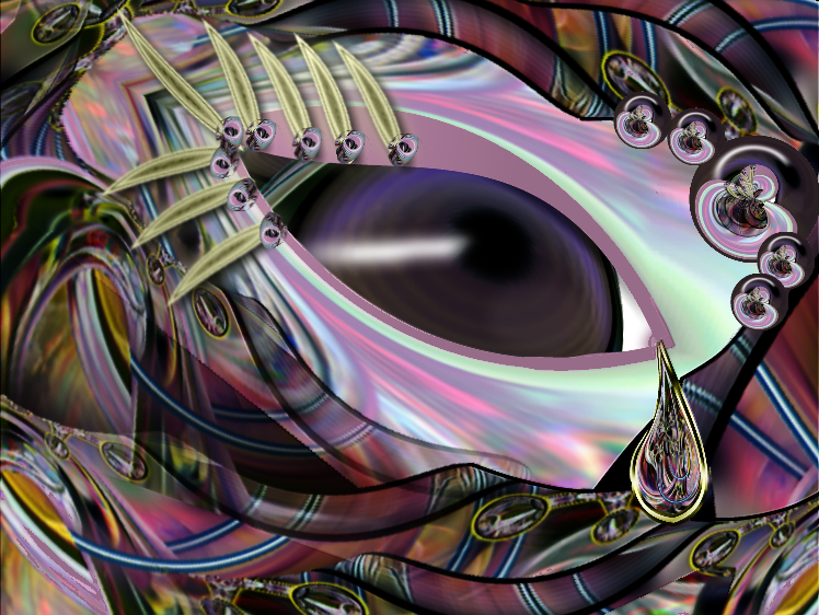
here is one I did this week Its not anything special. Just a wind down from concentrating so much on some other pictures I've been working on. No doubt there are loads of errors and areas for improvement. but its just a play thing , only real purpose is to try differnent things out.
-
lovely fractals. I see that you say you've edited those, in Paint.net? what did you do with this program. It would be lovely to view the before and after.
you have a wonderful Christmas
ciao OMA
-
yummy oranges! and those Ornaments get me right into the Xmas spirit.
ciao OMA
-
pink curtain/draped fabric wallpaper is wonderful. what method did you use? It has been awhile since I've done draped fabric, and I'll have to retackle that in the princess drawing I've on the go right now. It is quite possibly the same method I make it, but you know me I'm always on the lookout for variations and alternate methods.
ciao OMA
-
not yet free321123.
I've only just passed on my notes to Wilson so lets see how he makes out first. Its real difficult to scoot tuts down to managable steps for newbies. Especially something as complex as a tree. I already had been working on simplifying and that's what I sent Wilson but its still many steps. ciao OMA
 I'm trying to find the key for the padlock.
Oma's gallery
in The Pictorium
Posted
updated pg 74.