


oma
-
Posts
4,331 -
Joined
-
Last visited
-
Days Won
3
Posts posted by oma
-
-
yellowman those space scapes are spectacular. I also think the latest on you did on the other forum is perhaps the best I've everseen done completely with paint.net.
bravo my friend. excellent work.
ciao OMA
-
I had some free time this afternoon and managed to fix some of the errors in the princess
clickable thumb
includes some fixes
edit Jan 3 2010 I received quite a few comments re jaggies. They would have evened out in the intended final smaller size but they were annoying even in this work piece. So I've blurred out as many as I could no easy task on a flattened image at one and two pixel wide selections. so if I missed any let me know exactly where and if possible I'll get them fixed. IF POSSIBLE...
also for the little ray of sunshine that asked for a Tiara sorry not this image but I did add some sparkles to the head piece just for you.
I jazzed up the shoe as that was another area that needed some work. shiny shoe with a flower now.
sorry the table has to stay this way,,,too many cuts to adjust flattened picture.
and yes I did lighten the gown just a bit so the shading in the dress that took me ages shows more. and I also turned back on the layer where I lightened the hand on the chair.
************************************
the thumb picture will take you to my DA gallery view it at full size there for all the little details to show. .
-
? he wouldn't have taken the time to make this unless someone needed it.
 use that noodle and get creative. clue..... most people incorporate it into textures. since most plugins are seldom used alone but in conjunction with other plugins it will be part of a making some extreme texture.
 since i use lots of textures I wonder perhaps I might have been one that asked for it. can't recall but sounds like something I may have wanted .....
ciao OMA
-
@Janettsue.... oh it is so nice to see you drop by! I was just at wallymart yesterday to get some Xmas pictures printed as I wanted to send you one by e mail. They gave me a disc of all the pictures we took with our 35mm this Christmas. Right after I'm done here on forum this morning I'll send you a Christmas pic. I received your card it was so funny. How'd you get the president to sign it?
so funnny! Ps I'm on my way over to WelshBlue's gallery to snitch one of those wooden crates I saw in his shipwreck picture, and I'll pack up some of this home brewed wine to send you. Its strawberry flavoured and ummm so good.
@Sokagirl a Tiara? no didn't think of that. now there would be a challenge for me. Right after I do the other 10 challenges I've on my list.
How about you give a tiara a whirl, you've got the tallents, and I'm sure all of us over on PDN Fans are willing to give pointers. PS I think that alpha masking that Peter uses would be a good start point, and check the tut Sargon did on the jewels.
PSS take a look in one of the threads over there, There is a spot I show one of my first disaster attempts at making a gem from Ash's tut. Its hillarious. Chances are if I promise a Tiara I'll end up with a garbage image.
but promise I'll think about it. In the mean time "Crack" that's my whip lets have a peek at what you can come up with.. @Goonfella
good word been so long since I heard that one. Thanks for the nice word. And want to thank you again for the support you've given me during the making of this image. Like Helen and Barbie on fans you always seem to be there when the energy starts to faulter. @Aislin "giggles" Mary Poppins.! maybe you can do the umberella and suitcase for my Mary Poppins to carry.
that ought to be your little challenge from me this year. It is a totally different art direction than your usual.ciao All thanks for looking and the friendship.
OMA
-
working fine on my computor. I see all the images. Makes a nice flower. good tut.
ciao
-
@csm725 thanks you for nice complement. I put on pg 74 some work in progress pictures just so you can get idea of how some of this is done. Also my da gallery I have an old tut that shows some of the basics I use when doing faces. Like I said to some of the others above, I use the same blur painting method that I show on my pear tut, and you see it in some of the wip shots of the hummer (in this gallery) the snowman tut has a real simple blur painting in the carot nose. I've seen your work and you seem to be doing quite well with your images, I can see you tackling something like this in the future. You have more drawing skills than I had when I first joined here so once you get the hand of more plugins you will get more depth in your work.
ciao OMA.
-
great job on the new art pieces Lance.
ciao OMA
-
I think the PDN fans should open a jewlery store. Between the diamonds Sargon made, the jewels done by barbie and peter and this watch there could be quite a nice inventory.
timeless is a great piece of artwork. It could very easily fit into an advertisment in a magazine and be mistaken for the real thing.
stunning.
ciao OMA
-
now that you've changed the title here is a quick point in the correct direction . One of the mods wrote this. It is a good how to step by step tut.
it shows up under the creations tut section as a sticked item.
ciao OMA
PS welcome to the forum.
-
now see everyone perceives things differently. I happen to like the atmosphere on the planet, but like Aislin its the rays of the sun that are too distinct. My mind tells me if I look into that intensity of light my vision will blur the sharpness out. I'm in agreement about the texture of the planet that looks really nice. and although I'm not a fan of the color orange I like how you've worked with it in this solar image.
great job as always on your space scenes.
ciao OMA
-
excellent image that technical flower. I especially love the texture you've managed in the background that just highlights the symetry of that flower, like a lace foil for natures beauty.
keep up the great work
ciao OMA .
-
never haved used photoshop so not sure. but would not a layer under your work using the graph plugin by Madjik not work.
slip the layer of graph under work and then just uncheck or delete out before you flatten.
ciao OMA
-
nice manipulation of that secondlife picture. I really like how you've kept the girls eyes blue. makes for a startling contrast from the sepia and black somber tones.
great job.
ciao OMA
-
dragonG1.. learning and trying different ideas to get a variation of the cloud method for making rocks, I;m impressed. you can consider this was a highly succesful image on your part no matter how many votes you get or don;t get. The best and most personally fulfilling images are those where you learn something new, or try something different. Good luck in the competition its a stiff competition, as I;ve said lots of good entries.
ciao
OMA
-
sokagirl I'm sorry I missed out thanking you last post. you snuck that one in under the wire. between the time I was typing in notepad and when I added my last message. so sorry I missed thanking you. I truly appreciate you took the time to stop by.
Chad what nice things to say. I'm flattered, but I think there are so many great images done in paint.net, especially by my friends from fans that it would be hard to say this is best. It is true I put much effort in and use every plugin trick available make my pictures more complicated and more intricate. I'm just glad it inspires some to try something new and a bit more challenging. My thoughts are better to draw a poor image than not to try at all. with enough practice the drawings will eventually get better.
Welshy.... how in the world could I ever hate you? The inspiration piece had a beige dress and beige satin slippers. I tried for black satin but the shoe area is just so tiny that any lighting and shading detail seems to just get lost.
So just out of curiousity I tried something sparkly it also looses lots in the downsizing but here is a quick look. I'm not sure I like shoe this way but thought I had better try just to be sure and to let everyone know I consider their suggestions even though I don't always use those suggestions in the current image.
Note: in this one I turned back on the hand lightened layer as mentioned by Libby above.
The little gal didn't get much rest already she is being brought out into 2010 for a little trial revisions
what I tried here on the shoe. I took the same shape from the ring (which is the same teardrop shape as used in the bowl) made a maniac and used the plugin collage paint. I set it at 45 and uniform. Won't use it on this image as it makes the shoe too bold for the image, but I'm going to use that in another idea that's starting to form in my head.
ciao
-
@Helen thanks you for such continued support. You've helped me stay focused on this one and to really keep at it even when I thought I'd bitten off far more than I could handle. It was such a complicated image for me to do but you always were there spurring me on with positive attitude. You are such a great friend.
@Barbieq same thoughts I have of you. both here and on PDN Fans you come to bolster me when my confidence in my ability to complete starts to flag. another genuine friend.
isn't that wine bottle just the cats meow. My own private blend the glass of bubbly red is actually one I did awhile back called "Love Potion" just thought it should find its way in here. @Aislin thanks you. I've come to know you a bit better thru our couple of PM;s and I can see why this little chit of a gal would appeal to you. Thanks for coming by my gallery and leaving a comment. I truly appreciate it. come by any time, there's always something on the go.
@Kemaru thanks for stopping by. the lilies were one of the early images I did using smudge, just before I did the tulip image. and the fruit do you recognize the pear? remember the blur painting pear tut I did awhile back. and some of the wip shots from pg 20 of my gallery? The bowl is an abstract, can you now see where those distraction yellow blurs were intended for in that abstract. ? In the small version its hard to see the little bowls shadow but I tried to have it look like glass reflection on the table. pehaps it shows better on the large version.
@Libby that was a great call on the hand. I forgot to recheck a layer before I flattened it to make the picture for here.
I went back in and just rechecked the two layers.
one on the left is from above. one in the middle was just the hand lightened and the one on the right was an alternate hand and part of the chair lightened. I most likely will not go back in and change above as it is now classified as last years work. If she by chance makes it into another image it will be a change that will absolutley be done. Once again great call and good eye!
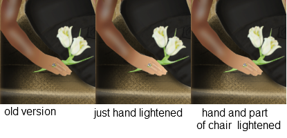
method copy just the hand portion onto a new layer, use brighten and contrast and lighten then blend the lightened hand layer by running a transparent gradiant up from the middle of the hand towards the elbow. good method for adding shadows and highlights. this also is part of how the hair variation of tones is done. along with some blend of multiply.
@Frontcannon welcome to my gallery I'm so glad you stopped by. As I told Kemaru I once did a tut for a simplified version of this same pear. viewtopic.php?f=31&t=28453 The blur shading is the same way I've done most of the ladies skin and facial features. The hair is not difficult just very very very time consuming and detailed. Yes very many layers but this is my major work for the year. This is just part of the file, there are also similar files on the wine bottle and the flowers and the background art. and yes like all I try I put full effort, and involve more than just brain engage, but try to also add from inside my heart and soul. Each image is like a little piece of me I share with all of my friends here.
ciao OMA
-
Helen Beginnings is one of those real thought provoking images that stays with the viewer long after they've moved on to other galleries. I really find this one is intriguing. Great Job!
absolutley stunning work.
it is always a pleasure viewing your art.
ciao OMA
-
DragonG1 I like the stone race! very funny.
lots of good entries its nice to see so many ! Will be a hard one to judge. Actually think you all should be proud. Some have more experience but those begginners in the competition are showing some remarkable workarounds with their limited how to do knowledge. Some real up and commers in this one.
I look forward to viewing how this one comes out.
ciao OMA
-
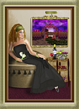
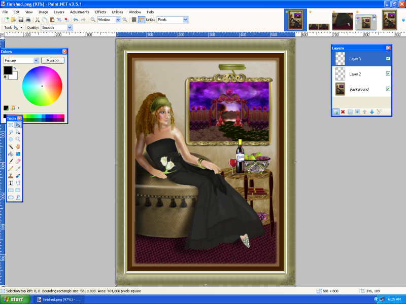
Well Its 2010. this morning I post the final of my princess image.
The image was extremely challenging for me to complete. The pose and the shading are some of the hardest I've ever done. I did manage to redo a better hand but the colorization just would not work in with the original so I had to salvage and merge bits and pieces of the new and the old using gradiants. Not 100% on the hand but overall for difficulty I say this is my signature piece for 2009.
By working on this one I have gained new skills and have learned where my weaknesses are. I know what areas I need to concentrate on in 2010. That alone makes this one what I think is my best so far.
here is the final version for Paint.net
and you can view work in progress shots on pg 74 .
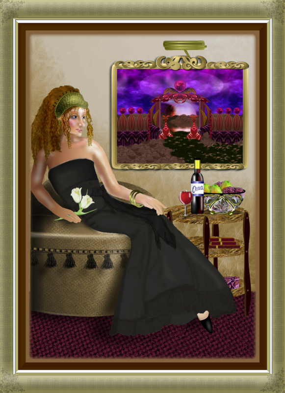
25456
thanks you to all who looked and left messages of encouragement. I don't think I could have tackled such a difficult picture with out your support. For those that looked but didn't leave a message, I hope the work in progress shots helped you a little bit to see how this one was done. (I'd love to hear from you even if you just say Hi OMA I stopped by for a looky look.
) ciao OMA
edit give me a few mins and I'll post the large version on DA just so you see some of the little shading details that the downsizing hides. (hair and dress)
.
-
Thank you Oma.I wanted to enter my first comment but i think i'm better at Humans haha.Once again thank you for voting for me.

you are more than welcome, I know you are much better at human form drawing, and I saw you really stepped outside your comfort zone with this one. That was the main motivation for voting for you, the step up to a challenge of something that you've not tried or have limited knowledge of doing is in my opinion something that in time makes one of the better artists on the forum.
ciao OMA
-
I voted for you forbiddenrose.
and my granddaughter told me she voted for Zieon.
don't let this get you down you have a nice talent for art and I'd seriously not like to see you get discouraged over some that haven't really given you a chance to find your feet in the forum. They all started somewhere and believe me they were not the best at the start. I was here watching them grow as artists. But honestly I can not ever recall that they received nasty comments like that when they were starting out. So they shouldn't be giving out nasty.
ciao OMA
-
thanks you AFG, Barbieq, and sokagirl. Aislin it is so nice of you to drop in for a wee visit.
I'm working on the redo of the hand tonight, not going so well. I'm not into paint.net tonight so I'll be taking a break. Hot cup of tea and a great book.
just wanted to show the latest updates added them on pg 74 with all the other wip on this one. there is one image added of the new hand very early stages, and also you will see sneak peek at the background.
very near done. most likely will be finished New Years day ,,, fingers crossed. Then I can get back to looking thru the galleries more closely instead of just wizzing thru them like I've been doing this past 2 weeks.
ciao OMA
-
Yes, but what if the blur could be adjusted on-the-fly without stepping back in history; like the opacity bar? That would help if you messed up a blur a couple steps back.
since I use blur all the time, let me clue you in on a secret. It gets easier with practice. and you make less errors several layers back if you make a duplicate layer uncheck one of the layers and then blur. you can always just go back and swap out the bad blur layer.
longer process but gives better results. also I've been known to use a transparent gradiant on one of the blurs if its way to pronounced.
there are work arounds. but as always the best pictures and best control comes with practise practise practise.
:wink:
-
Thanks you barbieq, Helen, Chad and yellowman. sorry I didn't have much time to respond only a few mins to pop in and add the updated wip.
I'm now nearing completion on this little gal. I've changed the gown somewhat from the inspiration. It just looks more regal in a dark color. I wanted to get away from the sweet look, dark just looks more sophisticated. Besides who ever heard of a little beige dress, it is always the little "black dress" is the must have in every girls wardrobe.
so "nearing completion wip image has been added on pg 74"
thanks everyone for looking
ciao
 use that noodle and get creative. clue..... most people incorporate it into textures. since most plugins are seldom used alone but in conjunction with other plugins it will be part of a making some extreme texture.
007 Nab's Gallery! (m/d/yy) 10/2/09
in The Pictorium
Posted
nab those floating islands are just the cats meow! I remember when Ben inspired me to work on the Once upon a time image I did when we first opened the new Pictorium. Well I think this type of picture might just go on my scale of just have to try again. I love the realism of the rock surfaces you've managed in that other program. Now if you were
to do this one in paint.net you would have my automatic vote for inclusion in galleria, no hesitation, hands down award.
ciao OMA