


Humility
-
Posts
237 -
Joined
-
Last visited
-
Days Won
1
Posts posted by Humility
-
-
Is there a plug in that like randomly adjusts the shade of a selection of objects? Like if I have 20 leaves and I quickly make it green. Is there a plug in that will make those 20 leaves 20 different shades of green?
-
Well this is certainly useful advice if I can figure out how to apply it. Thank you. Maybe I should have drawn the entire image first then done textures and stuff instead of creating each object seperately then copy pasting it into the larger image.
-
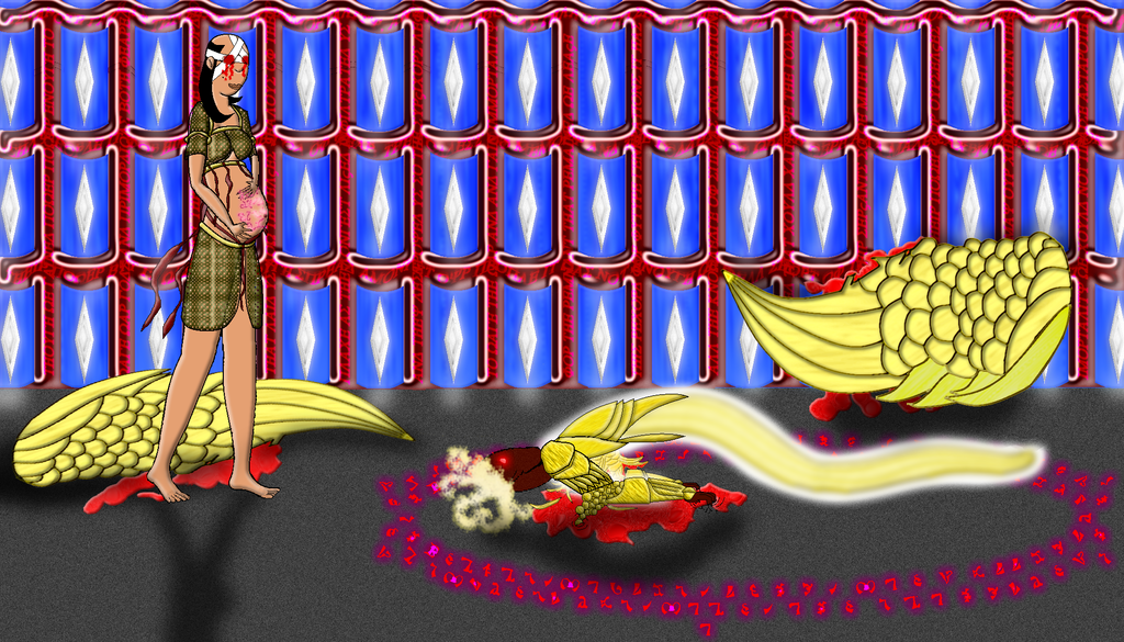
I think I'm going to have to just give up and call this image a failure. I tried angling the wing, drawing the shadow on the wing itself and even redrawing the feathers so their overlap pattern was going the opposite direction.(Feathers don't overlap like that and it became very clear very quickly) It now looks like the wing is being bent in the middle and that its tiny. And now I'm sick of this picture and am just washing my hands of it and calling it a total abject failure. Also I think beveling the blood was a mistake.
My Final attempt.

-
Thanks, I had tilted it straight backwards but I guess I should have angled it as well. Not sure how to do the shadow though as the wall is the light source.
-
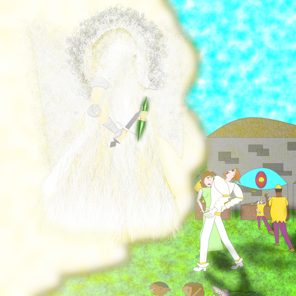
I can't get the upper right wing to look like its leaning against the wall. Anyone have any idea what I'm doing wrong there?
Also I just don't like how the angel turned out.
-
I don't know why but I seemed to have a real regression in quality with this image. But its my first modern image and my first attempt at a detailed face.
-
Two more pictures,
-
Two more pictures.
-
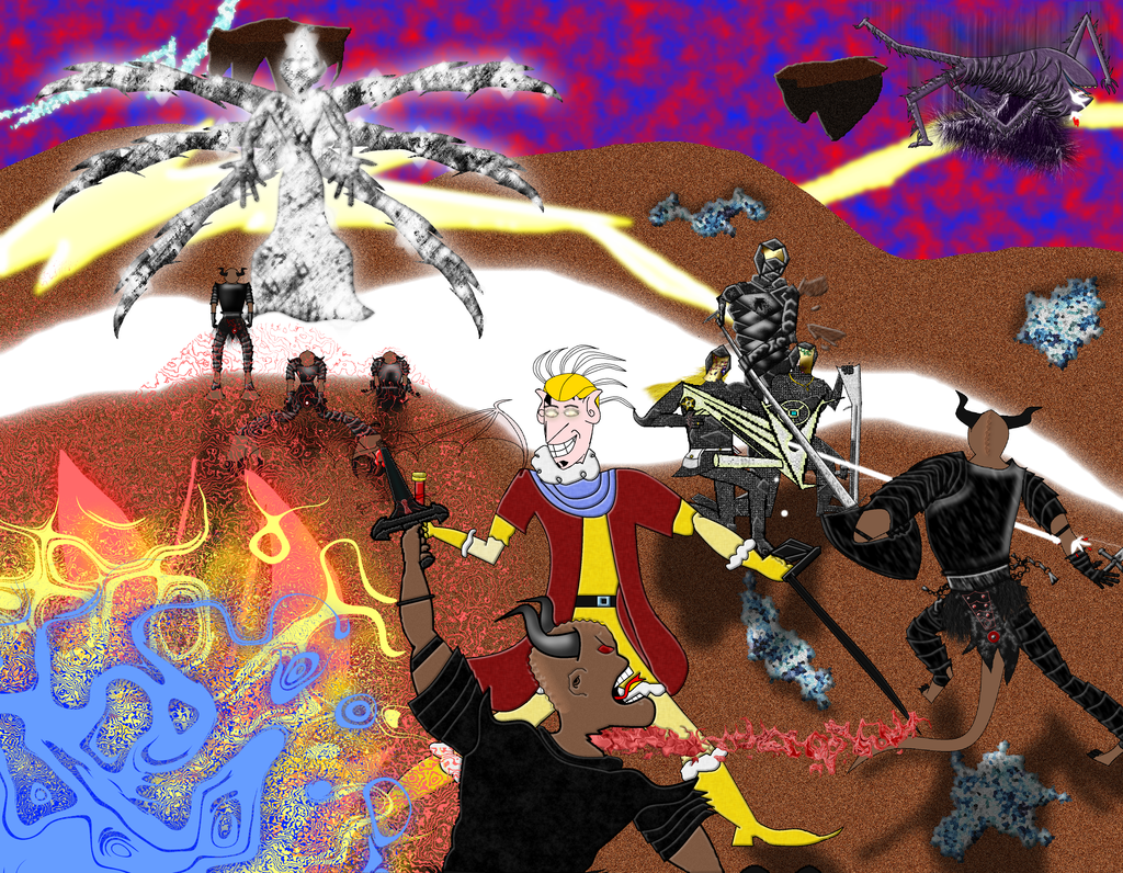
One of my players made this comment about it.
it would be hard to find something not disturbing there
The way it's colored is just strange and i mean a lovecraft kind of strange, gives an otherwordly look in a bad way. More than half the image is just unintelligible, i mean other than the guy with the deranged face (and my goodness, i can tell that was not the intention) and what i can assume are minotaurs i really could not get an idea of what is going on or what i am seeing, other than a collection of colors,filters and pseudo-shapes. I mean jesus what the hell is going on in the bottom left and top left/right.
I mean you got the hellish acid trip dimension right. you got it too right in factHe didn't like it.
-
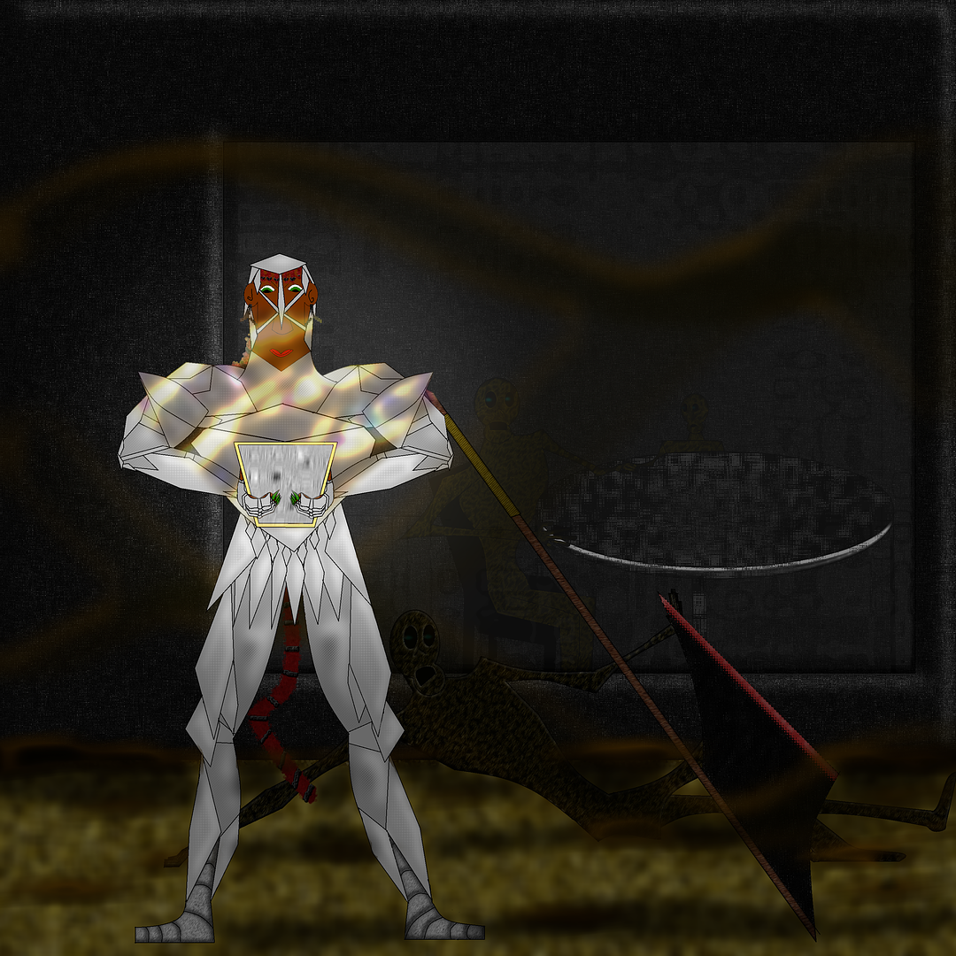
I spent probably the better part of 4 months on this image. II got most of it done but then was so sick and tired of it I stopped for about two months. Eventually I realized I just didn't want to do more on it, ever. So I vomited up a background and called it done.
First off its too large for my computer, I couldn't do anything without it lagging.a lot so that added to the frustration. But Primarily, I intended to add battle damage and corpses and scattered equipment. But I found I really hate drawing the same image or character multiple times. And thats basically what I would be doing. Thats just super boring to me. I could barely bring myself to finish the few repetitions there are already in the image.
I also screwed up a lot of the proportions, which I will blame on fatigue due to the large image size.
So I am never trying a large image again. Ever.
-
I've been working on this single rather giant image for weeks now. Its absolutely the single largest image I've ever attempted and I've noticed my day to day rate of progress is decreasing as I get, I guess fatigued is the closest word to it. Maybe sick of it or bored by it are more accurate. I work on it and work on it and there is still so much to do. How do you handle large image fatigue? Or is this something only I seem to be getting.
-
Oh liquify is the missing ingredient I guess okay thanks.
")
-
I am not actually trying to make a porcupine but its an example you should be able to understand. If I wanted to make a porcupine, with all those hundreds of quills, how would I make it without having to handmake each quill? As I have decided that doing that, is basically a sure path to insanity.
-
I kind of liked the second. It had a nice complexity to it my eyes enjoyed.
-
 1
1
-
-
Its pretty boring to me. The Grammar is very wrong. But I guess the colors are fine.
I see no errors in what you did. I can't really compliment you on any of the art because its not yours, and I don't think what you did made any of the pre-existing images better.
This was done completely in paint.net and I want to be criticized. Forewarning I am likely to respond to your criticisms with questions however do not mistake them for excuses or defensiveness. I just want to fully understand your opinions so I know what and how to apply them to improving.
-
1
-
-
Is this better then the original version?
-
Oh I did have it followed, why isn't it e-mailing me then. Hmm... Got it had to toggle a bunch of switches. Must be a result of the new forum.
-
Oh I forgot to follow this topic. It should do that be default. Thanks for the replies.
-
Is there a polygon line tool plugin? You know you click one point and then another and a line is automatically created between those two points? Also if it creates a secondary window to work in that won't work for me. A simple no will do if there is not. Thank you.
-
Spoiler
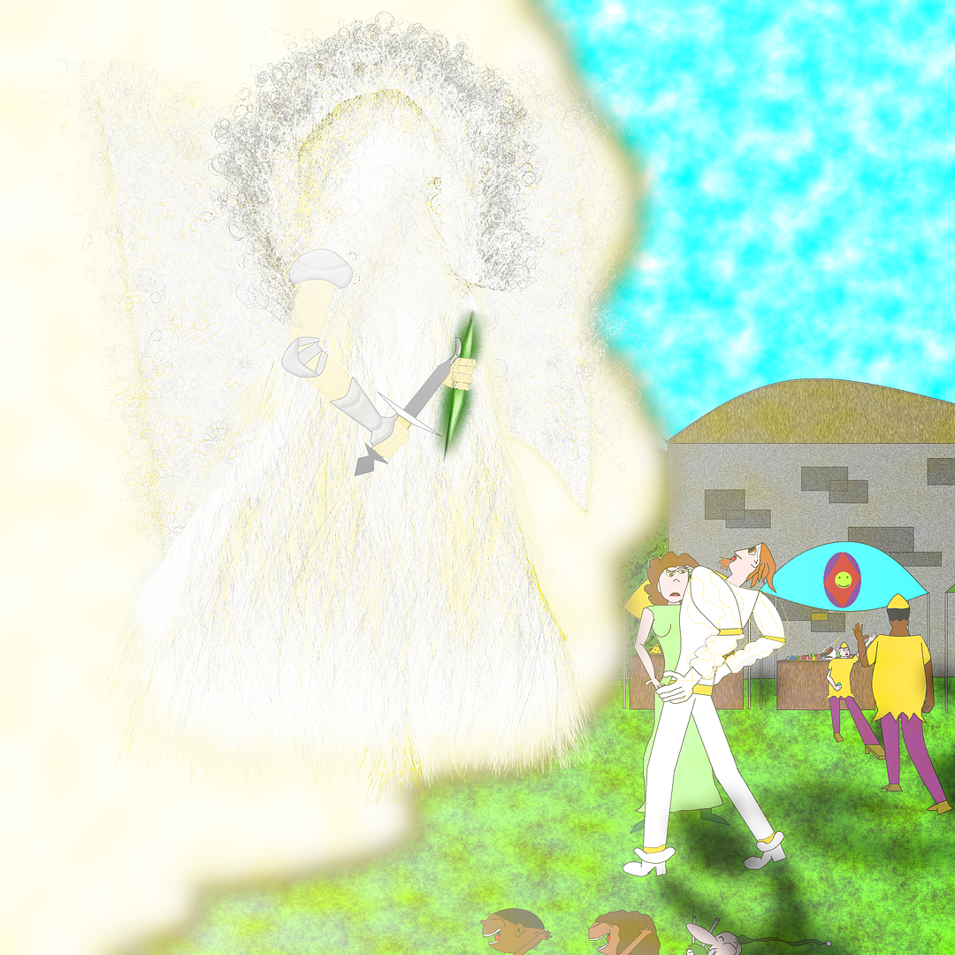
This picture I'm on the fence about sometimes I look at it and I really like it. Other times I feel like I forgot something and its incomplete. Anyway I tried more gradient stuff here.
-
Oh thanks! That angel wing tutorial will be really helpful!
-
My image is actually like 3000 by 3000 so its going to take a while. Thats why I didn't ask how to make it go faster. But this computer has four cores so I think that means it can run four paint.nets.
-
Is there a plugin that can render a lot of feathers? Like on a bird's wing? I tried searching for it but the feather plug ins that pop up do something different.
-
Is there a way to open up more than one window of paint.net? Because furblur can take up to an hour to finish doing its thing and I would like to work on other things while it processes or whatever.

Vary Shade Plug in?
in Paint.NET Discussion and Questions
Posted
the computer knows what an object is. Okay lets say I have 20 objects, all green, can a plug in just automatically change the color within a certain range based on the base color?