


CyberSpace
-
Posts
17 -
Joined
-
Last visited
Content Type
Events
Profiles
Forums
Blogs
Gallery
Downloads
Posts posted by CyberSpace
-
-
UPDATE!
I've added a Vista Folder icon and a Web 2.0 button. Check them out.
-
where did u get that font
?
The top one that says "text" is Franks.
-
Sweet! My brushes list was getting pretty long. You should put this in the description, or a help file, or something.
-
Thanks, that worked perfectly!
By the way, what's up with the "All Categories" drop-down list?
-
Even in version 1.9, if you change the brush size by typing a new number in the box, the brush size will not be changed until you use the brush twice. At least the undo bug is fixed.
Please fix this bug.
-
CyberSpace's Gallery
So I figured I'd make a gallery because I want to show off my work. I'll probably add a header later.
3/10/2010 - Glossy Text
I love making glossy text. This one has the "inner glow" (it's more like inner outline) effect. It also has some diagonal lines in it. I like them. What do you think?

3/9/2010 - Web 2.0 Button
Another Photoshop tut. This one was harder. I like the way it turned out.

3/9/2010 - Vista Folder Icon
Made using this Photoshop tutorial and using some alternate methods for things you can't do in Paint.NET. (My inner glow is a combo of Alpha Mask to invert the image alpha, then outline object to extend it into the image, and gaussian blur to get a "glow." You could probably do the same for and inner shadow.) I know it doesn't really look like the real folder icon in Vista, but I think you can't really tell if it was made in Photoshop or PDN.

Webpage Mockup
This is a mockup for a website I will eventually make.

Lines Thing
Made using this tutorial. My current wallpaper. I didn't put much time into it, and couldn't use random shape fill because it crashes when I open it. Click on it for the fullsize image!

-
Cool stuff. Orange is my favorite color! Also, what font do you use for the "welcome to my gallery" on the first post?
-
That would make sense. I guess I'll have to wait, my upgrade isn't shipping until next month.
-
The text in version 3.5 is very rough compared to 3.36. I hated it so much, I switched back to 3.36. Anyone else notice this?
EDIT: I'm using Windows 7 RC
-
Use motion blur, effects>blurs>motion blur. Also, this should not be in the tutorials section.
-
I think it's been done a few times in the past, but since the legacy tutorials are going bye-bye soon, that's not an issue.
But I also think:
- The glossy layer you add almost completely negates any effect you get from the transparent gradient
You should tell them to use filled shape :ShapeBoth: for the ellipse, otherwise they'll get just an ellipse :ShapeOutline: instead
I think you should explain to select the text layer and globally select outside their text, otherwise it won't select inside the letters if needed
I think the Curves, adjustment to all white and then invert colors was unnecessary...could just turn it to all black and save the extra step
just a few ideas...
Yeah, the white ellipse covers up the top part of the gradient. It's pretty much my fault though, because I did not darken the bottom enough in the example. I forgot to add to use a filled ellipse, I'll change that. I wan't thinking...you could just drag to the bottom right and corner to get black...I'll change that.
- The glossy layer you add almost completely negates any effect you get from the transparent gradient
-
This tutorial is available as a PDF. Click here to view or download it
This tutorial will show you how to make glossy, "web 2.0 style" text.
Plugins needed:Outline Object by @BoltBait or Outline Object by @pyrochild
Optional Plugins:
Color Balance by @BoltBait or Color Balance+ by @dpy
Drop Shadow by @KrisVDM
HOW TO INSTALL PLUGINS1. First, open (
 ) or create (
 ) a new image.
Create a New Layer (
 ) and write some text in whatever color you want.
 Name this layer "Text."
2.
 Duplicate this layer. Call the new one "Gradient Text".
With the "Text" layer selected, go to Adjustments>Brightness/Contrast (
 ) and darken the text some.
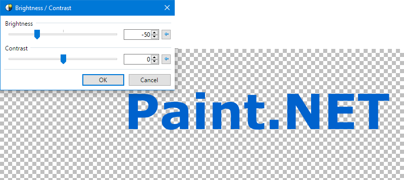
Alternatively, you can use ColorBalance to make the colors match better, and make the text look better in general. (I did; I added more blue)
Then, use a linear (
 ) transparency gradient (use the Gradient (
 ) tool in Transparency (
 ) mode) and drag from the bottom of your text up to the middle. Your image should look something like this:
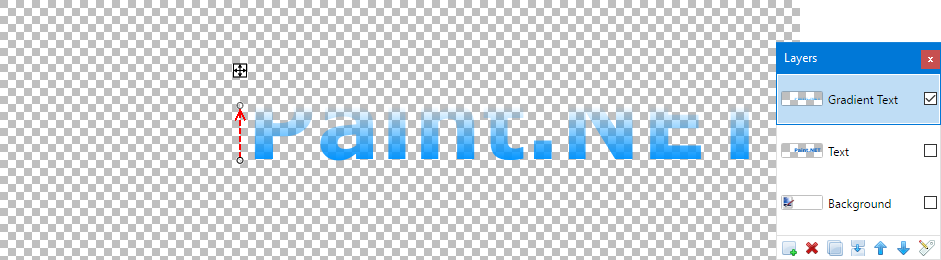
3. Make a New Layer (
 ).
Call this one "Glow."
).
Call this one "Glow."
Select the "Text" layer, and using the Magic Wand ( ) in Global (
 ) mode, click on your text to get it selected. Set Primary color to white.
Switch back to the "Glow" layer, and using the Ellipse ( ) tool in Draw Filled Shape (
 ) mode, draw a white highlight on the top of your text. Double click on this layer to open layer properties, then change the opacity to 45, or whatever you prefer. Deselect (CTRL+D) the selection area.
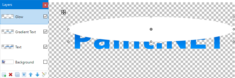
4. Uncheck the "Background" layer to temporarily make it invisible, so you can see how thick the outline will be.
Select the "Text" layer and go to Effects>Outline Object. Outline your text in white. I chose a width of 5 and transparency of 220.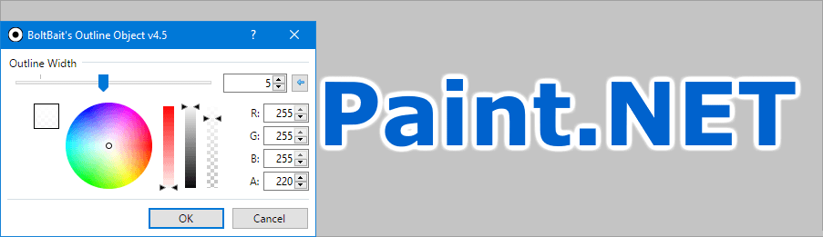
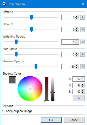
5. Go to Effects>Object>Drop Shadow. Set Y offset and X offset to 0. Set shadow color to R=G=B=92. You can use whatever you want for the shadow size. I recommend a widening radius of 5, a blur radius of 5, and a shadow opacity of 150.
Merge (
 ) all layers and your image should look something like this:
Another example:

Please post any questions about this tutorial, results, and advice in this topic.
Edited by ReMake
-
 2
2
-
-
Glitches:
After you resize a brush, you have to use the brush once before it becomes the new size. This is very annoying.
The undo button doesn't work all of the time. Sometimes three times, sometimes none.
Other than that this is awesome!

Could you add ctrl+z and ctrl+y shortcuts? (undo and redo, respectively)
Good Job!
-
-
First attempt. Suggestions?

-
Sweet tutorial! This is now my new desktop background.
Resized from original.


 ) or create (
 ) a new image.
 ) and write some text in whatever color you want.
 Name this layer "Text."
 Duplicate this layer.
 ) and darken the text some.
 ) transparency gradient (use the Gradient (
 ) tool in Transparency (
 ) mode) and drag from the bottom of your text up to the middle. Your image should look something like this:
 ).
).
 ) in Global (
 ) mode, click on your text to get it selected. Set Primary color to white.
 ) mode, draw a white highlight on the top of your text.
 ) all layers and your image should look something like this:

CyberSpace's Gallery NEW 3/10/2010: Glossy Text
in The Pictorium
Posted
Update!
Glossy text has arrived. What do yo think?