


LFC4EVER
-
Posts
2,430 -
Joined
-
Last visited
Posts posted by LFC4EVER
-
-
Experiment! Don't be afraid of trying out new things, new settings. Just go crazy, and you'll learn a lot!
-
It has enough feather in my opinion but the cutout is way too rough
I thought the whole purpose of feather was to prevent the cutout from looking rough. :?
Yes it is, but he meant rough as in the shape of the cut-out isn't good.
-
This is what Google Translator comes up with:
Chinese:
嘗試讀取或寫入受保護的記憶體。這通常表示其他記憶體已損毀
Try to read or write protected memory. This usually means that other memory has been damaged
Japanese:
嘗試讀取或寫入受保護的記憶體。這通常表示其他記憶體已損毀
嘗試讀取寫入receive protection or體memory. Display這體已other memory loss毀
P.S. I didn't know what language so i did both lol

-
P.S. How do you delete custom brushes from the list? I dont want all of the Winter Brushes but I can't delete any.
In your My Documents folder, there should be a folder called Paint.NET User Files, inside there, should be your brushes.
Heh, not bad:Not bad!? Its excellent! Good work!
-
When using move selected pixels, if the cursor is a hand like this:
 then it resizes the image. If it is a black arrow (sorry no image) then it moves the image.
 -
... because he was the "best tag maker" around, we were still allowed to criticize his work.
Well said. Also, nobody is perfect, theres a fault in everything, big or small..
-
Oooo, a realistic pen! Very nice! If you want to make it more shiny, then you could play around with Luminosity in Curves for some parts of the pen.
Made this "Aqua Text" from this PS tut in PDN, it is 100% PDN!

-
Press F1 on your keyboard whilst in Paint.NET, you should find a lof of information there. Or go here
-
Gah! I always used to love your sig, but now it doesn't seem nearly as good. Copy-past then add color is just too easy!
Yes, its easy, but if you want to make something look good, it doesn't always have to be really complicated. Sometimes simple methods work best.
-
concept for an image I am definitely going to do. I like it.

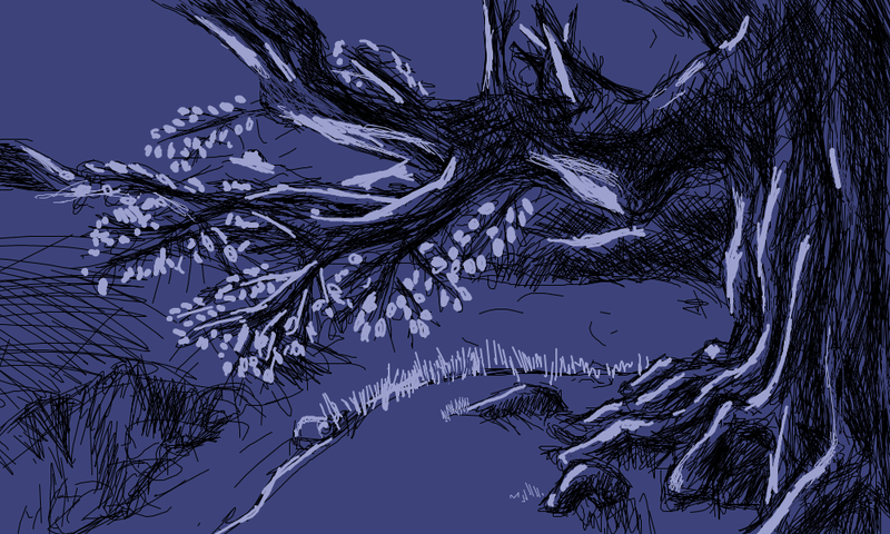
I feel like getting a tablet now.. probably never will though

EDIT: Damn, you can draw so good! Nice image!
-
Could you post an example image?
If not, then you could try making the image black and white (Ctrl+Shift+G) then on a new layer, fill it with a darker colour than you want the end image to look like, then set the blend mode to overlay.
-
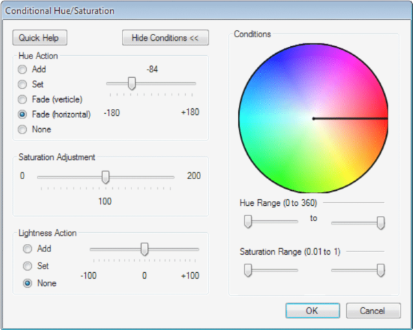
Play around with the Hue Action and the Saturation Adjustment in Conditional Hue/Saturation plugin. It should work.
-
:shock:
Wow..thats so...awesome..
-
That's amazing! Just one question. When I download the ABRViewer, it downloads correctly, but I can't seem to find where it is located. I've tried doing a search, but got zero results. Help!
Thanks, but as for your query, you should ask that in the tut about the brushes.
-
This tutorial is available as a PDF. Click here to view or download it
I am making this tut on my sig, as it has been requested by various people who asked me via PM on how i made my current sig.
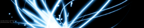
The result is not exactly as in my sig, as i am just showing you how to create the effect similar to this:
Plugins required:
You'll also need the Winter Breeze brush set which you can download here
How to convert and use PS brushes in PDN: Here
How to use Custom Brushes Mini: Here
The tut
 :
:
1) Fill the background black and add a new layer. Name it "Brush" or whatever else you want to. On the new layer go to Effects > Draw with Custom Brush. Find the brush you wish to use and draw (brush size 500 works best), then press the ok button. Then Ctrl + Shift + I (Invert Colours) so you can see the image.
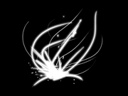
2) Duplicate the "Brush" layer and name the top layer "Inner Glow" and the middle layer "Rainbow". Select the "Rainbow" layer and apply Effects > Colour Filter, and colour it any colour, it doesnt matter which colour as long as it is not black, grey or white.

3) Now select the "Inner Glow" layer and go to Effects > Feather at these settings:
Feather Radius = 1
Effect Strength = 1
True Feather = Yes
Apply a Glow the same layer at default settings. You should now have something similar to this.
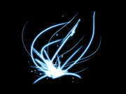
4) Now, using the rectangle select tool, select a section of the brush that you like, I'm using a selection size of 500px by 100px here. Then Ctrl + Shift + X (or Crop to Selection).
5) Now select the "Rainbow layer", and go to Adjustments > Conditional Hue/Saturation. Apply the following settings.
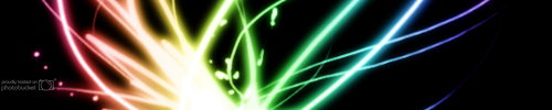
6) Flatten and your done! The end result should be similar to this:
Optional:
In step 5, you can further modify the settings such as the hue's in the rainbow by moving the slider in the "Hue action" box, or you can modify the Saturation settings by moving the slider in the "Saturation Adjustment" dialog box.
In my sig i used more brushes of the same set, and did more work on it, but the effect is very similar..
Please post your attempts and feel free to comment.
-
The 3rd is my favourite too, but i'd download the feather plugin as the dinosaur cout-outs are a bit aliased :AntiAliasingOff:
-
Photo-Mainp #5 Entry Added! See first post.
-
I did quite a few things on it, i didn't like the bottom bit, so i deleted that bit.
My Entry:
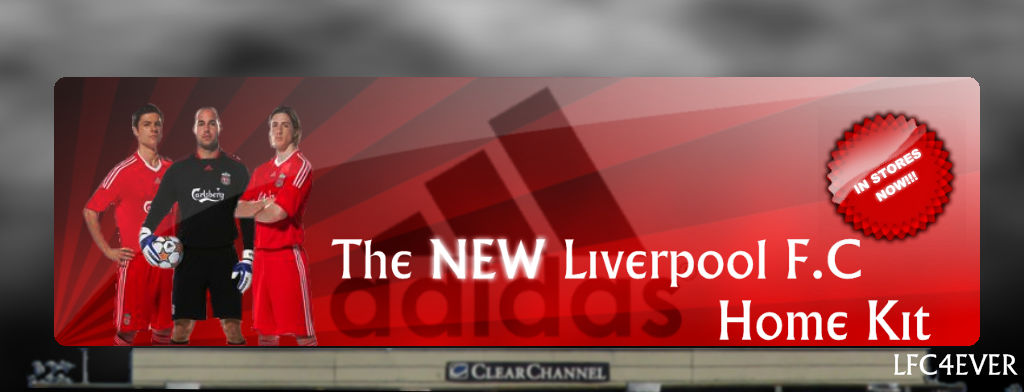
Stocks used:
(The adidas logo isn't a stock, i created it in PDN)
-
did you do that paper? or is it a stock? if so can I get that link?
The link is in the tut google_img provided, but its here if you want it too. I edited the paper though to give it that "old" feel.
-
A link to a tut, it should help:
-
Here's one i did (couldn't be bothered to add a hat
):
-
Generally, i think that people familiarize themselves with PDN by following tuts and just experimenting with PDN.
-
4. Use the object outline plugin to give a black outline to the text.
5. Select the inside of each letter while holding down ctrl.
6. Set your primary colour to white and secondary to orange. Click
 :LinearGradient: :AllColorChannels: and experiment dragging the mouse around several times until you have an effect you like.
Wouldn't it be easier to outline after the gradient has been added?
EDIT: You can use the Multi-Colour Gradient plugin to achieve the 3-colour gradient effect
-
:shock: Wow, those fingers are really realistic!! You could add more tone and shadows under the fingers.
Keep up the good work!

 then it resizes the image. If it is a black arrow (sorry no image) then it moves the image.
 :LinearGradient: :AllColorChannels: and experiment dragging the mouse around several times until you have an effect you like.
PDN Crashes
in Troubleshooting & Bug Reports
Posted
Oops, i missed the edit.. :oops: