


LFC4EVER
-
Posts
2,430 -
Joined
-
Last visited
Posts posted by LFC4EVER
-
-
I think he means the way it arc's..
-
Are you tryin to make an image of a rotated rectangle, as that can be done by drawing a normal rectangle and rotating it with
 by right-clicking and dragging.
 -
If a book or PDF file is made, then wouldn't it be easier for everyone to write at least 1 page of the book/PDF file and someone has to compile it all together and check it. That way its not too much work for just one person and it would also be much quicker to write.
-
nice use of brushes there! i like them.
My sig made from brushes too

|
|
v
-
Nice image, i like the way you made the curvy, wavy lines.
I'd make the text white though.
-
what would Pressure Sensitivity do and what is it, and how can it be used?
It varies the tone of the brush by the amount of pressure when drawing with a tablet.
Oh, i see, thanks!
This would be a good idea IMO, even though i don't own a tablet (probably never will) but i think it would be immensely useful in Paint.NET.
-
You could add an image, or use custom brushes to get a nice fractal thingy on the left.
-
How'd you create the glowing lines in your current signature? They're very nice, bright, and colorful.
Your gallery looks quite nice.
The lines were done with Custom Brushes and the colour was done with Conditional Hue/Saturation. The glow bit was done with drop shadow, glow, etc.
-
I'm confused, what would Pressure Sensitivity do and what is it, and how can it be used?
I'm guesssing its like opacity?
-
Another take on experimenting with wood:
-
Nice Gallery... but probably would have been beter if you had Arsenal in their
 :lol:
:lol: I like how you adjusted the twist offset so that it wasnt all in the centre. Cant wait to see more stuff from you!!!
and Liverpool...

Anyway, your stuff is good, with good matching backgrounds, but try different kinds of backgrounds instead of simple vortex's with twist and zoom. Experiment with Paint.NET more and you'll find there is a lot you can do with it.
-
yep, i believe that sigs are only worth their value if they have no stock/renders.
-
Have you changed your sig/ava combo because of liverpools reverse against chelsea?

No, i haven't changed my sig due to Liverpool "UNFAIR" loss against Chelsea. I had changed it just before as i wanted to do something different for a sig.
I'm still trying to get over the fact that Liverpool lost..

-
Once again Ash:
:shock: :shock: :shock: :shock: :shock:
Amazing photo manipulation Ash, and if only we could use PDN on mobiles..but then it'd have to be a good mobiles like to one you've manipulated or a LG Viewty/Nokia N95.
-
Nice stuff there Champ, i see that you've found the custom brushes plugin very useful and made amazing use of it. Many of your sigs are really good! Why don't you try and make a sig/avatar without using Custom Brushes or any stock/renders.
-
I see some very good stuff here. The icons are amazing IMO, and some of the sigs are really nice!
Keep up the good work!
-
Hmmmm..the icicles are getting better Icefusion, but the edges are a bit different, as some bits are sharp and some are really blurred. look at a picture of icicles, and you'll see that they have a sort of inner blur-shadow type thingy. Good work though!
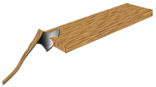
Here's my try at a falling axe? 100% PDN, no stocks, renders or brushes used:
-
:shock: :shock: :shock:
Wow!!
Amazing brushes there -Expriration-, and the glow around them is really nice!
I can't see anything wrong with it, and i suggest you enter your piece.
Good Luck and i hope you win (then it'll prove that PDN is just as good as PS)
-
Hmmmm...your work is ok..not bad..but not really good.
The gravestone image is good, but could be much more realistic by:
+ the gravestone being a bit stoney and rocky (add noise, then relief)
+ the sun can be a simple radial gradient, but if you wish to use dents, then try using bigger dents to get a more flame-y look. I suggest the picture being dark, and set at night with a moon.
+ the grass is good, but take a look at the grass in ZizOiz's gallery, my gallery (link under sig) and a few others. Also try using Ash's tut on hair.
+ Add a shadow on the gravestone.
-
Nice icicles, the transparency of them is good IMO, but i feel that the wavy'ness of them, ruins it slightly.
I'm going to have a go at developing some icicles too now...i was going to do that before..but i never seemed to get round to doing it.
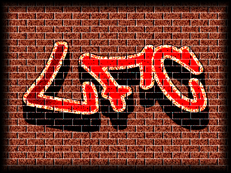
Here's my take on creating graffiti, done in around..15-30 minutes:
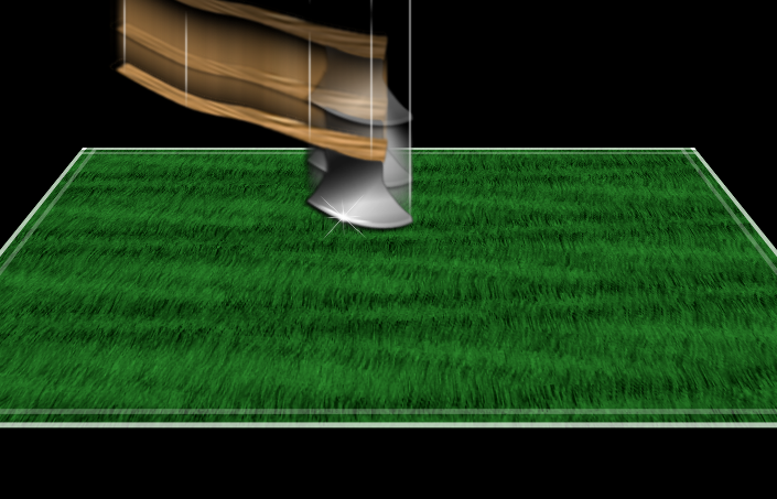
This is my try on realisitic grass too. i think it turned out OK..ish:
-
mhh i think my grass looks more realistic like yours tillerman and the stem is out of the tut from Ash, so it's realistic
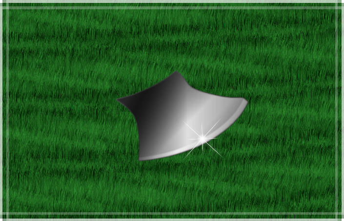
i have overworked(?) the handle of the axt, but i have problems with the chrome/metal thing although i have read all tutorials for that
Your grass could be made more realistic by using different shades of green and having no white outline. the different shades of green should show the different grass blades.
For the axe blade, try using Ash's really easy 3D metal/chrome effect tut
EDIT:
Here's an example:
-
:shock: :shock: :shock: :shock: :shock: :shock: :shock: :shock: :shock: :shock: :shock: :shock: :shock:
Wow..
*stares in amazement and cant think what else to say*
Ash, your sig says "A picture is worth a thousand words", and you're right, but in this case you're wrong.
Your Ironman, is too good to even say anything about it.
-
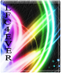
My new avatar, but i'm not sure what colour i should keep the text. its black now, but its a bit unclear IMO.
Any ideas on what colour i should make the text?
-
Cool C4D sigs with shape 3D Blooper and -Expiration-. They look amazing!
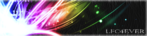
Nice work.I made a matching sig and avatar:
Avatar:
Sig:
 by right-clicking and dragging.
 :lol:
:lol: 
turning ps brushes into pdn brushs
in Paint.NET Discussion and Questions
Posted
There's a tut on how to do this, this should help:
Tut by morphedkirby:
Convert PS Brushes into PDN Brushes