


LFC4EVER
-
Posts
2,430 -
Joined
-
Last visited
Posts posted by LFC4EVER
-
-
That grass looks just like the perfect grass in a meadow.

Amazingly done!! I'll look forward to see the rest of the image!!
I'm sure it will blow my mind.

-
Excellent work everyone! Keep it up!
-
You've got some good work here! My favourite is the Photo-manip, i really do like how you made it look like a photo taken many years ago.
However, your "Illinois Janeece" could do with some feathering around the text, as it is a bit :AntiAliasingOff: Aliased.
Keep up the good work though! Looking forward to see what else you can do!
-
lol thanks.
 :wink:
 -
@LFC4EVER oh how nice of you the first letter of my name!
thanks a bunch now just to struggle thru the "M" and the "A"
and I'll be all set for a new avatar and siggy.
great job on converting that tut. would be nice to actually see a section here for those type of translated tuts. Well oma, here you go!

-
Can't wait to see the completed grass and tree!!
P.S. Check your thread title, its a bit messed up.
-
5th June '08 Update: Various images added. See first post.
-
I've been wondering how to do this too, but i don't think its possible. It would make it really useful though!
-
@topezia: Thanks, and the notepad is much better!! The page curl is really good too, and those nectarines in a bowl, very good use of Shape3D. Keep up the fantastic work!
@oma: Thanks for the comment! I may do the letters M and A, could be a nice challenge.
-
[shout] Shiny! :shock: [/shout]
8)
very shiny and very good.
Thanks!
Wow - those are crisp and sharp - looking really great (better as thumbnails the size you posted)Awesome job on this one-
You're getting a lot better man! Way to go!
Thanks! I'll probably redo the icons again, but on a larger scale as they do have quite a bit of :AntiAliasingOff: around the edges.
nice lookin icons man!Thanks!
-
@LFC4ever---Love the text effect you've got there 8)
I made a realistic Earth map:

It's not quite done (ie. Missing countries) but I might not get around to it for some time. Besides, I'm happy with the outcome
 . Open to all comments
Thanks, and well..your earth map is just astonishing!! The swirls in the clouds make it look so much more real! Excellent work and keep it up!!
-
-
This tut should get you started, just cut out the parts of the car following the tut, and modify.
-
Or the Oblique plugin. (click)
-
some widescreen stuff:
Did you draw this one? That's cool.
Must've taken him ages if he did. Looks awesome though!!
-
Also, you may need to resize or tile one of the images to get the whole elephant covered in that texture. Tiling works better for a more clear result.
-
Yes, the boot clips are missing, but the boot clips would only make it seem more realistic, which is not what i'm going for. I need to make it look more "logo" like.
-
Open each image on a different layer, by going to Layers > Import From File.
Make sure the "India Texture" is on a layer above the elephant, then change the blend mode on the "India Texture" layer to Multiply.
-
-
A logo for a school project i'm working on:

Its missing something, but i just don't know what it is..
-
He probably has.
-
A huge improvement!! Excellently done! :wink:
-
-
Made with shape3D, no idea what it is though.. was just messing around


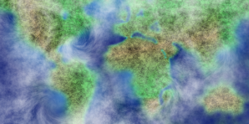


Image Umbrella: Signatures, Avatars, Logos & Text
in The Pictorium
Posted
Thanks everyone! I'm thinking of creating the whole alphabet in this text style (as a side task for when i get bored of some projects i do).