


LFC4EVER
-
Posts
2,430 -
Joined
-
Last visited
Posts posted by LFC4EVER
-
-
Nice stuff topezia! i love the name of the first one. "Doughnut Sun" lol
Pixel land is a good piece too, i like how some of the gradient background colours shine onto the city scape.
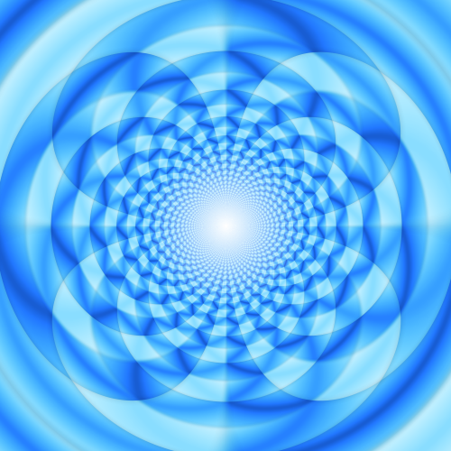
Polar Inversion abstract:
-
Nice tut oma, but on the layer with the rip, i suggest using feather or anti-alias so that it looks much smoother and not very sharp.
Excellent tut though!

-
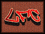
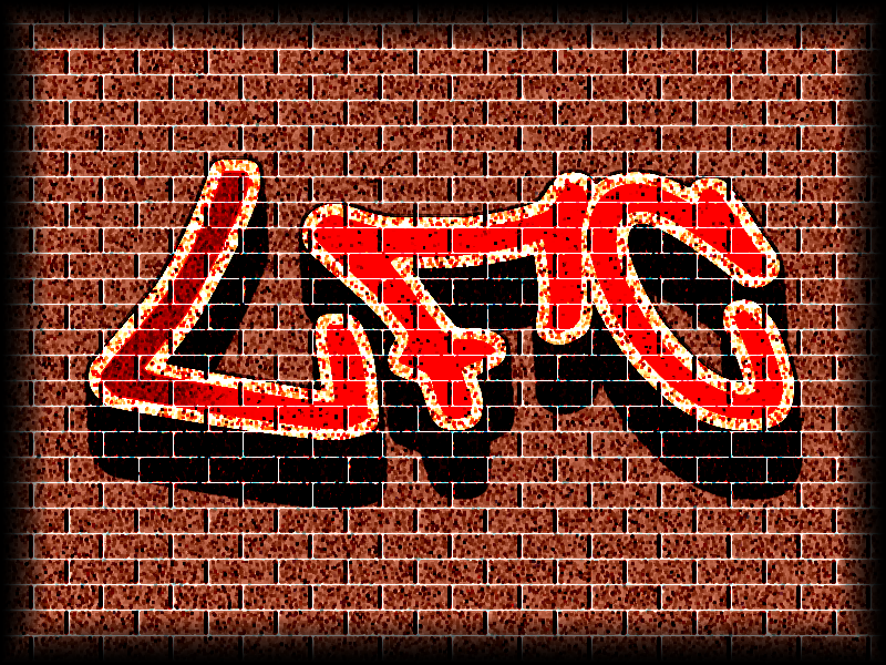
An experiment with graffiti and the newly acquired brick plugin.
-
@ZizOiz: Thanks
@IceFusion: Thanks
Never going to be an "Ash" though 
-

< Insert long introduction type text here which describes my gallery, and so on.. />
Well, here is my gallery!
Note: Most of the images are clickable thumbnails (excluding the "Sigs" section)
________________________________________________________________________________________________________
Space-y =)
Mesmerization:

Starfield:

Planet:

________________________________________________________________________________________________________
Web-Design
LFC Designz:

The 3 pages
Xtravagant Designs (a WIP)

________________________________________________________________________________________________________
The Nameless Category
Wooden PDN Type:

Sony Ericsson C902 (100% PDN except brushes):

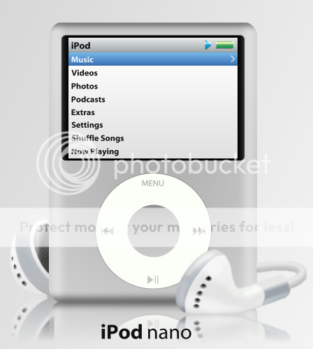
iPod Nano (100% PDN, yes 100%):

Nadal vs Federer - this was an AWESOME match:

World's Hardest Game 3D:

Mother Nature Vector Text:

Merry Christmas
 :
:
Memory:

Plethora of Colours:

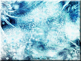
SnowStorm:
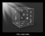
Glass Die:
Year 2500: Earth

Gold Text:

_______________________________________________________________________________________________________
Sigs:
LIVE:

Spiderman:

Gerrard:

Beauty:

Tech-y:

Merry Christmas:

Space-y (guess who this was made for
)
Yuna (also guess who this was made for =P) :

Prince of Persia:

B&W shelf:

Rainbow Mayhem:

Firefox:

________________________________________________________________________________________________________
Wallpapers:
Apple Wallaper v1:

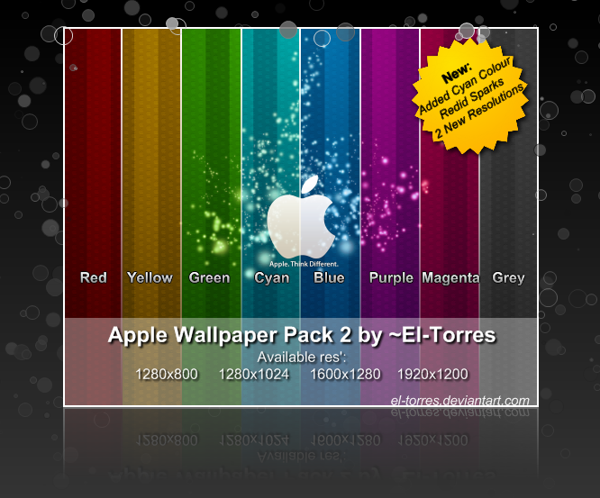
Apple Wallpaper Pack:
Chinese Wallpaper:

Hepxagon:

________________________________________________________________________________________________________
For more of my works check out these links:
________________________________________________________________________________________________________
lol, i've edited this about 50 times..

-
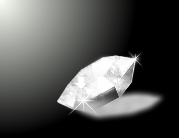
Made this using Ash's Gemstone v2 tut. Its a diamond
It looks pretty realistic IMO so i posted it here too.
-
:shock: :shock: :shock:
Wow..
So perfect..such realism... :shock:
Amazing..
-
My take on a diamond:
-
Not a bad idea...
Thanks a lot everyone who helped! (Especially Ash
 )
) -
Interesting stuff, not bad either too. Keep it up!
Some of your work could be made better by simply feathering the edges. For example the one with the red and black background which says "AJ STYLES" on it has a cutout of someone, but the edges are very sharp and pixelated. If it was feathered it would look a lot better.
P.S. I'd change the name of the thread to something like "simple's Gallery"
-
I meant the shine on the body of the PSP, not the screen. Sorry.

I'm thinking of adding a reflection of something onto the body of the PSP.
Do you think it could work, i'll post it again soon.
-
Worldnewser, Sabrown100, Ash:
Thanks for your tips.
@worldnewser: i vaguely get what your trying to say, but it would be very helpful of you posted an image, as it seems a bit "coarse" as you said.
@Sabrown100: i like the glare things you did, looks a bit more realistic..and i think i know to to make them.
@Ash: any ideas on how to create the shine on the image you posted? I'm clueless on how to do that.
Thanks all
-
@Oma: i like your brush. Its could be used to create leafy things, e.g. ferns, plants and leaves. It could also be adapted to create other fancy flowery things. I see a good idea there, but i dont have a clue on how to adapt it.
Made a PSP on Paint.NET recently (99% on PDN, with images used for reference and the screenshot is an image too)

I was wondering on how to make it look more glossy and shiny as if it has a reflection on it, to make it more realistic.
Any tips how?
Thanks
-
@R3VENGE:
It looks good. i like the use of Shape3D and the tilt of the "window" adds depth IMO.
However, it doesnt look like a window to me though, dunno what it looks like really..a glass pane??
Made a PSP on Paint.NET recently.
99% of it was done on Paint.NET, but a few images were used for reference, with one used as a screen.
NOTE: The glass "L" and "R" buttons on the top are a bit blurry, and although i tried to make them a bit more like glass, i obviously didn't succeed IMO, but thats my best shot at glass.
(Posted this in the Image Hospital too, for tips on how to improve)
-
Drop shadows can be done by first downloading the plugin, you can use the Paint.NET search to find one easily.
The effect will be found under:
Effects --> Stylize --> Drop Shadow
-
When i want to create a glow behind a text, i normally use "Drop Shadow" by Kris Vandermotten or "Outline Object" by pyrochild. I find that drop shadow is easier to create simple glows though.
-
Oh yeah, i see what you mean. I'll go and edit that later.
Thanks for the tip!
-
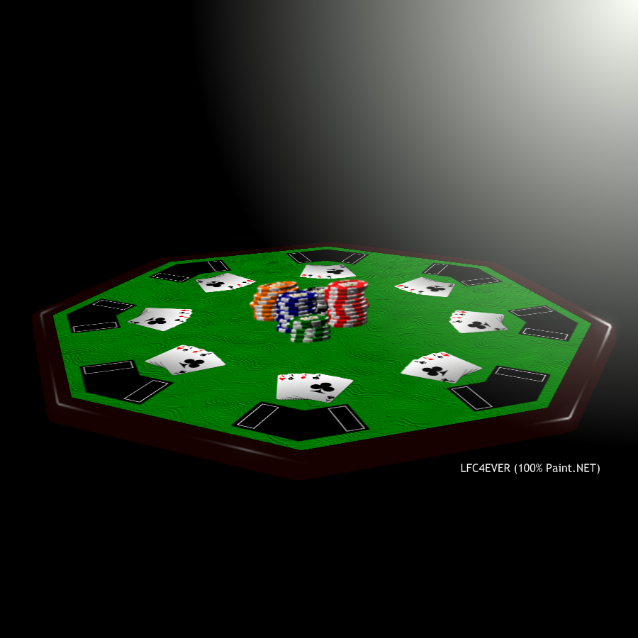
Amazing tut! I adapted the tut to create a poker table in a dark room.
-
I'd be really grateful if you could make a tut for the glass text, whether all three of you create it or just one of you, it doesn't really matter.
@Mike Ryan: i really like the glass text in your gallery
-
you could try a different angle (one where you can add more 3D effects), and maybe include some tones of light too, as it looks a bit flat.
-
Add a new layer :AddNewLayer:
Write the text on it
This way the text is on a transparent background and you can fiddle with it to suit your liking without ruining your background.
-
@LFC4EVER
looks amazing!!
now maybe put some kind of senery in the background..like a crowed looking on
great work!
Thanks! I may do a scenery in the background but the look i was going for is the table in a dark room with only the top being lit (that's why the table has no base
)Your sunset is excellent IMO, but to make it better i would make the sun more blurry around the edges and not that sharp. Try feathering or using a Gaussian blur.
LFC4EVER: :shock: Wow! that's incredibly realistic, right down to the shone on the wood! Nice work!iRock: That's a great color combination in those clouds-it looks just like sunsets I have seen!
Thanks!
-
do what it says to do then, just e-mail it to paint.net@hotmail.com
-
After having a read and attempt and the playing cards and poker chips made my Cjmcguinness, i decided to create a poker table.
Here it is:
Comments and how to improve it welcome!


Curved Text
in Paint.NET Discussion and Questions
Posted
Curved text can be done easily via the Tube Oblique plugin found HERE