


k.digennaro
-
Posts
909 -
Joined
-
Last visited
Content Type
Events
Profiles
Forums
Blogs
Gallery
Downloads
Posts posted by k.digennaro
-
-
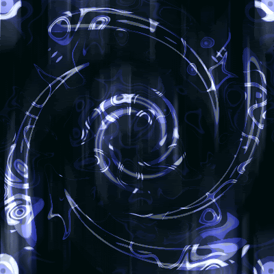
here's an abstract, it was fun to do, quite simple, a couple gradients, polygon plugin in and dents
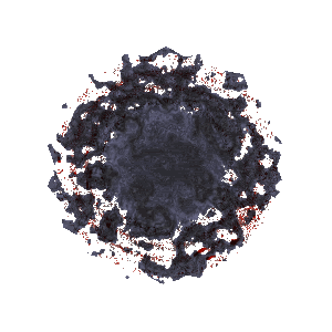
edit: sorry should have saved it as a png lost some of its quality o well
-
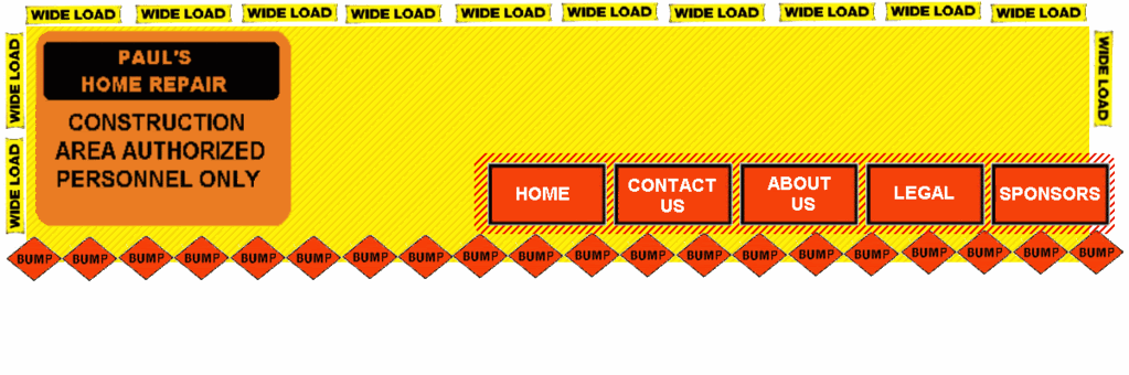
Bright colors are not the way to go when designing a website...especially multiple bright colors. Yellow in particular makes me go "ow my eyes!"
 Anyway, that's my two cents...perhaps add some shading to make the buttons stand out a little as well...? Good luck! 8)
thanks for the advice, i think im just gona create this page like i usually would instead of trying new things. Ill try some new stuff on my personal page instead. The one i drew above^^ kinda reminds me of home depot lol.
-
okay so i tried a different approach, im kinda playing around with this project because its a volenteer project. i went for a less professional look. In my mind i was thinking of a little kids room, decorated with construction symbols, i only did the header so far, what do you think?
-
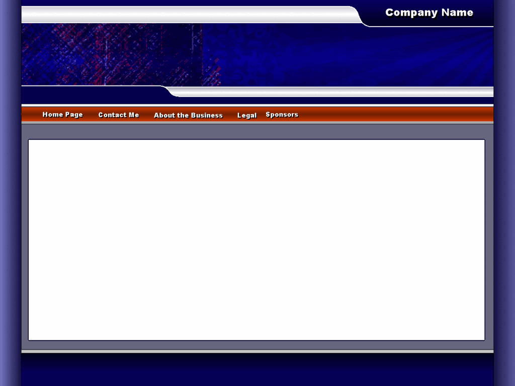
Also, assuming it is a business, IMO it should say "Contact Us" rather than "Contact Me".
well its a self owned/ran business, theres really only one guy. Ill probally change it any way just because you dont see many 'contact me's lol
Still - "Contact Me" sounds unprofessional to me.
true, ill fix it
 , still working with the layout.... the client really is giving me nothing to go on... just 'make a web page' haha, so its a bit annoying because ill show him something say 'hey about a button like this?' and he says 'looks good but i dont want blue' 'what color do you want?' 'it doesnt matter' lol but were geting some where lol, its a handy man page, im scraping that design above, i like it but its not what i was trying for, ill keep it in my portfolio for now. I think ill create a website that looks kinda like a construction site...hmmmm.. any ways thanks simon, ill be sure to post the final here
Kevin
-
Also, assuming it is a business, IMO it should say "Contact Us" rather than "Contact Me".
well its a self owned/ran business, theres really only one guy. Ill probally change it any way just because you dont see many 'contact me's lol
-
- [*:1bknox54]I don't really like the background.
[*:1bknox54]The three-point gradient looks a bit unprofessional to me.
[*:1bknox54]I think the white part joined to the header image should be part of the header image rather than white.
thanks for the tips simon, i agree with the gradient thing, i wasnt happy with the color scheme, ill go back and redo it tommorow, i need to add some more shading to the white part, i have a vision for that, but it didnt quite work out, ill post my final some time tommorow.
Thanks
Kevin
- [*:1bknox54]I don't really like the background.
-
here's another web template, would love some feed back on this one! this one's a business page for one of my clients, the color scheme etc. will most likely change.
enjoy!
-Kevin
edit: i no the text is misaligned ill fix it later
.Also sorry bout the doulbe, wow i mean tripple post. Its been like a week lol.
-
Great work. I like the web templates you made; very clever!
Thanks
-
Well....still working on the band page...lol, i have it basically up and running, but for some reason i still wasnt quite happy with the layout of the site, i felt like it restricted the amount of material i could put on the page. I made some major changes to the layout of the page, here's where i am so far, leme know what you think, I'd love to get some feed back, everything is 100% PDN.
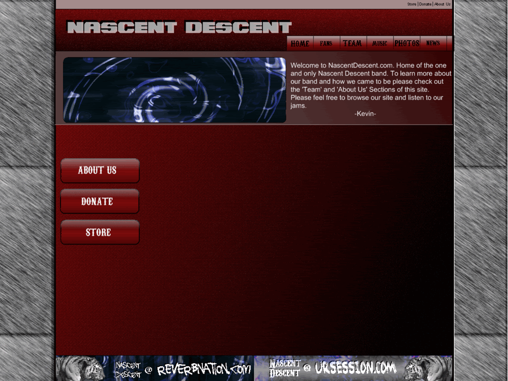
edit: the banners at the bottom of the page are 100% pdn, i used a stock photo, and rendered it beyond beleif for the tiger head, the background etc was all me
, anyways i was really happy with these banners -
updated textures with a grundge texture i came up with
-
@k.digennaro you've come a long way !
 I remember when ms paint was the cats meow with you. good work Kevin. I think you are finally starting to realize the full potential of what this program has to offer. Your pictures are starting to show much more depth and are starting to be more thought provoking.
 excellent work....shows what practice does.
ciao
Many thanks for the kind words Oma, and thank you so much for helping me get to where I am today, honestly I would still be stuck in my MS paint phase if it were for you and ash. And of course the rest of this community and you two had a special impact on me for some reason.
Many many Thanks,
Kevin
-
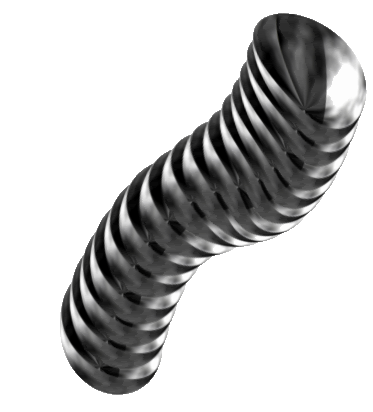
Tons of good works! I like some of your sigs (not the one with the pool though, it is not politically correct... (unless you make one with same text but from the wife's point of view :wink: ) like the gears background, lots of your hand drawings (cute the sig with duck and fishes!) and the metallic spring like thing which I presume is your latest work,
good stuff!
ciao ciao
thanks topezia
, yeah i just did the spring yesterdaytodays upade*
Random pics/ Blue ice, and metal tiger
Enjoy!
Kevin
-
Here's one i call blue ice
-
Render/Drawing of a tiger possibly for my band dono lol. Its got that brushed metal inlayed look, atleast thats what i was going for.
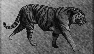
edit: i think i need to feather it a bit more
-
*updated random pics
Was just having some fun with shape 3D and came up with that, i thought it looked cool
probally will be another update today
enjoy!
Kevin
edit: just added another one i did with shape 3D, i call it 'Cresent Moon'.
The reason for these shape 3D images is because I'm not very familar with the plug in, im trying to learn more about it
-
here's one i just did, was just messing around with some texture and shape 3D. It kinda reminds me of a venalation duct. Not to complex, but looks pretty cool.
-
here's a metal texture i created. It looks pretty good. iono lol.
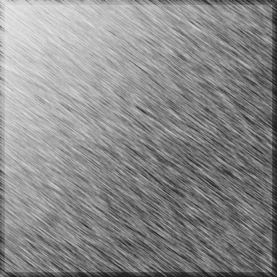
edit:leme know what you think
-
update*
added two images i created for my band. Under random Pics.
-
wow nice too bad their is not a good border plugin for pnd
everything rocks exepect those misc things.........
Its pixel art at the simplest
, but for pixel art its not bad, you could go into a little more detail, but pixel art is harder than most people think , atleast true pixel art.Good Job Fire_Ants, keep up the good work!
Thanks

You should definatly get Pixel World Started again

yeah, i sent topezia a pm asking for help lol, ive got to much going on right now to completely run it on my own
, im waiting for his reply -
wow nice too bad their is not a good border plugin for pnd
everything rocks exepect those misc things.........
Its pixel art at the simplest
, but for pixel art its not bad, you could go into a little more detail, but pixel art is harder than most people think , atleast true pixel art.Good Job Fire_Ants, keep up the good work!
-
i love the drangon picture
thanks
one of my favorites -
updated with some web temps, and some other radom pics, please remember that some of/ most of these images are under copy right, especially the web temps and the logos, if you would like to use an image for somthing please just ask.
Thanks
Kevin
-
Yeah, I think that would look better. A more consistent feel.
I also suggest using a horizontal navbar under your banner, instead of the vertical navbar on the side. But that's just my opinion.
thanks for the advice expiration, i was debating between the two. Ill try it out and see how it looks. I was thinking of just doing drop downs on all the other pages so it didnt take so much room, but well see.
THanks
Kevin
-
Hmm, I'm not really liking the navbar and footer on the homepage. They look kinda ... cheap to me.

Do you think i should make the home page look more like the other two pages?
 I remember when ms paint was the cats meow with you. good work Kevin. I think you are finally starting to realize the full potential of what this program has to offer. Your pictures are starting to show much more depth and are starting to be more thought provoking.
Image Umbrella: Realistic Images
in The Pictorium
Posted
Here are two logos i did for a friend of mine who is a hand man. I really like the animated one, but i also just like the hand. Any suggestions on either which you like or how to improve either?
Thanks
Kevin
^^if you look there are a couple glitches, ill fix those when i finalize it.
edit: the hammer when the head of it gets distorted was a glitch, but it actaully kinda makes it look like its bouncing up and down.
edit: on another note, here's one i just did. not exactly sure what to call it, but it reminds me of glass blocks.
edit: might as well put this one up to, basically the one above but with dents, reminds me of blood stained pavement