


k.digennaro
-
Posts
909 -
Joined
-
Last visited
Posts posted by k.digennaro
-
-
One I made for the "early departed" pixel PDN world:

we need to get that going again. Maybe ill get that going again this week.
-
I'm working on template for my band website, I'm having a hard time coming up with one that I really, really like. Here are a couple I drew up, Let me know what you think!

They all need touch ups. But for the most part there done. Feed back please
 , also please tell me which one you like the best .
any comments?
any comments?please? lol
-
Here's a quick one i did, nothing speical but i thought it was a funny concept.
-
 1
1
-
-
thats a good point oma
-
um... that's already covered in the rules: viewtopic.php?f=26&t=22620
hmmmm, well..... im trying to think how to say this..
Basically if you open threads there are defenitely images larger than 800x600 is some, maybe this will get corrected over time. I guess i feel like a hypocrite because if you look at my gallery there is over 70 images, but i used thumbnails, i guess the reason im saying this is because if i would have created my gallery with my full size images it would have been ridiculous.
-
the other thing i would say is maybe make a rule, or highly encourage posting images as thumbnails. Some images are just huge, and take for ever to load. I had a bunch of large images, i changed them all to thumbnails.
-
hmmmm, sabrown and boltbait you have good points. There are just so many galleries lol, i guess its easy to figure out which are the good ones and which arent for me.. but still. O well its just because im OCD and EVERYTHING has to be orginized lol (yet typos dont bug me...lol)
-
hmmmm, well i see that a bunch have people have been creating galleries, myself included, i think this is create. But i think that some of the galleries should get stickied. I just feel like there are so many, and people like ash oma boltbait, etc. should have stickied galleries.
-
New texture added. I used some of my custom brushes to create it.
-
thanks expiration! also there are a couple of my brushes that can create that texture. feel free to use them.
edit: also updated my custom brushes, added the ones from my 3rd brush pack.
-
Nice! One question. How'd you do the crumpled paper effect? I've been tryin for awhile and I just can't get it... :?
(Btw, I know it's not a big deal, but Team Mobile=just T-Mobile)
im guessing your talking about the paper effect in that sig, i feel bad but i forget who made that
 , i made the sig, but the texture was created by one of the other members. They posted it in the old pictorium.
Yeah oops
o well ill let the team mobile go for now .@Mike I guess you can come out mike
Ill redraw some gears for ya here in a min. (gotta finish my pizza ) -
major update! enjoy!!
-
ah, easy enough, thanks david.
-
Well im working on my gallery, and Im not sure how to do two things.
First off I know how to turn an image into a thumbnail but adding th_ before the file name, but how to make it so when i click the thumb nail to show it full size?
-
I made some custom brushes, i combined a few of them and came up with some cool textures. Im thinking of ways to use them. Leme know what you think.
-
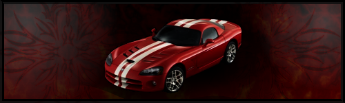
I think he's saying that because it's a stock image, you want it to be clear that it's completely separate from the background.
In my opinion, that's a personal choice. You're doing a great job, and the red that was incorporated to the background is a nice touch, I think. Remember that you don't necessarily have to go with all red, Condidtional Hue/Sat is really useful for recoloring the car to whatever you want it to be. (I say this because if you have made a specific background already following a color scheme, you can adjust it, or the car, so that they look nice together)
You might also want to go with a bit more contrast in the background, color difference. Just to distinguish certain things, as to not make it appear boring (not that it is, right now)
Hope I helped, I personally think you're doing a great job with it,
Nab
Thanks for the advice nab, i think illl try a couple things you said.
Thanks
Kevin
-
You don't want a thick border. Add some special things to the background layer, and make sure it looks like the viper is way in front of the background.
thanks for the advice, how can i make the viper look further in front?
-
Im working on a sig, i found a cool stock of a viper and im trying to work with it, but im just not sure how i should use it. what i did looks terrible.... im stuck. I wanted kinda a dark color scheme for the background, then the car to be the main focal point.
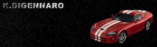
edit:well..this is much better, but still not right...iono what it needs.

edit: alright im gona edit this one more time, im not sure if im going down the right path, input please
-
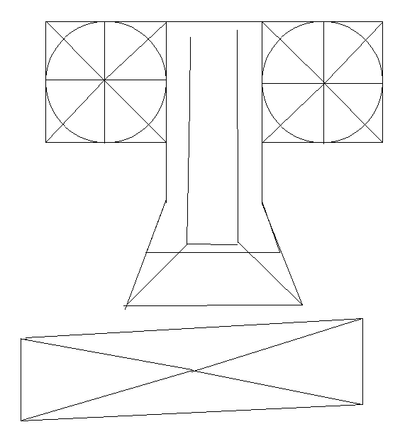
Okay i took it a step further. I drew a series of images to show you technique. You cant just start off drawing exactly what you want to draw. Your brain just doesnt work that way. First i create what i call a 'Skeleton'. Its just a really simple line drawing that i expand on. The line drawing shows the action and the shape of the body.
Before:
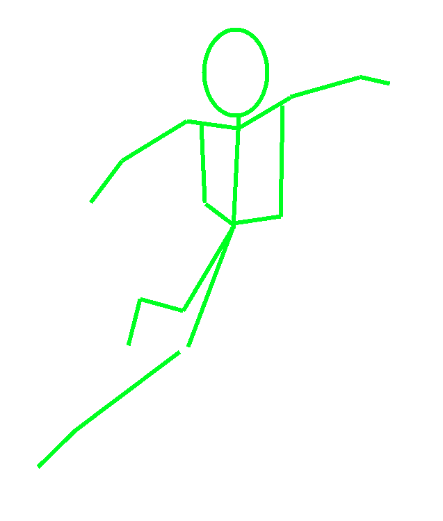
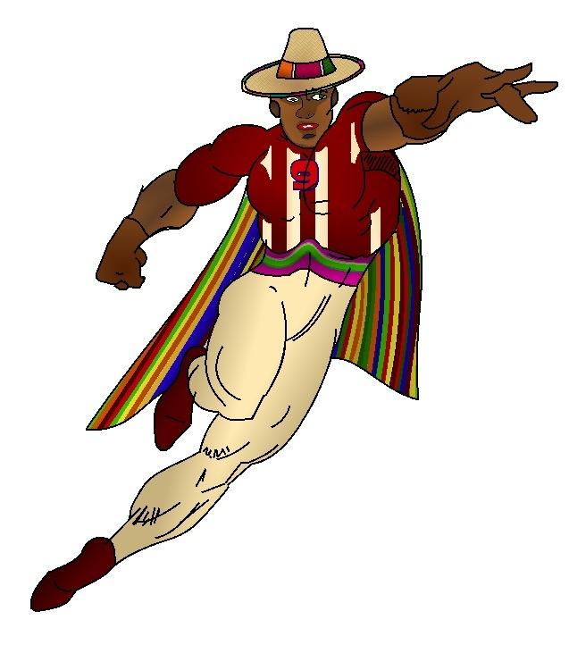
Now ive built on this 'skeleton' and created this. Keep in mind there were steps between these two. But these are the main ones.
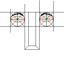
Here's an example of that face diagram i drew for you. This shows how the eyes fit.
-
....in intervolts of 10s....
Chuckle...I like the word you've created... :-)
haha, spell check wasnt made for lazy people
-
k.digennaro, I see your problem. Look in the lower right corner of your screen. See where it says "105%"? Change that to "100%" and everything will be fine.
awesome thanks bolt bait, im not sure how i changed it to 105, the zoom button on my pc goes in intervolts of 10s. O well. thanks boltbait
Kevin
-
hmmmm.... maybe ill restart the pc again and see wat happens
-
ugh, i cant get to it right now, for now bolts method should help you. just find a random person then use ink sketch and study it to learn how to draw it. Here are a couple tips ill give you. This is the grid i use when drawing a portrait. Now remember there are things like ash's eye tut that can be used for the eyes. But any ways. Heres the grid. Look at this grid. The one i just drew up is a little sloppy bu thats okay. Try to figure out how to modify those shapes into eyes, nose, and mouth, its pretty simple. If you cant figure it out ill help you.
-
thanks for the suggestion david, but i tried that before and no luck
i just tried it again to double check and no luck...
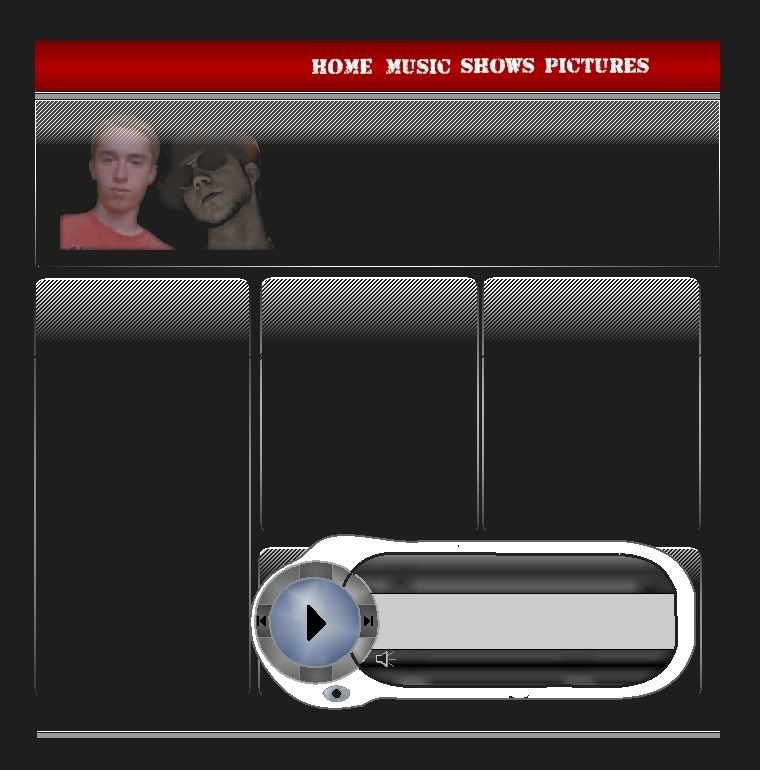


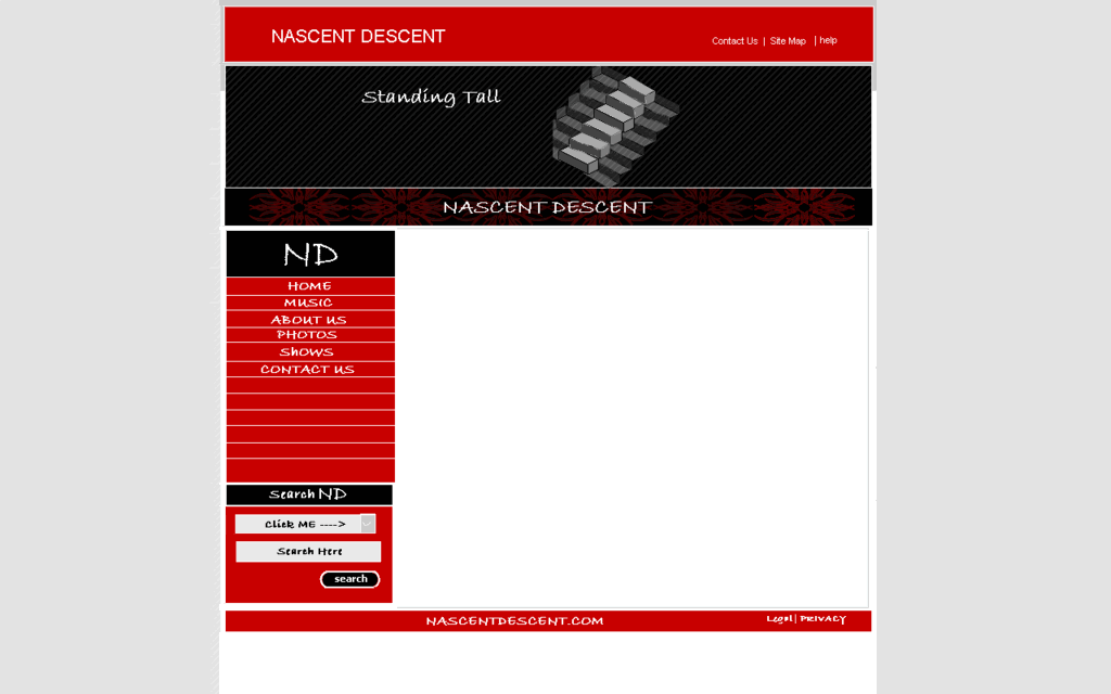

Image Umbrella: Interfaces
in The Pictorium
Posted
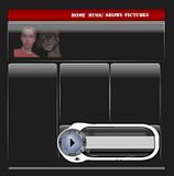
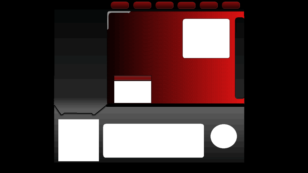
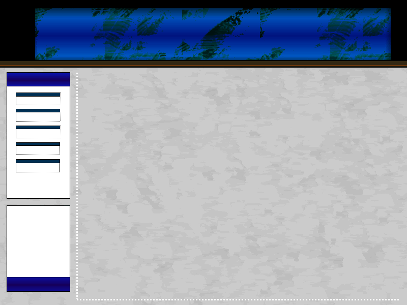
Well here's a couple Layouts I made for my web page.
Home Page
Photos
Discography
*Note I left out the content, just posted the layouts.
Let me know what you think. I decided to make the home page different from the others, im not sure if that was a good idea or not.