


k.digennaro
-
Posts
909 -
Joined
-
Last visited
Posts posted by k.digennaro
-
-
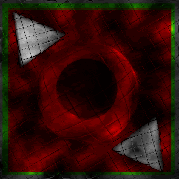
here's one i really like, just was messing around with a couple concepts.
-
Here's one I did, its like 60% PDN, I used terragen to create a landscape, then I used dents on it. I saw this particular part that looked like an eagle, I took it feathered it added some blending and came up with this
 .
.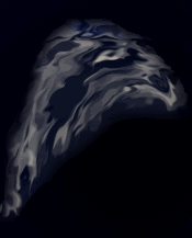
Enjoy!
Kevin
-
Heres one I did for all my fellow italians
. Wasn't really sure what to do with it. I might add more later.Hidden Content:Translation:"Friend who won't give, relatives who won't lend you a hand, avoid them like the plague."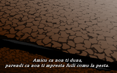
Enjoy!
Kevin
-
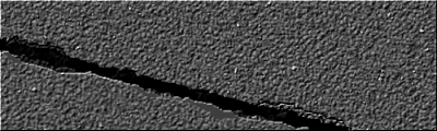
well last attempt before bed. i think ive got the texture down pretty good, there are a bunch of options for the texture. But the actual crack im having trouble with....
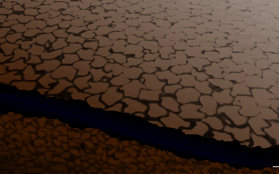
Thanks
Kevin
-
hmmmmm....its getting there. I think tomomorow ill start from stratch and see if i can make it better. Thanks for all the pointers
-Kevin
-
hmmmm, much better.
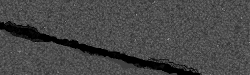
But I want to make it more realistic if possible, any suggestions?
-
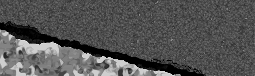
Once again im here for help
, I gotta be honest, when im just messing around with PDN and im not really into the particular drawing, ill just kinda finish it up and make it look alright. Then when i think of something i really want to draw or try and am really into it I might take weeks on it.We had a small earth quake here today, and I decided to try to draw a cracked ground. I used this pic and some others to give me an idea. http://news.nationalgeographic.com/news/2005/10/photogalleries/earthquake/images/primary/051011_earthquake1b.jpg
Now I'm having a hard time with this. Basically right now I've been trying to combine brushes and dents to create all the textures I need. I've come up with this. I'm not happy with it. But its a starting point. Does any one have any suggestions on how I can achieve this with PDN?
-
I dont go into the tut section very often, but i happened to look at madjiks abstract tut, I didnt follow it exactly, but i used the 2 tone gradient and polar inversion concept. I came up with this, about 3 mins work. Looks pretty cool.
-
watd you do? shape 3d?
Ctrl-Shift-Z
haha wow, i didnt even think of that lol. Thanks sabrown. I think i might acutally turn this into a background instead of a sig.
-

oOOOooo, i like where thats going sabrown, watd you do? shape 3d?
It still needs something, but looks really good, leme no how you achieved that, id love to play with it
,Thanks
Kevin
-
They're all very very good, But a tiny bit of anti-ailaising :AntiAliasingOn: ?At least?
depends which pic your talking about
-
Keep up the good work.

On your Random Pics section, could you not put so many images side by side?
Ash is not liking the side scrolling thing :?
Thanks
thanks for the compliment ash , and ill fix the scroll thing right now -
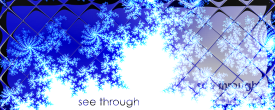
Don't use such dark background.
hmmm, i was afraid someone would say that
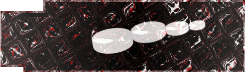
. What about if i made the pucks white or something that popped out? i really like this background. or even just lighten up the background.You could try lighten up the pucks.
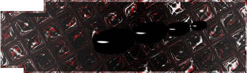
it still looks terrible, maybe i need to take a differnt approach to this concept...
-
Working on a new sig, Im having some trouble though, I want it to look like hockey pucks are flying at you, but i want it to work as well with the background, any advice?
Don't use such dark background.
hmmm, i was afraid someone would say that
. What about if i made the pucks white or something that popped out? i really like this background. or even just lighten up the background. -
updated some web temps, as well as added a new section for my custom guitar pick designs, added a couple new banners, and a couple new 'random pics'
Enjoy!
Kevin
-
Would you mind supplying the PDN file?
sure gimi a sec ill add it in this post
okay heres the pdn
http://www.mediafire.com/?uxm0dmo4blj
The texture can be created by using this brush from my brush packs.
Then just tile reflect.
-
Working on a new sig, Im having some trouble though, I want it to look like hockey pucks are flying at you, but i want it to work as well with the background, any advice?

-
My Bad Attempt:

hmmm, i like the background effect you have going, simple but it gives it a different feel.
Its to late for me to get into it, but tommorow ill see what i can do, i think you may have inspired me
Thanks
Kevin
-
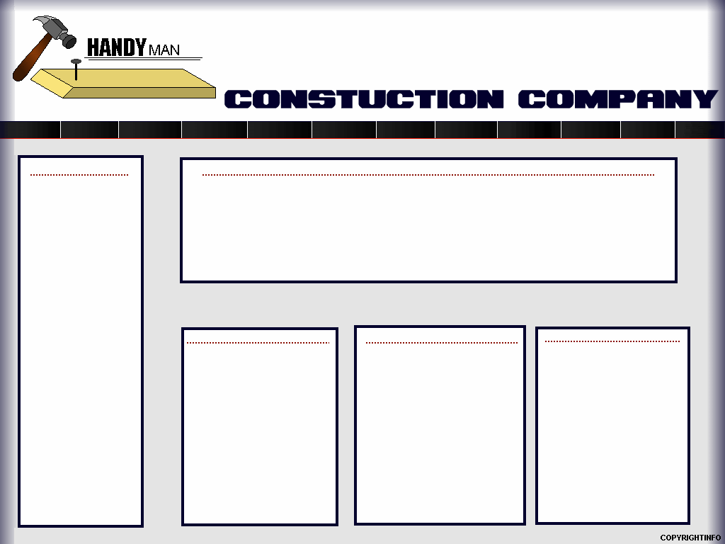
Ive been creating a lot of web templates lately, trying to get a portfolio going for web design.
Any ways, im stuck on this one. Im trying to create a page for a handy man. I created an animated logo for the header that i was happy with. But the layout im having trouble with. Below is what ive come up with, anyone have any suggestions? Im trying to give it a proffesional feel but at the same time not so cut and dry.
Thanks,
Kevin
-
I like it, very nice!
Ash, i must compliment you on your sig and av, i love them bove, very different from what were used to seeing, but they look amazing.
-
my first signature.
PS. my first

not as great as others but very nice for me, suits my style.
simple, but not bad for a first, the only problem is its to big.
Sigs must be no larger than 500x150 to use on this forum
Kevin
-
Here's a black and white i did of mario
, not perfect, but i was happy with it for a first draft, i may color it in the future.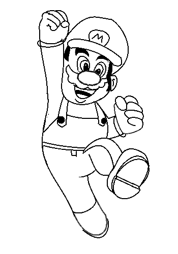
edit:^^^100% PDN free handed.
http://en.wikipedia.org/wiki/Mario_(Nintendo_character)
I read a little about mario just for the sake of it, its really interesting how planned out this game is, most games, atleast as it seems, dont go into this much detail. It's like reading a biography when you read this wiki page. Its rather interesting id suggest reading it. I though the most interesting part was that the artist said 'Mario wears a cap because I find it difficult to draw hair'. That made me laugh cause I had a hard time drawing the hat, I was thinking while i was drawing it, wow i wish he had hair lol.
-
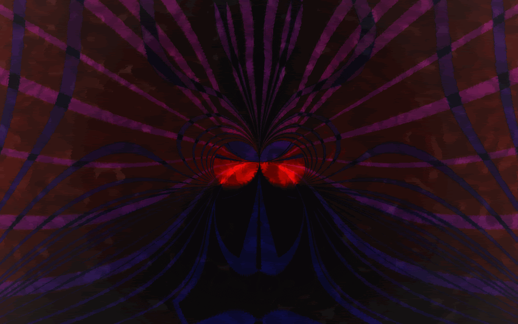
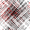
@k.digennaro ... Rorschach test ? 8) quite the departure from your pixel people. good to see you expanding. You should check out the Tate on line, see some real fine examples of pop/abstract. Interpret a few of those, I'd love to see what you come up with. That's how I started learning about abstract art and get a lot of my inspiration re color and how shapes define emotions.
here is one I've had on the back burner for awhile just couldn't figure out how to finish it until now. It's more pop than abstract but think it cross genre's well.
quote]
Just a random piece honestly
, i was messing around with the poloygon plugin and dents and came up with that. thats a good suggestion i might check out some art after work.Thanks
Kevin
-
love the hammer only thing I can see that might fix it a bit is to move that hammer just a touch to the right if possible to strike that nail dead on the head.
good job though nice and smooth gif. not jerky at all..
thanks oma
, when i redo the final ill adjust the hammer
silent install -- Italian speaker needed!
in Troubleshooting & Bug Reports
Posted
Ciao nasosan, dare il benvenuto a Paint.Net. Fare tuo domanda in italiano, per favore.
Kevin DiGennaro
P.S. I'm not a native of Italy my grand father is, I speak some Italian although I am not fluent in Italian. I can read it better than I can speak/type it.
I just asked him to ask his question in Italian.
P.S.S I haven't been around in a while been focusing on web design and coding, and have been using PS lol I swore I'd never use it, but I'm ashamed to say I have upgraded to it haha, I haven't used PDN in a while but who knows, I might come back, I always loved the program.
Kevin DiGennaro