


Wither
-
Posts
1,068 -
Joined
-
Last visited
-
Days Won
2
Posts posted by Wither
-
-
First off, the thread title made me chuckle.
Secondly, what do you consider zombiefied? Something like what The_Lionhearted did here?
We can help a bit better if we understand exactly what it is you're trying to get.
-
Welcome to the forums!
 [...] Trajan Pro - Bold (open type).
Paint.NET can only support and use True Type Fonts. Open are entirely ignored. Though you could write the text you need in another application, take a screenshot and copy it into Paint.NET.
I have found similar fonts in paint.net but I would prefer to use the actual ones - if possible.The fonts aren't in Paint.NET, they're in your computer.
 Paint.NET only uses .ttf fonts that are installed on your computer. It doesn't have special fonts that only it can use. Just so you know.
  Is the best editable format to use with paint.net for things like logos and headers for websites - PNG. The reason I ask is because I need to know the best format for my graphic designer to send me the finished images in.
PNG is really good if you need high quality and don't want to lose any details at all. I'd recommend having him send it to you in that. However, if you're going to publish it to a website and want to provide your user base with a shorter page loading time, I'd recommend saving a copy as .jpg or .gif (be sure to keep the .png if you want/need a high quality version for yourself) You lose some details, but your users will appreciate you more for being able to see the picture sooner.
-
Hmm you're very right. I prefer feathering them in because it gives me control over where they appear and makes very soft edges that come into the picture without a defined edge. I'll edit that into the first post. No reason for my preference to be misrepresented as the only way to do something like this. >_>
-
This tutorial is available as a PDF. Click here to view or download it
Required Plugins
---
The point of this tutorial is to make something similar to this.
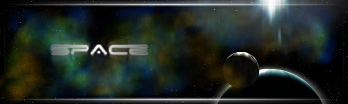
I would also like to encourage you to find other uses for this besides just a signature. There are a myriad of other uses for this, so be sure to experiment. Don't just pass it off as another signature you'll never use, use it as a learning tool to further your understanding and possible uses of Paint.NET's effects and plugins!
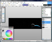
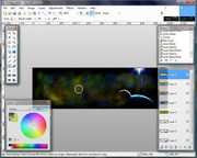
Ok, so first off make a black background and add stars. Click here if you don't know how to add stars quickly and easily.
Then make a new layer and fill it with any color. I prefer blue, just because I like the color blue.

Run Shape3D on this layer. I encourage you to play with the size and position. Lowering the 'Z' (forward/back) value of the Light will tell S3d that the light is very far behind the object, giving it this eclipsed look. Remember to adjust the light to relate to your lightsource. In this case, the 'sun' is going to be above and behind the planet.
One last thing, the strength of my Light here is 5.20. Strength of just 1 would have worked, but I found it far too dim for my taste.
Now let's make a moon, because it looks better than having no moon. 😉
Make a new layer and use Clouds. The default settings will do fine. For best results, use black and white for your colors.
Run Shape3D on the cloud layer. Remember that the moon should be much smaller than the planet. If you'll notice, I changed the "X" (left/right) value of the Light. The sun will be slightly off to the side of the moon. It would look weird if it was perfectly straight up like the planet. Always remember that sometimes, it's the most infinitely subtle of details that really pull a picture together.
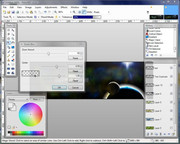
Now let's add some atmosphere to the planet itself.
Make another new layer and add clouds again. Once more, default settings are perfect.
Shape3D once more. Use the same settings you did for the original planet.
Now you should move the planet layer up and set it to Overlay.
Next we'll make the sun. Go to Render -> Mandelbrot Fractal.
Default settings all around, except for the angle. I set that to 180. You'll notice that there's a little tip that's pointing down now.
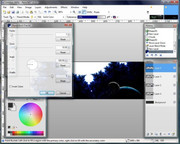
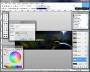
After that's done rendering, move the fractal so that the tip is just over the planet. (or wherever else it is you'd like your sun to be.)
Now, Motion Blur the fractal in the direction you want the sun to shine. (In this case, down.) Do it at a low setting and repeat a few times. It looks better than using a really large distance all at once in my opinion.
Now, use 'feathered brushes' to get a soft selection and copy over only the part of the sun you want. (in my case the very tip)
Setting the sun layer to Additive will remove all the extra black parts.
Do any other minor tweaks you want to your sun.

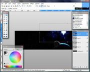
Now for all that atmospheric dust! I'll direct you to the 'feathered brushes' tutorial again for this section, because it makes everything look A TON better.
Make a new layer and fill it with clouds at default settings. Your color choice should be Black and a light shade of any color. Lower your primary opacity and make a new layer. Clone some of the clouds into the new layer, make sure you don't color over the planet or anything.
Alternatively, you could use Clouds on the entire layer. That works great for covering the entire scene with 'atmo dust'. However I prefer the method mentioned above because of the softness of the edges.... Your mileage may vary.

Set the new clone layer to Glow and lower the opacity.

Repeat that step with a bunch of different cloud colors.
Do some final adjustments for your atmospheric dust. Lower/raise the opacity of the different layers... whatever looks good to you.
Go back to the sun layer, and use zoom blur. set the focal point around the middle of the sun. Blur to preference.

Go back to the base planet layer (the solid color one you started with). Select everything outside the planet and invert selection. Make a new layer under the planet layer, then fill your selection with white. Zoom blur with the focal point in the middle of the white dot. Lower the opacity of the layer to make it a bit more subtle.
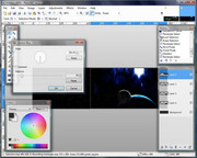
Finally, the text. I used Space Age because it fit well with the theme, but please use whatever font you wish.
Write your text (in white) on a new layer. Duplicate that layer and invert the colors (so it's black). On the newly black layer, use Outline Object to outline the text in white. A width of 4 and softness of 255 is what I used here.
Now, go back to your top (white) layer, and make a radial gradient from the center out in Transparency mode.
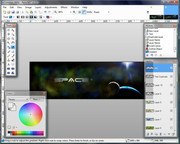
You're done!
Again, you can use this technique for far more than signatures and you could expand on this even farther to make some really cool spacescapes...
For example, I used the same atmospheric dust and white eclipse (the zoom blurred "white dot") technique here.
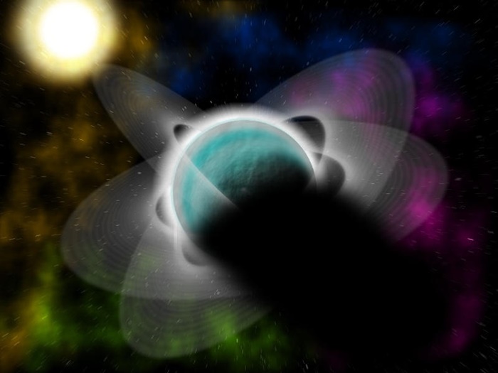
Have fun! I intentionally left out one or two of the little details (like desaturating the planet a little... Oops, just gave that away, didn't I? >_>) that I did after it was done. That way I can be sure you've learned something. 😉
-

^^^^^^^
Looking for comments


A little Mii person. Interesting. Did you make him yourself or just screenshot him?
If it's the former of the two, you have my applause. :shock:
-
@ jerkfight - your abstract things are really cool! Very nice color choice. Your designs recently have been reminding me of "rock band" art.
@ -Expiration- - That is so cool looking. It makes me think of something being deleted in the Matrix.
---
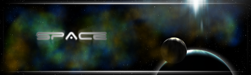
^ Click for full size 1000x300.
I don't normally 'Pictorium-ize' signatures, but I really liked this one. It was made for the space contest ncfan51 mentioned earlier.
-
First you'll need the Shape3D plugin if you haven't already got it.
Then go to the bottom of the Shape3D window and find the XML -> Load option.

Then just find the XML and you're good to go.
To get the skin color, select the orange from the default palette and lower the Saturation in the Colors window to about 30.
-
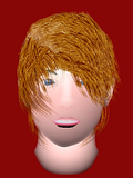
NEW UPDATE OF WHAT I'M DOING! guess who it is
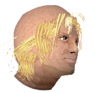
:shock: That's really good! Just try and avoid overdetailing the hair (it looked metallic the first time around) and you'll have a masterpiece!
...And CJ... :shock: I must learn the secrets of glass... :dA"plottingsmiley":
-
This video tutorial I found on Youtube covers practical usage of what Mike.Ryan52 said.
If I understand your question correctly that should be just what you're looking for.
-
Why does nobody say anything about mine? I feel unwanted....
I know the feeling all too well.

@ jake2k - That. Is. Slick. :wink:
---
I started working with space recently... yay space!!

And this one was me trying to define 'random crackles'... I ended up with stained glass.


---
And finally...

I spy my grass tutorial!
The text does seem out of place... it may seem a little difficult, but you might want to consider making the grass look like it's resting on the hill. The top line will be smaller and every line will progressively increase in size until you get to the bottom, which will be the largest. From there, you could also add a few extra patches of grass in front of the text to add to the illusion.
-
Oo that's a neat reference chart.
---
Good job on your tree... It could use some fading though.
---
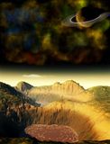
Behold, I give you Infinity!
A totally sweet planet with lots of rings and such!
-
You seriously did that on PdN? Wow. Nice job. :wink:
The pool of water doesn't look that great though.
Yup. 100% PdN (besides the land of course. :wink:)
As for the water, I agree it's a little off... The original idea behind the scene was much different... then it slowly ended up being what it is now.
---
clay tile not sure how I'm going to work this one into the Indiana jones picture but I'm going to try. might need to darken it a bit more. :idea:
I don't know how it would fit in there either... but it looks great!
It is a little bright though. More like a highly polished bronze or copper now.
-
Do you mean all in the same image? ... Or what?
You can open separate files at once by pressing Ctrl and clicking on them in the Open window and clicking 'Open'.
If you want them all in the same image on separate layers go to the Layers menu -> Import From File.
-

The grainy bars are sort of cool, but the ball in the center seems out of place somehow. It doesn't seem like it transitions in quite smooth enough. Try brightening the entire thing a little bit or bring it down a few notches in the center light spot.

Very interesting. The background, though simplistic, is a very nice looking effect. I don't really think the earth was the best subject for it though.
-
Looks pretty good, R3VENGE.
Here it is again... because I like it!
I was messing around with Crystallize and I ended up with this. It makes me think of radio waves. haha
-
My first crack at spacescapes.
The land was Terragen of course, but everything else (including effects applied to make the terrain less bland) were Paint.NET... of course.
-
It is, technically. Except the clone stamp doesn't do anything with transparency, and there's a lot of transparent edges in the grass. Going back to reset the stamp's origin point to maintain realism would probably take you a little longer then just duplicating the layers. If you have a large area you want to fill, get a large cluster and just start building up.
For example, use a single cluster of grass and keep copying until you've got a bigger cluster (about 5-6 of the original), then use that enlarged selection to fill a bigger area. Just keep doing that until you've got a grass selection that won't take too long to fill a very large area.
-
still 100% pdn
That's a good step up from last time! It looks really good.
The hair still seems 'overdetailed' though. I don't know how to explain it, but there are just too many individual strands, which takes away from the 'feel' of it in the end.
-
Take a look at this tutorial that Myrddin wrote a while back. It should cover everything.
-
-
Yes. ImageReady came bundled with every version of Photoshop from 5 to CS2. They've discontinued it for CS3 and beyond.
http://en.wikipedia.org/wiki/Imageready
... I don't really see how this is related to Paint.NET at all anymore.
-
...What's your question? ImageReady is made by Adobe and has little to nothing to do with Paint.NET.
-
First, I'd change the thread title to something that doesn't break The Rules.
Now that you've done that (you still haven't? Go do it now! Now, I say!!) I can tell you that Paint.NET gradients take up the entire selection (or entire layer if you have no selection active). You can get around this by drawing your new gradient on separate layers.
-
Ed, you genius! That's perfect!
Everything I had in mind (and more!)(A resize/remove dot function wouldn't be looked down upon, but that's probably the unfinished bit)
Eerily enough, I was even thinking that 'Perspective Helper' would be a proper title for it too. :shock:


Possible plugin request-curly q swirly thingy generator
in Paint.NET Discussion and Questions
Posted
Wow. That block of text single-handedly destroyed any confidence I may have had in my own mathematical abilities. :shock:
Only kidding... but still :shock: