

Scooter
-
Posts
426 -
Joined
-
Last visited
-
Days Won
12
Posts posted by Scooter
-
-
Oh Good heavens! These fine artists deserve to be recognized for their effort sooner than in 5 months. Come on folks get the
leadvote out.Me? why, I like the Wabbits use of colors and the style of the font. Though RFX has an intriguing idea.

Wabbit + 2
RFX + 1
-
I knew there were some good guys with great help out there. Cheers


-
 1
1
-
-
2K25
Yes it can be done. My idea may or may not do what you need in your specific case, but here goes:
1st keep in mind you can have as many layers as you want- like a book can have 2 or 100 pages .
So you currently have 2 layers; background = text and layer 1 which has "a texture" . Now add a layer 2 on which you put your picture. OK?
What I would suggest is to use your "magic wand tool " click on the text and have the background "disappear" leaving only the text and its texture.
Select All (copies layer), move to your picture layer and paste the copied text to it (layer 2) . this should get you what you want.
I'm sure there are many more efficient and effective ways that others will offer , but this is my " fast and dirty" way


-
Welcome Reggie.
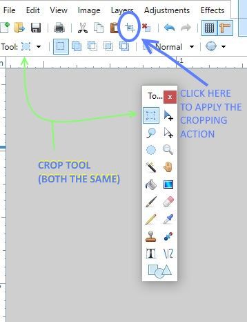
As an addition to EER's fine suggestion; You can, if the text is not covering a part you want to save, use the "cropping tool" to remove the offending item
-
1
-
-
Markie
Well done . You have a good eye on how to employ the tools as well as how to crop for the most effective layout. Keep trying different things, to get a feel of how to get PDN to work best for you.
-
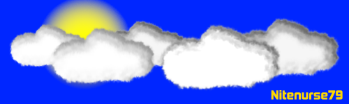
This tute was done long before I was a member and longer before I was a lurker. I used this tute to make a signature for SOTW#111 Clouds competition, just thought I would share it here for those who don't drop by the competition thread. Really good tute pdnnoob with some nice add ons from yellowman

THAT long ago?!?!? goodness me, time flies


OK back to subject at hand; I like this tute because it is a clear, clean, presentation of how to make a cloud; even with all the individual steps there is a logic in the flow of information and great graphics to show us (OK, me) how to do it.
 pdnoob
 -
Ego Eram Reputo
Sucess! the directions you and Rick (
 ) gave, did the trick. I did have to download the Win self extractor. Thanks to Rick's instructions it worked like a charm
 All is well now, in Scooter Land, where the PDNs can now play and the tutorials, can dance in the fields.........?too much?
 ....'thought as much
Seriously thank you for the help
and thank Scott too, when you see him
-
5
-
-
Yes, I have read the pinned solutions above but nothing seemed to correct my situation- Though I tried them, to the best of my limited understanding of computer-eze.
I have tried to install the Ver 4.5 and have been stopped by the following error messages. See 4.5instal fail
After much frustration - all install fails seem to be hung up on finding a correct "staging" file.
So, I canceled the update and went back to the 3. version I had tried to up date. Now it would not work see 4pt5 NG2
After repeating the same install procedure -hoping I had missed a step, the results were the same. No update ; No previous version; No joy.
I did a "computer restore" which brought back the 3.5 but now, even with a "PDN repair" attempt, I got the error message : ERROR 591B
I created a mess of the whole thing. Having tried to delete the existing version and trying a clean instal of the new version; the results are still a fail .
If I could get some specific steps to follow, though I understand it is a pain. I have reached my knowledge limit and I would be most grateful.
-
For the love of pete does it always have to be this hard?OKFF your composition is fine, the "swerling space-ie'" background is intriguing. Your font choice and its color is very stark and sharp....well except for the blur. Not sure about the need for the blur,but interesting choice.RX your talent is evident in both your current signature and your checkered
pastoops I mean, Entry. Very crisp and well executed, good contrast with the red text , shading on the ball may be a touch heavy, but not bad.FotoFactory - 0Racerx - 2
-
Well this was a lot of fun
Thank You toe_head2001
-
1
-
-
Yep mighty fine revision TR

I'll get it in a moment


-
Heartiest Congratulations! Cc4FuzzyHuggles, great job.

Toe_head and Pixey, a much deserved "Well Done"

-
Good Heavens you guys don't make it an easy choice.
after much hemming and hawing ;I vote
Beta0 = 1
Ishi = 1
-
So, you have been busy. No resting on your gradient blending laurels, for long.
This is a very clean use of the provides tools and I think gives much more control for those instances wherethe "usual" drop shadow is not able to be adjusted to your requirements.
-
UH,Just your basic WOW!
Your pictures and text are Great- I understand the idea very well. Many Thanks for your work
-
Thanks so much @Racerx - I've always been facinated with animation, but have found the subject difficult. I will be trying your suggestions - look out........ I may post something soon (if I'm not too old to figure this out)

Racerx thanks from me to. looks workable for me ( -I slow some times)
An Pixey ;
Pixeys don't get old, they just get cleverer and cleverer and clev......well you get the idea

-
renee
A most impressive result for your hard work.
Legibility is light years ahead and the visibility of the characters is much improved.
Re: "embossing Give Bolt Baits page a read and download, if you have not already done so. http://http://forums.getpaint.net/index.php?showtopic=11514
 bonne chance
 -
toe_head2001
Well Done. Simple, the way you present it.

-
Now for why I came on here: Is there anyway to control the distance between letters in the text mode. My words are too far apart for the font I'm using--plus where I want to put them.
renee
Kerning is the amount of space between each individual character that you type.
Here is an article on how to, for Word 2013 http://www.quepublishing.com/articles/article.aspx?p=2030049&seqNum=10
Also for a simpler method Pixeys answer is a good one http://forums.getpaint.net/index.php?/topic/31440-looking-for-a-plugin-to-manipulate-letters-separately/
-
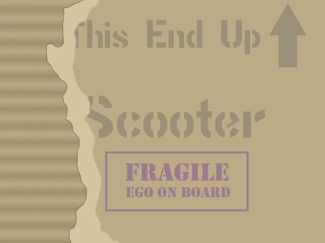
so here's my original unheralded entry

Photo= mine
All Paint.Net

-
1
-
-
Awww you guys

Tack, Danke, Thank you, for the kind words.
Well the paint is dry, the dust is settled, cat box cleaned, so on to great things......... well maybe a short nap first-----just in case I get caught up in the throws of inspiration later.
-
As I have been oh so busy with many important things (watching paint dry, sunsets, the Christmas Cactus bloom and drop its flowers cleaning the cat box etc.) I realized that I have neglected my PDN
friends- those I know and those I haven't "talked to" yet. So accept my apology for my tarty HAPPY New Year.
Also my most humble gratitude for the esteem shown me by the honorific title of 2014 Homer Simpson Award Winner
I am truly greatfull and will wear it with a sense of pride throughout this year
WOO HOO!! time for a doughnut or or or a BEER!

-
1
-
-
Renee
Sorry have been off the forum for awhile, so have just discovered your question.
If I may, I will throw out some thoughts for you to consider and reject/ ignore/ look at them as if they were small puppy that did something bad/ embrace or none of the above.
My confusion starts with the actual title is it "The Saga of Monterrian Gouterrian" or " The Saga of
MonterrianGouterrian Volk Caldera? As laid out on your cover, it would appear as if the Volk Caldera is the authorOn to the font choice, perhaps a revisit to the fonts available is in order. Ballade is a bit too visually complex to be a quick read by a potential customer seeing it on a rack among many many other titles. That said there are fonts of the same "style family" that are more legible to the quick glances.
The Saga of Monterrian Gouterrian = Old Century
The Saga of Monterrian Gouterrian = Sherwood
The Saga of Monterrian Gouterrian = Storybook
The Saga of Monterrian Gouterrian = Vagabond
As a few examples.
While the choice of red is a good one to separate the title from the background the feeling you have, that it lacks something is valid. It is too "flat" you need to add some dimension to the title. even the addition of a shadow would benefit
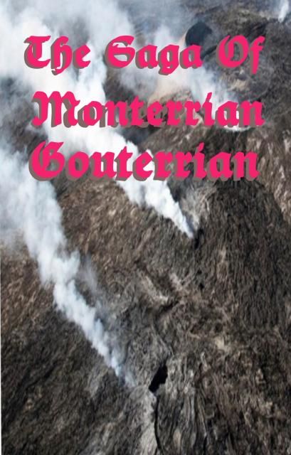
I'm sure others will have even more insite, and be more help. Regardless looks like an interesting project
-
Congratulations Eli and Well Done to Pixey and Searose all your entrys are inspiring .

Applause
 also for Nitenurse and DrueDale s entry's as they showed a good vision of the requirement.
good thing I didn't enter-I can't even spell kel-tic; then, I get all tied up in knots about it.

-
2
-


[SOTW Discussion] Talk inside...
in Discussion
Posted
Maximilian has a good handle on this situation.
If your finding yourself in an "bla" place; Try another aspect of PDN you aren't too familiar with or a technique you have never tried. That way you'll give your mind a rest from the usual projects. Then you never know you may find a new tool/talent you can use to advance on to a new skill level.
.