

Scooter
-
Posts
426 -
Joined
-
Last visited
-
Days Won
12
Posts posted by Scooter
-
-
 SOB links broken on noted:
 looked in "search" but no joy. any alternatives you can suggest?
Creating an Animated Waving Flag!
Started by
arik-so, Jul 16 2009 04:52 AMThis tutorial extends ('Create a Waving Flag using Displacement').
 link broken
What you will need:
Paint.NET (self-evident)
'Alpha-Displacement' - plug-in
link broken 'UnFREEz' - GIF-animator = link works
-
Skullbonz, very nice ; The effect is very polished (da kid aint so bad eather)

-
 got my vote in- good job(s) all..... especially the ones I voted for
-
?still on going?

Both of them are good, however I think Nitenurse ' s is more refined than Xzerizon' s which is a bit too complex--though, I appreciate the talent used to create it.

Nitenurse - 3
Xzerizon - 2
Nitenurse79 wins
-
very nice job to both of you. As the styles are so different it makes choosing difficult.
Doughty, the combination of space and the orb and spaceship are too dissimilar -one realistic-the others cartoon like; perhaps a different combination would achieve your goal
Ventor, I like the very smooth transition of background and text both blend well together into a good over all result-
 I'm not so bothered by the corners.
Doughty - 0
Ventor1 - 3
Ventor1 wins
-
welshblue: Wow most excellent use of 3D. intriguing-kudos
Nitenurse79: clever use of "center lighting" on back ground and frame; like the font and color (colour) combination
Welshblue - 2
Nitenurse79 -1
-
Good job both; but
Doughty - 2 ( The metalic look is very crisp and realistic)
Minners71 - 0 ( Would have been better not so tilted back so show the engraving background to advantage)
-
NMD don't be "afraid" of letting text show; as a main component of your signature block. The graphic should hold it's own just fine, but the text is the sig. part most people read- other wise it's a logo
NN79 you did wear sun glasses creating this -did'nt you?

NMD - 1
NN79 2
edit: cause cant count
-
I like your progression from the initials form to the question marks.
This now is a symbol by which your clients will be able to recognize your site/company, without having to always read the words - think Coca Cola swoosh , Nike swish, NBC peacock, Chevy bow tie, etc.. Well done.
A small thought: as various computer monitors will render colors differently, you may wish to adjust the background color a little farther away (color or value) from the gold question marks, to keep the symbol shape stronger than the background
as noted by chging to B&W the gold ? is nearly lost

your just about there. good luck
-
Nitenurse - 2
NinjaManDan - 0
Ninja not enough "signature" visible. great fire though
-
Minners use of Tom and Jerry is clever.
nitenurse, for a signature, is much more legible
Minners71 - 1
Nitenurse79 - 1
-
due to the well done color fade
minners71 = 1
NinjaManDan21 = 0
-
I cleared my post for my noncompliance with the rules- will do better next time---Apology's
-
Amended.

I assume now the score is
minners71 - 2
Xzerizon - 0
Apology's for not being clearer; nitenurse79 is correct, the voting from the two of us combined, IS:
minners71 - 2
Xzerizon - 0
-
OK; ONE whole vote for.......

minners71 due to the controlled color gradation used and the "movement" of figure arm, the stars and 3d shield as well
Xzerizon, sorry, I like yours, but can only vote for one

-
nitenurse79
just a thought to play off minners71s idea.
Perhaps an "other world-ly" background to the inside of the frame.
i.e.
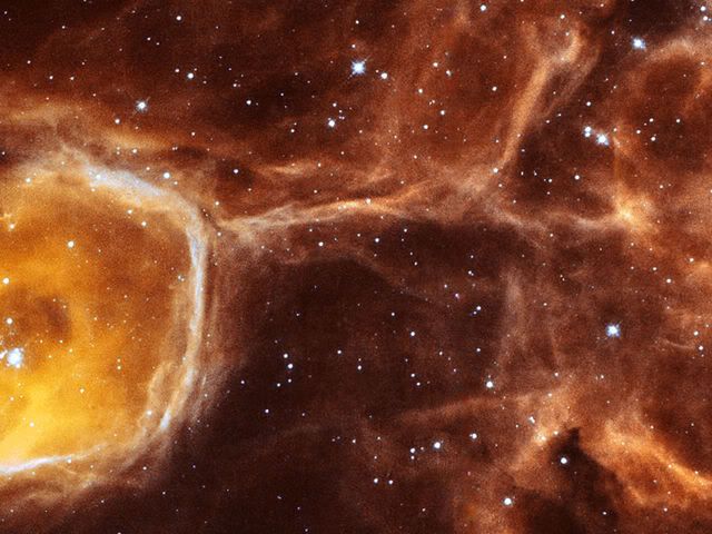 (got it from a free pictures by Hubble Telescope site)
As your sub fits into the same perspective angles as the frame it looks just right.
IMHO


Sig Battles (ENTRIES/VOTING ONLY)
in The Archives
Posted
While you may feel that is true now, don't give up.
Think how would you feel, if another minimalist won in the next round and you had missed that opportunity?
Also, all current styles change sometime, and those who were the in the wilderness become the new leaders; so don't miss you chance.
The critiques of your work should have the benefit of allowing you to sdvance above your current level.
Good luck
Apology's to the forum moderators and members for stepping outside of the rules of this topic.