


-Expiration-
-
Posts
1,076 -
Joined
-
Last visited
Posts posted by -Expiration-
-
-
I seem to remember a "Post your desktop here!" thread somewhere in the Overflow ...
-
Thanks for the tips Ash.

I'll get to work on it tomorrow when I have time, it's kind of late right now and I have a dreadful cold.

-
He was talking to the person who posted right above you, Fire_Ants.
-
Did you make sure to change the units to pixels? (It's inches by default)
Then when you click, you don't have to drag it to make the selection, but you drag it around to move the selection.
-
Thanks Miguel.

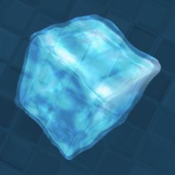
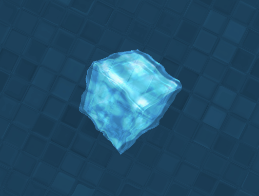
The only bad thing is that if you put my ice cube on a black and white (or probably any other color at all) background, it doesn't look anything like ice.

-
I'll work on it.

(After I finish my homework, of course)
EDIT: I tried to smooth out the edges a little. I'm not sure how to round out the edges more though.
-
Updated with one new picture: Ice Cube Experiment. Besides its overly-jaggy edges (and I don't mean aliased), what do you think? :?
-
Thanks Mike!
P.S. The background is just a very subtle clouds with a Tile Reflection with -11 curvature.
-
Does it look like an ice cube? Yes? No? Maybe? (Besides the extremely jagged edges)
-
The colors are nice. Reminds me of spring. Maybe because I used them in my spring wallpaper thingy.
-
Yeah, I think that would look better. A more consistent feel.
I also suggest using a horizontal navbar under your banner, instead of the vertical navbar on the side. But that's just my opinion.
-
Hmm, I'm not really liking the navbar and footer on the homepage. They look kinda ... cheap to me.
-
The abstract one is nice, it has a nice color scheme, but you spelled "abstract" wrong.
It says "astract"
-
I spy my tut! :wink:
Thats some nice stuff you got there. Keep working at it, I'm looking forward to seeing more from you.
Also, why don't you post the images here instead of linking to them?
-
The stuff you make is amazing, I love the style and flow all of them have.
Thanks Fire. Your work is quite stunning as well.
Your buildups and the concept is truly amazing. I really like your wallpapers.Thank you Max.
-
Hey Bugster! I really like the Orb (I wonder why.
), and Twisted Minds, which looks like a cable wire thing. Looking forward to seeing more from you!
-
Well, modification/manipulation doesn't only apply to photo fakes, it's just the direction that most people seem to lean towards.
-
Wouldn't photo-editing fall under this umbrella?
-
Hehe, thanks Bugster. I'll be sure to drop by your gallery today.
-
Woot! I has a banner!
-
They look nice R3venge, but they don't have a lot of depth, they're quite flat.
New sig & avvy set, based on my PI + wallpaper, to celebrate my 200th post! Party! Wooo...oooo ... oo ... okay ...
-
@mman6460--honestly, I just took a page outta -Expiration-'s book. I figured how -expiration- would start off and put my own spin to it Most of the stuff on them (ranks, tie, coat) was handmade. I'm not too happy with the hats, but I knew I wouldn't be that good going through all the time making the hair. I will tell you this though: the head and body are Shape 3D Renders (with the body being a half sphere map) with the shadows at different settings :wink:
Noooo! My book! You ripped it.
Here's another tip: Always keep your lightsource in mind. It'll determine where to place shadows and highlights for creases, seams, and general shading. If you don't have a consistent lightsource, it doesn't look as nice.
P.S. You can just call me (e)Xpired.
-
Brilliant! *claps*
-
Thank you Jedi.

expiredConcepts - Latest: Audio Jungle Wallpapers Released!
in The Pictorium
Posted
Thanks CMD!