


Wither
-
Posts
1,068 -
Joined
-
Last visited
-
Days Won
2
Posts posted by Wither
-
-
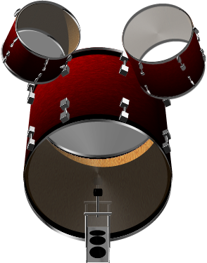
Ok, I fixed that problem with the medium tom's head. I also made the whole thing slightly bigger so the shadow doesn't get cropped out.

Blooper, that thing's cute... in a devious sort of way. (Hmm, was that a pun?)
---
I have the .pdn file for this on mediafire now.
I have the full 1024x768 I used to render it, along with both the textures used for the shells (both inside and out). - 5.9 MB :shock:
Or I saved another that was cropped to the kit's immediate area with all the layers still intact. (No extra textures though, as cropping would have messed them up) - 944 KB
PM me for the link(s) if you're interested!

-
@ Wither: Your high tom has a clear bottom head, yet your medium tom has a white bottom head. Either thats how your set is and the way you like it, or possible room for improvement. Regardless, its GREAT!
Hmm you're right, it was supposed to be transparent. But it didn't make it because of how Shape3D handles lighting. I didn't notice this before. Thanks for pointing it out to me, I'll try and get it fixed.
(Hopefully I can find the exact angle I used. haha In retrospect, I should've saved the XML's for everything...)Oh and for the specially interested, you can get the .pdn (1.9 mb) if you'd like.
-
Well, yeah, but it looks cool. :-)
Yup! And besides, I don't think anyone's going to jump in and start playing it anytime soon.

... I hope not anyway. :shock:
No, I don't think so. This is probably the most awesome thing I've seen since Ash posted the Christmas Ornaments on a tray. WOW. :-) High five.You mean it?
Sweet! [high fives back]@ Darkshock - I like it!
-
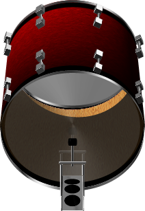
Ok, I added the shadow and threw in a reflection just for kicks.
Is the reflection too much, do you think?

-

Finally done with it! I can hold my head up high and say "100% PdN!"
-
@ BlackSmoke - I like the second one the best. The first one's just a bit too bright for my taste. Pretty nice looking though. Keep at it.
---
Edit: I'm now up to about my 50th layer. That last drumset I made was finished at 36. So far I've still got the cymbals and floor tom to go, and I'm also not done with the snare stand...
Hurray for details! Tedious, yet fun. :wink:
-
Well, don't tell anyone, but they are filled with helium. I'm not some kind of wizard capable of making things float after all. :wink:
-
Update on my drumkit status. Those brackets are time consuming, but I've learned so much about how S3D handles the X, Y, Z axises. It's a good learning experience!
The toms are currently floating there, but they won't be defying the laws of physics soon enough!
-
Ash that's really cool looking! It also doesn't hurt that I just happen to like The Simpsons.
 I feel good, because I think I see basically how you did it. I'm a little lost at the subtle curve of his head above the brow.
 I've been spending extra long on this drumset hoping to get it right. I just finished rendering the kick drum. The pedal is reflected in the head if you look closely.
Suggestions, compliments?
I'm thinking the brackets connecting to the hoop might need some resizing...

-
@ Pyjo - That's amazingly well done. Welcome to the Wonderful World of Paint.NET.
---
I've been working on my shell texture, and I think I've got it! Now that I have the colors down I'll just need to make about 50 layers of drumset....

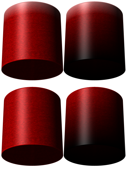
Which looks best? I'll leaning towards the top right. But I want a second opinion.
-
I didn't think it would be copyright infringement, and now I don't feel quite like it's sacrilege now that it's even better than I had hoped.
I decided to focus on the cymbals for now. I'm hoping that the color and logo (position wise) is real-ish.
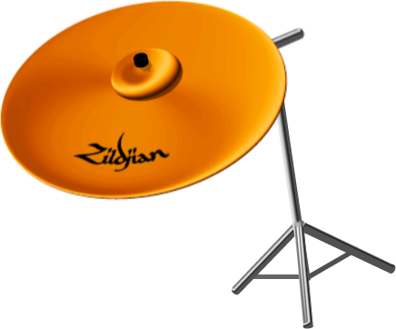
Zildjian logo from here
Also, I've decided to get the texture nailed before I start constructing the drums. One of my favorite color schemes (besides my own white kit) is a red "glitter" effect. This page is the best example I could find. I like the red<-->black gradient of the first set, but want it to feature the 'glitter' of the silver shells below it. Any suggestions?
-
I need to learn how to use Terragen. That's amazing... :shock: x20
I've decided to start working on a new S3D project. A drumset again, but much larger and from behind the set and with a lot more detail (the last one, admittedly, was just a bunch of cylinders vaguely positioned over each other.). ... Wish me luck and inspiration.
(Would it be copyright infringement (or possibly sacrilege) to put official brand-names on the cymbals and such?)
-
That's about the easiest way while still maintaining a better quality than Magic Wand-ing it.
The 'nubs' are the square shaped things on the line itself. If you can't see them, pressing the control (Ctrl) key should make them appear again.
-
@ Ash, I'll be sure to try that later. It might just do the trick!
@ verndewd - ... my. brain. hurts. (Though I know what you mean this time around. haha)
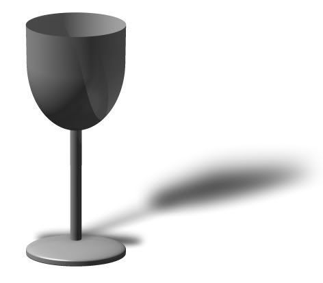
Ok, so I'm laying down and can't sleep. So I decide to toy with my glass some more (only to realize just now Ash's hourglass thing). So rather than start from scratch again, I added some 'wine' to the glass (to help the illusion of depth) and improved the base a little.


(It's nearly invisible on white...
Here it is again with a darker color to help define the edges)Maybe now that I got that out I'll be able to sleep. :shock:
-
@ nab - looks pretty neat. I just don't know what it is. o.O
@ topic - ok, I've played with the transparency ... and stuff. So here's my "it almost isn't even really there" wineglass.

Though I'm sort of concerned I may have passed "glass" and gone to "ghostly translucent".
I go for ambiguous light first and then glass edge thickness illusion, surface is a hard thing to randomize and ambiguous internal is relatively simple.Ok, so I got... around 6 words out of all that. :shock:
-
The shadow weirds me out too. The particular angle of it is tricky for me to nail. (Still working on it
)And making it transparent (which I did slightly in the example I posted) works, but it's not quite what I'm looking for out of it. I'm trying for something that looks more glassy. Almost to the point that the only thing tipping you off that it's even there is the reflection of light off of it. I'm thinking that if I have a light blue-ish color around the edges, it should give me what I'm looking for. But just putting it on afterwards removes any sense of depth.
I'm still thinking of stuff, and will hopefully have a more glassy looking glass up soon. (That was fun to say. haha)
-
@ silent-9 - wonderfully creepy. :shock:
@ verndewd - Nice.
Here's my latest foray into 3D. A simple wineglass. As usual, I managed to make the shape without trouble... making this look like glass is another story. [rushes back to experiment further]
If the glass continues to elude me, I shall just make a metal goblet. Or something.
-
I really like that first one, salu. The way it appears to wrap around itself is really impressive.
Ash, that's nothing short of amazing, as always.
Now to sit patiently and wait for Ash to read his dA messages. [twiddles thumbs]
janettsue's Christmas baubles look really, well, real.
And I'm totally jealous of verndewd's CDs. (The first of which reminds me of the blue-backed PS2 games)
-
That's really phenomenal, Verndewd. A tutorial would not be looked down upon. :-)
I second that.
-
No stock images were used in the creation of this signature...
...but 87 faces were rocked upon viewing it. :shock:
Very, very nice.
Only 87?
Minimalistic and gorgeous.
Madjik's metallic M is very nice too.
-
@janetsue - I like the deer. He seems regal and important.
@Madjik, Panhead, david.atwell, worldnewser - following your suggestion of the right one, I based the tutorial off of that.
The version on the left was just an elliptical selection instead of an S3D dome.
-

Ok, I sharpened it while still (hopefully) maintaining the illusion of it being in motion.
-
Ok, I think it should be more readable. I used a little less motion blur than last time and tried focusing the flames lower.
It says 'subtle'. Mainly because I can't think of anything less subtle than a meteor crashing to the ground in a fiery explosion. >:]
Yay irony!

-
Ok, so I think I've got the firey meteor text thing to the point where I could make a tutorial out of the process (if it seems worthy of one).
So far I've got two methods of making the "fire". Both very similar, but one's a little longer (step wise) than the other. Can someone help me decide which of these looks better?

===
@ verndewd - Looks pretty neat. xD
Paint.NET is getting noticed!
in Paint.NET Discussion and Questions
Posted
He must enjoy seeing his name plastered all over everything. Sadly, he lacks the creativity to make up stuff himself.