


Wither
-
Posts
1,068 -
Joined
-
Last visited
-
Days Won
2
Posts posted by Wither
-
-
Oh, sorry about the confusion. I like it, but I just don't really have anything to say about it. Does that make sense? haha
-
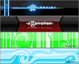
Some sigs I've been working on. :?
Which one do you guys think is best?

I really like them all.
I like the color scheme of the first (plus the 'snowy' look it has).
The second one (maybe unintentionally) has a neat sense of depth.
And the fourth has a nice pattern.
Not a lot to say about the third there.
-
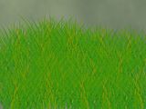
^ Tutorial is being requested...
Mmkay, I think I could write one up, but first do you mean a tutorial on the grass itself or how I got the colors? (Or both?)
-

I started playing with the colors.

You can't really see it that well even with full view. I recommend downloading it for the full 4000x600 version.
-
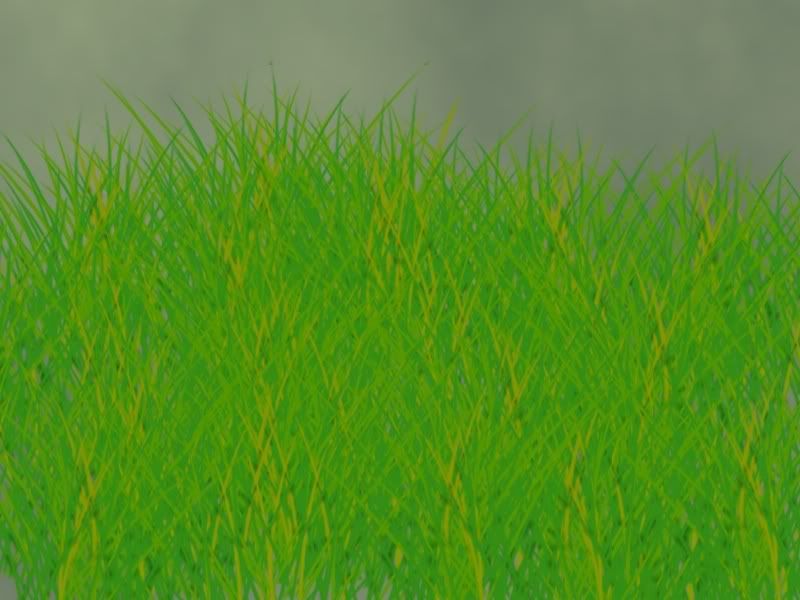
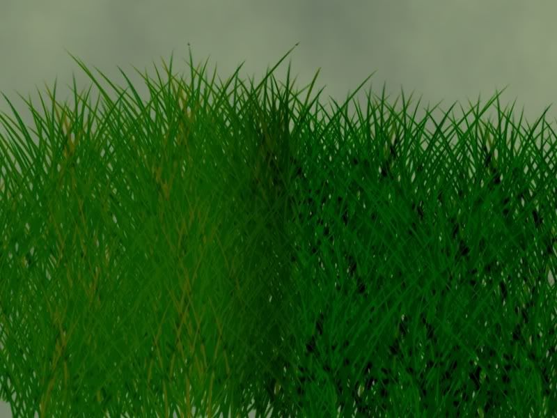
I decided that the motion blur method just wasn't the way to make grass for me.
The same picture, only I played with some blend modes. I like Multiply and Color Burn the best... but I can't decide between the two.

-
Yes, you would still need Ctrl + F, but it's useful if you want to do the same effects to every picture.
And there's really no way (that I know of) around that box showing up.

(try making it really small and just hitting enter twice at the save screen.)
-
Well, congratulations.

One question left: Will we have to wait half an year or will there be an update, maybe after the next weeks? (3.21 - no new features but bug fixes.)
Rick has spoiled us often in the past by releasing bug fixes and such every few weeks. It likely won't be too long before 3.21 is ready to go.
-
Pretty! :shock:
But you rely waaaay too much on stock photos.
-
If you want to do the same series of effects/adjustments, then I recommend pyrochild's ScriptLab plugin. viewtopic.php?f=16&t=20403
-
:shock:
Wow.
The only thing throwing it off is the center. It just seems far too bright. ... but still :shock: :shock: :shock:
-
It's already stickied. No need to plug it further.
 (or maybe there is, but self-advertising just didn't seem like the way to go for this one. :wink:)
 -
Happy to help.
It doesn't really tell you what they mean. Though most of them correspond to the symbols in Paint.NET and are used to help people find things by giving them a simple image to find.
-
Like this:

Also, where can I find a list of icons and what the mean (like :AddNoise: , :AntiAliasingOff: , ...)
The simple, fast way to get that effect is to get your picture all set.
Then fill a new layer with white. Change your primary color to be fully transparent. (and change the blend style to Overwrite) and start typing.
---
Those icons are tools and buttons in PdN. If you click 'View more smilies' you'll see the rest of them.
-
You'll need to change the title of this thread to something more descriptive.
I'm having trouble understanding your exact problem though.
Since you mentioned AIM, and I'm a fan of live chat over anything else. Feel free to IM me at Troytastic.
-
Thanks! I can't believe I didn't think of that before.
You spent much more time on yours, of course. But here's my (hasty) attempt

-
Nice one, jerkfight. :wink:
Thanks it has 13 layers i think, my first relistic art.
Deviantart Worthy?
I think it's just about there. Personally, I would change the angle (if you can) so that more of the face is visible. A nice background and shadow (and possibly a reflection, depending on the 'situation') always help it come together too.
-
Some of the card symbols can be made via alt codes...
Not quite Alt codes, but they all can be done with special characters nontheless.
♥ ♠ ♣ ♦
---
Anyway, this looks really neat. I feel special, because I figured out how to do the bent card (mentally) a little bit after I saw it.
I think I see how the chips are done too. I'll have to make some before you finish this to see how close I came.
Edit: I totally see how it's done, Shape3D wise, but getting those 6 little marks perfectly spaced has me stumped (for now)
-
Haha, that's great.
I especially like the one with the flag.
-
I'll assume you're talking about something like this?
-
Your post seems to be all in order as far as the rules go.
As for your picture, I'd be happy to take a look at it. I can't guarantee anything, but I'll be able to let you know after I see it.
-
I decided I'd take Darkshock's "anti-IE" emoticon and turn it into something a little closer to home.

0.1% Google Image Search
0.9% Imageready
95% Paint.NET
4% UnFREEZ
:wink:
-
i made this for a web design company. if they like it, I get $200
Beautiful. Except for the swoosh. The swoosh could use some AA. >_>
... I wish I could find people/contests that pay hundreds of dollars! [pouts]
-
A few things ive created.
[attachments]
The shape is exquisite... the color needs work.
Nice, Noodelz!Is there a tutorial for that? I saw a 3D text tutorial, but the results didn't look like that.
I could be totally wrong (because I haven't tried it myself yet), but I think you can use Median to smooth out the corners like that.
Either way, that is quite impressive Noodelz.
-
I made this. It supposed to represent the different sides of me [[Happy , loved♥, embarrassed :oops: , sad
 , mad :evil: , and tired*yawn*]]. Its like if you spin the die, whichever face you land on will be my mood for the moment. Kinda like an unplayable, unwinnable game! LoL. Anyway, it sucks, but at least I tried!
[dice image here]
Actually, if you drew those smileys yourself, it looks very good. Even if you didn't do them yourself it's still not that bad. Don't sell yourself short, you'll never get anywhere.

 , mad :evil: , and tired*yawn*]]. Its like if you spin the die, whichever face you land on will be my mood for the moment. Kinda like an unplayable, unwinnable game! LoL. Anyway, it sucks, but at least I tried!
The Pictorium! Post your created or edited images here!
in The Pictorium
Posted
:shock:
Ok, pyjo, color me envious.
:shock: :shock: