


The_Lionhearted
-
Posts
2,337 -
Joined
-
Last visited
Posts posted by The_Lionhearted
-
-
Another signature I may use in the future.

Kreeos, of all the stuff I've seen of yours, this is my favorite.

-
Looks good...is there any chance there could be some option to randomly rotate the brush image whenever it is rendered onto the canvas? Something like leaves falling at different angles.
But overall this looks good...potential here...just needs some spit and polish.

-
2) Can I have your rabies?
:shock:
-
It's not a ScriptLab thing, it's a PDN thing. Effects authors are limited in what they can do, and messing with layers isn't one of them if I understand it correctly. v4.0 anyone...?
-
Combine with Ed Harvey's Dents, my Jitter or Stitch, and various blurs to make some highly realistic blood.
I might post an example later if I ever finish this essay...
Everyone chant with me...
Write...write...write...write...

-
I tried to Scriptlab this once, but it involved multiple layers and I couldn't do it. :?
-
Awesome!
-
I love grapes.

-
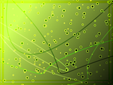
hubbly bubbly background, its something like the glow background done in photoshop/gimp but this is 100% pdn
edit:
forgot the image :oops:
Very nice salu! I'm especially a fan of the lines that change colors. Nice touch.
-
@Mike no problem rest assured most people go back thru previous pages of the pictorium just to see if they missed anything since last time they looked. and if they are not they will be missing some nice artwork.
anyways I'm working on a series of art cards for the seniors home gift shop. trying to get my designs down. Here is one I think has potential but not sure of the coloring. it might still hit the dust bin in the final cut of cards, or undergo a color change. . I don't really like the sparkles so think they are coming out toot sweet.

That's awesome oma! I agree though, the sparkles are a little off...but it looks really good!
And sabrown, nice change in sig/av.
-
Think of layers like transparent sheets of paper all stacked up on top of each other. It can be tricky at first, but keep playing around with it.
As to how to do stuff, if you want to lighten your picture may I suggest "Adjustments -> Brightness & Contrast"...
And to cut people out of a picture, there's an excellent tutorial available in the tutorials section called "Cutting out people the easy way".
Welcome!
-
Thanks pyro!
-
Alright. Followed advice from Ash. Instead of doing a true recolor, I thought about an abstract recolor. Any better?
No glow. Other than that, good.
-
Just wait for people to read your post from before, no need to post again.
I would add just 1 color to 1 part of the image. it's up to you if you wanna or where to add.
Just dont think I would have gotten the same amount of response on a previous page, and I am thinking about leaving the paint on the tip of the brush colored and color in the splatter. What do you think?
Yes.
-
Feather as necessary. Wipe hands on pants.

-
To be honest Madjik, it's the UI that's keeping me from this one.

-
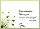
mostly made in PDN
Very nice. I like the quote.
-
Thanks for the mini-tut janet!
-
Thank you for the constructive feedback. I did this as an experiment, to play with all kinds of C# 3.0 stuff. But it's nice to here people actually like (some of the) results.
Oh definitely! Thanks for answering my questions!
Surface Blur is one of Ed Harvey's effects...
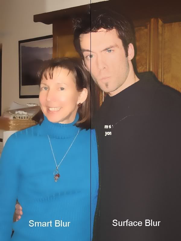
Can you see my confusion? I may have used too much of Ed, but they seem to do similar things. :?
And changing the colors gave me vastly different results on the Monotone/Duotone stuff. I knew I was missing something. Thanks!
-
First off, let me echo many of the sentiments here...thanks Kris! New things to play with!
Couple of things I wanted to mention though:
1. Lack of drop-shadow-color-picker. It was oh-so-useful, but I read your post earlier and now we're probably not going to be able to get it. RIP color picker...RIP.

2. "Grayscale on Color Paper" just makes my image black. I'm a little confused as to how this is supposed to work...? I tried it on a straight photo.
3. A few of the adjustments seem to be pointless. I'm thinking in specific of "Darken", "Lighten", and "Negative". This seems like something we could do ourselves pretty easily unless I'm missing something...
4. The "Duotone" and "Monotone" effects just seem to make my image grayscale...I'm guessing there's more to these effects than I get at the moment.
5. "Average Blur"? I don't get it... :?
6. "Fade Edge" = Awesome! I've been wanting something like that for a while!
7. "Smart Blur" looks very similar to "Surface Blur"...what is the difference?
8. I also wanted to re-iterate everyone else in saying that the submenus look a little weird...I don't have a constructive suggestion for what to do though. Sorry. :?
9. I know you've explained how to re-compile your effects into separate dlls already, but...por favor?
All in all, a good addition! My comments are merely suggestions, nothing more. Thanks for making all this stuff for us, I appreciate it!

-
 1
1
-
-
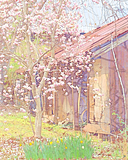
BoltBait love the plugins. This is pastel over ink. It doesn't hurt to have a great picture to work with. My brother took this one.
That is amazing. How EXACTLY did you do that?
That is the hottest thing I've seen all day. :shock:
-
If I remember correctly Madjik already created one...? :?
-
Pictorium, my friend. Other than that, looks good. Welcome!
-
Yeah...with how many people you fooled barkbark...I think you can call that one a success.
Had me.


Custom Brushes Plugin 5.1.5
in Plugins - Publishing ONLY!
Posted
Agreed. As much as I like it, I'd much rather wait for something awesome than settle for something mediocre now and gradually see improvements. For example, pyrochild's Splatter was near-perfect when it came out...because he took his time on it and didn't let other people dictate his schedule.