


Mayor_McSteeze
-
Posts
550 -
Joined
-
Last visited
Posts posted by Mayor_McSteeze
-
-
Bizor, please try to comment on other peoples work and then post something for yourself.

@Cortez, It looks pretty good to me although i would prefer the orange gradient to be toned down a little bit. Maybe you good add a little C4D behind the render?
@Bizor, Actually looks pretty nice, the C4d's flow nicely and the colors work well together, i would suggest adding a simple border though, it would add to the awesomeness

-
@Falken, doesn't really seem like you but the texture is great
 Although i do not (like Chrisco) like the rings. And im sure your going to add a spectacular Nebula/Galaxy thingamabob in the background
@Bizor, A neat idea you have. Although the (tiles?) themselves are a little blurry and AA. Otherwise its a pretty cool idea. Maybe think about adding some water to it?
-
Your newest sig is beautiful!
-
Update: New Sig.
Grassy Sig: (One of my Favorites
)
-
Gazek, There is already 2 entries so i will go with the Ptuz Vs. st1cki3 matchup.
Ptuz, I like the overall grungy-ness of the sig but the text doesn't fit very well and the right side is rather plain. I do like the concept though.
St1cki3: I like the clean approach on this one although it is a little plain. The border is a fantastic touch also. Therefore...
Ptuz: 0
St1cki3: 1
-
I'm not sure if it just me, but i cant see your images L3ron

-
I'll play along with my current.

-
This tutorial is available as a PDF. Click here to view or download it
Here's a simple water effect that I created a while back but have yet to post
 .
.
Step 1. Make a new Canvas. I choose 450 X 150. But it's really up to you.
Step 2. Render Clouds at the default settings.
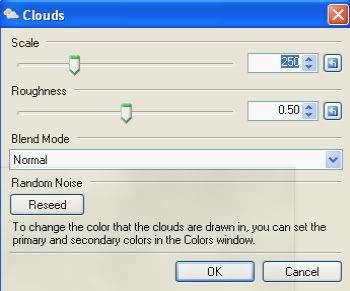
Step 3. Next, Render Clouds with the belnd mode set to difference 5-7 times. (Do Not Duplicate the Layer!) (Press Ctrl+F)
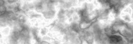
Step 4. Invert the colors. (Ctrl+Shift+I)
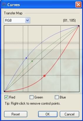
Step 5. Color with curves. (Feel free to mess around with this setting.)
Step 6. Next run displacement close to the following settings. (Experiment, please.).
Edit by EER: Displacement is a plugin - get it from this pack: MadJik's Plugin Pack
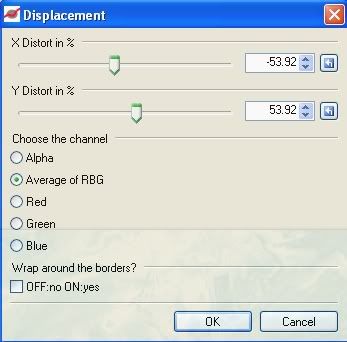
(Feel free to mess with this to give you a better effect.)
Step 7. (Optional) Duplicate your final result and run a zoom blur around 50 px, set the blend mode of the new blurred layer to lighten for a "Light Shining" through look.
Estimated Time To Complete 5-10 Minutes.
Final result!
Hope you liked this tutorial.
Feel free to post questions and results.
Have fun!
-
Thanks all for the appreciation.
And yes the Earth idea was inspired by a photoshop tutorial but it easily converted over to PDN.
-
Upadte: 3 New piece's
Earth:

Planet:

Wreckt Clothing Line:

Feel free to comment and critque.
-
Wow escapist angel, could i ask how you made yours?
It looks very good!
-
Im glad everyone is enjoying this tutorial as much as i enjoyed making it!
-
Sorry for the double post, Dang computer!
-
Thanks Chrisco, i think i like that one the best too!
A quick sig that i made that I'm starting to like more and more.
-
Just made my new signature, (which took over 5 hours!
 )
)Need some opinions on which sig you like best. (I'll be adding a drop shadow after i see which one is best)


Tell me what you think
-
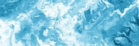
It's really quite simple, it's semi-transparent free-form shapes with different opacities layered on top of each other with the overlay and screen blend modes. the some frosted glass and clouds to get a frozen look.
-
This is probably one of the tougher decisions I've made in sig battles.
Since CSM's sig is 100% (which i didn't know before!) I'm going to have to give it to him.
Clockwork, your sig is actually really good so don't get discouraged.
CSM: 2
Clockwork Demon: 1
-
@L3ron & ptuz, Thanks guys, i really appreciate it!
Here's another new abstract,
I like the "frosty" feel it has.

-
First piece is your best, but you need to work on smoothing out your edges, try feathering, AA's Assistant or something along those lines that should help.
-
I clicked on this first post expecting to see a nooby post involving polar inversion, but I'm impressed, you definatly have some talent. For a first image 8.5\10 The Gradients at the bottom are a little out of place, and the text is way to blurred, but otherwise, nice job.
-
N00ber, i like your outcome, it looks really nice.
-
Sorry for the double post, just a quick update here, A little abstract piece i call holographic.

-
Siddek: 0
Crisco: 1
Siddek, it's alright but there's not much to it. Text doesn't really work either.
Crisco, much better then your last Sherlock sig, I really like this one
-
@Barbieq, Thanks, Iv'e always felt simple things work best.
@Possum, Thank you as well! Im trying to incorporate the Brain-ish texture into a piece but I'm having trouble
Here's My First Attempt at Making Pixel Art. (Still a WIP)

 Although i do not (like Chrisco) like the rings. And im sure your going to add a spectacular Nebula/Galaxy thingamabob in the background


how to get rid of this pesky white outline
in Paint.NET Discussion and Questions
Posted
Also you could use the feather plugin to get rid of gross edges, Median would work too.