


Mayor_McSteeze
-
Posts
550 -
Joined
-
Last visited
Posts posted by Mayor_McSteeze
-
-
Ill challenge with my current


-

Mu haha, perfect for testing my new rating system
Text & Or Border 14/15
Color Scheme 8/10
Textures & C4d's 17\20
Compostion & Flow 15/15
Quality 9/10
Execution 9/10
Concept 7/10
Unique & Eyecatching 8/10
Overall 87/100
Smoooth.

-
Update: Metroid Sig (Yay for more smudge!)


As always, i made slight variation of the original, tell me which one you think is best.
-
Stone:
Text & Or Border 5/15
Color Scheme 7/10
Textures & C4d's 10\20
Compostion & Flow 7/15
Quality 6/10
Execution 6/10
Concept 6/10
Unique & Eyecatching 5/10
Overall 52/100
Psycho:
Text & Or Border 2/15
Color Scheme 2/10
Textures & C4d's 7\20
Compostion & Flow 3/15
Quality 6/10
Execution 3/10
Concept 6/10
Unique & Eyecatching 5/10
Overall 34/100
Stone:1
Psycho:0
-
Ill enter with this.
(Which seems sooo old!

-
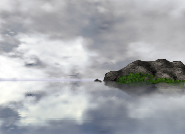
Eh, a close up grass stock with some glossy effects and some text.
Could be worse, composition is good though.
-
Musiphonix, need to work on the AA, and really think hard before making a space sig because they just get old real quick (if they're not good!)
Chrisco, Not extraordinary, but it blends very well and the grungy feel to it is nice
Chrisco: 3
Musiphonix: 0
# Winner Chrisco
-
100% PDN

It's beautiful.
Honestly i thought it was a real picture before i scrolled down.

-
I really like your first and second piece's. Your style is quite interesting to say the least.
Keep it up!
-
Update:
New Piece: (Based Off of Expired's Glowy line tut.)
Soul:

-
No votes yet?

I LOVE pixel art. (Even if im not so good at it.
 )
)My vote goes to PDNnoob, its fantastic, really.
-
@Heat Stroke: Look pretty good, the colors are a little intense and feels like theres to much going on at once.
@Olav Really amazing piece. You should try your hand at abstracts more often! I love the "weightless" feel to it, like its getting swept up into the air.
-
I counter your halo sig, with my new halo sig,
(I really felt you beat me with your last halo sig, so i though some competition was necessary. Call me Crazy.)
-

Probably your best two works right here, The rest of the sigs don't really interest me very much, there kind of bland.
-
Update
New Sig Update:
V2.03

V2.02

V1.02

-
Bum bum bum, this last defeat has made me go extra hard on you
-
Update:
New Sig, I REALLY like this one. I want a different background though, any idea's?
-
Darn, that was a quick post ^^
Anywho, Ill enter with my SOTW sig.

Stocks listed in Sotw.
More of a composition sig then a 100% PDN.
-
Gazek- I like your idea but that white bar is just making me not like it. And the text has a little jaggie issues.
Axle- I like the render and the stars, but honestly, i despise the text. Jaggie, about 1 px wide. Ew.
But regardless.
Axle- 2
Gazek- 1
-
Update:
Adding some more results.


Remember to post your results!
-
Update: Sotw 44
-
-
I'll enter with my current.

-
I'm not too sure about the rest of you, but I've had a trial version of WinRar for about 3 years now and it's never expired
Yep, Iv'e had mine for longer then i can remember


Sig Battles (ENTRIES/VOTING ONLY)
in The Archives
Posted
I know, but im unable to install fonts, and the basic fonts are suckish so i just don't use them.