


Zieon Eslador
-
Posts
148 -
Joined
-
Last visited
Posts posted by Zieon Eslador
-
-
The only thing I can think of is to use a black circle as a half-sphere map and rotate it until you have a bowl, then overlay it onto the die.
I'll try to find an example in a tutorial in a few minutes.
*This isn't a tutorial, but if you read the whole thread, you should understand what I'm getting at.
**Or you could listen to Boltbait. :wink:
-
They are there for a reason, because you point the hour hand toward the sun and boom you have your directions
 . This article explains it a bit using your watch as a compass
That's pretty awesome, and come to think of it, I remember a friend once tried to show me that.
In that case, make that no faults x2, Goonfella. :wink:
-
soakgirl isnt there an advertisement rule too?
It's cool, he's covered.
23) ...If you want, you may include a few links in your signature as long as they are small and unobtrusive... -
Awesome detail, Goonfella. Looks similar to one of my dad's old watches.
...So, what's with the compass display? I'm pretty sure North isn't always going to be the direction you're pointing the watch.
-
Aliasing, Hutton.
-
1. Listen to Lance McKnight.
2. Listen to Lance McKnight.
3. Listen to Lance McKnight.
-
I think it's a her, Aislin. :wink:
The second one looks better, but I don't like how perfect that circle is around the lightning. Other than that and the size, I can't find anything negative about it either. What book, game, tv series, movie is that from?
-
-
Also, again, forgive me for the small size of the wallpaper

It's fine, the black around it is filled in with desktop icons, so I can't even tell.

-
Kemaru, I'm not so much a fan of the colors, but I like the design a lot. My vote's on the centered logo version. Can we get a link to the desktop-size version?
Also, aguba, that's now my desktop. :wink:
(Click for DeviantArt link)
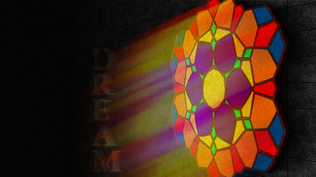
Took ~3 hours, made from scratch in Paint.NET. I don't suppose this fits the WOTW theme...
-
Added "Dream" to Desktop Art.
-
Does this mean you usually do?
This thread is getting a bit silly now.
On with the next one, I say!
You seem to have forgotten I've only entered 2 contests, I don't think I have any "usually's" yet. :wink:
Is that a bad thing?
I don't suppose you consider glass to fit in the "Stone" theme...?
-
My vote went to Brandon because he is new & my stepson, otherwise you would have got mine.
Chalk it up to experience. Your work should have received more recognition but at least you entered, made the effort & it was not an easy theme.
I wish my relatives were that cool. 8)
I have no problems with losing a contest, and I wasn't shooting for recognition. I just couldn't figure out why my entry was the only one with no votes. (Probably because I didn't vote for myself this time)

-
Briamoth, I see some really jagged lines on the sides, make sure you set the quality to 5 when you use Polar Inversion.
-
I'm not a sore loser, but seriously guys, 0 votes? Should I just draw with the pencil tool for the next contest or something? I really don't know what to think right now.
Though, congrats barbieq25. Can't wait to see what you pick for the next theme. *Yep, it's your turn to pick the theme.
-
To your battle-stations!
(Abstract > Crystalize > Blur/Gradient of some sort)
-
Much better, aguba!
I still notice the Aliasing, but you must've blurred it, because now you can only see it if you look hard. When I get bored of my current desktop, that'll probably take it's place.
-
image
Back from the dead
Please tell me this looks realistic.As I was scrolling, it looked extremely realistic, but then I saw the Aliased edges... You did a very good job making it look 3D though.
Aislin, try the image-modification thread. :wink:
-
As they say, Frontcannon, "Simple is always best."
So, now what?
-
Frontcannon: 2
Everyone else: 1
Sorry Frontcannon, but everyone else's looks pretty awesome.
-
soka it looks a little 2d.
Hey flip, we ever going to wrap up the WOTW? :?
Also, the buildings are black silhouettes, so shouldn't the sky be a bit darker? Looks nice either way.
-
I like the outcome, but... isn't the 6th image in the wrong spot?
*There we go, I was wondering how your tank turned into a golden pedestal so fast.
-
About your avatar, I really can't figure out what to do with a tomato. :?
Give me a little bit...
-
my halftone doesnt work, are you sure you selected the correct settings.
All I have to say is-
are you sure you selected the correct settings.I took the screen-captures as I made the bullet, and those are the exact settings in the picture, and the ones I used.
Make sure you have-
1.) A selection rectangle filled in with the bullet color.
2.) Black as your secondary color and the color of the bullet as your primary color.
3.) A new layer.

Image Umbrella: Realistic Images
in The Pictorium
Posted
Critique-
Falken, the centered green dot and the radial flares around the sun are too opaque. Also, blur the semicircle that is covering the top middle a bit. The rest of the lens flare could be a bit more transparent, but it looks fine as is. If you're going for complete realism, the moon shouldn't be there. If it's between you and the sun, how does it reflect the sun's light? :wink:
The image is awesome though, and even if you don't change the things I pointed out, it looks great. The background is yours as well?