


Lance McKnight
-
Posts
1,227 -
Joined
-
Last visited
Posts posted by Lance McKnight
-
-
I once asked if TIFF was supported, and the answer I got was basically a no.
-
Transparent gradient, I believe.
-
It seem to be a simple thing. Pyrochild had the right suggestion. One thing in resizing the image is how you can tell PDN where to anchor the image. If you want to have the text on the right hand side, with white space, tell PDN to expand to the right while anchoring the image to the left. Make sense?
-
Could you elaborate some more on Excel?
It seem to me that the size is an issue here. The only thing I can think of is to make the image smaller before moving it into Excel.
-
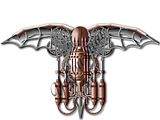
I know a steampunk style when I see one, and this is one. I got confused when I saw text on the image, and realized it was your name watermarked. Are you planning on adding texture or leaving as it is? And I have never commented on your phonograph. That stuff rocked! I remember my first father having an old recorder...

-
barbieq, I have often found that duplicating the fractal after removing the black increases the color and contrast. Sometime running Gaussian blur at default helps too. There's a lot of combination you could do with some of the color editing capabilities of PDN and fractal. They are addictive! But "Summer Love" is golden! I love the stained glass effect you have going.
-
Just to clarify pdnnoob's post. You can rotate the selection by using the right-button of the mouse. Holding down the shift and right-button will rotate the selection on a 15 degree increment.
-
Oh I see what's happening. Here's a question for you. What was the original size of the canvas and the image size itself?
The issue, from what I am seeing, is the image was bigger than the canvas' size. Before you pasted the image, did Paint.NET prompted you with the dialog that says "The Image you are pasting is bigger than the canvas size, do you wish..." and it gives you three options to choose from. My personal suggestion is to click the 2nd option (I think), which allows you to keep the canvas size, but allows you to scale down the image to fit the canvas, or you could click on expanding the canvas size to accommodate the size of the image, and you can always resize the image later.
Unfortunately, once you deselect the image, and you try to move it, the information that was contain inside the selection is gone.
-
Unfortunately, there's isn't a tool to do that. One work around is to use transparent gradient and fade out where you want the fade to start and end.
Smudge can do that too. I think if you set the pressure really high or something like that, you can make it fade. Give both tips a try and let me know which works. I'm eating dinner and typing this at the same time.
I had a brain fart when I was writing this. I meant to say to increase the jitter in smudge, and it'll fade out pixels like a paint brush. Experimentation is key.
-
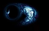
Weird...when I was scrolling through, I thought the ball moved, and had to go back to look at it again. I like how it has the ink swirls, like a squid squirting ink when it's threatened, and the darkness. Reminds me of the film of the deep sea exploration that was totally awesome.
-
Unfortunately, there's isn't a tool to do that. One work around is to use transparent gradient and fade out where you want the fade to start and end.
Smudge can do that too. I think if you set the pressure really high or something like that, you can make it fade. Give both tips a try and let me know which works. I'm eating dinner and typing this at the same time.
-
Try the Conditional Hue/Saturation plug-in to see if that helps.
-
Just offering a thought, if it's worth anything at all, I remember somebody gave me a tip. Use the grid maker plug-in, then run rotate/zoom to set the grid on an angle, and make the design you are going for.
There's also the Perspective plug-in that will drawing vanishing points for you. dpy also has the plug-in to create trapezoid and perspective distortion.
-
On the very bottom layer that says "Background" turn it off. Then save as PNG. It saves transparency.
I am also assuming you are working on layers.
-
I really like how you did Torus #2. It could be used as a logo.
The other ones I like is the image in panels, though I feel the shadow is a bit too strong, and should be a tad bit subtler. Your gallery is off to a fine start.
-
Honestly, Flash is your best bet here. Those kind of animation involves complicated masking process, animation tweaks, and a whole lot of Mountain Dew. If you want to do this with PDN, treat each layers as key frame in animation. I have never made animation in PDN, but I believe the very top layer is the "first" key frame, and working your way down.
Best of luck, Loco...funny name BTW.
-
Very sound advice from PDNNOOB. I might add that don't go for fancy fonts either. Keep the text simple as well. Do some research on other pharmaceutical companies and study how their banner, texts, layout looks. It'll give you an idea of how to convey the message you want. Good luck.
-
Have you tried the recolor tool?
-
It sounds like when you copy and paste an image, it's bigger than the canvas, it will "shrink" the ones you are trying to work with. What I would do is open each image individually, resize them as necessary through Image>Resize, and put both of them together in a new file on separate layers.
I'm hoping that it was helpful, the question sounded a bit ambiguous.
Edit: Beaten by EER.

-
This is a reply to KeyLogic. Is there a tutorial for this? If not, can you make one? I just tried this but it isn't working. When you say you make a new layer, are you duplicating the original layer or making a transparent layer? You also say you use paint bucket, but do you also use magic wand to select inside the lines you drew with line tool, and what color are you using to fill in the area? When I tried this, the apply texture effect asked me to open a new file, then it filled in the area with just a blue background. One more thing, on which layer are you using the line tool? The original layer or the new layer?
Thanks (Yes, I checked for a tutorial on this but couldn't find one)
Scroll up to welshblue's post and you'll see the link to a tutorial. It will answer your question.
-
Use Image>Resize to resize your photograph. As for layers, view the following guide on how to use layers and blending modes.
-
@Lance I just end up with a white screen
 followed the steps 3 times and each time the same.
Sorry about that! I just tested my method, and it seem duplicating the white layer was an extra step not needed. I edited the steps. Thanks for catching it!
-
I haven't been posting here for a loooong time, mainly because I just don't have as much spare time as I had when I was fifteen.

Anyway, every now and then I create something with Paint.NET, because messing around with graphics is still fun. Inspired by this website I wanted to make something similar with pdn, but I'm not quite happy with the result:
http://a4.sphotos.ak...730491834_n.jpg
I made use oft the PencilSketch-Tool and a few other Plugins, but the "drawing" still doesen't look very drawingish in my opinion.
Any suggestions how to create a better drawing-like image with pdn?

Here's what I do -
- Duplicate original image.
- Make it black and white and duplicate it.
- Invert the duplicate b&w layer and set blending mode to color dodge (warning: it will make it completely white! Don't fret). Run Gaussian blur on this layer. Higher than 20 pixels gives the sketch look.
- Duplicate the white layer (the one you changed in previous step) and run Gaussian blur.
- Optional - copy original image and move it to the very top layer and change blending mode to Overlay.
This mini-tutorial was actually adapted from a Photoshoop tutorial. Super easy to do.
-
In addition to what delpart said, you could do a search for a laptop stock image, and work from there. With some practices and WIPs, you could create similar effect. Good luck.


Are there any watercolor aiding plugins?
in Paint.NET Discussion and Questions
Posted
I think this tutorial is a close way to duplicate a watercolor picture. One step might be tricky, but I think it can be done.