


K_I_N_G
-
Posts
309 -
Joined
-
Last visited
Posts posted by K_I_N_G
-
-
Well at first I didnt know what the hell your signature was but I see it now. Good tutorial.
-
Cool, post your results guys. See what you can come up with.
-
This is for generally abstract works, but makes for interesting gaming banners.
-
Add shadows and lighting to the stone that the sword is stuck in. It has a box-look too it depending on how you see it. Shading and lighting should take care of that.
-
Very cool.
-
New signature:

Perfect.
-
PDN isnt able to hold the animated picture. It will freeze no matter what, use a different program or use frame for frame.
Not true. It can, using Simon Brown's Animated GIF reader/maker. You just need to rename the extension to .AGIF.
Hmm, I didnt know that. Thank you.
-
Coolz. If anybody has any suggestions I am open too feedback.
-
I am surprised there isnt any more posts on this. Really good tutorial, well-written and exactly what I needed. Thanks.
-
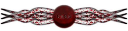
Its just lines and gradients...on everything. I used this tutorial for the wires (just added lines with the paint bucket). These two for the chrome outline: 1. 2. The background is three circles, filled with a light and dark gray gradient. Clouds with a light roughness set to overlay (to give it a grundgy texture). A paint bucket set to rivet within the circles. Then dots using the paint brush at bigger then smaller sizes and a 1 or 2 pixel Gaussian blur.
Took upwards of an hour so really its just patience and the basic tools of PDN.
-
That joker sig looks great man. Awesome gallery.
-
meow :shock: the sun got to close
That one rocks man.
-
PDN isnt able to hold the animated picture. It will freeze no matter what, use a different program or use frame for frame.
-
Interesting outcome, I think I'll use this in a retro sig.
Using brushes can come up with a nice blood effect as well (wrote a tutorial using that method).
Still doesnt quite look like blood....
-
A hundred and somethin views but only 3 replies...hehe, not what I expected.
Consider using a blur or a brush with some transparency so it'll make the blood look more realistic. Using a variety of brushes gives a good effect as well.
-
Well I' m sure someone can use this to make a better signature or something than I did. Post your results if you find the time guys, I'd quite like to see what others can come up with.
-
Happy birthday, if your lucky you'll get hit by a moving vehicle.... I mean unlucky. Wow its late.
-
This tutorial is available as a PDF. Click here to view or download it
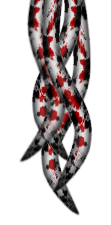
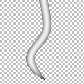
Welcome, today we'll be making this:
You need:
Goonfella said:You`ll have to install Simon Brown`s Custom Brushes plugin along with ABRViewer to convert the PS brushes into PNG files.Here-
I found a photoshop tutorial and thought the outcome was pretty cool so I tried it with PDN. The outcome was useful (IMO) so I thought I'd post a tutorial on it. Photoshop tutorial.
You will need the custom brushes plugin as well as a blood splatter type of brush (if you run a search on this site you'll come up with a lot). I used this brush pack.
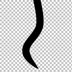
1st step: Start off with a canvas size of about 300/300. Get your line tool and draw a black, curved line in the center of your canvas at about 30 pixels. We'll call this layer line A:
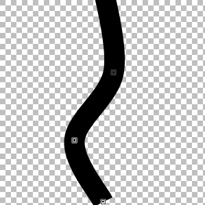
2nd step: Create a new layer and name it line B. Draw another line at the bottom of line A on this layer with a different color (as its easier to see). Draw this starting at the right end point of line A and finishing at the left side of your tentacle in a smooth arch. Right click to create a smooth curve. This will make it seem like line A is tempering out like a tentacle:
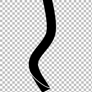
3rd step: Delete everything on the left side of line B on line A. Delete the line B layer. Now we have the basic outline for our tentacle:
4th step: Duplicate your line A layer and invert colors (Adjustments/invert colors or CRTL+Shift+I). Get your Magic Wand tool and at 0% tolerance Select the transparent part of this layer and then invert selection (Edit/Invert selection or CRTL+I). Run a Gaussian Blur with a radius of 18. Merge this layer on to line A and you should have something like this:
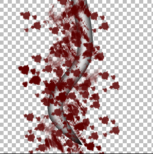
5th step: Duplicate the line A layer and set the top layer to multiply. Merge this layer down. Now add a new layer and name this layer Blood. Set your primary color to a dark red (used hex #5B0000). Go to custom brushes and randomly add blood splatters across the canvas:
6th step: On line A get your Magic Wand with a tolerance of 60% and select the transparent background. With this still selected go to your Blood layer and hit delete. Go back to your line A layer and run a gaussion blur of 2%. Duplicate this layer then merge it down. Double click on your Blood layer or go to propertys and set the blending mode to Color Burn (Glow gives a good affect as well and you can always just leave it as is):
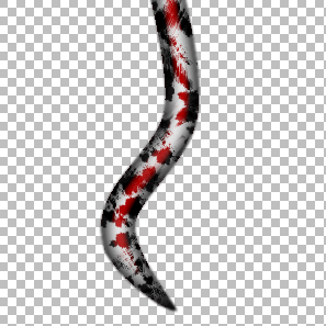
7th step: Flatten your image. Select the transparent background (with your magic wand at 0%) and once again invert your selection (CRTL+I) and feather it (Effects/Selection/Feather Selection) at a radius of 3. Wah-lah, now your finished. You can use lighting or anything else you like to give it a 3d look but this is as far as I went with it. Although I prefer mine to be a little thinner so I usually stretch 'em vertically and make 'em smaller. Heres my final result:
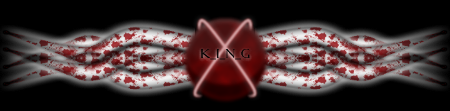
Used this technique to make a sloppy signature:

-
True that. If I get any more requests I'll consider it (we really need more tutorials in the forums).
My newest two hack-jobs at something weird:
-
Haha, well thank-you, I dont believe my signatures are worth a tutorial just yet though. Perhaps once I make something decent.
-
Good gallery. Very talented.
-
Hmm, the directions/description could use some work but its alright.
-
Your welcome.
I took your advice, doubled the amount of sigs in the gallery (they kept looking good to me so I kept puttin 'em up).
-
Thanks. I suppose I should try to change it up with the render placement.
As for the signature it was easy enough. I used the wire tutorial in the forums to make the pipe things. A simple circle, filled with blue, a radial gradient on another layer (set at overlay), a few dots blurred at 1 pixel, and the chrome ring was just a few gradients of different grays. As for the background I used a few big circles, a radial gradient and filled them with the paint bucket where the fill was rivet.
I have no idea how I remembered all of that....
Transformers Tutorial!
in Tutorial Graveyard
Posted
^Hes referring to the fact that its 8000 px's tall. Um...I suppose a quick way around this is to cut it into different images at every 800 mark, or simply post a link to the image.