


K_I_N_G
-
Posts
309 -
Joined
-
Last visited
Posts posted by K_I_N_G
-
-
@YY10, a bit too monotone. A nice way to keep your colors separate but around the same range of tones is to flatten your finished image without too much color work done on it. Duplicate the image and use curves or your preferable method to change it to whatever color you like, then simply change the transparency to a lower level. Keeping your hues blended together is always a good idea but too much of one color can ruin a signature.
And theres always the distinct possibility you already know this so please dont be offended if I sounded patronizing.
I particularly liked how this one turned out and thought I'd share it:
EDIT: Seems I posted right after Theonlychad so thought I'd give an opinion. A nice texture, a bit rough but I think it adds to the overall effect. Using a texture as a signature is sometimes a good idea but in this case I'd suggest shaping the texture into something more appealing.
-
That bravery signature is just awesome man.
I've been working on graphic design lately but its like starting all over again. I just plain suck, but checking out your work really inspires that nudge I need. Thanks a lot.
-
Very cool. Seems you've updated quite a bit here. I dont practice graphic design anymore but I'd like to think my opinion isnt wasted hehe, great job.
-
@Oma. Love it.
-
It really is pretty cool. Thanks for writing this one man.
-
@Zatharath, very nice touch with the colors.
A LITTLE TIP, I can see that the edges on these are a little fuzzy or jagged. The cure for this is to simply start at a large size where your smallest dimension is at least 1000 pixels then resize to what you want. This will make the edges nice and smooth.
-
Two new signatures:
(Used a few brushes but all in all about 70% PDN)
-
@Benji, you can see some of the stock showing behind your light or whatever towards the bottom right.
@Soul, thats really good.
-
Thats pretty good.
-
Hmm, I think second is a little more preferable. That white center in the first is a little too big.
Great work.
-
I'm not too sure about that. Usually an abstract is what you want it to be, if it was brighter in the center it might seem better. Idk, abstract to me is usually something to inspire what your feeling. It should seem intense.
Broken Thorns (100% PDN);
-
Broken Thorns (another abstract piece) 100% PDN:
-
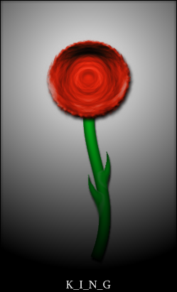
I've seen all the rose tutorials on the forum but I wanted mine to have a stem instead of an abstract looking piece. So I thought I'd share how to do so:
1. Make a circle selection or draw one. Center the selection.
2. Render clouds at default settings with the inside of the circle selected.
3. Run drop ripple.
4. Run dents.
5. Run twist.
6. Duplicate layer, go to adjustments and flip the layer horizontally.
7. Lower the opacity to about 120 or use overlay.
8. Use color tint or any other method to color the rose.
Using the same plugs can achieve different affects, then using the 'wire' tutorial you can make a stem.
My finished rose:
-
I found this very useful. Thank-you.
-
Curves, brightness and contrast, layers (to color 'em differently). Its simple once you understand how to manipulate photos more. Read a few tutorials.
-
Perhaps, but I couldnt quite get the 'rocket' part done well so I just made it small and left it there to gather dust haha. Considering it was upwards of 6 hours just to do each gradient and the outline took a good 2 hours or so, I probably should have put more work in it...but oh well.
-
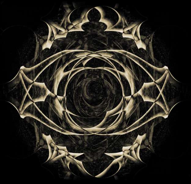
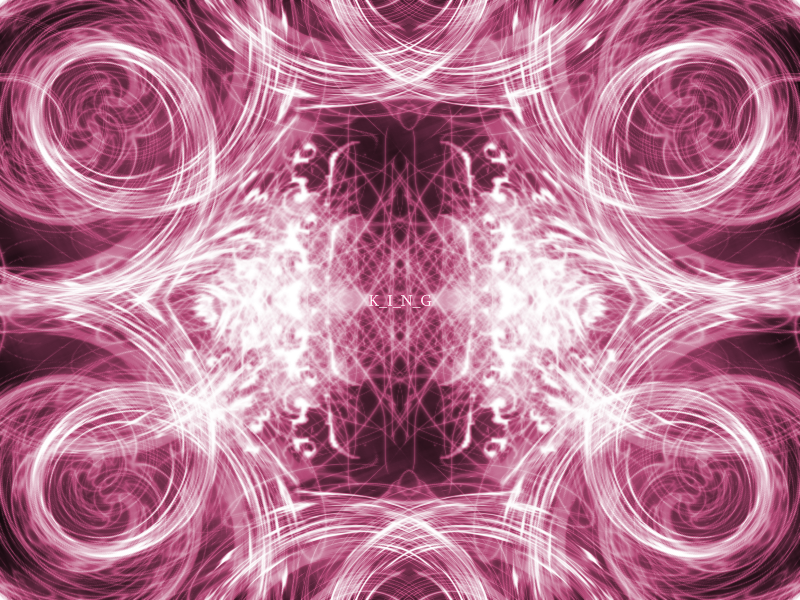
Well I liked my original abstract I named 'soft light' but I wanted a little more depth in the center so I redid it using the same technique:
-
So I was browsing through and found a few flowers.
Some of the pieces here make mine look feeble but I thought I'd give it a shot anyway:
Yes its not exactly A class, any tips on how to make it better would be appreciated
 .
. -
@Yellowman, I agree about the grass but man...the shadows, the sky, the texture.... Thats a great piece.
-
Hmm...the term 'fish' comes to mind.... Perhaps a little :AntiAliasingOff: here and there but its not too bad.
-
:shock: :shock: :shock: :shock: :shock: :shock: :shock: :shock: :shock:
So beautiful
Thanks, but I think your 'explosion' abstract tops it. Was my original inspiration, I just couldn't quite replicate the technique so I went a different way.
@Goonfella, thats just cool man.
-
Yeah I understand what you mean. Guess I get infatuated with it :oops: .
-
@Darkshock, haha, man that one made my day. As most of my original work was based on trying to duplicate your style. Never accomplished it, so I just went on with some weird stuff to make my own.
@Lego, thanks, I didn't notice the repetition till you pointed it out. I'll work on that.
Did an abstract piece for a background:
-
@Soul, your second abstract 'explosion' is very cool.
My attempt at a background:
Shockworks
in The Pictorium
Posted
Constructive criticism.
Not very constructive.