


TopHATslash
-
Posts
3,300 -
Joined
-
Last visited
Content Type
Events
Profiles
Forums
Blogs
Gallery
Downloads
Posts posted by TopHATslash
-
-
Thanks..
Tech!

-
-
I just want to see different stuff. I'm the same with everyone, so don't take it personal. Yeah, I might make sigs mainly, but I try different styles all the time. These seam the same except maybe some changes in fx or lighting.
All I'm saying is your work rocks, but I just want to see new stuff.. thats all. I like seeing different styles from everyone.

-
Yeah, about 15 layers of 'em. :wink:
-
Random thing for my dA.. I call it grunge. No brushing or anything, 100% pdn. (Except for 1 stock, but all it does is give the lines in the bg.)
Enjoy!
-
That apple is noyce.
-
Not bad. Kind of basic but it looks pretty cool.
-
As the previous comments said, depth of field is a cool concept, but removes a lot of detail.
I've found some quality high-res textures at http://www.darknews.com/high-res-textures/.
An easy way to make a simple seam in metal is to make a light grey 1px line with another dark grey 1px line fitting snug beside it. The order of the light and dark depends on where the light is supposed to be coming from (If the light is coming from the top then put the darker line at the top).
Have a look at jake2k's sig to see how he did the seams.
This might be some inspiration:
I don't want to use already made textures....
The main thing I need to work on is to keep it clean. Last night I was working on this one sig but then a blackout happened and I lost it. It was really good though, imo.
-
It was a start, yes. I made a tech sig awhile back but it was just a mess around. The problem I have with them is that I can't get a good rounded-shaped object without A. it being to blurry or B. it being too unrealistic. I need help on how to get a good dirt texture without making the whole thing too dark. Oh and also, I need help on the "creases" in the metal. Where there are cracks, I don't understand how to do this. Should I use outline object? I think I might start over so that I can use your advice in a different piece.
Can someone help me with getting a good metal texture which is 3d'ish but not being A. blurry.. or B. unrealistic.
Thanks both of you for the feedback. I love tech stuff so I thought I'd have a go at it. I hope sometime to get up to Jake's level, but for now I'm a beginner. Oh and Jake, I don't take criticism roughly ever.. it just helps me improve.
-
-
I think its apart of ed Harvey's pack.
-
Oh my bad, I thought he just wanted the grid thing going over.
-
Sweet.
-
I'm gonna use that bottom one of my Ericsson if you don't mind.
-
Use different fill settings with the paint bucket tool.
-
The planet needs a good texture and needs some more work on the atmosphere. Also, fix the distortion of the ring, its messed up at some parts.
-
Okay I went back and looked at it and the reason I thought it was stretched is because its blurry. Try flattening it and then duplicating it and then sharpening and erasing everything except for the focal.
It has a little depth, but will be improved a lot if you sharpen the focal like I said above and if you blur the background a little more.
-
I'm going to be buying Topaz after christmas for my MacBook Pro, so then I will edit it for ya.
-
Already commented on dA. I think it needs work if you show the original size, but a smaller version looks very cool. Might I use as a texture for a sig sometime?
-
Definitely.
-
Woot! I'm a lacrosse player and I love your lacrosse drawing! I also love Le Festin! Your work is awesome, and clean, and very well colored. Many times I see drawings like this on other sites and the drawing is clean but the coloring is poorly done, but not for you!
I will check back for updates constantly.
-
Hey Helen! Thanks for the feedback. I have a lot of non-sig related art, but I don't really post it here because its really old. My specialty is sig creation I think so that's what I do. Thanks for the compliments!
I'll head over to your gallery.
-
I'm not one to say much, because all I have recently done are sigs but I was just saying because I would to see him expand to other styles. Great work pipp92, as usual.
-
I've never seen him do something other then the soccer sigs. Yeah, he's pretty good at them, but I've never seen him do anything else*. Thats all.
*Other then the occasional celebrity stock or game render sig.

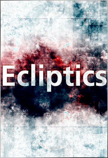
Image Umbrella: Signatures, Avatars, Logos & Text
in The Pictorium
Posted
I need to work on being neat and clean, like you jake. I don't understand how to get my objects 3d.. when I ran alpha mask on the blurred edge to cut it off.. it filled in the transparent parts with white/black. :?