


TopHATslash
-
Posts
3,300 -
Joined
-
Last visited
Posts posted by TopHATslash
-
-
How in the world can this be done.. again!? What, is this the 46th time this same outcome has been written into a tutorial?
-
I'm sorry, but the tutorial was very hard to follow. I spent a lot of time trying to figure out the mistakes you have made. On the other hand, the tutorial was very neat. With many pictures. I really liked that. And you did spend a lot of time on it. So thats great. And your final sig. came out very nice, and fascinating. I will give you a 8/10.

Mistakes I made? Please brief me on what I did wrong in this tutorial. Intermediate means you have to have a good knowledge of the program before attempting it.
But seriously people.. if I wasn't clear in a part just let me know.
I'll add all of the entries tomorrow morning.
Yes Minoeman, I'll add your newer one below your previous.
-
New sig. PS smudging then went into PdN on mom's laptop to smudge more and brush. CC
-
Erase whats on top of the baldy from gears.
 The focal shouldnt have fx on its face.
 -
Added every outcome to box.

-
Check my newest signature tutorial in the creations section. It'll get you back in shape.
-
Wooot! Lego is back!
-
Reportz it.
-
Thanks both of you! :AddNoise:
-
Sorry that I didn't have time on christmas day.

-
They seem sorta basic though on the foreground. I like the background. It seems too square. Imo
-
The fx are okay. The depth is nice man. The fx seem to be the focal rather then the render;
-
It could be realistic if I put effort into it. I was rushing to get it done because I was driving across the country. >.>
-
Its a render made using the program Cinema 4D. I didn't make the ones that I used, I got them from deviantart.
-
Hey! I have tutorials too! Check out my sig tutorials.
Anyway, your sigs are nice but definetly show that you repeated the same process through a couple different tutorials. Try changing up the concepts, and trying your own style. Otherwise, nice work.
-
Theres a widescreen border.
A little photomanip I made. It is a stock background and a lot of C4Ds. Credits can be found on deviantart: http://ecliptics.deviantart.com/art/The ... -107218914

And the sig:

-
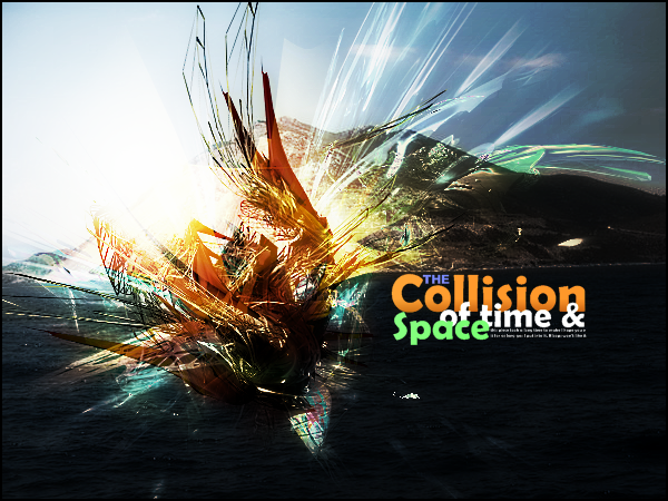
All the editing was done in Paint.net. There are probably 10 or 12 different C4Ds in this that have been turned, twisted, blurred, erase..
The credits for the resources can be found in the description on dA:
-
V1

V2

V3

No brushing or stocks. all pdn.
cc?
Ehh its .. blegh. The colors are all alike, no zestyness. Having a few different shades of the same color throughout a tag is awfully boring, man. Sorry, but I've seen better from you. It has nice flow, but the focal is LQ or blurry, can't tell. The bg is just some fx and blackish.

Overall its pretty nice, but the bg and colors could use work.


-
I'll add your outcomes to the box.
@Flow: You have a bit too much depth.
-
the fx are cool and so is the text! nice man! work on depth though.
-
Sounds good! I can't wait to see your result.
-
-
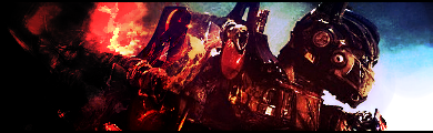
Here is an outcome that I did following my own tutorial. Used a stock: http://www.empiremovies.com/images/post ... poster.jpg
-
Oo. I added everyones into zeh box btw.

Image Umbrella: Signatures, Avatars, Logos & Text
in The Pictorium
Posted
to above post: ehh just got my first rrod.