


ncfan51
-
Posts
2,393 -
Joined
-
Last visited
Posts posted by ncfan51
-
-
What type of program? Just anything?
Yep.
-
1. Try http://www.oldversion.com/program.php?n=paintdotnet
2. I'm guessing the cache.
3. Ambiguous titles are against the rules.
-
You could try:
Soften Portrait
-
[*:1xhjvtw4]Softness(0)
[*:1xhjvtw4]Lighting(20)
[*:1xhjvtw4]Warmth(4)
and
Sharpen (20)
Then play with Curves and Levels.
-
-
That plugin doesn't work with Paint.NET version 3.30 Beta. If you want to use it, download the latest stable release (3.22?)
-
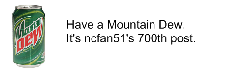
I love the Coca Cola can. A lot.
-
I like your OS
 nice mix of colors
Thank you
-
Oh. Mi. Mother. of. Cream. Corn.
Effects Lab kicks awesome...
-
On Endorphin Comic Page 1, It says "Drew by Andrew D", while it should say "Drawn by Andrew D". I love Flower in the Field.
-
Wow! I love you’re work absolutely creative and amazing..
Thanks!
I might use some of those graphics in my sigs if I can get you’re permission.Feel free to!
And are you Indian? If you are so am I!Yes, I am.
Also visit my sig gallery…OK, I will.
-
I wish there was a text-box for fine tuning, either that or Pyrochild's idea.
-
I love it! It reminds me of a CRT screen. Good Job with this.
-
I think I know who nominated it. Heh.
excellent gallery. I like the lone nebula but actually love the one create something.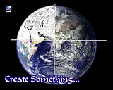
very very appealing.
Oh yeah, I remember that one.
-


I call him "Li'l Dude".
-
Wow. I didn't realize it was good tutorial week.
First, PrettyDarnNeat's "Something Happened on the Way to Purple", and now this!
Just. Plain. Kewl.
-
 1
1
-
-
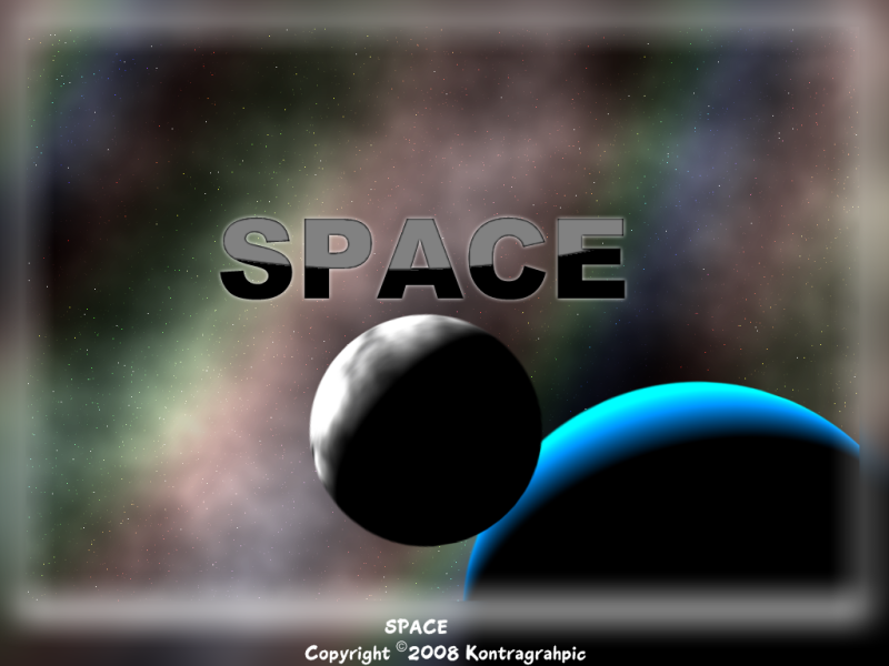
Tell me about this one... 18. "Lone Nebula" :shock:
How did you make it?
That one was easy to make. First make a basic noise starfield on Background layer (their are oodles of tutorials). Then on a new layer, do Tom's Fire tutorial with a radial gradient instead of a linear one. Change blend mode to additive. Use Color Balance to add color, and done. I did a little bit more on lone nebula though. I believe I duplicated the layer, ran Sepia, and then did a transparent gradient on it.
wow i love your current sig is thier a tutorial on it
 Thanks!
Yes there is a tutorial:
http://pdnshowcase.googlepages.com/mysignature
Wow! Wow! Wow! (Did I mention, Wow?)

Those are cool! What font did you use in the Vortex picture and where did you get it?
Also, those fractals are AWESOME. What font did you use for those? Like on feathers, fusion, epic, etc.q
Also, (
LOL), on the NCFan new degree of simplicity sig, how do you get the upper half a lighter color than bottom? I know thats a fairly simple question, but I've seen it on a lot of signatures and I can't figure it out :oops: . PM me if this isn't supposed to be discussed in this thread. :wink: Thanks!1. For "Vortex" I used Space Age, found on dafont.com
2. For fractals, I used "Visitor", a VERY common font. Just search it, there should be dozens of sites offering downloads.
3. For the "lighter part of signature" thing:
Refer to steps 7 and 8 in my signature tutorial:
http://pdnshowcase.googlepages.com/mysignature
Thanks for all the kind replies.
-
Pixel People rule...

-
Check your PM's. I sent you a link.
For the sake of anyone reading this: link
Read carefully. He wants burnt edges.
EDIT: Whoops. BB00 basically said that.
-
@Illnab1024:
I should have said this months ago:
Most.Useful. Plug-in. Evah!!!
In my media classes, I get my students to do A LOT of image compositing - and this plug-in makes it a breeze...
If anyone is interested, I posted a Student Handout: (http://www.geocities.com/gerry_satrapa/Compositing.pdf)...
Is it worth a Tutorial (PM me if you think so)? I did search, but couldn't find a similar tutorial

WOW. :shock: That is a great PDF. There has been a tutorial on it though, by CMD:
-
To be precise, use Alpha Mask, but Caveat Emptor--It takes around 15-30 minutes!
-
I love the fourth from the top. IMO you should color it blue to make it look like water.
-
 WARNING! The following may be hard on the eyes!
Sorry for being a vile double poster, but it would be very hard on the eyes if all this was merged into that one post. All my signatures:


I have quite a few, heh.
-
Darn. I hoped no one would realise that.

I noticed it as I was uploading it to Photobucket.
-
1024x768 an/or .jpeg version available via PM;

The 2nd one is for my new site, Kontragraphic.
-
Clouds
Gradient
Text
Gaussian Blur
Water Reflection Plugin
Circle tool
I know I'm missing one.


Suggestion: Rotating Child Windows
in Paint.NET Discussion and Questions
Posted
Is this an April Fool's trick?
If this is, I am going to mortally rip the eyeballs* of the next person I see. It's getting to the point of annoying now (especially when it's pretty convincing)
*DISCLAIMER: This is a complete dramatisation, of course.