


cjmcguinness
-
Posts
494 -
Joined
-
Last visited
Posts posted by cjmcguinness
-
-
I'm glad so many of you are enjoying this simple 'tutorial' and using it to get your feet wet with Paint.NET and the forum.
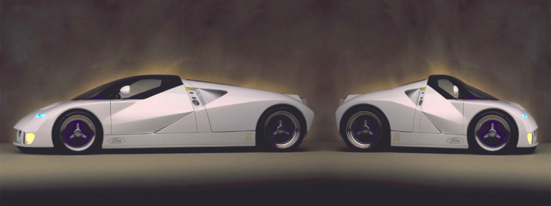
I came across an image for the Ford GT90 Concept car and just had to see what it's offspring would look like.
GT90 Concept & Son
Keep 'em coming.
-CJ
-
I haven't been very active with PDN lately, hence no recent artwork posted in the forum.
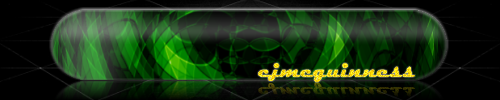
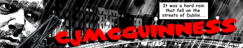
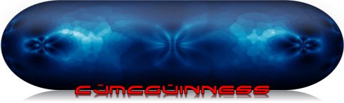
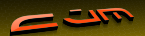
With nothing new to add, I thought I'd update my gallery by posting the signatures I've created (some were for proper forum use and others were SOTW entries).
In (roughly) chronological order:


-
Awesome

Thanks
But i prefer your siggy :oWhich one?
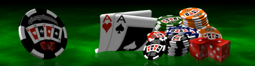
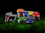
My current one:
Or my old, Poker based, one:


-
Thanks, great tutorial!!!
Heres my attempt!!
Keep them coming!!
ihave2feet
Pretty good work for your first post in the forum; glad you enjoyed the tutorial.
You managed to replicate the background exceptionally well, considering it is not part of the tut - however, you need to work on the sizes and angles of some of your chips, as well asthe resulting reflections. But still pretty impressive for your first attempt.
Keep up the good work.
-CJ
-
This tutorial is great! Thanks for the help!
Here is picture i edited with your tutorial. It worked perfectly, also very easy!
Before:

After:

Is it all right if i make a youtube tutorial video on this??
You are more than welcome to make a YouTube version of this tutorial, providing that it very clearly promotes Paint.NET and references this original tutorial.
Make sure you post a link to the video, once you have posted it.
-CJ
-
It looks like I may have missed the deadline, although usually for competitions (such as SOTW) the deadline is midnight PST on the date stated, which is still almost 7 hours away (at the time of posting).
For what it's worth - here's my entry...
Stock:
-
Illusive rock like texture...
Regarding your title - did you mean...?
Dictionary.com - Illusive - "Based on or having the nature of an illusion."
...or...
Dictionary.com - Elusive - "Eluding clear perception or complete mental grasp; hard to express or define. Difficult to detect or grasp by the mind, or analyze. Hard to comprehend, solve or believe."
Either probably describes it adequately, Just wondering if you meant to describe the piece as having the "Illusion" of a rock texture, or that you had been trying for a while to capture the "Elusive" rock texture. :?:
-
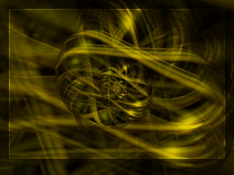
I am posting too often here, I'll have to take a rest I suppose , but that's my "creative" period, here is the wonderful world of 3d, rotating layers, changing layers blend modes, drosting and adding a bit of kaleidoscoping ... (that's the title).

Excellent, I love it the abstract image, but I don't think the frame is doing it any favours; the red doesn't enhance the image (IMO).
I would have framed it quite differently (I hope you don't mind me messing with your image, but it's just for demonstration purposes)...
I simply fill the frame area, on a new layer, black and set the transparency to 128%. Then on another layer, select the area inside the frame, set your primary and secondary colours to White, Effects > Render > Bevel: Depth 2, Strength 20 - I then set the blending mode of this layer to Overlay.
Anyway, as I said, the abstract itself is stunning - great work.
-CJ
-
Nice work (as usual) Ash.
Amazing photo manipulation Ash, and if only we could use PDN on mobiles..but then it'd have to be a good mobiles like to one you've manipulated or a LG Viewty/Nokia N95.I own a Nokia N95, wouldn't it be great if Paint.NET was ported to Symbian!
-
Some nice tuts you're making...Nice tutorial!Thanks!Thanks much, cj! It's an awesome effect, and a great tutorial!
Thanks guys, glad you enjoyed it and great results.
-
Just a quick question - when designing our new killer application, are we expected to provide just one screenshot type entry, or (as with mobile type themes) a series of operational screens? If it is a series, is there any suggested minimum/maximum limit to the number of screens that make up your entry?
-
Your artwork is impressive! I was not sure if I entered the Tate Gallery site by mistake!
Great!
Ciao ciao
Thanks you very much for the kind comments, topezia; much appreciated.
-
Just a quick, colourful, abstract.

^^ Clickety-click to for full view and download of the 1920 x 1080 HDTV Widescreen version ^^
-
Just a quick, colourful, abstract.
^^ Clickety-click to for full view and download of the 1920 x 1080 HDTV Widescreen version ^^
-
Aren't you describing Zoom blur?
Sort of, but in the opposite direction - blurring inward toward a point, rather than outward from a point.
It's more like zoom blur+Zoom blur that the slider can go to - value.
The reason I pitched this as Motion Blur+ was that I like the current level of distance control you get with Motion blur, but rather than blurring in uniform straight lines an improved version would allow the user to blur toward a single focal point. I suppose this could be added as an improvement to the current Zoom Blur Deluxe, with the ability to select negative values.
I thought of that idea, also. That could be really helpful!Couldn't that be achieved by mixing the source for Bulge and Zoom-Blur?
Bulge 'bulges' inwards too... And Zoom Blur would, well, blur it...

I would see this as more a combination of Bulge (with the ability to use negative values) and Motion Blur; but yes, you've kinda got the right idea.
-
I have a request to all you plugin developers out there - can someone produce a Motion Blur+ type of plugin; the specifications are described below.
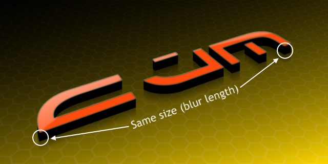
Recently I've been playing around with creating 3D text using a technique provided in Jake2K's tutorial that involves using Motion Blur. However, I've found that this can produce some unrealistic results when you rotate text (or indeed an object) at an oblique angle, as the 3D parts all end up being the same size (those closest are the same length as furthest) - ie. not really in perspective (example 1).
Example 1.
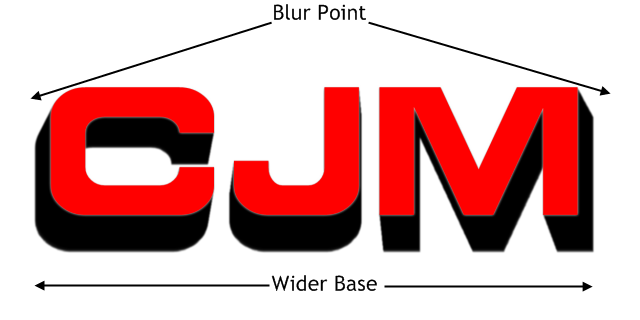
I've also tried using zoom blur to create a perspective effect, but given that zoom blur works from the centre of an image (or the chosen focal point in Zoom Blur+) you get the effect of the 3D base of the text being larger than the text itself (example 2).
Example 2.
Now, ideally I am looking for someone to develop a plugin, something similar to the Zoom Blur+, where you can adjust the focal point of the blur - but instead of the object being blurred FROM that point, it is blurred TOWARDS that point. Essentially, a Motion Blur+ plugin, where the image, instead of being blurred in a single uniform direction (example 3), the user can select a focal point and everything is blurred towards that point (example 4).
Example 3.
Example 4.
If you take Example 2, and think of placing the focus of the blur below the text and having the 3D part blur inwards, towards that point, then you could create 3D text with more of a feel of looking down from above. If you set the blur length long enough it would appear to blur into infinity
This could almost be called Perspective Blur, and would have other applications beyond simple 3D text - I'm thinking of blurring backgrounds of photos to a perspective point, blurring clouds that disappear off into the horizon, etc...
I'm sure (given the complexity of some plugins that have been developed) that this would be 'reasonably' straightforward to make, combining elements of the current Motion Blur code, perhaps with elements of Zoom Blur (but kinda in reverse).
I'm hoping there's someone out there up to the challenge.
-CJ
-
How do users adjust the colors' alpha?
If there is no drop down.
Unless there are 2 sliders all the time which controls the 1st & 2nd colors' alpha.
My initial thought was that simply the act of right-clicking on a color management area could switch the focus from Primary to Secondary, but thinking about it further, it would probably be best to stick with the drop-down for toggling and using the advanced properties (in the extended window).
But I do believe that in the basic window, full left & right click control of both the color wheel and palette would be useful; without having to switch between the two.
Getting even more radical, the Colors window could be altered to allow maximum control in the normal window, by moving the manual selection of Primary & Secondary to the 'extended' area and bringing in the Alpha Transparency to the normal view. If users had full left/right click control in the color window the only need for manually switching between the two would be in the 'extended' area for control of RGB & HSV values.
The focus of the Alpha Transparency could always remain in the Primary colour, and the user could use the 'bent arrow' to toggle Primary & Secondary - thus changing the focus of the Alpha control. Alternatively, if we had full left/right click control, you could adjust the Alpha value of the primary and secondary colors by either right or left clicking on the Alpha slider.
I find I use the Alpha control a lot more than manually adjusting the RGB or HSV values, so it would make sense for this control to be available in the standard colors window.
Something like this...
I don't want to get too sidetracked from the original request, which is full right-click control of the secondary color in the wheel and the palette.
-
This is not quite a full feature request, but there's a niggling issue with the Colors window that I have been meaning to mention; it's by no means a major issue, just a point of consistency that (in my opinion) could be fixed/amended for better operation.
When using the Colors window, for selecting Primary and Secondary colors, when the focus is set at 'Primary' you can left-click on the main color wheel to select the primary color; currently right-click does nothing. However, if you use the color palette below the wheel, you can left-click to select a Primary color and right-click to select the Secondary color.
Now, if you switch to Secondary color (from the combo) a left-click on the color wheel selects the Secondary color (as you would expect) and right-click still does nothing. In the palette area, left-click changes the Secondary color, but now right-click still also changes the Secondary color (you might expect that it would change the Primary color).
The same continues in the expanded colors window, with the RGB and HSV values - only left-clicking can change the Primary color (or Secondary, if you have this selected from the combo).
Now, I am not a programmer, nor familiar with the capabilities of configuring mouse-click actions, but my question is, is it possible to program the left and right mouse buttons to control the Primary and Secondary color choices in the color wheel, palette and RGB/HSV sections all by the same method - left-click adjusts the Primary and right-click adjusts the Secondary (and vice-versa)?
In fact, if this were possible it would negate the need for any drop-down combo for selecting Primary and Secondary color to perform adjustments, as all Primary and Secondary colors could be selected/adjusted by use of just the left & right mouse buttons. Is this something that is possible?
I would like to suggest, at the very least, that when the user has selected Secondary color, that a right-click in the color palette should change the Primary colour; as this would be consistent with user experience when in Primary mode.
Does anyone else agree, or have an opinion on this?
Thanks-CJ
-
If there is still interest out there for another Photomanipulation contest, and Jerkfight is too busy to oversee it, I'll happily take over the management of the next contest.
Alternatively, perhaps Pyjo, as winner of the last contest, would like to take on these duties - as well as deciding on the next theme.
Either way, I'm eager to have a go at something else...
-
It's been some time since I submitted anything 100% original, made with Paint.NET - but I finally found the time to fulfil one of my desires/ambitions and create a full chess set, using only PDN. After spending a week (on and off) making the pieces I kinda lost interest in the background; perhaps I'll revisit this later and put in something more interesting.
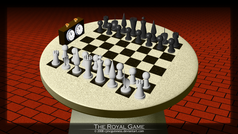
Each of the pieces was individually rendered using the amazing Shape 3D effect plugin - so are all based on basic geometric shapes, with some additional manipulation. I had to make a decision when it came to the Knight, as this is generally represented by a horses head (not easy with Shape 3D!). After many experiments, I finally settled on a "Lance & Shield" design, and I think it turned out OK (although it's not as solid as the rest of the pieces).
Click on the image to view larger size and/or download the full 1920 x 1080 HDTV widescreen version.
Enjoy.
-
It's been some time since I submitted anything 100% original, made with Paint.NET - but I finally found the time to fulfil one of my desires/ambitions and create a full chess set, using only PDN. After spending a week (on and off) making the pieces I kinda lost interest in the background; perhaps I'll revisit this later and put in something more interesting.
Each of the pieces was individually rendered using the amazing Shape 3D effect plugin - so are all based on basic geometric shapes, with some additional manipulation. I had to make a decision when it came to the Knight, as this is generally represented by a horses head (not easy with Shape 3D!). After many experiments, I finally settled on a "Lance & Shield" design, and I think it turned out OK (although it's not as solid as the rest of the pieces).
Click on the image to view larger size and/or download the full 1920 x 1080 HDTV widescreen version.
Enjoy.
-
Amazing tut! I adapted the tut to create a poker table in a dark room.
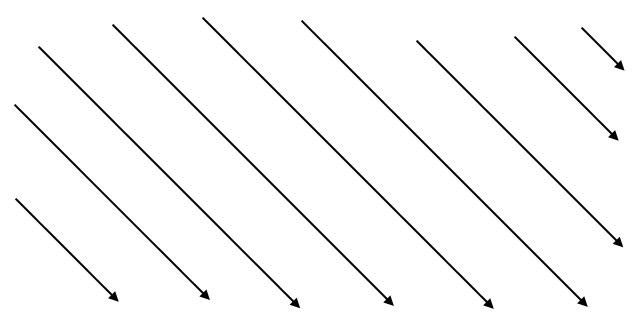
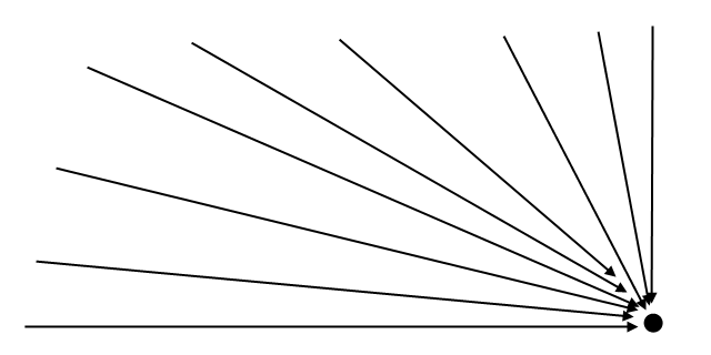
Excellent, I like it. However, there's one thing that doesn't look quite right; the angle/perspective of the table compared to the chips.
The attached image will demonstrate what I mean; it looks like the viewing perspective angle of the chips and the table are quite different, in my (very rough) estimation the chips are rotated to an angle of roughly 87 degrees, and the table is somewhere around 75 degrees (you will see the difference in the arrows I have overlaid).
You should be conscious of this sort of perspective/angle difference, as matching the two will give your images more realism.
Hope this helps for future work.
-CJ
-
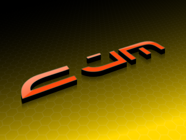
Something I made using Jake2k's 3D text tutorial.
-
Excuse me for bumping a previous post, but thought I'd put it out there again...
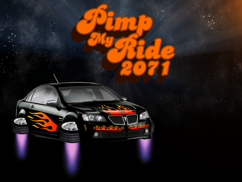
I've got another suggestion, if anyone's interested - what about skinning a car?There was a competition last year on deviantART - Skin a Scion
The details page is still available with download links to the cars you could use.
Also, take a look at some of the entries - including the winning one - to get an idea for the kind of manipulation I have in mind.
We could choose one of the stock images provided in the competition page, or choose a completely different car (but perhaps steer clear of BMW's - we don't want to upset anyone, if you know what I mean
 ).
).I think it would be fun and challenging to do a 'Pimp my Ride' type of manipulation.
 ).
).
CJ's Image Gallery: Updated 20110722
in The Pictorium
Posted
Thank you very much for the kind comments.