


usedHONDA
-
Posts
5,684 -
Joined
-
Last visited
-
Days Won
1
Content Type
Events
Profiles
Forums
Blogs
Gallery
Downloads
Posts posted by usedHONDA
-
-
This has been requested so many times in the past. I made a poll about it in Feburary/March of last year (it was like 60% for and 40% against), but Rick didn't want to. He says to register to deviantART and post your stuff there. At the time I didn't agree, but now I see his point. dA is a much better place for posting art. You get better critisizm and hundreds of people get to see your artwork (more than the 30 PDN users we have here). It only takes 3 minutes to register, and so worth it! Because of my registering to dA, I'm getting in a magazine for making a cursor pack there (what? I had to bring it up!)
-
Nice UI hack ya' got there

-
Yup. It was said in a note-to-self type of manner, so I'm 95% sure he's going to do it.
-
Yeah, my favorite font from dafont is Geosans Light. You can see it in action here: http://usedhonda.110mb.com/g.htm
-
This would actually be good for the next release when Rick will also have an "Open Recent" button added to the toolbar.
-
Sometimes, you have simple vector images, where fonts like Times New Roman or Franklin Gothic are the best, and other times, you have some radical image with lots to look at and you use a tiny 6-pixel-tall bitmap font, and other times where you want the text itself to be the focus of the image, so you use something from DaFont. Otherwise, use either Calibri, Segoe, or Verdana.
-
What about photoshop patterns too?
That's where the magic of my brush system concept comes into play. You can make patterns with simple modifications of the source code.
Yes, I rule.

-
We'll have to wait for layer blending (and hopefully layer blending-based plugins) for that one.
-
OR you can make the image, paste it into Word, and play with the word art there.
-

My first PDN post :PolarInversion:
If this truly is your first post (and not a secondary account made by a user with 100+ posts), then it's really good
-
What my idea of a custom brush would be is a .ZIP (renamed to .PCB or something)that contains bitmaps of the brush (in .PNG of course) and some sort of text file that contains the brush's source code (for how the brush will blend, how it reacts to a certain speed of cursor movement, color changing, ect.). With a simple yet flexible system like that, be sure that you'll be able to convert PS's brushes.
-
Well if you want an effect for that type of color blind test, try the Color Balance adjustment to let you change the red, green, blue, cyan, magenta, and yellow of the image.
-
Maybe he's talking about an Effect that disappeared. If this is so, then that's just a result of recoding the effect system and reorganizing the location of them.
-
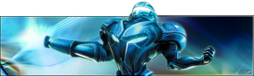
I can't believe I'm doing this, but...
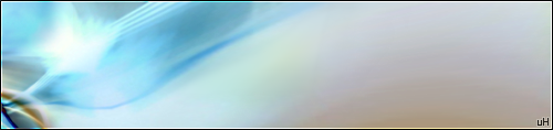
I'm posting my origional polar inversion sig instead of my excessively-advertised Dark Samus one. Why? Because I like it more, it's easier on the eyes, and 4 very dignified people requested that I use it. Oh, and there's one less stock image
Stock image used:
Go ahead, download the wallpaper. It's mine
-
Now this looks nice! It will be of good use! Thank you, Illnab
No suggestions as of yet.
-
I said the rules bit because it says about not typing in caps lock.
Please, it's just one word, seven letters, and it was to emphasize that no source images were used.
-
Diddo
Also, I'll probably post my entry tomorrow. Any final requests?
-
Backgrounds have to be .jpg files
Or GIF, BMP, or PNG files, though PNG doesn't look good when resized or stretched by Windows via Desktop Properties.
-
Well, if I'm going to enter a drawing contest, I'd like to be able to draw, but with Paint.NET's brush/tool system, drawing the letter "S" looks more like a backwards "Z".
-
Though this is getting off topic, I'll extend it one post (and hopefully end it, too).
As I've said once or twice before, I've tried to make a font in a typeface editor, and it's extremely tough work. You have to design every letter with precision, making sure that your letters are readable and that your characters are following the same style. It's not just "Let's make some lines, antialias it, and make it a TrueType!" It's more like:
"Okay, let's make some concept sketches of what this can look like... well, that sucks. Let's do another.... that's better, but the serif on the "b" is a little too exaggerated... okay, now let's make it." *another 2 months goes by* "It's done! Let's put it in the Vista daily build!" *a few more months pass, 2 weeks before Vista's launch* "What?!?! They took the font out? How dare they! Let's put it on Fonts.com and sell it for $300"
Then, hundreds of people buy it, a few of them Torrentize it, and the developer(s) work on another one for Windows 7.
-
Of course it's fun! Why else would an entire page of entries be submitted in the first 1.5 days of competition?
BTW, I updated the WIP [work in progress] by adding another version of the photo (the end result you see in my off-topic mini-tut) into the mix, also heavily tweaking the right side for more eyecandy. Oh, and now it's my signature.
-
It reminds me of European cathedral architecture... nice
Update to SOTW:
Though it's looking a little blurry and JPEG-ish...
-
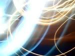
How has that got polar inversion in it?
It uses a bit of every corner in this:

It was originally a typical-looking polar inversion until I cut and pasted the corners in a new layer and flipped them all so they're all in the top-left corner, then I used layer blending to make the colorful fractal-like effect you see. Then I added the border, text, and Dark Samus to make it a little more exciting.
Maybe later I'll try to recreate it and post the polar inverted wallpaper before I flipped and cropped it.
-
Yeah, I'm trying to work on that...
Updated:
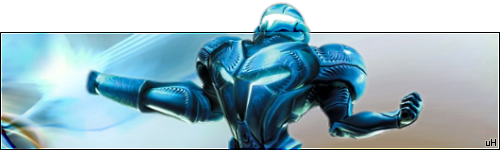
Now she's "inside" the signature (behind the black border).
Forum Suggestion: Pictorium Dedicated Section
in Paint.NET Discussion and Questions
Posted
@Ash: Political correctness. I like your strategy
But seriously, join deviantART! Most of us are already registered (about 45)!