


usedHONDA
-
Posts
5,684 -
Joined
-
Last visited
-
Days Won
1
Posts posted by usedHONDA
-
-
Here is my rendition of the Windows Mail logo, albeit inaccurate and very poorely done....
You did a very good job with the icon, but I wouldn't say that the Vista one is "inaccurate and very poorly done" because it isn't. They used 3D modeling software to create the origional icon and then they edit it in Photoshop. IMO, they did an outstanding job with the icon.
Another wallpaper:
-
verndewd, you should use the edit button instead of double-posting.
-
@spike: Hey! Grr....
looks good.
----------
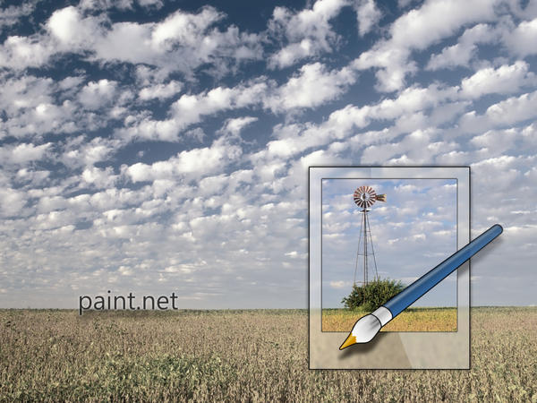
I did it again. I've redone the Paint.NET logo! This one took much less time to make than the last one (about 3 months ago), but looks much better! I tried to implement the Vista style into it by making the frame glass.

I also changed the image and brush color because I was fed up with the overly saturated blue/red combination.
-
I just remembered something... I have the .NET framework 3.0 installer (the 50 MB one) in my hard drive. I think I should write that to a CD.
-
Very artistic! I bet it'll get a lot of views.
-
Aww man! I wanted to be on page 404! I find it more important than 400.
-
-
Paint.NET Glass logo:

Vista-Ready!
EDIT:

I'll make a full-sized wallpaper later.
-
My compliments go out to everyone on the last ten pages.

Ooh, that's me!

-----EDIT-----
The old:

The new:

It's just a slight Hue/Sat adjustment.
-
I've never saw this plugin earlier! Cool.
-
Here are the online help files:
http://getpaint.net/doc/latest/en/index.html
Also, Paint.NET doesn't have 8-bit BMP support yet, but it may in the future.
-
I remember that one of Rick's Beta releases had a bug that let you make the brush size more than 100 pixels (i.e infinity). I was going to tell him about it but it was fixed before I was able to.
-
A little late, aren't we?
Yeah, N8, that's exactly how I did it.
-
Here's the smaller version of the Pencil sketch effect icon:

Not that pleased with it, though.
-
I did this by copying and pasting:

-
I'm really proud of this one:
It's the full-sized version of the Pencil Sketch effect icon! It reminds me of Microsoft Surface.
-
You're completely plagiarizing the Windows Vista icons.
Sorry, I was just experimenting (I'm also using it as an icon for one of my folders).
-
@zookey: I actually created the sig about 3 months ago. I just thought that I should bring it back
-
^^Human-based spammer^^
EDIT: Nevermind. I see some actual Paint.NET creations in his posts.
-
I also prefer the normal file, but who can hate the aero look? Here's another version with a more aero effect (blurred glass):


-
Which Paint.NET file icon do you like the most?


I made the icon glass because I thought it would look good (and it does).
-
I nominate Paint.NET icon skinning to be the next MSC!
It'll be kinda like skinning Paint.NET, but you only redo the icons.
-
In celebration of our reaching of page 400, I have created a celebratory image of it created with random effects:

-
..Ok, ill start working on a new set of icons tommorow...
MSC #3 anyone?


The Pictorium! Post your created or edited images here!
in The Pictorium
Posted
Oh... oops.
EDIT: Thanks, zookey!