


Marilynx
-
Posts
310 -
Joined
-
Last visited
-
Days Won
1
Posts posted by Marilynx
-
-
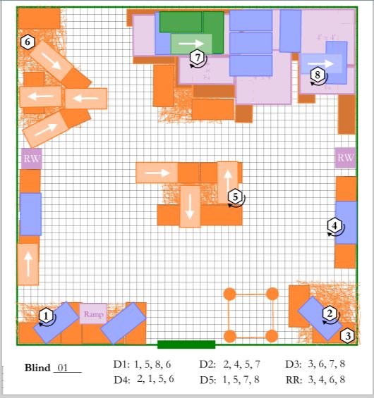
If anyone would like to see what these "Barn Hunt" maps are about, here is a video of my Harper Dachs' Rat Champion Excellent (First Q of Ten needed) run.
All that straw is in three layers, plus leaners, and I use PDN to create the course maps for a judge so that s/he can have course builders do the heavy lifting.
Then there are the Blind layers -- the places where the Judge will be hiding the rats for each group of Hunters.
My husband is NOT a videographer. And you may ignore the handler. Just pay attention to the handsome Dachshund.
-
5 hours ago, Djisves said:
MadJik and Andrew offer good advice Marilynx and that's how I also save multiple PNGs from one PDN.
However, if you're worried you may overwrite an existing PDN or JPG, here's another way which does not require you to close the PDN file every time:
1. Select All (Ctrl+A) your original PDN file.
2. Turn on and off the appropriate layers to get the image you want
3. Copy Merged (Ctrl+Shift+C)
4. Paste into New Image (Ctrl+Alt+V)
5. Save (Ctrl+S) the new image as a JPG with an appropriate name
6. Close (Ctrl+W) the JPG file
7. Start again at 2 for the next JPG image
I believe I will try this! I am always paranoid about overwriting a file and really, REALLY screwing things up. (Lost about 4 hours work doing that once, years ago. Not something you forget.)
(Later) OK, THIS worked perfectly. Thank you very much. I did my two most complex (and multipage) files in half the time it took me to do one of the least complex files.
-
1 hour ago, AndrewDavid said:
Hi There @Marilynx Just a few quick answers
You are not unflattening nor are you making any changes to this file.
No changes will be made to this file unless you reopen it. Remember - a JPG does not have layers.
Hope this helps
")
If I do a Save As to JPG, PDN tells me the image must be flattened, but that the flattening can be undone.
So, if I'm in that JPG, and I hit Ctrl + Z, I can unflatten the image, but it's still called a JPG.
-
16 hours ago, MadJik said:
Hi @Marilynx I'm often (but not as often as 64 times...) doing this kind of merge layers/save the picture...
But once the file is saved as (with another name), I don't close/open. I just press Ctrl+Z to undo the "merge layers". This methode you are sure to keep image size and dpi.
Otherwise (not tested) PDFCreator allows to create jpg. https://sourceforge.net/projects/pdfcreator/ as a printer. You'll have to test the setting to check if you could keep the image size and dpi...
I thought of using the Ctrl+Z (after all, PDN tells you the flattening can be undone!).
What I wasn't sure about was if I undid it, and then did save-as to another file name, would the original JPG still be a JPG?
That is, if I go from 2017-07-12C_SK_04Master.PDN to 2017-07-12C_SK_04Master_Blind00.JPG, then unflatten 2017-07-12C_SK_04Master_Blind00.JPG, make my change of layers, and Save As 2017-07-12C_SK_04Master_Blind01.JPG, will 2017-07-12C_SK_04Master_Blind00.JPG be an actual flattened JPG? Or will the layers be in it?
-
I am saving some fairly large files to JPG to send to a Barn Hunt Judge for her courses for an upcoming set of trials.
By "fairly large," I mean 2100 x 3000 pixels at 300 dpi.
Having created the course on multiple layers, I then have layers which must be turned off and on -- Turn on Blind 01, save to JPG, close JPG, reopen the PDN file with the course, turn off Blind 01, Turn on Blind 02, save to JPG. And repeat about 16 times. For each of four courses.
The problem is that opening and closing and etc. these files appears to eat memory, and after a couple of them, my computer (Toshiba Satellite, running WinPro 7 because I don't want Win 10 until I buy a new computer, and I haven't decided what I want in a new computer yet.) gets exceedingly unhappy and must be rebooted. This gets very tedious, rebooting every fourth or fifth Save As when you are doing anywhere from 64 to 128 of them.
Now, a short form solution would be to use good ole Cute PDF and print the page to a PDF file.
This would let her print them -- but not (with the software she has and her level of computer knowledge) edit them.
Does a Print to JPG like the Cute PDF driver exist in general, or for Paint.Net?
-
3 hours ago, Ego Eram Reputo said:
This excellent plugin should do the trick...
Oh. My. Yes, it should. But I think I am going to have to wait until after the Barn Hunt to try to figure out what those directions are telling me to do.
My brain is rat-gnawed at the moment, hence the need for a Hunt.
-
Barn Hunting again.
I have about 25 layers for a Barn Hunt course.
For printing each layer, I just click the layers on and off and print a page at a time. Obviously, I could do this to PDF. But that would mean 25 PDF files.
What I want to do is to print each of the layers as a page within a single PDF file.
Is there a way to do that?
-
On 3/9/2017 at 1:04 AM, toe_head2001 said:
Yes, it called a Clipboard manager. These are stand alone programs, and not integrated into paint.net.
These work just as you described. They list last few items that have been on the clipboard, and you can select one of them to place it back on the clipboard.
Personally, I like to use ClipX.
Regrettably, I wasn't able to get ClipX to work. It downloaded, and apparently installed just fine. I filled in the options. But it doesn't come up when I'm working, regardless of program.
So I did my courses the old-fashioned way, one selection at a time, through all 16 layers of each of five courses.
But I thank you for the suggestion.
-
Like this! The ball is good, and I like the floor under it, too!
-
Thanks... I will go take a look at ClipX and maybe ask around other places.
Was just thinking that if it was integral to PDN and I'd missed it, it would be nice to know.
-
So, I've sort-of come full circle on my PDN.
I found PDN looking for a program with layers in order to do Barn Hunt courses. (Nearly lost my mind.)
I now have a really fine template for doing generic courses. I've also done one for our local club which can be distributed to hired judges to make their courses on. I'm going to be doing another one after I get the measurements for a Hunt facility in the north of my state once I get the measurements on that.
And I'm doing the courses for our formal practice (not YET a Judge) in a couple weeks.
My problem -- I have to set up maps with the rat tube positions for each blind. I have each blind on a separate layer. There are twenty blinds for each level, Novice, Open, Senior, Master.
I use the Wand to select the tube symbol (Rat 1) and then go through the layers placing Rat 1 on all the layers. Then I select the next symbol (Rat 2) and repeat. But by the time I get to Rat 3, I'm turning on and off layers so I can see where to position the next one so that it is different from the blind before it and after it.
Sometimes I get screwed up and have, say, two #5s on one blind and none on another. And maybe I am working on #6 when I discover it. So I have to go re-select #5, put it in place, then go back and reselect #6, and continue on.
In Word, I can turn on the Clipboard, and it will show be a list of the last ten or fifteen items I have copied. I can click on one, and it inserts that text or picture into my document at the point I specify.
Can I do something similar in PDN? Can the Clipboard be selected from that way, and maybe I just haven't found it?
I attach two clips of a Master and a Senior course showing rat tubes. Note: orange rectangles are ground-level bales, blues are second level bales, and green is third level. Rectangles with arrows are "leaner" bales, angled against another. Light purple are boards placed to support tunnel structures. Each "level" is on a separate layer so I can print construction maps for course builders.
I plan to be doing a tutorial for other Barn Hunt course builders to use Paint.Net for their courses. I find it relatively easy, the maps are clear and easy to use, and for those of us who spend all or money on our dogs, PDN's price is definitely right!
If anyone is interested in seeing my boy, Harper, run, you can see the videos at Riverstar: https://youtu.be/x-5L-TimvIY which is his first Champion run -- he's searching for an unknown number of rats (as it turned out, there were only two), and must find them, and then tell me he's found them all. (My husband is NOT a videographer, btw!)

-
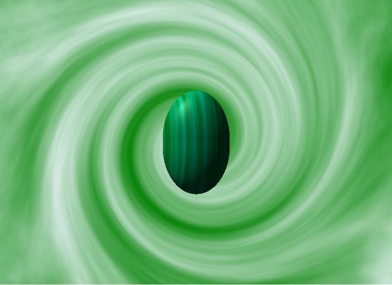
To get the banding, I suggest generating smooth clouds then using the old Adjustment>Curves trick of making a sine-like response curve, as is done to make reflecting metal. To make the linear banding, it might be useful to select a tall, thin rectangular area and stretch it horizontally with Move Selected Pixels, the way wood-grain textures are produced.
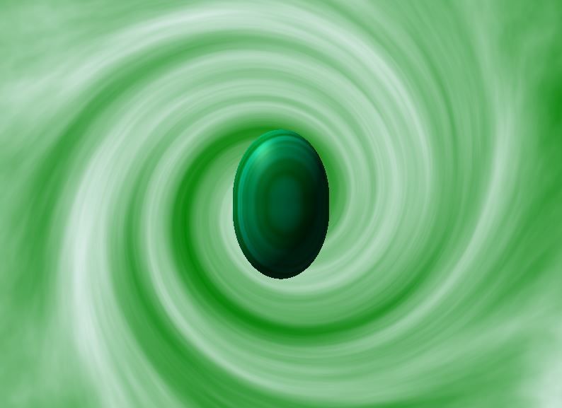
Marilynx, I like those pictures you made, but I think there needs to be more contrast in the color of the bands. Also, you might run Effects>Objects>AA's Assistant to smooth the edges. They would probably look more like jewels if the specular highlights were brighter. The highlight should be white, not green, but perhaps the greenish look is due to their not being bright enough.
Yes, I was looking at the larger images as they posted on here (they're smallish on my laptop) and thinking I needed to AA or feather the edges.
I deliberately dimmed the highlight on this -- it's actually white, just dimmed -- because the brighter light didn't look right to me. (I've been sitting here looking at an actual malachite cabochon in different lights). The bright highlight just didn't give the particular effect that I wanted.
Keep in mind that these aren't "jewels" as such. Malachite is a copper based mineral.
I would be very interested in a tutorial on the uses of Curves. It pops up in so many tutorials, and I like the effects obtained by following the directions in them. But I don't understand what Curves DOES in order to create my own settings. That's one reason it did not occur to me to use Curves on this particular project. But I may go back and tinker with it. I made it a point to keep copies of all my layers so I could go back and try other techniques on them.
-
I started with Clouds > Contour > Gaussian Blur > Dents
I added a layer with a green/blue color and changed the mode to multiply.
Merged the layers
Used the heart shape to cut a heart shape.
Used Bevel Object on the heart and duplicated the layer.
Finally, on the lower layer used Trail... to give it a 3D aspect.
I finished with a spark made with Highlight...
Oh, neat.... I must go and try that!
-
Well, here's my shot at this, taking BarbieQ25's suggestions into consideration. (And being challenged by Eli's version!)
In particular, the idea of trimming a section out of the resulting Effects => Render => Clouds, and Effects => Distort => Dents for my stone.
The first time I tried it, I couldn't fill my canvas without having overlaps that looked weird. So, I made a very large canvas (3000 x 3000) at 300 dpi, and did the Render => Clouds, and Distort => Dents with dark green (008000) and turquoise (00FAC9).
I trimmed out a section that I like and went back to my smaller canvas (1200 x 1200 @ 96 dpi) and pasted it in. Only took a little bit of stretching to get it to fill the canvas with no overlaps. Then I duplicated it and rotated it from horizontal lines to vertical lines (and again did a little stretching to fill the canvas).
Then I used Effects => Render => Shape3D to create the stone on each of the two layers. The horizontal versus vertical striping gave very different effects.
-
My try but it is so difficult to get those dark green colors.
Ooh, I like that -- how did you get there?!
You are sooo right about it being difficult to get the rich, true "emerald" greens!
-
Green & Turquoise Clouds then Dents. Play with the sliders until you get a look the you like. You could also take a tiny portion of the results, blur the edges & put it over a larger green shape to get a smoother looking more realistic look. Layers will probably bee your friend here.
Layers are emphatically a friend. Dents are interesting. I'd played with them a little on something else, but hadn't thought of them in conjunction with this. The chief problem is that it's not possible to control the amount of a given color in the clouds. There's too much turquoise.....
-
In my ongoing series of Talismans, I need some malachite cabochons.
("Malachite" in search and "Images") It's a gorgeous deep green stone with streaks of lighter green or turquoise.
I tried doing Noise with emerald and turquoise and then motion blur but that was too fine a grain -- colors were not distinct enough and were too small.
I tried a gradient with the two colors, and that had possibilities, but was not the stone.
I tried an emerald background with turquoise streaks, and then blurring it.
Any thoughts on how to do this?
-
It would've been faster but the power went out last night right as I started the publish process
 Such is life ...
Very fast... I'm impressed. Uh... there's a reason we have a whole house generator.....
-
Okay, cool -- I'll try Boltbait's since I already have it installed. Thank you!
Drat. I must be doing something wrong. Looks like I'll have to install the Curtis one after all.
-
Interested in this tutorial. However, it does call for a plug-in by Curtis called Tile Image. I note, in going to the thread on same, that some of the effects in his pack are incompatible with the current version of PDN, and there doesn't appear to be a way to separate the ones that aren't compatible from the ones which may be since they're all in one .dll.
Really would prefer not to cause my PDN to explode or something.
Is there an updated version of Tile Image, or, is it now included as part of PDN? I only see Tile Reflection as a built in. I have Boltbait's Fill from Clipboard and Fill from File, as well as Madjik's Tiles Reflection XY.
-
I think maybe I'll add a few mini-tutorials like the one above to the Texture Shader thread. Since I knew what I was trying to achieve when I wrote the effect, I tend to forget how confusing all those various controls can be.
Thank you for the step by step. I've been tinkering with it and have got some interesting effects -- I would dearly like to know how you did some of the examples you posted in the Texture Shader thread, so if that's what you meant by posting some mini-tutorials, I will be eager to see them.
If I'm following you correctly, you start out with a B&W image, and then change the primary and secondary colors to what you want before running texture shader?
And yes, when you know precisely what you wanted when you set up a plug-in or other device, it seems perfectly obvious. <grin> Remember, up to two months ago, I'd never used anything with more than one layer, and for the most part, not much more complicated than Windows Paint! So what seems intuitive to an experienced user / programmer may not be to a newbie!
(I ran into that with a recipe for mock chocolate cake... I specified the measurements in ounces. I meant mass weight. It was obvious to me that you weighed the ingredients. Then someone came back and said the recipe didn't work. Digging into what went wrong, I discovered the person had used, not six ounces (170 grams) of an ingredient, but six FLUID ounces, or three-quarters of a cup. The 170 grams of ingredient comes out to around a cup and a half if measured in "fluid ounces". Of COURSE the recipe didn't come out!)
-
Marilynx, Texture Shader looks more complicated than I think it is, because it does two separate (but related) functions, so it requires controls for both. The top controls determine how the image in the clipboard is mapped onto the height-map. The bottom controls control how the height-map is shaded. They let you set the position of the light, along with its color and brightness. They also let you set how shiny the surface is with the specularity controls. I think most of what the controls do is fairly intuitive -- particularly with the lighting.
Uhm... I'm sorry. Texture Shader is not intuitive to me, at least. Maybe I'm slow on some of this stuff.
Let's say I want something like the MJW in Black effect, as here. What would I have to do, step by step, and setting by setting, to achieve that? I don't know... I literally cannot see the "intuitive" part of this.
-
I used a simple bucked fill and noise on default (except for the saturation which I set to 0) before running a motion blur. After that I used Pyrochild's grid warp plugin to stretch the texture I made alongside the horn. Then I made a gradient-looking shading, duplicated and ran MJW's texture shader to add some lighting (downloaded the plugin today so I'm not going to say I know what I did there before it happened
 ) I put the texture shaded layer above and set it to Lighten, the duplicated shadow layer on top and set to Overlay.
I like the effect you got.... but I'm not sure what a "simple bucked fill and noise" is or how to do it / find it.
I know where to find motion blur, at least -- nice to know I was on the right track with that!
I have Pyrochild's grid warp -- guess I will have to tinker with it and try to figure out what the dickens I am doing with it.
When you say you made a gradient-looking shading, where you meaning linear? Or was it a solid the shape of the horn which you ran a clear gradient over to make shading?
And yeah -- I have MJW's plugin, but I really have no idea what does what on it.
-
Continuing on with the making of the Talismans from my writing....
The next one is a horn, akin to a Jewish shofar, such as the one here. Or here.
For the first image, I can probably recreate the metal ornamentation with the various jewelry skills.
The shading on it does not appear to be too hard -- different layers for the darker shadows and the highlights.
What I'm having trouble with is the texturing on the horn itself. It appears the texture can run either along the length of the horn, or around it.
I've experimented with Effects => Blurs => motion blur which kind of gives the effect without the 3D aspect. And I cannot figure out how to wrap it along the curves of the horn. Either lengthwise or around the horn.
I wondered if MJW's Texture Shader plug-in (Effects => Distort => Texture Shader) would be the solution, but I looked at the UI and said "Ack!" because I have no idea what I would be doing with it. It's obvious from the thread on same (see above link), that some of the effects may be what I want, but I have no idea how to get there.
Any assistance would be appreciated.


Print to JPG?
in Paint.NET Discussion and Questions
Posted
Harper is an AKC conformation Champion, working on his Grand Championship. He is also a Barn Hunt Champion, which required 10 runs like the one in the video, on all sorts of different courses. Neither he nor I know how many rats are on the course -- it is up to him to search it, find them, show them to me, and then, somehow, tell me, "Hey, Missy, I found them all!" as he did in this video by running to the gate. So, he's got Beauty, Brains, and a Nose!