


delpart
-
Posts
336 -
Joined
-
Last visited
Posts posted by delpart
-
-
Do you realize how many "the road less traveled" jokes that caused my head to go through?!
Well at least if you are already working with a specific file type when you chose Save As you will default to the same type. Thankfully it doesn't force PNG.
At least we are not forced into the whole Export debate again on how to better do saving. Being of a different mindset, I dont care for that method even though I it could have saved me several times.
-
Definitely has uses. Thanks for the continued work DPY.
-
It's starting to become addictive!
12 step program ...
-
 1
1
-
-
Wee bit tall but only because I'm seeing the doorways. Even though I dont live near buildings like that, I have that reference point ... But I dont know how tall those doors are, just what the average ones are here in the US. Giants exist though ... He could simply be this 7 foot tall guy in his old age: http://www.imdb.com/name/nm0537631/bio Seen near other people he makes caricature of lots of normal objects.
Shadows helped set him into the scene now though. Shame on the lighting. That's annoying when you lose that little bit magic like that.
-
Layers are your friend ... The power of most editing done this way is really helpful. At the end they can be merged into a "single" image of course.
Regarding 3) To get a trace from an image like this with transparent areas to work with, try something like Black and Alpha+ to remove the white, or something like Grim Color Reaper if the source is to "grey" in some areas. You'll be left with an outline that you can merge onto the original with color in to your liking.
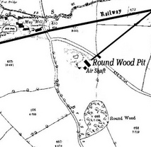
Depending on which details need to remain of course. Since this looks like a plot map, I'm not sure if you need those text designations etc.
Using Black and Alpha with faint lines can lead you to a small amount of hand editing, but no need to trace the entire thing. To get it "denser" just create layer duplicates and merge them as needed. (Or use a sharpen pass or similar before the B&A pass on it depending on how it works out.)
Snipet example of your test object:
Base:
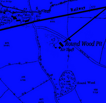
Black and Alpha pass over blue background for contrast and to show transparency:
Darkened lines with three layers and some color:
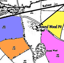
Hope that helps some ...
-
Animation is a tough mistress ... Depends on what you're going for. Being the usual animation fan the style can be everything from slideshows or slow dissolves to hyper-realism at more than 24 FPS for the drawn approach.
I liked the adaptation of the BTF Charger as an animation more than the static. Usually I'm put off on gifs ... Mainly because I'm looking for the clay characters to show up for the stop animation feel many of them have.
Will be fun to see some concept art when you're ready to open up that pandorian box.
-
I forgot to mention I had a much larger work. I reduced the original size so I could have it hosted on Photobucket, but the much larger piece actually contained more details, and it's available at dA. However, being generous sort I am (I know some are snorting at that thought), I'm going to link to it - take a peek. WARNING: The size is 3500x1500. You have been warned.
The flare is actually created with the Highlight plug-in, it took me some tinkering with the setting and using a grey color (for some reason grey works the best) I think I got close to how the tutorial had it. No blending mode was used since the color took care of it. I also neglected to mention that there is a fractal inside the color of the nebula and it was created with Apophysis 7X.
I am actually inspired to create another space scene. It's starting to become addictive!
Never been happy with Highlight, just not enough patience yet ... Like a lot of the tools with range its harder to "experiment" with while trying to be time frugal.
Thanks for the full size linkage. I still dont haunt DA and a lot of the original full size are hidden a lot of the time anyways ... I already ran into the headache that reductions rarely capture more than an impression for what I've toyed with. Being able to see more of the detail made this a different picture in many ways ... Sort of similar to being able to see an original painting versus the small 18x30 poster print. Not matter what its printed on, it's never the same. Planets still dont push like I would hope for, but the background is nearly night and day thanks to the detail.
Good luck with the 12 step program later on.

-
I found the solution in internet:
Go to Control Panel
Find "Mouse Properties"
Go to "Pointer Options"
Put a check mark in the "Display Pointer trails"
Slide the bar over to "short"
Apply the changes and then restart paint.net
see: http://forum.tabletp...solution-2.html
Cursor is now normal (a small cross).
Now that is curious. I tried rotating my monitor to simulate this issue and couldn't reproduce it. I'll have to try it again with some trails on to see what happens then.
Thanks for being kind and reporting back what caused that to occur. Much appreciated.
-
General help guide by BoltBait on how to install plugins: https://boltbait.com/pdn/InstallingEffects.php
The layer manipulation and selection manipulations can produce "cleaner" results, but if you can figure out Perspective, it may be quicker to figure out.
-
Finally realized there is a change to the top post ... The new yers pic is gone and I liked that (hint hint, plenty of space ...)
I could get all critical but I'm not sure it would be of help as this is a "first" and adaptation from PS to PDN is not usually fun IME. The color could be done differently, but I wasn't there to see what in under there to make a recommendation on any change ... not that my experience to date would probably help there ...
Maybe I should have just said I dont think the colors work but I still see a solid space scene and can appreciate the work in doing one. I actually like the planet but it lacks scale in my eye, but that could be because of the color/nebula and lack of harder contrast or shadow throw ... Not sure why it lacks scale to explain it. Maybe the missing flare to draw the eye "into" the image?
Again, small disclaimer, I've looked at too many of these creations to be impartial in my head so I dont want to just tear it apart.
RE: Flare. Agreed, the one click wonder of the PS flares have to be created more or less from scratch. I'm still trying to figure out if I understand how Majik's works and how to modify it reliably to create similar (not the code, just the method). Just not enough time in the day to work on that. Suffice to say you pretty much have to create it by hand. Line with overlapping circles with some gradient blending, then layer blending to get the flare/glare from a splinter blur curves corrected copy, then some black and alpha or similar to make it an easy integration ... Meh, I'm sure you have better ideas on how to make one with all the glass work you've managed. Now of course I'm wondering if I can figure out a "formula" of sorts. I've only managed one example of my thinking on it so far, Digital DNA in my gallery just to see if that
-
You're welcome. Plugins will extend your abilities. Especially since some of them are merely upgrades for basic functions in several cases ... Curves+, etc.
Perspective in Vertical Trapezoid mode looks like it should work well enough to match the angle from the films ... text gets a little distorted. Have to consider this some ... Plus potentially working on a larger canvas and reducing it as any time you start to tilt things you need more space ... this example the text was from about quarter the way down to the bottom of that frame ...
Example:
-
No, that fading text can be done. Not sure what you've tried though to more than broad stroke recommend some plugins ...
Quadrilateral Reshape and Perspective plugins should help here. Plus layer titling depending.
Quad is in Evan's package: http://forums.getpaint.net/index.php?/topic/13003-evans-effects-v18-january-6-2012/
Perspective is in DPY's pacakge: http://forums.getpaint.net/index.php?/topic/16643-dpys-pack/
-
Ditto on the shadows ... he seems disconnected from the image.
Neat composition idea though overall.
-
That color change did help. Makes it stand out from the background/fade more.
Neat work. Eye's really pop.
-
TH: 2
AGJM: 0
In all fairness AGJM's does have strong potential. Just needs "something" that's not there to create some depth ...
-
@RB: Stop ordering that pizza with extra shrooms ...
Though a good outdoor living space can be nice.Wonderful new ones Dug. Thankls for the background info on your experience. It helps to know where your eye is coming from. All the "about the artist" things people ignore are really important. One of my favorite sculptresses was blind ... Not amazing work by most people's standards, but it spoke to me in a gallery in La Jolla I would stop in at.
Country living really works for me. I pine (puns intended) for the woods inside an awful lot. Like most modern people I want my creature comforts but I definitely like being "outside" ... All those extra elements and layers really work out to make a solid impression.
The spill scene is great. The handle could be blended a little differently as it I kept staring at it, but the rest of the composition is just perfect in blur and tone to get that soft light café on the sidewalk feel.
The bird is a great show of your drawing skills progressing with PDN. The eye etc help add a focal point for the image.
The strange fruit background I'm torn on. The fruit doesn't have the same edges so I found myself looking at the background. This just could be me and how I get drawn into those things (oops, no pun intended). Or maybe it was just my inner urges to line up the panels.
Stronger shadow relief or something might help with that blend more. -
I guess I was being to ... hesitant. You fixed two things I noticed and a third I didn't even see as a problem, the shadow ...
That final, final pass is nearly perfect. You're doing a much better job with selections than I've managed so far.
Very true on the idea of making this tut your own. That's what separates the artists from the machine for sure. Reproducing a tutorial is not to be shamed mind you, but learning from the tut is key. Or using the tut as the leap board is better.
-
Really well done. Has a great feel to it and the one cross blend is pretty seamless. Only reason I think I see something is I was trying to see something ...
As usual I got caught up looking at everything else in the pick as well. Nice wall art etc.
-
That's one expensive pool table ... Can imagine the ground crew giving those fly-boys some solid (deleted word) on that one. "Sure, you can land in 50 foot swells, but can you dodge an 8 ball?"
-
Well to start with, Step Two is showing layer properties and not the settings for Gradient Bars ... Start by fixing that.
The coloring part needs to be explained more so that someone completely new to this can understand what they should see and why that works that way. For example that its the Paint Brush tool. What size brush since you've specified the starting size, etc.
Obviously since its a beginner, you may want to include further information and examples of dialogs to help here. For instance, in your examples, you are probably leaving out the fact that certain blend modes and other approaches potentially used (plus links to how to do that) will garner some of those results.
Not too bad for a starting point tut as it covers layer use and utilization of a rendering plugin. Main thing with beginner tutorials is to encourage use, just make sure you dont frustrate and leave the user having to guess too much. Plus the explanations, even if generalized are key to explaining why this is a tutorial in this area and not just an effect walk-thru.
Cheers.
**EDIT: Also, the size of the starting signature wont work here until resized, etc. You should probably caution of that or include a resizing step ...
-
@JIM: Stalker ...
:mrgreen: This compression effect is not going to go away easy at all. That banding is everywhere in this picture. The face and other places show it besides that light source on the right. I normally only see this from compression in format changes or in places like digital cable box captures. Digital cable and the like all compress the daylights out of even the High Definition feeds and you get banding galore like this. In this case we can assume it got thrown through the JPEG ringer probably to reduce its byte size or something.
Not trying to be dismissive, but to clean that up you are looking at a ton of selective editing. Lots and lots of selection passes, surface blur and smudge (since smudge has pretty good dithering) combos, done in layers so you can piece it back together without losing detail elements like the bed frame ... By the time you're done doing that you could almost re-create the entire thing on some levels.
Also, whatever you have tried in that attempt clean up the banding should be mentioned to clarify any further help someone might offer. The image does speak a thousand words but also leads to thousand guess as to what you may or may not have done with it.
More or less I'm in the GIGO camp on this. Your source has serious artifacts and may or may not wind up acceptable trying to be cleaned. But like any edit it's whatever you find desirable to decide upon how much effort is acceptable.
-
Well done. Blending that into semi-transparency plus the shadows really sets it.
-
Ditto. I have a copy of it from a ... well that place we dont mention.
-
These are the only two things it has..
"Vandermotten.PaintDotNetEffects.Installer.dll" and "Install" Why aren't the dll's all there? Why do I have to install something??
Kris just does it this way. From the top of the thread though, this part of the description may have been helpful in this instance:
"This version contains an installer. Just run the installer, it will ask you which effects you want to install and copy the required dll's into the Paint.NET effects folder. It will make no other modifications to your system."


Controlling for different lighting in two medical images of the same subject
in Paint.NET Discussion and Questions
Posted
I think I know what you are describing, but I'm not sure if the darkest common is really where you would focus. Skin tone is more likely to change from a source light difference. Could you post some samples (clipped even to avoid issues of propriety and idenity of course) to better "see" what you are running into?
The stated example is pretty common correction for image blending, but the direction of the source light and a ton of other things will affect how much of a change to the primary subject is happening. Whitebalance, cross-processing and few others might help, but it depends on how much color difference there is. At least for me, fluorescent hues and incandescent hues tend to vary too much for there to be "one method" really.
Not trying to nitpick it to death either or be dismissive. Examples would help though to probably get more engagement as well.