


delpart
-
Posts
336 -
Joined
-
Last visited
Posts posted by delpart
-
-
I was trying to use alpha blur incorrectly previously. Thanks for the update as with these examples I can see how it is supposed to be used more accurately than previously. Especially with how this interacts with transparency and what remaining alpha value may have on the outcome.
Thanks for the slider control update as well. That makes for a much different tool in many ways.
-
Nice. Great job on the background and I like how the text 'pops' ... masterstroke using green in my humble opinion in my poor knowledge of making sigs
That's what it was. Complimentary earth tones in background/text foreground without a lot of overblown shadow and crazed lighting, that makes that one work ... I kept wondering why this didn't look "as expected" ...
I'm starting to realize there is a different realm of sigs as well where the style is replicated with different subject matter and minor differences. Much like music. This may sound contrite, but trying to find a basis for appreciating of any art form is often needed if you dont just click with it.
Like Welsh said, the text works well for this style as a lot tend to obliterate the name in ways that more or less dont always work for my eyes.
-
 1
1
-
-
Cracks turned into an alpha blend or other blending method using this method or slight variation should help accomplish what you need: Yellowman's Cracks Tutorial
The height and negative space aspects can be achieved with a range of tools and plugins. But this should get you thinking in 3D in a different manner.
-
I would suggests the Tools menu for its placement. This is a relatively specialized application effect or tool of sorts.
I only ask for another location besides a named sub-menu as I have space issues already with the length of the effects drop down menu.
Again, thanks for not only the effort but the links to all the side conversations and information on what is being done with this under the hood.
-
..., but that's because those are the main things I make.
And I agree about Weave getting a bad reputation. Sure it's very simple to use, but that's the whole point of paint.net; so people who aren't experienced with graphic design or art can still make something that looks really cool. I find it kind of sad when people talk bad about certain effects as they are easy-to-use, when those same people are making images made almost exclusively of renders and/or pictures. But maybe that's just me

Well said mate. That's not just you. Rarely are people encouraged to embrace the arts, or with what life throws out, able to take the time to be an "instant professional" with all this. I'm pretty sure there is a silent majority that agree with you on this aspect of paying poor lip service to the effects the dev crowd has been gracious enough to create for everyone. Creating anything by your own hand, no matter how overdone, is often that first step to greater things and all that.
*/related: I get really cranky when people push the noob taunts too far in gaming and other things. Not everyone has the time or the natural skill of others, yet they seem to think its okay to drive everyone off with their harsh comments on inadequacy towards others. Taunting a braggart who claims to be better ... fine. Being rude at every turn to new players results in just fewer players and dead servers.
VOTEY:
Torn as I like noob's most recent effort. It really is a superb effect. I'm thinking I may be swayed to vote against it for various reasons including the fact I've studied it to look for the optical illusions and how it was put together too much ... Where as I saw a sports logo and was instantly blank on the impression.
That being said, the impressions of reflection tape, and a whole bunch of other things sports related are captured in this seemingly simplistic signature you've created. Reflection tape, netting, baskets, color inference, (obvious) sports brand, sense of flow and focus, logo compliment in the design, etc. ... So regardless of what people may infer, it is these aspects and nothing else that I vote for Schnicka's.
pdnnoob: 2
Schnicka: 1
-
That is oddly haunting.
-
Love the soft render feel that blend in the Rose gives. Amazing attention to detail in blending down that much into a single piece. Or simply: wow.
-
Do you mean the ability in MSPaint to just grab the control points or whatever they are called and drag-resize the canvas size? There isn't one if that's what you are looking for. From what I've been able to tell the way the layers all have to work together etc makes this more problematic than it seems.
Is this grid plugin able to create what you need? LINK: Majik's Grid Maker - good control and options include checkerboard which may be helpful
EDIT: Ack, I knew that isometric didn't sound right ... His Hexagon Grid maker will make true iso shape grid though: LINK: Majik's Hexagonal Grid maker
Can see a either grid like that being helpful for pixel art for sure. And other things now that I think about it ...
-
Well I can finally add a reply ... Guess I needed to do that housecleaning on my cache after all.
Really wonderful stuff. Grats to all for taking the time to add to the inspiration and theme. Lots of standout work (puns intended).
-
I just haven't come up with a good enough pun to go with the twist yet ... Though I refuse to head into Elizabethan discussion areas to look for fuel on that one ... Seems like I affect that in my way of speaking far too easily as it is without adding insult to injury.
I find it a contemplating image. I'm still one of those freaks who believes in the Singularity, so this strikes a cord with me. Just dont have much to say other than that and my own narcissistic ramblings though ...

Speaking of disembodied heads ... anyone want to trade a slightly used migraine prone one with me? I'm ready to take mine off right about now ...
-
Wonderful sense of depth and use of color. Welcome back.
-
NN is spot on and I'd like to offer a little more on things that will happen when you reduce an image dimensionally.
PDN has four methods to accomplish this. Each is offered for varying results. The default (super sampling) comes as close as possible in most cases to compressing the image into a new one that will look like , but is not actually, the same image. All three methods are not perfect reproductions. They simply cannot be the case unfortunately.
In some cases what you display on your screen using PDN at 50% will not be the same as when you re-size the image to 50%. Just a handful of pixels, but on several occasions I've cut out screen-shots at 50% displayed reduction to eliminate artifacts that only show up when doing the same level of reduction using the included methods.
The aspect ratio reductions have to be carefully done as well. If you take an image that is 357 pixels square and reduce it 50%, you will not end up with perfect reproduction at 179 pixels square. The rounding up or down of the fractions on this and especially uneven images as well as ratios that are inherently lossy (like 33%) have to be considered in the source dimensions.
Then if you opt to use a lossy compression format like JPG, or GIF, any distortion and artifacts from these sorts of compression issues when resizing may be amplified even more.
The more esoteric considerations is that images with lots of chaos often reduce to things less recognizable. If there is finite detail, like that Kubotan that you want to remain recognizable, you may have to consider working with larger images to display enough detail for the person to recognize the item.
Again, this is just information provided in hopes of eliciting conversation and are not meant to be absolute or 100% accurate representations of everything that may be affecting your outcome. Quality of source images, etc all have impacts. I'm just thinking out loud in the rare chance it may be helpful.
-
Most of those are available, but not engineered at doing pixel art specifically. Though even in PS the comparatives are not geared such ... Conversion to pixel level art could be done though using them as tracing masks, etc though.
I would suggest taking some time going through the plugins fully to see what isn't available: Plugin Index - There's more here than most people realize.
-
Well, not sure what you haven't found as you've not listed the things that are not to your liking. For most pixel art it always seems like reductions from large image sources and all the other techniques rely on palette reductions or block/pixelating tools. But then with lots of manual adjustments done with basically pencil tool to avoid any problems with left-overs from the downsizing.
Base tools for image reduction into outlines accomplished with Threshold or the other outline tools may be helpful as something to consider.
There is a base effect of Pixelate and a slightly modified version of the idea that winds up in blurs from Pyro called Pixelate+ ... Pixelate+
I dont recall the ways you would reduce color information down for this sort of thing. I think Red Ochre and some others have some color tools though that may help with that.
That's all assuming you are doing pixel art conversion of other things more or less and working downward in sizing from what I know of it.
Figure if I think out loud on these, you might be able to clarify what sort of plugins you are thinking would be useful in the area.
Hope that helps.
-
Missed the other recent updates until this one. Very nice blends and modifications. Inspirational even for extending PDN work with such clarity. To mirror what others said, thank you for taking the time to drop them by here. Great examples to work from.
-
It is a WP as in wallpaper...
Love the simplicity & this would work great as a wallpaper. Good call on your part. Sweet as!
Ooops. I okay scratch the WIP comment from above thanks to BBQ pointing out I'm starting to really read into things ... Eeek, that's scary I didn't comprehend that correctly. So, plain ole kudos on the crisp impression of this Wallpaper.
-
The color of your text will based on the primary color from the Color dialog/tool window. If this isn't showing (and should be there by default, press F8, or from the Window drop down menu at the top of the screen, look for Color F8 ...
Until the text is committed fully you can change the color and see which will work best by selecting from the palette swatches or the wheel. Not sure how to explain that aspect of text better, but some testing will show you how it sorts out. Same with adjusting font, font size, and position actually.
Hope that helps some.
-
Kudos for the level of detail you've presented in the improved version. Thank you for taking the time and effort.
-
I dont know if I should report EER's post or not ... It's spam, but it's like the good Hawaiian kind of Spam; fried and tasty.
Wait, now do I need to report my own post for being a bad follow-up attempt at humor?
-
I really like that mate. I first thought to use the word sharp in describing the detail and contrast, but it seems ... well redundant yes, but "punny." And I didn't want to be punny.
It also creates a but of optical cross-over illusion in the middle that I really love. WIP maybe, but even as of right now, that is striking.
-
I'm still testing something fully that came to mind, but I think you dont want to resize "this way" with either tool.
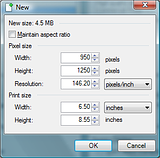
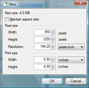
The website is fixed at 950 pixels. So you can adjust the DPI in a couple of places here to make your imports not need to be manipulated as much. There will still be a little bit of aliasing but thats the nature of the beast. This same aliasing is caused even if I zoom the page down in size in the browser. At least in Chrome, Firefox, and IE. So I dont think you're going to get much better with text embedded in an image without using Adobe tools. However this other approach shows a little difference in the output to PDF.
To shrink a 950 image to 6.5 inches for publisher, you would set the DPI to of the canvas before pasting to 146.2 DPI to cause it to fit at 6.5 inches when imported. Technically this isn't much different than letting publisher have its way with the images but it seems to help ever so slightly in my fast testing.
Image of new canvas dialog (height can be adjusted to whatever is needed or matches ...):
Also, save your shots as PNG. This is lossless format and will not lose information when imported into Publisher. You're doing enough pixel crunching without doing any more damage by gif or jpg. They really are not good for this sort of thing.
Exporting to PDF in Publisher: Commercial Printing option. It will flag your doc as having a problem: RGB color space. Once converted to CMYK plus spot in my testing, my PDF's actually shrank in size slightly without fidelity loss and images at 300+ DPI no longer had pronounced aliasing as seen with the High Quality Printing option. Especially if you are going to potentially exceed 150 DPI, you have to choose these options or it will mangled stuff.
This may help you work around the problem and get a slightly better result. I think I see a difference.
No matter what though, when you take a website screen-shot (combinations of images and text), then crunch it into an image, its going to lose some of the fidelity. Especially with the text. This is one area where Adobe is king as it tends to do things that it holds the patents for. I'm not anti-MS by any stretch. Just in the world of PDF's, we all have to seem to pay homage to Adobe ...
I hope that makes sense. Rather hectic day, but I was curious about the issue and thought I might be able to help find something of a solution. So far I'm not sure I've done more than show you a parlor trick to match DPI of a canvas to make resizing unneeded in Publisher for future needs. (Like headers, etc.) I've used that method specifically in Word docs to avoid some sizing issues, etc. Just wasn't sure what impact it may have in Publisher on image quality when compressed to PDF. So far I'm not sure its much different. But I do prefer to use PDN to cut up screen shots.
*Almost forgot: set you selection box tool to a fixed width of 950 pixels by whatever height works for the capture. I have to guess on the height you would want to grab as the site seems to vary a little.
-
On what OMA said, the name of the layers can be quite long. With text layers you can easily name them with the text in those layers in most cases ...
I guess my "(doubtful)" was actual as to it being the wrong layer. I should have been more clear. Glad you got it sorted.
-
Might be CMYK conversion issue. I've seen that (in my limited use) of it coming out like that with CMYK source PSD files. If it can be converted to RGB at the source, you *may* get a different result when imorting it into PDN.
-
Soothing is perfect description for that last one. Stocks or not (silly purism concepts), it's put together well. The arguments over tool combinations and pure from nothing composition is really overblown as well. I wont use a butter knife when a screw driver is the correct tool. I try to keep this in mind.


Jim100361 - My Stuff
in The Pictorium
Posted
Glad WB bumped this I thought I had made comment ...
Oilpainting has a nice aspect to it. Just not sure why my eyes dont like the blend. The concept is really well done though. Just my eyes again.
The House comparison is wonderful. On many levels the writers probably are more than a little influenced by this other legendary example from comedy's past. Reflections in time on what people find funny maybe and tons of other direct comparisons of the two can speak volume you dont need to on it's behalf.