


Greg135
-
Posts
81 -
Joined
-
Last visited
Content Type
Events
Profiles
Forums
Blogs
Gallery
Downloads
Posts posted by Greg135
-
-
Hi there,
I'm trying to precisely place lettering on an image....
The tricky part is that I have to create 10 images all with different lettering. The image is exactly the same for each but the lettering is different i.e. different headings. And there are two lines of text on each image.....
If it was just one image I would probably use a pixel ruler to manually check the spaces between words etc, but that is very laborious and not easy to do 10 times.
This is what I'm doing:
1. Create the lettering using the Editable Text plugin - two lines of text (see image)
2. Cut out first line of lettering (two words) and position in new layer over the image....and repeat for second line of lettering.
3. Try and line up line of lettering both horizontally and vertically, ensuring same spacing between .....grrrr
EDIT: The critical part is to get EXACT spacing between words.....and make sure the spacing is IDENTICAL on each new image
Please tell me how you would do this and if there are any grids available?
Regards
Greg

-
Thanks Ego Eram Reputo,
Those both worked well....
Just a further question with regards to using Fade Edge - I saved the finished work as a .png file to keep the "fade edge" looking great (better than it does if you save as a .jpg - because it seems to take on a bevelled edge appearance)
The resulting .png file size is large (between 464-711kb for 3 images). I normally use FastStone Photo Resizer to resize images but in this case it seems to cut off the "fade edge effect".....
I realise that this question is not about PDN but any advice on how to resize the .png image would be helpful.
Regards
Greg
-
Also another thing:
If you notice the picture has a semi-transparent block with text in it - how do I do that?
Thanks....
Greg
-
Make sure you don't use the gradient anywhere past the edge of the bottom picture. If you need to, lower the opacity of the top layer while you work so you can see what to avoid. For best results, put the start and end of the gradient on the edges of the images.
Another tip: hold shift while drawing your gradient to keep it horizontal.
Thanks pdnnoob,
That works perfectly!!!!!!!
Any ideas on how to provide a fade on all the other edges?
Regards
Greg
-
Guess I should have been more clear on my instructions.
Here's what I got using the gradient tool (through a variation of the tutorial I gave you):
http://i758.photobucket.com/albums/xx228/pdnnoob/Untitled-9.png">http://i758.photobucket.com/albums/xx228/pdnnoob/Untitled-9.png
What I did:
1. Separated the images and put them on different layers
2. Widened each image slightly so they overlapped
3. Used the gradient tool on the top layer to blend them together
Thanks pdnnoob,
Got the best "joining" result using your method....
However, I still get a "hard line" that shows up from the image on the lower layer....
(it makes no difference which image I put on the lower layer - the hard line shows up)
How did you get the soft line?
Thanks to all the other contributions from Doughty and Klaxxon....
Regards
Greg
-
Also another thing:
If you notice the picture has a semi-transparent block with text in it - how do I do that?
Thanks....
Greg
-
Hi pdnnoob,This tutorial might help you (with the intent of explaining how the gradient tool works)
Thanks for the reply but that solution doesn't really help me....
I have attached a couple of other pics which show you what I want to do.
Two things:
1. Blur the area where the two pics join
2. Blur the edges of the pics
Hopefully you can see from the attachments what I want to achieve.
Regards
Greg

-
Hello everyone,
I need to find out how to blur the images for a client website....
What I have done is to take 2 images and put them alongside each other, but I need to blur the area where they join to make the join look less severe.
Also, I need to blur the complete outer edge of the whole image as well.
Have attached image....
Your help will be most appreciated....
Best regards
Greg

-
We used to offer 3 options to clients.
1 very basic & boring
2 very over the top with a price tag to match
3 is the one you wanted the client to pick
Yes, Greg, an important lesson. You must be rather disappointed to come away without a decision.
Also, for what it is worth we used to get 60% up front for materials, terms were 7 days or we charge $20 per month late fee.
All artwork remained our property until fully paid for. That stopped them from taking our artwork to another company to undercut us.
Look forward to seeing more of your artwork & great ideas

Hey Barbieq25,
Yes it's a bit disappointing....
But my main focus of business is actually web design and internet marketing....which is the bulk of the work for this client anyway....
I think I will have to sit down with him and get a much more focussed idea and run with that.
I agree with you about getting up front fees....my normal is to get 80% up front.
I'll certainly post any new ideas and concepts here once I get them...
Best regards
Greg
-
Hello everyone,
OK I met with the client and learnt an important lesson....
He had invited all his agents and a couple of associates to the meeting....ever tried to get a bunch of people to agree on anything artistic?
Every person had his or her 2cents to throw into the mix....
So needless to say I came away without a decision.
So back to the drawing board and this time I will meet with the client on his own.....for sure!
But all is not lost....I have the work done as a base to work from...
Again thanks for all the input....I will post updates and new images here...
Best regards
Greg
-
Thanks for all the extra suggestions everyone....
I'm seeing the client this afternoon so I won't change anything right now....I still have to prepare a discussion document.
But I will definitely get back to you later on and let you know what happened...
Let me just say that you guys are a great bunch of people....helping a complete stranger with no expectations of return!!!
Bestb regards
Greg
-
Hey Greg, it is great to see you giving credit as Welshy said & I am very happy to read such a positive outcome. A wonderful sharing of collective experience.
It may be a bit late but a single pixel white or black outline on the lettering would give it that extra pop. Signwriters often do that with vinyl to make the image/letters stand out a bit more.
Good luck with the meeting. I am sure they will be impressed. Good colour choice too the blue since blue is the communication colour.
Well done Greg & Pdnnoob for the mini tute. Never too late Barbieq25.....almost midnight here!!!
Yes the experience has been really good.....last night I was panicking and really didn't have a clue!!!
I'll try the white outline.....what's the best way to apply the outline?
And yes thanks very much for the good wishes....appreciated.
regards
Greg
-
Press F4 on your keyboard to access the blend modes

Thanks nitenurse79.....where would I be without you.....lol
-
Sorry to post again, but perhaps run AA's Assistant plug-in to remove some of the jagged edges around the curves.
You post away...no problem...
I still need to do that too....
regards
Greg
-
Brutally honest ... it's a taste thing but I don't like the colour of the E.
But I'm seriously thinking I need an eye test in real life, so that could be me thinking it's too bright
One suggestion I would have is to make a new Bevel Selection layer and use the alternate lighting direction option, so that the lighting changes. Then maybe set the layer Blend Mode to Overlay, it'll help it blend in nicer IMO
That's cool welshblue....
My idea is to put something completely different in front of the client...
I'll play with your other suggestions....where is the Blend Mode?
regards
Greg
-
Greg, just a head's up. If this logo is going to be used both on the Web and in printing format, you should save it in different formats. For example, your Web logo should be saved as a .png with a dpi (resolution) of at least 300. If the logo will be used on flags, boards, letterheads, etc., you should probably save it as .tiff since it's the printing format and with a 300 dpi (at least).
Thanks Helen....
Great head's up...was not aware of those requirements....
Hopefully my PC is powerfull enough to render those resolutions...
Regards
Greg
-
Sorry...timed out...

-
Thanks nitenurse79 and pdnnoob and welshblue!!!!!
OK here is the result....
Be brutally honest please....meeting with the client tomorrow....
The final logo is going to be used right across the companies media branding
including:
-business cards and letterheads
-real estate boards and markers
-flags
-large format advertising boards 8' x 12' and larger
Just a quick question - what resolution should the final logo be created in to meet all the printing requirements?
Regards
Greg
-
Really nice to see someone giving credit where it's due. It's so so dis-heartening when people get advice and run
Have you considered a bit of Bevel Selection on the larger E ... it seems a bit 'flat' at the moment
You know what Welshblue....this forum is really great because of the people....and you can include yourself in that group!!!
I agree with you....I need to make the design more punchy....
I think I've been at it too long today because I can't figure this out.....
I tried the bevel but it applies the bevel to the background and not the E itself....(large E is on a transparent background)
Any ideas on how to do this?
And any other ideas will be most welcome...
Regards
Greg
-
Ok everyone,
Herewith one of the logos......colours are not final....
Again thanks to everyone for your input....have to single out pdnnoob for going the extra mile!!!
You guys are awesome!!!
Regards
Greg

-
OK.....finally with much trial and error, I managed to duplicate what you did pdnnoob....
I'm not sure if I can remember the steps it took to get here.....
Anyway have a look....
Everyone else as well.....yes you are all included....you know who you are - thanks for all your help.
At least I can now use this as the base for one of the logo ideas...
Regards
Greg

-
Greg, to invert the color, you press Ctrl + Shift + i
Thanks for the tip Helen....
-
The extra effects was to cover up the mistakes in the e

To make the "e" like that, I made one layer with a tilted black oval, then duplicated it and inverted the color to make a white oval with the same rotation. I shrank the white oval and moved it into position. Then, on a new layer, I used the line/curve tool to draw the curve I needed to remove from the white oval. Once I deleted that part of the oval, I deleted the extra layer. From here, you're pretty much done. You may need to move the separate pieces of the white oval a little when you are done, so select one piece with lasso select, press ctrl+x, and paste it on a new layer.
TIP: After you draw a straight line, right click on one of the nubs before you start dragging them around. This sets the line/curve to "bezier curve mode" which makes nicer looking curves.
Hey there pdnnoob,
I've been playing around with a bunch of fonts....
OK...thanks for your explanation....but I'm struggling to follow your instructions...
Let me tell you what I did:
-created ellipse on white background
-selected ellipse
-tilted ellipse
-duplicated titlted ellipse (still selected) Layers > Duplicate Layer
But how did you " invert the color"?
Am I correct thus far?
Regards
Greg
-
Yup...definitely need a shameless self-promotion award for you, RedOchre
Another way to do it is to add another new layer and draw an ellipse set to outline mode
Use the ellipses to draw the area you wish to remove, then select that area and go back to the other layer and hit delete.
I messed around (and got carried away) and took a screenshot to show how many layers I usually end up with in an average project
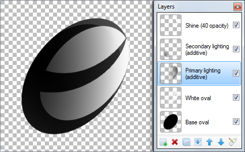
Notice that I didn't try to draw the e in one layer. In fact, a total of 3 layers were used. One for the black, one for the white, and one for drawing what I want to remove from the white.
Pdnnoob....that's exactly what I had in mind...
I'm going to have to try and get that same effect...
Thanks for taking the trouble....much appreciated.
Could you elaborate on the steps that you took?
It's almost midnight here...so I'll tackle this tomorrow!
Thanks again....
Regards
Greg


How can I use a grid to precisely place lettering on an image?
in Paint.NET Discussion and Questions
Posted
Thanks xod,
Just got to figure out how to use it.....do you know if there is a tutorial?
Regards
Greg