


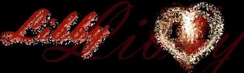
LibbyH
-
Posts
81 -
Joined
-
Last visited
Posts posted by LibbyH
-
-
Um Briamoth... I don't see any text on your sig?
-
Sokagirl, your stuff is always so interesting.
 I like your newest work, but I think my favorite is Capsules, it is so beautiful and dynamic.
 -
When I found this tut I bookmarked it because I didn't have time to read it. I just now came back and finished it, and wanted to let you know it was really helpful, and really funny. Thanks.

-
Thanks Rick et al Paint.NET v3.5 is amazing!
Of course who doubted that it would be? -
Oh! That's really interesting. I knew before I came here that I could do a lot with paint.net, but I still had no idea how amazing this program is!
-
It is beautiful. This is kind of a strange comment, but I thought of being in a castle and looking up at the ceiling.
-
Very nice tut Nemo! I'll be trying this one tonight if I get the time. I've been wanting to do more creating in paint.net. Currently I spend most of my time photo editting.
-
I also like the effect of the planet tut with oranges and yellows, and then use dents to texture it.
-
Yes I do think that's better EE! Before I think my eye was being drawn too much to the dark shadow b/c it was so much darker, and would miss most of the rest of the picture, b/c the shadow was the focal point. Now I think my eye travels up the bridge, which creates more movement and life I think...
EDIT: And congrats on your 100th post!
-
Thanks Nemo. I'm still working on more complex things. I'm excited about some of the results of these functions, but they're all still preliminary.
-
I like it Nemo. It's very cute, and I think it would make a good watch. It also fits my life "I'm running late." I think that's part of the reason I like it. It's well done.
-
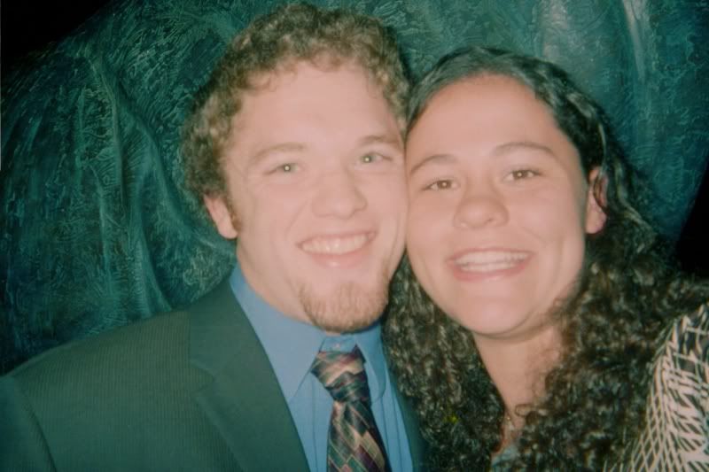
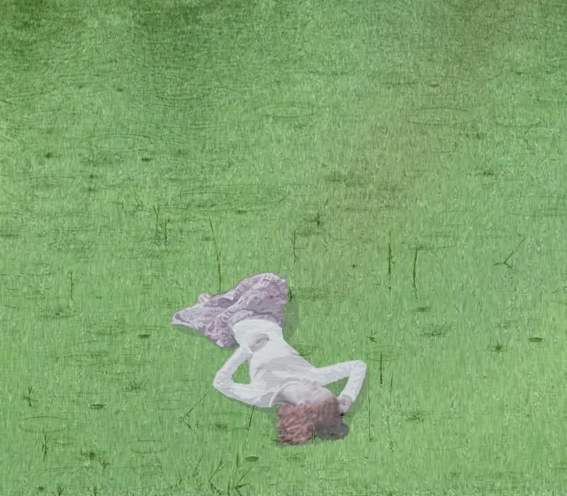
So these are pictures from before I had a digital camera, that were poorly developed:
Hidden Content: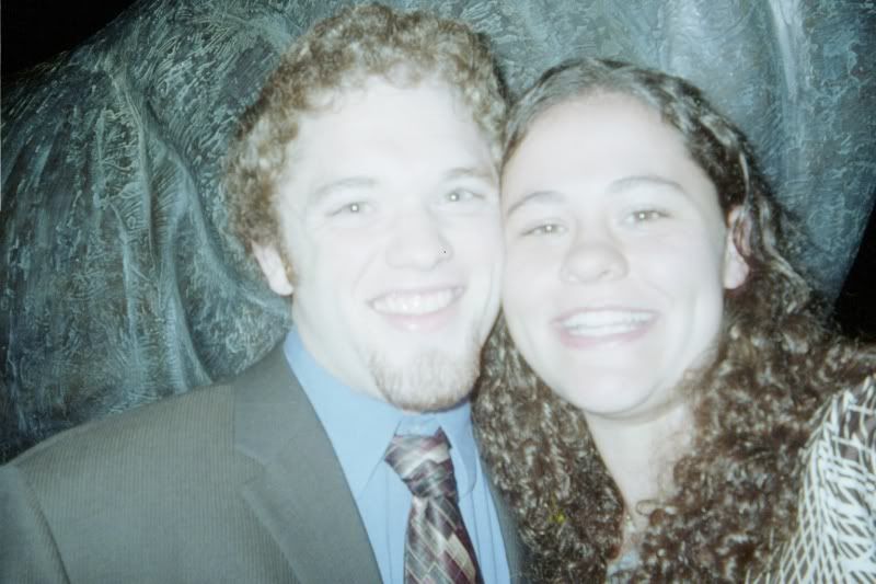
And here's my edit, mostly with curves:
-
Nice work barbieq25. I like your dragonfly, glass ball, and cracked glass balls especially. Vibrant use of colors and textures, and I love the fact that you have a jewels gallery.
-
Thanks barbieq25 and sokagirl. I hope to be posting more soon.
-
Hey Mag. I like your nighthill image. The moon, reflection, grass, birds and tree are all beautiful. The only thing I might suggest changing is the stars. I feel like they garner too much attention. However I do like them and wouldn't suggest cutting them out all together, maybe just toning them down a little. Sorry it came out of a bad experience... Or I'm glad it came out of a bad experience, to have gotten something good out of it? Hmmm. Hope you know what I mean
. -
Flip. Fun tutorial. I really like the effect, and all of the ways you can change it to come up with different outcomes. I haven't tried working with shadows yet, but that's def on my list of things to try tonight.
Skitzo, your sword effect is really cool. You might also think about putting a line down the middle and doing some kind of gradient? from middle to outside. But I think it looks really good now.
Zandy, your adaptation would make great scrapbook paper.
I really like the one with the blurred background, it pops more. -
Can you add a little of that blue to the left side as well. I think that might help.
-
So last time I was on the honey colored abstract wasn't showing up on my computer, so when I came back and saw it I though how did I miss that? I love it, and I agree it looks like it could be a precious gem.
-
h3llb0yn3cr0 I agree I really liked this tut too. I'm excited to see your try at this, please remember to be careful with your language so you don't offend anyone.
-
Thanks! That's really helpful. I've got it now, and hopefully it will help others too.
-
That's great! I think that's much better, and I don't think it takes the attention away from the focal point at all.
-
Sigs

<!-- m -->http://th04.deviantart.net/fs19/300W/f/ ... Pierot.jpg<!-- m -->
"Realistic Images"
Hidden Content:My first picture in the pictorium is a combination of several tutorialsPlanet tut comp
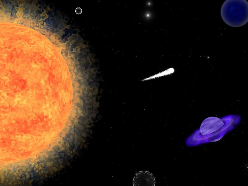
Shoutouts for my first "painting" to:
Hidden Content:PacerCoin for the exploding planet<!-- l --><a class="postlink-local" href="http://paintdotnet.forumer.com/viewtopic.php?f=31&t=26973">viewtopic.php?f=31&t=26973</a><!-- l -->
flip for the planet, texture, glow etc tutorial
<!-- l --><a class="postlink-local" href="http://paintdotnet.forumer.com/viewtopic.php?f=31&t=31472">viewtopic.php?f=31&t=31472</a><!-- l -->
jsonchiu for the rings tutorial
<!-- l --><a class="postlink-local" href="http://paintdotnet.forumer.com/viewtopic.php?f=31&t=6463">viewtopic.php?f=31&t=6463</a><!-- l -->
Sharp for the starscape tutorial
<!-- l --><a class="postlink-local" href="http://paintdotnet.forumer.com/viewtopic.php?f=31&t=31262">viewtopic.php?f=31&t=31262</a><!-- l -->
Frozen_byte for the cosmical clouds etc. tutorial
<!-- l --><a class="postlink-local" href="http://paintdotnet.forumer.com/viewtopic.php?f=31&t=27083">viewtopic.php?f=31&t=27083</a><!-- l -->
Thanks all!
-
 1
1
-
 1
1
-
-
I really like the background, the colors and the blur. Is there a way to make the text on the second picture move a little slower? It's making me a little dizzy.
-
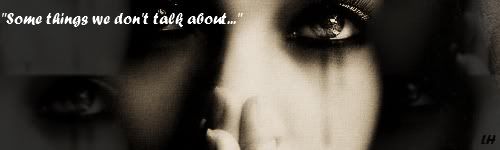
Very nice text graphics. Intricate enough to really catch your eye, but simple enough to remember I think. I really like the first one, although you do have to look that one for a minute to read it.


Libby's colorful portrayals
in The Pictorium
Posted
Well I thought about posting this in the image hospital, because there's something wrong with it, but I'm not sure what. But I wasn't sure if it was a major or minor problem, anyways I decided to post here instead. I'd appreciate feedback, I am just not sure what's wrong with it.
EDIT: Yikes, I forgot to actually post the image.
Stock Images