


Wilson
-
Posts
469 -
Joined
-
Last visited
Posts posted by Wilson
-
-
The cupcake is good, Rubrica. You are so talented for your age. (I bet people bring that up a lot.) Love all the stuff here!
[off-topic]I just realised I have to go on NationStates![/off-topic]
-
I'm going to buy it, just for the Paint.NET bit.
-
Sorry, direct link only. Image is too large to post on here.
-
Love the new Apple Abrstract, HELEN!
-
Search for Octogonal Reshape Plugin.
This should help you out.
-
That pattern you see, represents transparency. When, you view the file online or somewhere else it won't have that checkerboard pattern.
-
-
Very nice picture indeed. Good use of photo techniques! The blurring really adds a sense of depth to the photo.
@007 Nab I PM'd you too, remember? I asked to see the files and they were amazing by the way.
-
Yeah, I've never really understood why this happened either but what Yellowman said should sort it.
-
Great plugin and well done on getting it Sticky'd.
Using it when I get home to my PdN computer...
-
Love this one! Great art, great tutorials, well done Nemo!
-
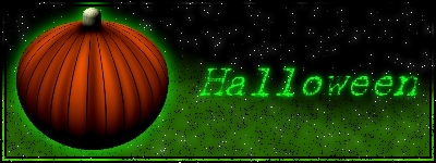
Love the Halloween Poker Chips. Spooky.
Keep it up.
-
I love Kemaru's entry. His style of brushing is just amazing!
-
100% PdN. No stocks or renders used.
-
You should really post this in the thread for the Circle Text plugin.
-
Just under the Help button, there is the Units drop down menu. Click on that and then select Inches.
Then using the Circle Selection tool you can make a 1" circle, just look down at the bottom for the circle size.
-
Can I just start off by saying that I like all of these pictures. I'm going to go through each picture here and rate it, ok?
The first signature, the purple one, is quite interesting. I believe you used dents to distort the arrows, right? The colours are quite good and nice use of brushes in the background.
the second signature with the burning text, is really nice, inventive use of Random Shape Fill for the fire wisp. The text looks like it is on fire, as I imagine it is supposed to. However, the American flag in the background has been stretched and distorted. You could have filled the empty space with a tiled flag or another symbol.
The third signature is the pyrosig. So I can't really comment. Good colours, nice font is all I can really say as you didn't come up with the idea for this style of signature.
The fourth signature contains interesting use of twist and the MOL plugin? The diagonal lines rendered over the entireity of the signature sort of distract the viewer from the point of view which I would assume is the center. The beackground was made with a tutorial I think so it's not really as good considering that's not really your work either.
The fifth signature was created using a tutorial, so again I can't comment.
The sixth signature using the Shadow render is really good. I like the Glow'y line and dots. The background is also really good including the writing on top of it. Not enough colour for me but each to their own opinion.
The seventh signature including Yoshi, now, the render could definitely use some feathering. Remember, feather is your friend. However, the background you created for this one is really interesting and so is the text that is on the signature.
I'll edit in the information about the avatars later.
-
You have some really interesting works here, ραиđeмøиıυм, I really like the colour depth in all of the signatures and I especially like the last signature that you featured here in your gallery. I suggest however, that you move on to something beyond signatures as I can see real potential in all of these works of art.
Your first Paint.NET signature is outstanding. If I was making stuff like that when I started out I wouldn't be worried in the slightest. The text is really interesting and so is the background. I like how you have used the transparency in all of your current pieces.
In the one with the render. I love the way you got that text to look, great glow and interesting font. Do you know what font it is? You've arranged it so that it looks really realistic. Love this one.
Your current signature is also really imaginative and it uses good blending.
Overall, great work, great use of transparency and I can't wait to see more of your stuff.
-
That is cool.

-
If I understand you right, what you want to do is have a black outline to print out and colour in?
If I'm right you could just use the Line/Curve tool :LineCurveTool: to create the picture you want and then just print it out so you can then colour it in manually.
-
Most graphics tablets work with Paint.NET. I know this as I have gone through a variety of them and they have all worked, just keep the receipt and return it if it doesn't work.
-
Posted this in the Pixel umbrella, thought I'd post it here, for the sake of having all tips nearby.

Open a new layer under whatever your working on.
Pick 2 colours you want to blend.
Make a linear gradient, from one edge to the other.
Use the posterize effect, and choose how many colours you want to use.
And you're done! Now all you gotta do is pick the colours with the colour picker and use them.
 You can delete the gradient blend layer afterwards.
 Some might call this cheating, I call it creative use of advanced tools.
EDIT: Example.
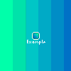
I like it! because it works!
Thanks for sharing Kemaru.
-
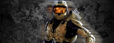
I'm trying to make a Halo signature and need advice on how to improve it. Does anyone have any ideas?
-
Yeah, I agree with you but this might be a bit hard to implement into Paint.NET.
Worth giving it a shot though.

Paint.NET is getting noticed!
in Paint.NET Discussion and Questions
Posted
I just want to see what they said, that's all.